Cleanly modern A5 House refurbished by Raz Melamed Architects to put a contemporary spin on an historical building 由RazMelamedArchitects翻新的清洁现代A5House,以在历史建筑上进行现代旋转。
2019-08-05 18:08
In the historical city of Tel Aviv-Yafo, Israel, the fresh and modern A5 House was recently completed by Raz Melamed Architects as part of an ongoing project to refurbish older buildings in the area for easier modern living without disturbing their outwards historical context.
在历史悠久的以色列特拉维夫-亚福市,拉兹·梅拉迈德建筑师最近完成了这座崭新而现代的A5建筑,这是一个正在进行的项目的一部分,该项目旨在整修该地区的老建筑,使其在不影响其外部历史环境的情况下更容易地过上现代生活。
In reality, the A5 House is a modest but still impressive 70 square metre studip apartment that has been redesigned into a modern getaway. It lies at the centre of Tel Aviv’s historic Neve Tzedek neighbourhood, which is part of the reason it was chosen for this refurbishment project. Despite the fact that designers on the project had previous experience with authentically and respectfully redoing historical buildings, this particular spot presented a unique set of challenges.
在现实中,A5豪宅是一个温和,但仍然令人印象深刻的70平方米的存根公寓,已被重新设计成一个现代度假。它位于特拉维夫具有历史意义的Neve Tzedek居民区的中心,这也是它被选为这一翻修项目的一部分。尽管该项目的设计师以前有过真实和体面地重做历史建筑的经验,但这个特殊的地方提出了一组独特的挑战。
Previously to being redone, this property as derelict and abandoned for many years. When designers arrived on scene, they found what looked like a collection of ramshackle shacks, all hacked together in a way that appears shoddy and unreliable. The effect of this construction was to make an inner space that appear like a sort of dark, disjointed maze with only a hidden back patio for private outdoor space.
在被重做之前,这一财产被遗弃和遗弃了许多年。当设计师们到达现场时,他们发现了一堆看起来像摇摇欲坠的棚屋,它们以一种看起来低劣和不可靠的方式拼凑在一起。这种构造的效果是使一个内部空间看起来像一种黑暗的,不相交的迷宫,只有一个隐藏的后露台为私人户外空间。
Additionally, a slanted wall that divided the main inner spaces presented something to think about and work with or around. In short, the space needed thorough renovation. Within that, however, it was essential that contractors remain diligent and careful, since they were, in fact, working in an historical space. The team aimed to work carefully enough to protect the building’s outer shell and preserve the home’s historical integrity.
此外,一个倾斜的墙,划分了主要的内部空间,提供了一些思考和工作,或周围。总之,这个空间需要彻底的改造。然而,在这一范围内,承包商必须保持勤奋和谨慎,因为他们实际上是在一个历史空间中工作。这支队伍的目标是认真工作,以保护建筑物的外壳和维护家园的历史完整性。
In the early planning stages, designers came up with three distinct potential layouts that might work within the unique space. Each of these accounted for the sharply slanted wall in different ways; one tried to hide the wall to create an illusion of wide open rectangular space, a second worked it into the plan in a way that was subtle, and the third made is a central part of the layout, relying on it quite heavily.
在早期规划阶段,设计师想出了三个不同的潜在布局,这些布局可能在独特的空间内工作。其中的每一个都以不同的方式占据了急剧倾斜的墙;一个试图隐藏墙,以创建宽开放的矩形空间的幻觉,第二个是以微妙的方式将它工作到计划中,而第三个则是布局的中心部分,依靠的是相当大的。
In the end, designers went with the first plan, option for openness and free flowing space with as little slanted interruption as possible. They did this by taking advantage of both horizontal and vertical space, eventually dividing the apartment’s interior into four distinct spaces, each one rectangular in shape.
最后,设计师选择了第一个方案,选择开放和自由流动的空间,尽可能少的倾斜干扰。他们利用了水平空间和垂直空间,最终将公寓内部划分为四个不同的空间,每个空间都是矩形的。
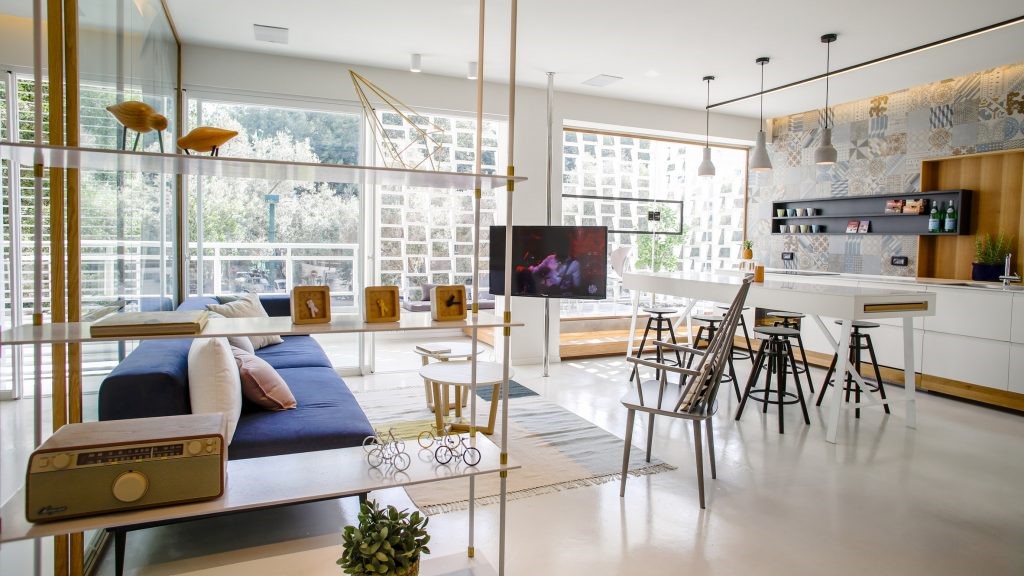
Now, the spaces are organized into a sleeping area, a living room, and kitchen, and a stunning outdoor patio. Each of these are divided by beautifully intersection vitrine windows that open from room to room or onto the patio using a Belgian style pivot door. The patio is accessible from both the living room and the bedroom, while the bedroom is separated from the two inner social spaces by an additional wall of windows.
现在,这些空间被组织为一个睡眠区、一个客厅和厨房,还有一个令人叹为观止的户外露台。其中的每一个都是用漂亮的相交的维林窗户隔开,窗户可以从房间到房间,或者使用比利时风格的枢轴门在露台上。起居室和卧室都可以进入庭院,卧室与两个内部的社会空间隔开一个额外的窗户墙。
The use of only glass walls within the apartment itself and surrounding the patio has a practical function as well as a decorative one. This way, natural light is permitted to flow freely into the rooms, reaching just about every corner. The same goes for fresh air when the windows are pivoted open. The stone wall surrounding the patio, however, keeps the inner space nice and private despite the clear line of sight from the patio inward.
仅在公寓内部和庭院周围使用玻璃墙,既有实用的功能,也有装饰的功能。这样,自然光就可以自由地进入房间,到达每个角落。当窗户转动时,新鲜空气也是如此。然而,围绕着露台的石墙,保持了内部空间的良好和私密,尽管从天井向内有清晰的视线。
In order to keep the flow of space and open concept construction of the inside rooms even and symmetrical, designers opted to hide the apartment’s bathroom behind a subtle door in the kitchen. This stops the apartment from having an uneven visual space and makes it feel like a standard modern one-bedroom, despite its old fashioned courtyard and lovely historical outer aesthetic.
为了保持空间的流动和内部房间的开放概念结构,即使是对称的,设计师还是选择把公寓的浴室隐藏在厨房的一个隐蔽的门后面。这阻止了公寓的视觉空间不均匀,让它感觉像是一个标准的现代单人间,尽管它老式的庭院和可爱的历史外部美学。
On the more public side of the house, which faces the street, designers opted to glad windows with wooden shutters that are more standard of the buildings in the area. This gives the inner spaces privacy without interrupting the visual aesthetic of the local area. The effect is that the modern appearance of the apartment inside and the way it contrasts with the exterior is sort of a surprise for visitors entering for the first time.
在面向街道的房子更公共的一面,设计师们选择了用木质百叶窗来装饰窗户,这是该地区建筑的标准。这给了内部空间的隐私,同时又不影响局部地区的视觉审美。其效果是,现代外观的公寓内,它的方式与外部形成对比,这是一个令游客第一次进入的惊喜。
The clean, simple layout plans might make the apartment look like it was easy to manifest, but that’s not so. First, designers had to essentially rebuild and replace the original infrastructure due to rotting beams near the roof. The original flooring, worn and unsuitable after years of both use and neglect, also needed redoing.
干净的、简单的布局计划可能会让公寓看起来很容易显现,但这并不是这样。首先,设计师必须重建和更换原有基础结构,因为屋顶附近有腐烂的梁。经过多年的使用和忽视,原来的地板、破旧的和不合适的地板也需要翻新。
Each of these radical project aspects, of course, had to be completed within the parameters set out by local preservation authorities. Designers could not, for example, change the height of the building. Any changes or updates that were made to the outside fo the home were done using locally sourced supplies that would have been authentic to the area in any era.
当然,这些激进项目的每一个方面都必须在地方保护当局规定的范围内完成。例如,设计师不能改变建筑物的高度。对房屋外部进行的任何更改或更新都是使用当地采购的供应品完成的,这些用品在任何时代都是对该地区来说是真实的。
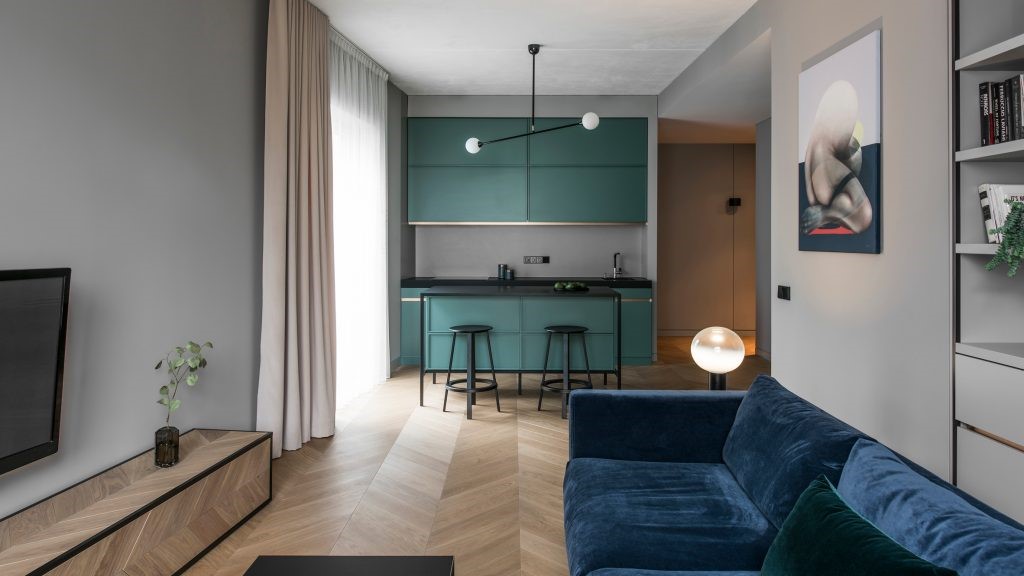
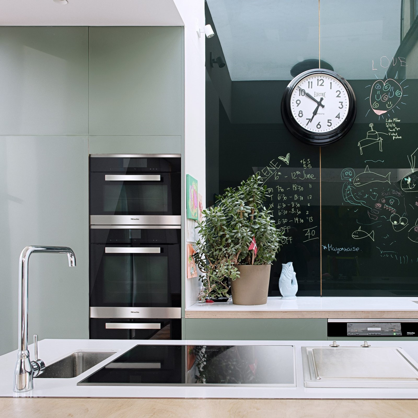
This sense of natural, raw materiality continues on the inside of the apartment as well. A calming grey colour palette was chosen as a happy medium between old fashioned and minimalist, modern aesthetics. The bathroom features grey tiles while the kitchen and bedroom boast impressive woodworked details that have been painted a matching grey.
这种自然的,原始的物质感继续存在于公寓的内部。一个平静的灰色调色板被选为一个快乐的中介之间的老式和极简,现代美学。浴室以灰色瓷砖为特色,而厨房和卧室则以令人印象深刻的木刻细节而自豪,这些细节都被画成了灰色
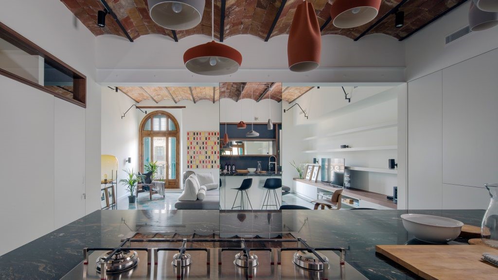
In contrast, the kitchen island, granite countertops, and steelwork around the pivoting glass doors were all done in black in order to ground the space and create periodic focal points. Greenery in the serene, old fashioned patio completes the space, bringing that sense of a natural escape home.
相比之下,厨房岛、花岗岩台面和围绕着旋转玻璃门的钢结构都是用黑色做的,目的是为了把空间磨平,并创造出周期性的焦点。宁静的、老式的庭院里的绿色植物完成了这一空间,带来了一种自然逃避的感觉。
 举报
举报
别默默的看了,快登录帮我评论一下吧!:)
注册
登录
更多评论
相关文章
-

描边风设计中,最容易犯的8种问题分析
2018年走过了四分之一,LOGO设计趋势也清晰了LOGO设计
-

描边风设计中,最容易犯的8种问题分析
2018年走过了四分之一,LOGO设计趋势也清晰了LOGO设计
-

描边风设计中,最容易犯的8种问题分析
2018年走过了四分之一,LOGO设计趋势也清晰了LOGO设计


 PintereAI


