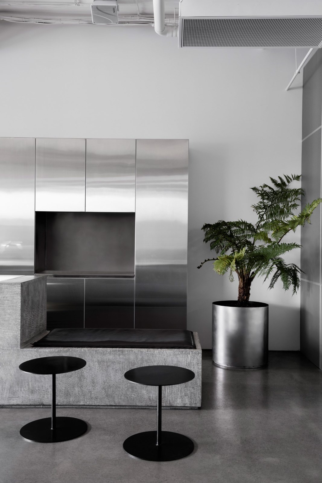
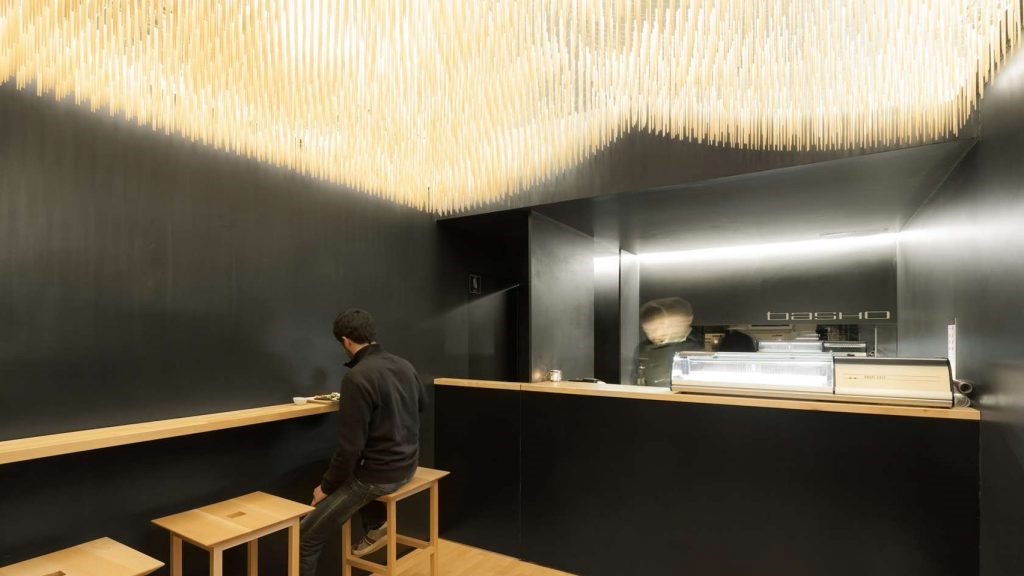
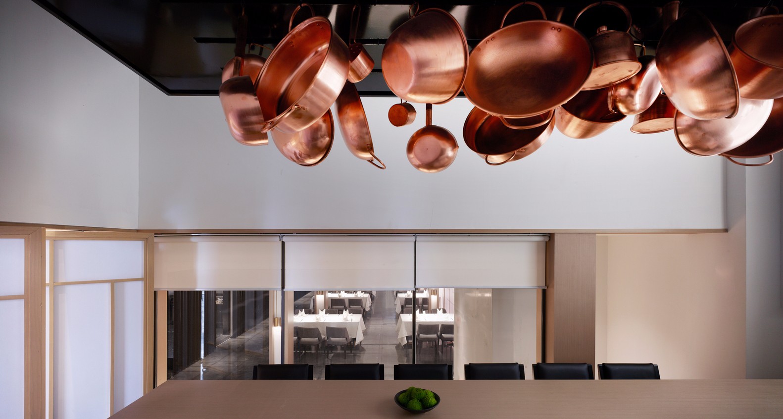
Notorious and calming SLA Salad Bar created by Standard Studio in The Netherlands 由荷兰标准工作室创建的臭名昭著且平静的SLA沙拉吧
2019-08-09 10:48
On a bustling central street in Amsterdam, in the The Netherlands, design teams at Standard Studio have recently completed a new franchise of the well known restaurant SLA Salad Bar in order to account for how successfully the company has grown in recent years.
在荷兰阿姆斯特丹繁华的中央街道上,标准工作室(Standard Studio)的设计团队最近完成了著名餐厅SLA沙拉吧(SLA Salad Bar)的新特许经营,以解释该公司近年来的成功发展。
The original salad bar was launched in 2012 and has seen nothing but positive growth since. The latest evolution is the opening of this new location, which is the eleventh of those built all across The Netherlands since the first. With this new bar, designers were specifically tasked with not only making the new restaurant itself, but also creating an entirely new design for the store’s interior.
2012年推出了原来的沙拉吧,但自那时以来没有任何积极的增长。最新的进化是这个新的位置的开放,它是自第一个以来在荷兰建立的那些新位置的第十一个。在这个新的酒吧里,设计师的任务不仅是制造新的餐厅本身,而且为商店的内部创造了全新的设计。
This goal goes above and beyond just giving the building a new look. Instead, the priority was to established a recognizable atmosphere and look that customers might consider typical of the brand, associating it with the products and services it provides and the values its staff put forward with the company name. This aesthetic will continue onward as even more new locations arise.
这个目标超越了上述目标,不仅仅是为建设一个新的面貌。相反,当务之急是建立一个可识别的氛围,并希望客户可以考虑品牌的典型,将其与提供的产品和服务联系起来,并将其员工的价值与公司名称联系起来。随着更多新的位置出现,这种美学将继续向前发展。
Of course, even within the process of building a brand and typical, consistent look, it is essential to do so from elements that might be catered to specific spaces and applied flexibly to ensure that each new location functions and looks its best. After all, having each space be an organized, positive experience is still the most important thing beyond sticking to a particular look, even when the store is trying to convey a comfortingly well known identity.
当然,即使在构建品牌和典型的一致外观的过程中,也必须从可能满足特定空间并灵活应用的元素中做到这一点,以确保每个新的定位功能都能发挥最佳的作用。毕竟,每个空间都是一个有组织的,积极的体验仍然是最重要的东西,即使在商店试图传达一个令人舒适的已知身份时也是如此。
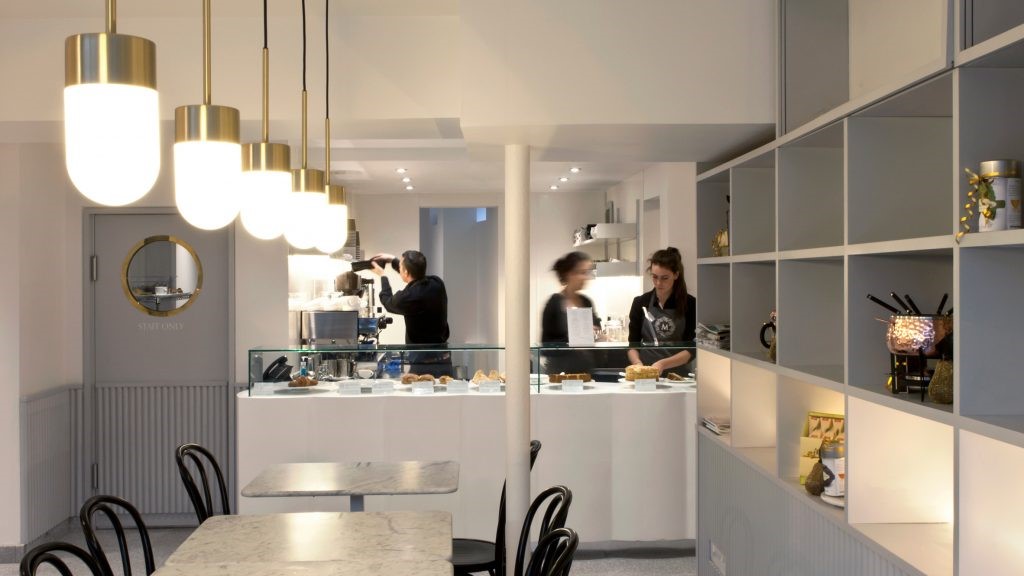
As you can probably imagine, the process of putting together and making individualized salads is, in fact, the central function of the space. This is why the salad counter, which features spacious prep surfaces and storage spots for many different fresh ingredients, sits at the heart of the space like a hub.
正如你很可能想象的那样,放置和制作个体化沙拉的过程实际上是空间的中心功能。这就是为什么沙拉柜台有很多不同的新鲜成分的宽敞的准备面和储藏点,位于像枢纽这样的空间的中心。
Once they’ve moved the length of the salad counter and have their meal in hand, the space is set up intuitively in terms of space, so customers easily understand to move onward to choose where they’d like to sit and eat in several different seating arrangements laid out around the shop.
一旦他们移动了沙拉柜台的长度,手里拿着他们的饭菜,这个空间就会按空间直观地设置起来,这样顾客就能很容易地理解如何继续前进,选择他们想坐的地方,并在商店周围布置的几个不同的座位上就餐。
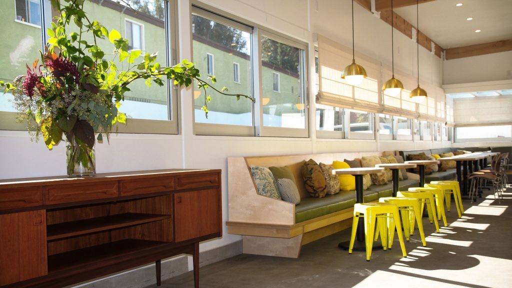
The seating spaces are flexible and have been designed to accommodate all kinds of different customers and their needs, depending on who their party consists of and what kind of day they might be having or what kind of dining experience they might be looking for. These range from individual stools at a bar for singular people grabbing a quick bite to comfortable, more intimately placed corners suitable for couples who want to take their time together.
座位空间是灵活的,可容纳各种不同的顾客和他们的需要,取决于他们的聚会由谁组成,他们可能有什么样的日子,或者他们可能想要什么样的就餐体验。从个别的凳子在酒吧为单身汉抢夺一口,舒适,更亲密的角落,适合夫妇谁想要在一起。
Since the central point of the stores themselves, no matter location or style, is the food, the SLA salad bars are always built at central spots in the urban places the company choses to put them in. This makes the tendency of the space to feel diverse, accommodating, and flexible even more important, since people from all different backgrounds and experiences are more likely to be customers in busy urban centres.
由于商店本身的中心点,无论位置或风格,都是食物,SLA沙拉酒吧总是建立在市中心的地点,公司选择把它们放在那里。这使得空间的多样性、迁就性和灵活性变得更加重要,因为来自不同背景和经验的人更有可能成为繁忙城市中心的顾客。
Precisely because of those city locations we’ve talked so much about, however, designers made it a point to establish an aesthetic that is also sort of calming. In short, designers wanted this particular Amsterdam location to feel like a momentary escape from the hectic contexts right outside the doors, like a slower paced place where people can come together.
正是因为这些城市的位置,我们已经谈论了这么多,然而,设计师强调,建立一种美学,也是某种程度上的平静。简而言之,设计师们希望阿姆斯特丹这个特定的地方能让人感觉像是从门外忙碌的环境中暂时逃脱出来,就像一个节奏较慢的地方,人们可以聚集在一起。
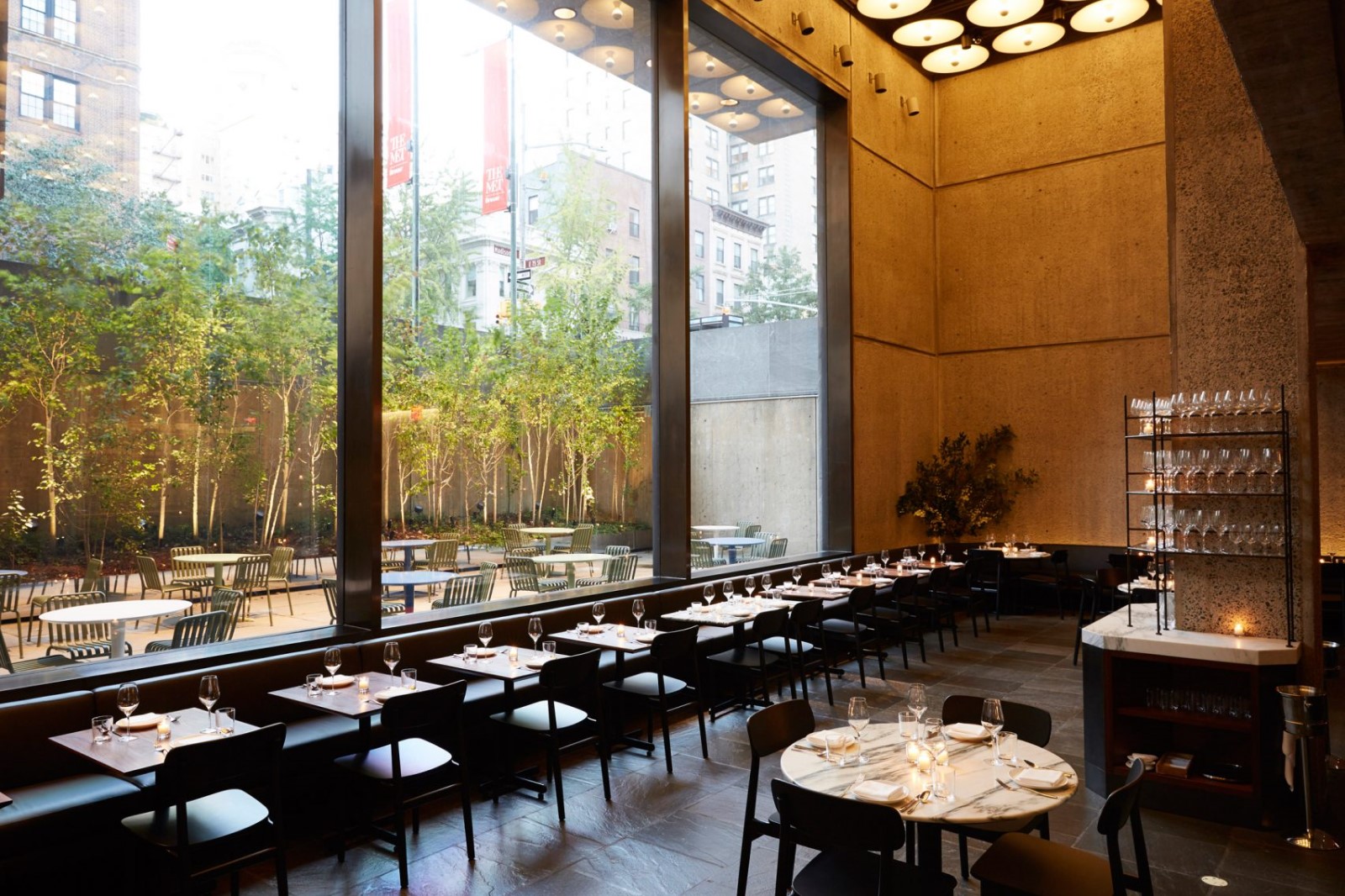
Overall, the space is quite open concept, making it feel contemporary in its calming, peaceful style and sensical layout. Wooden walls inspired by fins delineate space according to function, outlining where staff work versus where customers are free to spend their time. Large windows provide both natural daylight and a view of the bicycle heavy streets outside.
总体来说,空间是相当开放的概念,使它在平静、和平的风格和感觉到现代。以翅片为灵感的木墙根据功能划定空间,概述了员工工作地点与客户自由花费时间的位置。大的窗户既能提供自然光,又能看到外面的自行车街道。
One of the most interesting aspects of the space that is intentionally consistent from location to location is the inclusion of greenery right inside the restaurant (beyond the presence of salad leaf options, of course). Plants play a huge role in the decor scheme; some are live and potted while others, like moss and fern leaves, are dried and framed. Green tiles and other details included around the space tie the plants in well and make the space feel and look cohesive.
这个空间中最有趣的地方之一就是在餐厅内加入绿色植物(当然,除了沙拉叶选项之外),这个空间从一个地方到另一个地方都是一致的。植物在装饰设计中起着巨大的作用;有些是活的和盆栽的,而另一些,如苔藓和蕨类植物的叶子,则是干燥和框的。绿色瓷砖和其他细节包括周围的空间,把植物很好地绑在一起,使空间感觉和看上去有凝聚力。
One element that’s unique specifically to the new Amsterdam location of the SLA salad bar is the “show kitchen”. This refers to the way the functional kitchen and all food prep stations are built with glass walls so that there is still a delineation of space, but one that lets customers in on all of the work that goes into their meal, providing what becomes an almost entertainment moment. This space is also used for cooking workshops that customers can sign up for in the store’s off hours!
一个元素是独特的,特别是在新阿姆斯特丹的SLA沙拉酒吧的位置是“展示厨房”。这指的是功能齐全的厨房和所有食品准备站都是用玻璃墙建造的,这样就可以划定空间,但也可以让顾客参与到用餐中的所有工作中,提供几乎成为娱乐的时刻。这个空间也是用来烹饪车间,顾客可以在商店的休息时间注册!
Photos by Wouter Van Der Sar
 举报
举报
别默默的看了,快登录帮我评论一下吧!:)
注册
登录
更多评论
相关文章
-

描边风设计中,最容易犯的8种问题分析
2018年走过了四分之一,LOGO设计趋势也清晰了LOGO设计
-

描边风设计中,最容易犯的8种问题分析
2018年走过了四分之一,LOGO设计趋势也清晰了LOGO设计
-

描边风设计中,最容易犯的8种问题分析
2018年走过了四分之一,LOGO设计趋势也清晰了LOGO设计


 PintereAI


