PintereAI


新作|玮奕设计 · 远离喧嚣的「冥想住所」 首
2025-07-28 21:28


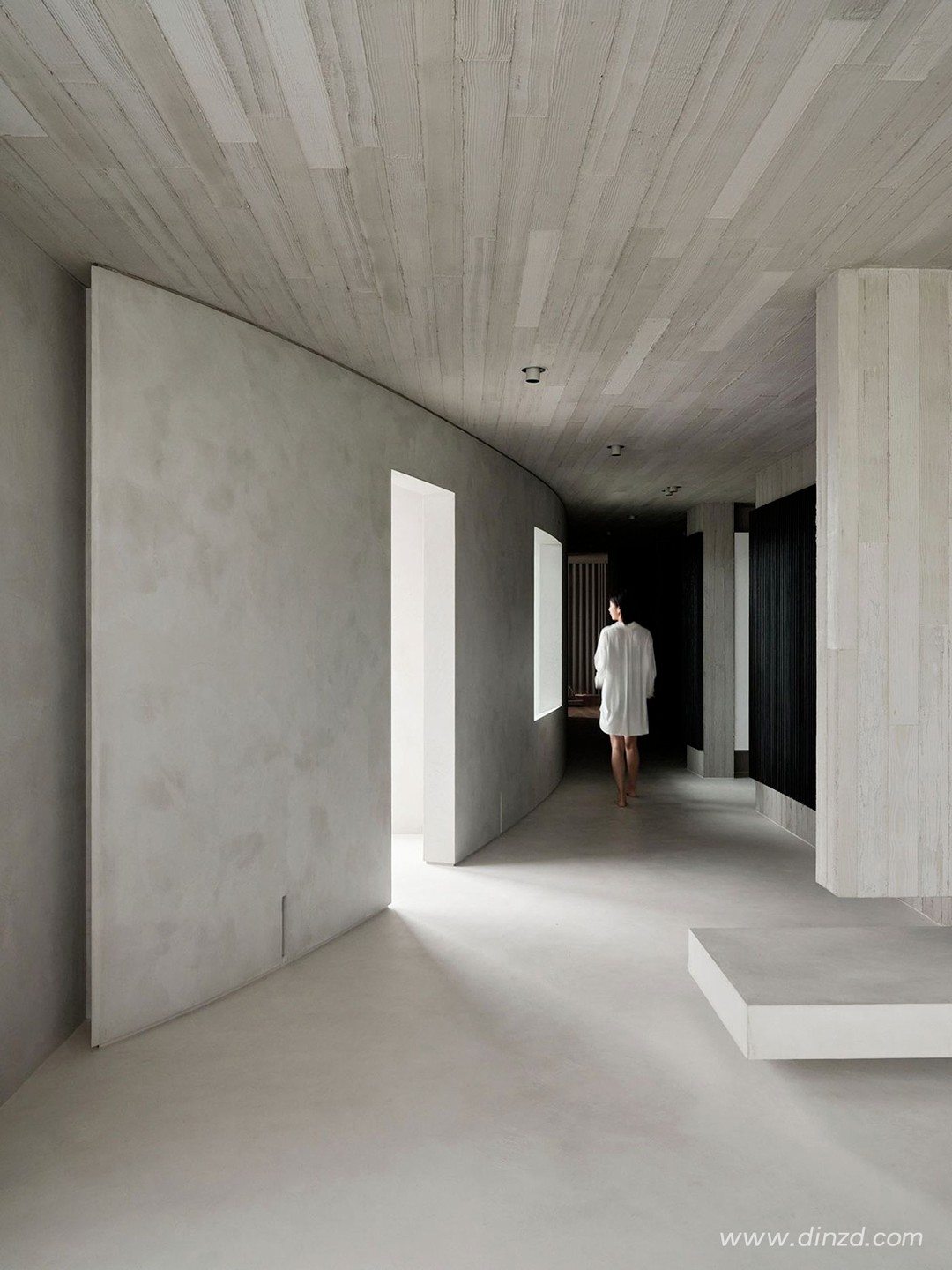
在室内设计领域,灵魂极简主义是一种难以界定、更难以成功驾驭的风格。总部设于台北与上海的玮奕国际设计事务所却深谙此道,他们擅长在极致简约的空间中注入诗意情怀,其最新完成的台湾台北住宅项目12M便是最佳佐证。这处位于繁华市中心的改造公寓被构想为宁静避世之所,其命名源自那道12米长的弧形墙——这道墙体将公共生活区与私密寝居区不着痕迹地串联起来。
In the world of interior design, soulful minimalism is a tricky style to pin down let alone successfully pull off. Taipei and Shanghai-based Wei Yi International Design Associates has a talent for exactly that: creating starkly minimalist interiors that are nevertheless imbued with a poetic sensibility, as their latest residential project in Taipei, Taiwan, attests. Conceived as a peaceful retreat from the bustling city centre where it’s located, “12M” is a renovated apartment that takes its name from the 12-metre curved wall that seamlessly connects the living areas on the one side of the property with the private quarters on the other. Underpinned by a muted colour palette of white, grey and black, the starkly minimalist interiors belie a dynamic spatial composition, contrasting textures, and a laser-focused attention to detail in a soulful scheme that reflects the owner’s personality.


以白、灰、黑为主调的极简空间内,动态的空间构成、丰富的材质对比以及对细节的极致把控,在看似克制的设计中悄然构筑出反映主人个性的灵魂居所。
Underpinned by a muted colour palette of white, grey and black, the starkly minimalist interiors belie a dynamic spatial composition, contrasting textures, and a laser-focused attention to detail in a soulful scheme that reflects the owner’s personality.


业主性格喜静,期望打造一处既能远离城市喧嚣、又可招待友人的冥想居所。为此,设计团队通过标志性的12米弧形墙,将公寓划分为相互交融的公共区与私密区。这道柔和的曲面墙体不仅实现了采光充沛的开放式客厅、餐厅、厨房向氛围沉静的主卧室(经由门厅式走廊)的自然过渡,更柔化了空间整体的直线条设计语言。
A solitary person by nature, the property’s owner requested a meditative abode where he could find refuge from the city as well as entertain friends. In response, the team divided the apartment into a public and private zone that effortlessly flow into each other by way of the titular 12-metre-long curved wall. The wall’s gentle curvature facilitates the transition between the light-filled, open-plan sitting, dining and kitchen area to the atmospheric master bedroom via a vestibule-cum-corridor, as well as softens the overall rectilinear design language.


混凝土饰面的主导地位,配合白灰主色调、利落线条、极简收口以及精心设计的现代家具,共同彰显出设计师的极简主张。一系列错落的立方体块与突出平面赋予空间雕塑感,这种效果在单色调的衬托下更为显著;而抛光水泥、模板混凝土、粗粝灰泥等不同肌理的交替运用,则编织出丰富的空间层次。炭烧木、原木与金属饰件的加入,不仅强化了这种层次感,更与冷杉木纹清水混凝土墙顶面形成艺术呼应。
The predominance of concrete surfaces in combination with the muted colour palette of white and grey hues underlines the designers’ minimalist approach as do clean-cut lines, minimalist trimmings, and impeccably designed, contemporary furnishings. A series of discrete cubic volumes and protruding planes introduce a sculptural sensibility, made all the more pronounced by the monochromatic colour scheme, while a variety of finishes and textures - from polished cement, to board-form concrete, to rough stucco - create a rich spatial tapestry. The addition of charred wood, natural wood and metal accents further enhance this tapestry as well as artfully echo the Fir wood stamped concrete walls and ceilings.


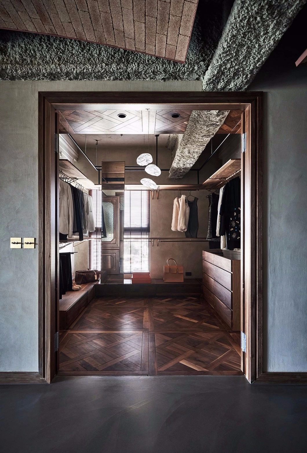
开放式布局的理念延续至主卧,睡眠区、浴室与更衣室形成既独立又互通的三个区域。居于空间中央的睡床犹如仪式场所:一侧是全景落地窗,后方独立衣柜隐藏着更衣室,延伸至浴室盥洗台下的木质长凳成为自然引导。
The open-plan layout of the living room is carried on into the master bedroom where the sleeping area, bathroom and dressing room form discrete yet interconnected zones. Placed in the centre of the room, the bed takes on an almost ceremonial role surrounded by a large window, a free-standing wardrobe behind which is the dressing room and a wooden bench that slips under the bathroom vanity, the latter leading to the bathroom area.


相较于混凝土主导的公共区域,卧室采用硬木地板与灰泥饰面,在保持项目整体凝练气质的同时,营造出更为柔和的氛围。
Hardwood floors and stucco surfaces imbue the bedroom with a more mellow ambience compared with the concrete-dominant public areas while retaining the project’s austere profile.

项目名称 |
12M
项目地址 |
中国,台北
项目面积 |
280㎡
主创设计 |
方信原
设计公司 |
玮奕设计


创始人/ 方信原
现今的设计,已非昔日装修或工程的统合名词,而是更多的面向,来探讨生活脉络、对话、连结、转化、细节、度的呈现方式·让居住者从中获得不同的体现。
玮奕设计Newspaper(Wei Yi international design associates)位于台北大安区敦化南路一段376号十楼之一,成立于2003年善于利用低度设计结合现代主义,表现出宋代美学及寂文化所形成的设计风格。
Newspaper代表着每日新闻,表示每个案件的规画都有其特殊表达的涵义。2009年启用了这个单字,且将”N”字运用中国书法的笔触,将其符号特殊化,运用这个特殊的符号,作为品牌经营理念的起步。设计品牌化之后,其延伸的范围甚广,文化、艺术、家饰、饮食、、、等,其扩及和影响层面广泛,这也是我们使用了Newspaper其”N”字作为品牌LOGO的意义。经由”N”的推广,使得人们对于美的事物及设计价值,能够更为深入。


推荐作品

相关文章
-
2018年走过了四分之一,LOGO设计趋势也清晰了LOGO设计
-
2018年走过了四分之一,LOGO设计趋势也清晰了LOGO设计
-
2018年走过了四分之一,LOGO设计趋势也清晰了LOGO设计