合成现象|RUNAS全球营运展示中心:装置咬合下的自然叙事 首
2024-11-04 22:09
The project is the RUNAS Renas Global Operation exhibition Center, Synthetic Phenomena completed the design and construction project three years ago (2021) and attempted to document it with a vision three years later. Faced with the characteristics of rapid renewal, short cycle and large loss of commercial exhibition halls, designers tried to intervene in the exhibition space with more sustainable thinking, and took shaping a longer life cycle exhibition center as the core problem to be solved.


RUNAS瑞纳斯是立足于佛山的高品质门窗五金系统优选供应商。全球营运展示中心,是合成现象在三年前(2021年)完成设计及建造的项目。现在尝试用三年后的视觉去记录它。
RUNAS RenAS is a preferred supplier of high quality door and window hardware systems based in Foshan. The global operation of the exhibition Center is a project that Synphenomena completed design and construction three years ago (2021). Now try to record it with the vision of three years later.


以往,商业展厅往往更新快、周期短而损耗大,因此,当面对这样高内耗的业态时,设计方把塑造一个更长生命周期的展示中心作为核心需要解决的问题,希望探寻一个将原本制造业展售空间的传统形象迭代更新的设计方法。
In the past, the commercial exhibition hall was often updated quickly, the cycle was short and the loss was large. Therefore, when faced with such a high internal consumption, the designer took shaping a display center with a longer life cycle as the core problem to be solved, hoping to explore a design method to iteratively update the traditional image of the original manufacturing exhibition space.


项目坐落于国内铝门窗产业的核心聚集地 ——佛山大沥镇的华亚写字楼。此写字楼作为当地的地标性建筑,居高临下,可俯瞰整个区域。其玻璃背板上的白色印文,彰显着含蓄内敛的品牌文化,悄然与周围环境建立联系并形成对比。区域环境中那些老旧的楼宇,宛如宏观而抽象的背景画卷,在岁月中日复一日地演绎着迭代与更新的自然叙事篇章。
The project is located in the core gathering place of domestic aluminum door and window industry -- Huaya office building in Dali Town, Foshan. As a local landmark, the office tower has a commanding position overlooking the entire area. The white inscriptions on the glass back reflect the reserved brand culture, quietly establishing a connection and contrast with the surrounding environment. The old buildings in the regional environment, like a macro and abstract background picture, interpret the iterative and updated natural narrative chapters day by day in the years.
该空间占据写字楼层的半层,与保险公司相邻,这一地理位置优势为其带来了较为可观的访客人流。故而,前厅以曲面的延伸奠定空间基调,呈现出简洁且开放包容的形态,旨在树立良好的品牌初印象。
The space occupies half of the writing floor and is adjacent to the insurance company, a geographical advantage that brings a considerable flow of visitors. Therefore, the front hall lays the space tone with the extension of the curved surface, showing a simple and open and inclusive form, aiming to establish a good brand first impression.


前台参差有致的造型,仿若千叶岩堆叠层积的生石,巧妙地塑造出由地质景观引发的独特空间感官,以室内别具一格的 “风景” 创造与品牌的美妙邂逅。而品牌名字则稍作后退,透明的立体亚克力字采用壁龛形式嵌入背墙,尽显低调内敛之态。
The uneven shape of the front desk, like the stacked raw stones of chiba rock, cleverly shapes the unique spatial sense caused by the geological landscape, and creates a wonderful encounter with the brand with a unique indoor landscape. The brand name is slightly backward, and the transparent three-dimensional acrylic characters are embedded in the back wall in the form of niches, showing a low-key and restrained state.


“随机” 生成的金属球实现了不同金属材质的巧妙应用,其镜面能够映射空间中的行走动态,不仅增加了空间的活跃度,还带来了对时空的独特感受 —— 时而凝聚,时而幻变,宛如一条潜在的线索,悄然贯穿于整个空间之中,为其增添了一抹神秘而灵动的色彩。
The random generated metal ball realizes the clever application of different metal materials, and its mirror can map the walking dynamics in the space, not only increasing the activity of the space, but also bringing a unique feeling of time and space - sometimes condensed, sometimes phantom, like a potential clue, quietly running through the entire space, adding a mysterious and clever color.


氧化铝板构建而成的金属盒子空间仿若从天而降,将对金属的感知予以具象呈现 —— 在这一巨型金属盒子内部,机械臂装置从工业的视角,伸向斑驳的石头。从初始之态逐步推进,挖掘的动态蕴含着探索的态势 —— 探寻金属的历史渊源。
The perception of metal is embodied in the space of a metal box made of aluminium oxide panels, which seems to fall from the sky - inside this giant metal box, a robotic arm reaches out to the mottled stone from an industrial perspective. From the initial state to advance gradually, the dynamic mining contains the trend of exploration - to explore the historical origin of metals.
金属盒子所具有的现代风格与五金的历史背景导览,形成了一种抽象的反差效果。墙面运用五种各异的金属材质,塑造出丰富的空间层次,同时也回应着企业的行业属性;自金属盒子开凿景窗,营造出通透的空间关系与探索视角;玻璃围合而成的透明层次,令文字产生交叠,结合多媒体形式,从多个维度、以动态的方式演绎五金的发展历程。
The modern style of the metal box and the historical background of the hardware guide, forming an abstract contrast effect. The wall uses five different metal materials to create a rich spatial level, but also responds to the industry attributes of the enterprise; Cut the landscape window from the metal box to create a transparent spatial relationship and exploration perspective; The transparent layer surrounded by glass makes the text overlap, combined with multimedia form, deduces the development process of hardware from multiple dimensions in a dynamic way.


主展厅侧重于单品的展陈布局,采用磨砂亚克力材质打造柜体,并结合灵活的榫卯结构方式,构建出模块化的展示单元。这种设计具备高度的灵活性和可变性,能够使窗口规格持续适应产品的调整需求,实现可持续更新。
The main exhibition hall focuses on the layout of single products, using frosted acrylic to create cabinets, and combining flexible mortise and tenon structure to build modular display units. This design has a high degree of flexibility and variability, which enables the window specification to continuously adapt to the adjustment needs of the product and achieve sustainable updates.
亚克力材料自身简洁的特质,与展示功能相得益彰。其虚化的背景巧妙地引导视觉聚焦于展品之上。商品呈现出一种悬空的状态,成功树立起精湛卓越的前瞻形象,富有创造性地转变了五金产品的传统固有形象。
The simplicity of the acrylic material itself complements the display function. Its blurred background subtly guides the visual focus on the exhibits. The goods show a state of hanging, successfully establish a superb and excellent forward-looking image, creative transformation of the traditional inherent image of hardware products.


配合可变 RGB 的 LED 灯光,它能够调动各异的情绪,适应不同的展示状态,进而营造出沉浸氛围的展示与体验效果。整体的视觉呈现彰显着品牌面向未来的创新叙事风格,引领参观者进入想象的空间,让他们畅想产品为使用者的生活所带来的丰富体验,在无形之中传达 RUNAS 的产品理念 —— 独特的美学享受以及高品质的生活理念。
With variable RGB LED lighting, it can mobilize different emotions, adapt to different display states, and then create an immersive atmosphere of display and experience. The overall visual presentation highlights the brands innovative narrative style for the future, leading visitors to enter the imaginary space, allowing them to imagine the rich experience that the product brings to the users life, and conveying the product concept of RUNAS - unique aesthetic enjoyment and high quality life concept.


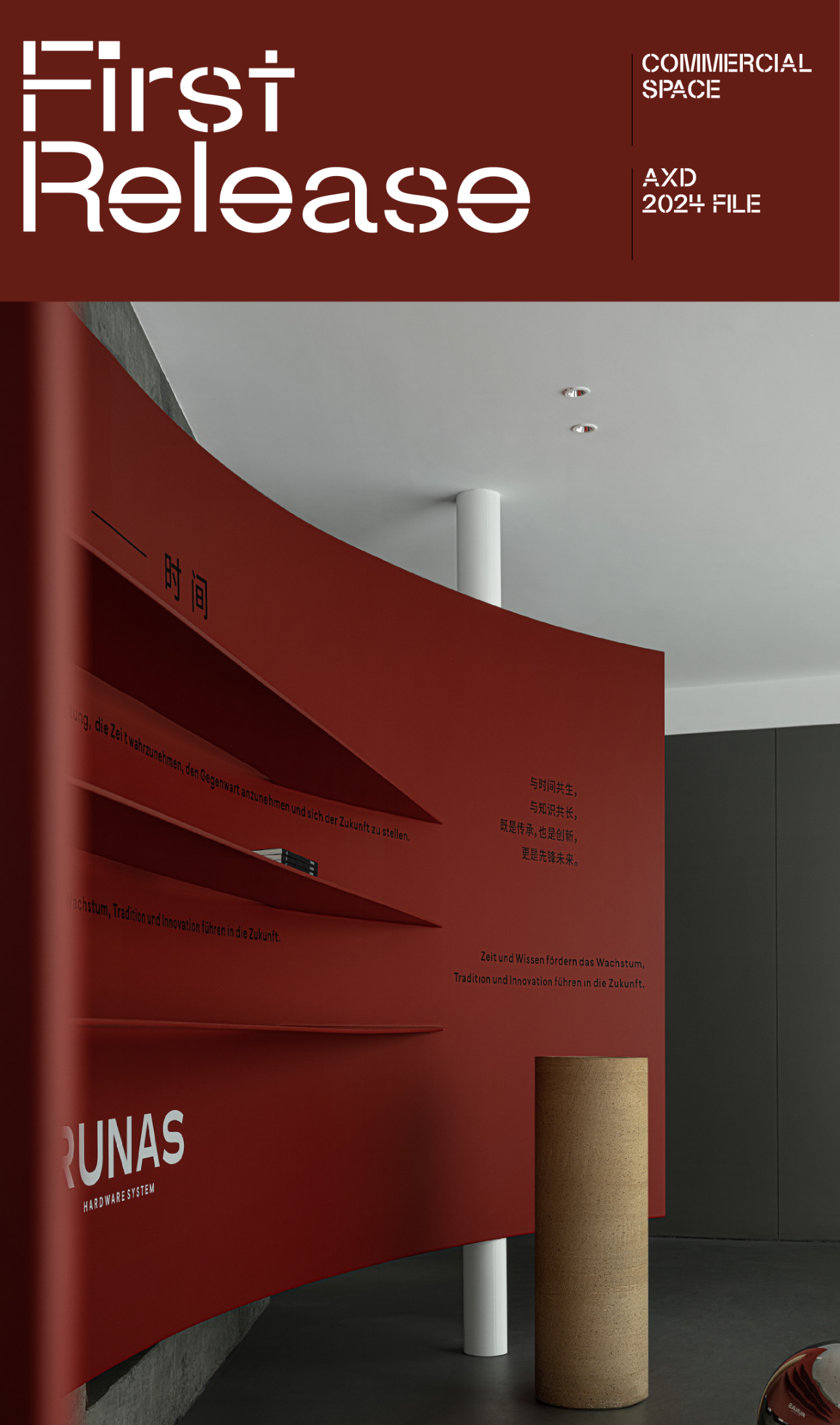
以斜线悬落的混凝土墙体,为空间带来了独特的变奏效果,同时也起到了空间路径导向的作用,引导着窄入宽出的行动线路。混凝土与亚克力的材质相互映衬,产生了虚实对比的视觉效果,与此同时,水泥的粗犷质感通过向后退的设计表达方式,更加突显了金属的精致感 —— 红色金属展板轻盈悬立,如同一座里程碑式的抽象篇章,从过去、现在到未来,在曲线的流转中娓娓道来,也巧妙地回应着五金产品的线条语言。
The slanted concrete wall brings a unique variation effect to the space, but also plays a role of spatial path guidance, guiding the narrow into the wide out of the action line. The concrete and acrylic materials set off each other, producing a visual effect of virtual and real contrast, at the same time, the rough texture of cement through the backward design expression, more highlights the delicate sense of metal - red metal panels lightly hanging, like a landmark abstract chapter, from the past, present to the future, in the flow of curves, told. It also subtly responds to the line language of hardware products.


基于展示与接待销售的双重需求,以适应以销售为主的 OEM 品牌商业模式。多功能厅的设计,致力于创造自由、可持续的新价值,展望美好未来。水吧区域提供了社交交流的休闲空间,活动座椅着重体现现场的灵活性,能够适应休闲、专业、分享等不同情境,从而演变出各异的空间状态。顶部天花采用简洁的线条集成灯光系统,尽显严谨之态,有效保持了空间的纯粹性。
Based on the dual needs of display and reception sales, in order to adapt to the sales-oriented OEM brand business model. The design of the multi-function hall is committed to creating new values of freedom and sustainability, and looking forward to a better future. The water bar area provides a leisure space for social communication, and the activity seats focus on the flexibility of the site, which can adapt to different situations such as leisure, professional and sharing, thus evolving different spatial states. The top ceiling uses a simple line integrated lighting system, showing a rigorous state, effectively maintaining the purity of the space.


不同功能空间的标识,采用德文与图形相结合的方式。其中,红色元素汲取自独特、卓越且敢于领先的现代主义风格,凭借严谨的线条与优雅的形式,展现出品牌的德国产品基因 —— 精湛的工艺细节。品牌、产品与空间三者协同作用,共同输出独树一帜而又统一完整的品牌形象。
The identification of different functional Spaces is combined with German and graphics. Among them, the red element draws from the unique, excellent and daring to lead the modernist style, with rigorous lines and elegant forms, to show the brands German product genes - exquisite craftsmanship details. Brand, product and space work together to produce a unique and unified brand image.


值此三年之际回顾项目,无论是从设计的角度而言,还是基于商业的历程来看,皆具有重要意义。空间,宛如拥有生命的有机体,融入独特的品牌语言和时间的自然叙事,呈现出一个兼具当代性与未来感的展示空间。即便历经外部市场的迭代与更新,依旧绽放着迷人的魅力。
It is important to review the project at this three-year point, both from a design point of view and from a business perspective. The space, like an organism with life, integrates the unique brand language and the natural narrative of time, presenting a contemporary and futuristic display space. Even after the iteration and update of the external market, it still has a charming charm.


- 空间轴测图 -


- 平面
项目名称 | RUNAS全球营运展示中心
项目地址 | 中国|广东|佛山
设计面积 | 550㎡
设计时间|2021年03月
完工时间|2021年08月
平方造价|6000元
设计单位 | 成都合成现象品牌设计有限公司
设计总监 | 陈立
设计团队 | 李聪达、庄琪、吕发康
项目施工 | 广州坤宏装饰工程有限公司
主要材料 | 环氧地坪、亚克力、氧化铝板、耐候钢板
项目摄影 | 李恒
平面视觉设计
| 魁KUIdesign/南金明


陈立
HCD合成现象设计
创始人/设计总监


HCD合成现象,是一家集品牌策略、建筑空间、产品研发为一体的复合型设计公司,专注于为不同行业客户提供商业空间体系化设计服务,致力提升项目的整体性价值与行业影响力。合成现象,围绕感知与理知的哲学理论,关注客观条件、商业逻辑与底层关系,以设计视角创造联系,呈现多维多元的解决方案。由点合而为面,聚合能量,价值共创。


合成现象 × NUBAN努班工厂体验中心


合成现象 × SUNGYE先越国际营运中心


合成现象 × VOXRY沃思瑞产品体验中心


下载


