引 景 Cited shadow
2016-08-17 00:00
简介:建案名稱: 日月光大樓 作品名稱: 引 景 Cited shadow 設 計 師: 唐忠漢 建築類型: 中古屋15年/大樓 設計風格: 人文自然 房屋格局: 一層四戶 建案地點: 台灣 新北市汐止區 攝影師: KyleYu、Sam/Yvonne 空間坪數: 45坪 空間格局: 3房2廳2衛 主要建材: 石皮、薄片鏽銅磚、橡木木結木皮、茶鏡、黑鐵、古拉爵石材
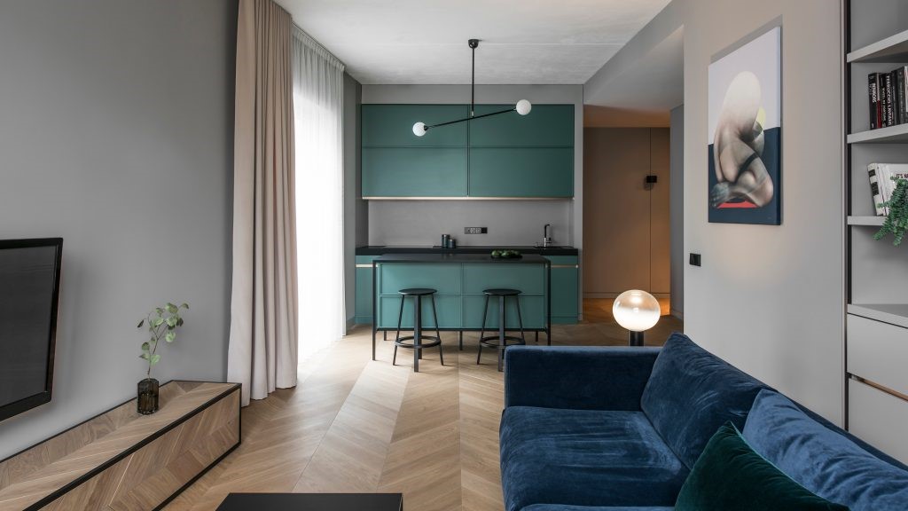
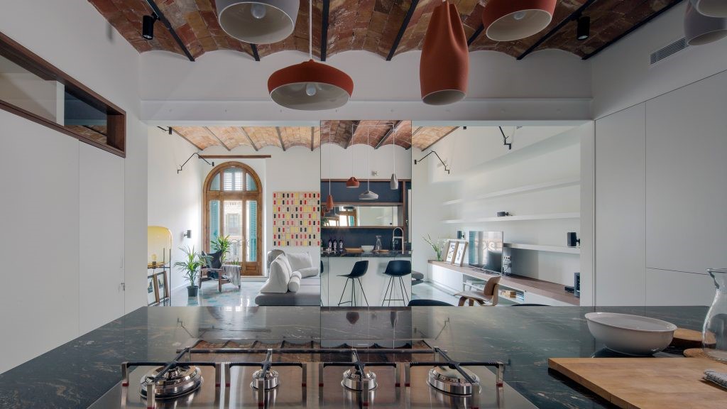
順往視線底端,天光、水影、綠樹相互交語,如沐如蔭。
在入口的軸線上將冰冷的建築邊界移除,陽台內推以玻璃透明的特性做為中介材弱化室內外的界線,
並配合大面積開窗調整室內外的比例,室外光線順勢引影入內,
因應使用者獨身的生活模式,以開放自由的平面配置為原點,
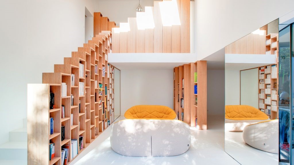
私密範圍則以拉門作為界定,橫向及縱向的空間依序展延成有近景、中景、遠景變化的景深。空間感交錯並且相互引進各區域的背景與光線,重新定義及塑造嶄新的生活模式。
石材遠看延伸出挑,縷縷纏繞的麻繩燈粗獷並隱含細節;
實木長桌上,一叢綠意從刻意安排的裂縫裡生長出土地氣息;
電視牆面木皮的紋理歷歷可見,不羈的結眼是時間帶來的層次;
The starting point of space is the continuation and extension of the stony wall surfacing
When following vision to the bottom-line, skylight, water-shadow, and green tree have mutually conversed, soaking in the shade.
For the axis by the entrance, the icy cold border of the building is removed, and the transparent feature of glass within the balcony is used as the intermediary material in weakening the indoor and outdoor borderline.
Working in conjunction with the grand-sized window-opening to adjust the indoor and outdoor proportion, outdoor lighting is then smoothly brought in as indoor scenery.
The space itself has then achieved its natural course with dialog between external and internal users
Cited shadow, helping the nature and life to match with consummation.
In coping with the life model of users as bachelors, open and free 2-D space allocation is taken as the starting point,
Private domain is defined with accordion door, with horizontal and vertical space extended into changing depth of field with close, medium, and distant shot. The intermixing sense of space has mutually brought in the background and light-beams of various domains, helping to redefine and shape up the brand novel way of life.
With distance view of the stony materials, it extends into distance, while the winding and spiraling hemp-rope lantern reveals lunch detail in coarseness;
Upon the long and concrete table, a bush of green is deliberately arranged to pop up growing telling the sentiment of soil; wooden patterns can be easily perceived from the TV wall-surfacing, while the uninhibited knots are of the layering brought along by time;
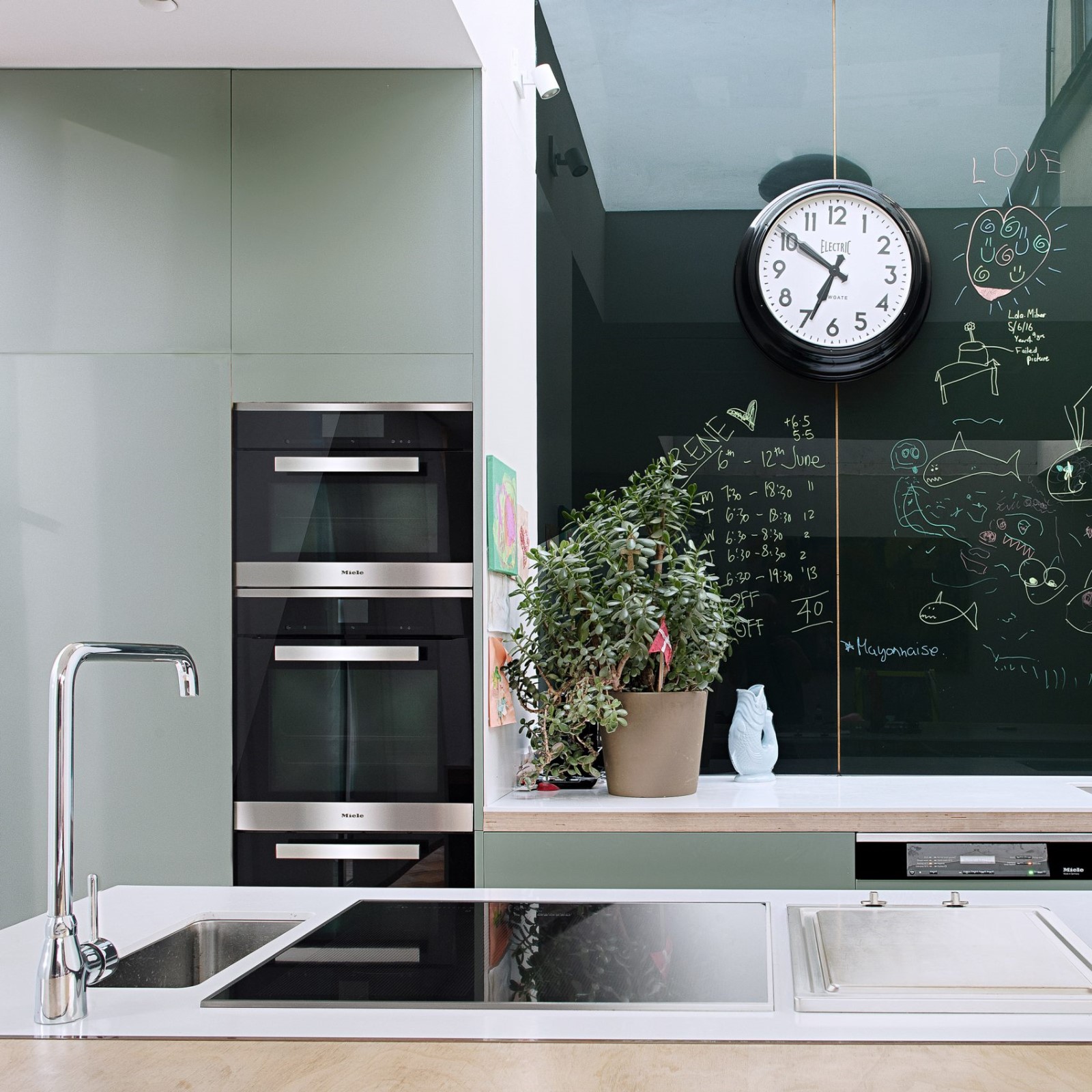
Clean and neat contours of iron pieces render the lowing body weight to be more three-dimensional.
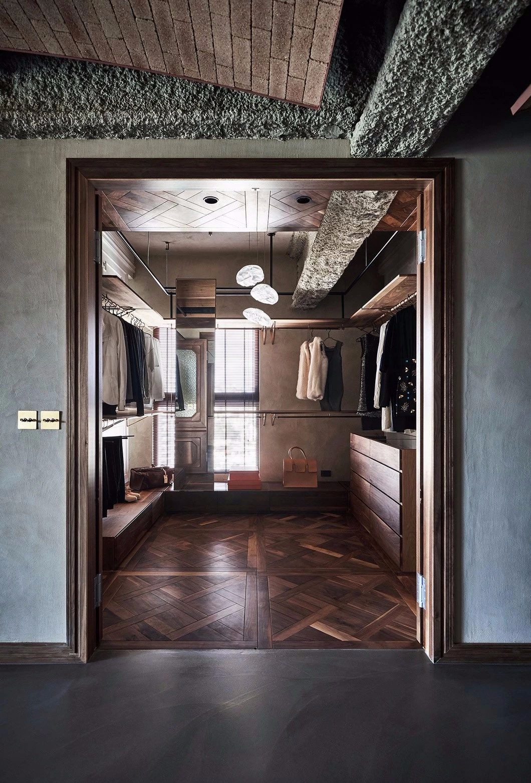
The rusty cooper-plate on the other side then dye out with delicate touch.
Use stone as vista at side wall
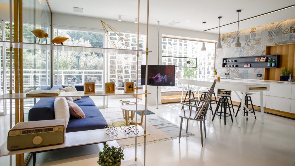
Free circulation brings various scenes at every point, flavored by natural light flow
The similarity of materials extends the vision from entrance, vestibule, restaurant, to balcony and connects in-door and out-door space smoothly.
Transverse axis is from open concept to intimate, cozy element. Gradually define the space
 举报
举报
别默默的看了,快登录帮我评论一下吧!:)
注册
登录
更多评论
相关文章
-

描边风设计中,最容易犯的8种问题分析
2018年走过了四分之一,LOGO设计趋势也清晰了LOGO设计
-

描边风设计中,最容易犯的8种问题分析
2018年走过了四分之一,LOGO设计趋势也清晰了LOGO设计
-

描边风设计中,最容易犯的8种问题分析
2018年走过了四分之一,LOGO设计趋势也清晰了LOGO设计


 PintereAI


