Paju Brave House June Architect
2018-12-23 19:00
架构师提供的文本描述。在Paju的勇敢之家是一个低预算的项目。紧缩的预算意味着必须放弃很多东西,但建筑师们努力工作,以确保设计有最低限度的尊严要求的房子,使用统一的比例,把整个和详细的部分。
Text description provided by the architects. Brave house in Paju was a low budget project. A tight budget means having to give up lots of things, but the architects worked hard to make sure the design possessed the minimum level of dignity called for by a house, using unifying proportions that brought together the whole and the detailed parts.
Text description provided by the architects. Brave house in Paju was a low budget project. A tight budget means having to give up lots of things, but the architects worked hard to make sure the design possessed the minimum level of dignity called for by a house, using unifying proportions that brought together the whole and the detailed parts.
© Yunsuk Shim
陈云秀


在这所由七位住户-父母、他们的两个儿子和女儿,以及大儿子的岳母-共同居住的房子里,重要的是为大家庭创造共同的空间,让他们一起享受,以及提供个人隐私的个人空间,同时保持在低预算的范围内。
In this house, shared by seven occupants – parents, their two sons, and daughters-in-law, and the eldest son’s mother-in-law, it was important to create both communal space for the extended family to enjoy together and the individual space offering personal privacy, all while staying within the bounds of a low budget.
In this house, shared by seven occupants – parents, their two sons, and daughters-in-law, and the eldest son’s mother-in-law, it was important to create both communal space for the extended family to enjoy together and the individual space offering personal privacy, all while staying within the bounds of a low budget.
© Yunsuk Shim
陈云秀


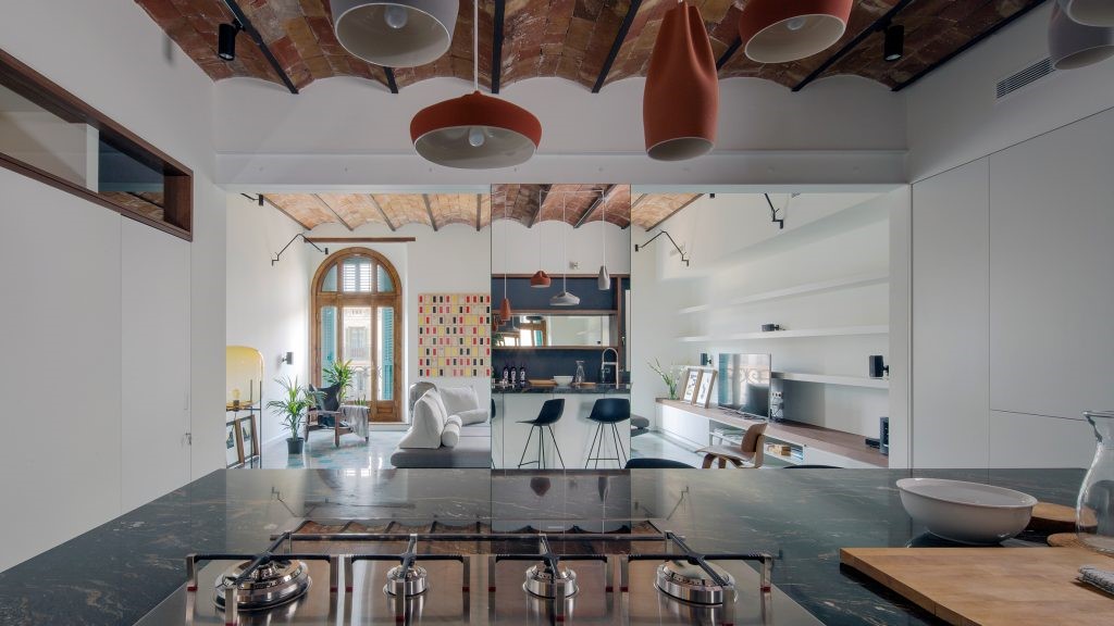
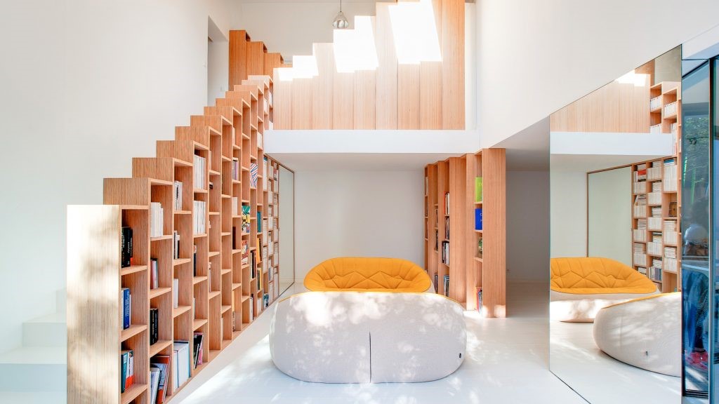
通过适当利用比例、空间和光线的适当感觉,可以低成本创造美。建筑师们努力在整体质量、窗户以及每个空间的高度和宽度方面找到合适的比例。房子里的各种空间感觉被创造出来,尽管它的形式很简单。
Creating beauty at a low cost can be achieved by making good use of appropriate senses of proportion, space, and light. The architects worked hard to find the right proportions in terms of overall mass, windows, and the heights and widths of each space. Various spatial sensations inside the house were created, despite its simple form.
Creating beauty at a low cost can be achieved by making good use of appropriate senses of proportion, space, and light. The architects worked hard to find the right proportions in terms of overall mass, windows, and the heights and widths of each space. Various spatial sensations inside the house were created, despite its simple form.


为共用空间和私人空间制作了不同的天花板高度和形式。例如,第一层和第二层卧室,尽管有相似的平面图,但根据各自天花板和墙壁的不同形式,传达了完全不同的空间感受。第二层的两个房间在平面图和横截面上看起来很相似,但是由于窗户和天花板的位置不同,感觉就不一样了。
Different ceiling heights and forms for shared and private spaces were made. For example, the first- and second-floor bedrooms, despite having similar floor plans, convey completely different spatial feelings according to the respective forms of their ceilings and walls. The two second-floor rooms look similar in terms of floor plan and cross-section but feel different thanks to the different positions of their windows and ceilings.
Different ceiling heights and forms for shared and private spaces were made. For example, the first- and second-floor bedrooms, despite having similar floor plans, convey completely different spatial feelings according to the respective forms of their ceilings and walls. The two second-floor rooms look similar in terms of floor plan and cross-section but feel different thanks to the different positions of their windows and ceilings.
© Yunsuk Shim
陈云秀


Architects June Architect
Location Paju, South Korea
Lead Architect Hyonseok Kim
Design Team Boran Kim, Kihun Lee, Jinhwan Chun
Area 154.67 m2
Project Year 2015
Photographs Yunsuk Shim
Category Houses
Manufacturers Loading...

 PintereAI


