I Tower Chiasmus Partners
2018-07-24 19:00
建筑团队Lee Hyunho Lee,AIA,James Ke,Narae Yang,Sangwha Lee室内设计团队Chika Nomura,Yeseul Huh Construction CoRemsys混凝土模板Myunghee Hong,Hyungdon Yoon,Changsuk Lee Client Joonho Moon,I-Partners(数字营销代理)
Architecture team Hyunho Lee, AIA, James Ke, Narae Yang, Sangwha Lee Interior design team Chika Nomura, Yeseul Huh Construction Coremsys Concrete formwork Myunghee Hong, Hyungdon Yoon, Changsuk Lee Client Joonho Moon, I-Partners(Digital Marketing Agency) More Specs Less Specs
© Namsun Lee
李南孙


架构师提供的文本描述。我大厦位于江南商业区几个街区处,这是现代首尔的象征,这里集中了商业、企业和住宅区,人们可以在那里找到许多数字设计广告公司。地理位置的这些特点,以及新兴的数字广告品牌对“新型写字楼”的需求,意味着需要将功能的灵活性、效率和象征意义融为一体。为了进一步说明背景,该地点位于一个街区拐角处,北面是一个小公园,周围有三到五层的住宅建筑。面对北面的公园和南面的商业区高层建筑,设计需要在不破坏社区公共空间和形成城市景观的一部分之间取得平衡。在这种情况下,在高宽比为2:1的大楼内,必须达到为200名雇员建立会议、讲座、活动和休闲空间的目标。
Text description provided by the architects. I Tower is located a few blocks from Gangnam's business district, a symbol of modern Seoul that features a concentration of commerce, corporate and residential areas where one can find many digital design advertisement agencies. These characteristics of the location, and the emerging digital advertising brand's demand for a 'new type of office building', meant that there existed a need to incorporate functional flexibility, efficiency and symbolic significance. To further illustrate the context, the site is located at a block corner and faces a small park to the north, around which there are residential buildings of three to five stories. Facing the park to the north and the business district's high rise buildings to the south, the design needed a balance between not disrupting the neighborhood's public space and forming a part of the urban landscape. Under these circumstances, the objective of establishing a space for conferences, lectures, events and leisure for 200 employees had to be achieved in a building with a height to width ratio of 2:1.
© Namsun Lee
李南孙


要建立一个具有紧凑核心要素的综合平面图,就必须通过尽量减少流通和建筑费用,提高空间效率。考虑到建筑高度的局限性,建筑的质量几乎是雕塑的,但每一层平面图都是正方形的。外部混凝土围护结构的功能类似于拱门,消除了室内空间中需要多个柱的需要,进一步最大限度地提高了办公空间的效率和灵活性。每一层平面图的四分之一面积通过垂直循环、浴室和厨房的核心功能为其余楼层服务,该服务空间垂直紧凑,3米。地板的其余部分是一个高度4.5米的开阔的大空间,不仅可以用于办公室工作,还可以用于活动、表演、展览和其他活动,使其具有几乎无限的多功能性。人们必须认识到,由于需要适应现代社会的快速变化,即使是为单一目的而建造的建筑也需要这种功能上的多功能性。
To build a comprehensive floor plan with compact core elements required establishing efficiency in space through minimizing circulation and construction costs. Given the limitations presented by the building's elevation, the mass was established almost sculpturally but every floor plan is a square. The outer concrete envelope functions structurally like an arch, removing the need for more than one column in the interior space, further maximizing the efficiency and flexibility of the office space. A quarter of the square area in each floor plan serves the rest of the floor through the core functions of vertical circulation, bathroom and kitchen, and this service space is vertically compact at 3 meters. The rest of the floor is a big, open space at a height of 4.5 meters, and can be used not just for office work but also events, performances, exhibitions and other programs, enabling almost infinite versatility. One must recognize that such versatility in function is demanded even from architecture built for a single purpose, due to the need to adapt to the rapid changes that characterize modern society.
Elevation + Section
高程剖面


该大楼在地下室一层设有停车场,地下室二层设有250个座位的多用途剧院,并设有单独的入口。地面以上8层有高度4至4.5米的空地,共有200个工作站、8个会议室和6个行政办公室;核心包括浴室、电梯、楼梯、储藏室、服务器室和9层3米高的休息区。
The building houses a parking lot at the first basement level and a 250 seat multipurpose theater at the second basement level with a separate entry. The 8 floors above ground contain open spaces that are 4 to 4.5 meters in height, and feature a total of 200 workstations, 8 conference rooms and 6 executive offices; the core contains bathrooms, elevators, stairs, storage, server rooms and resting areas in 9 floors that are 3 meters tall.
© Namsun Lee
李南孙


© Namsun Lee
李南孙


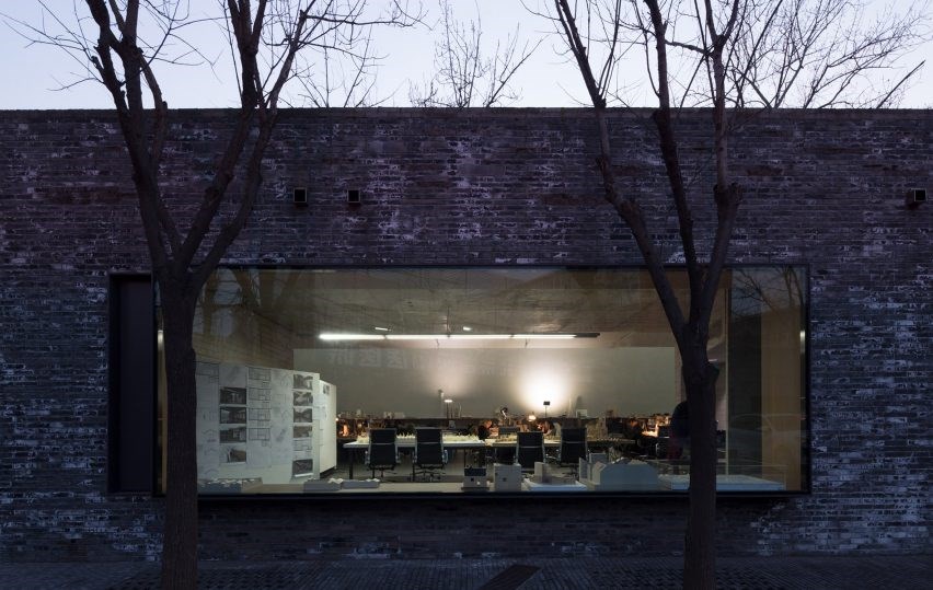
像苹果切片一样,混凝土质量的南面由玻璃制成,允许阳光穿透空间,光滑的玻璃与粗糙的混凝土纹理之间的粗糙对比,将质量表现为破碎。虽然质量由一个空间组成,但质量被分成三个部分,每个部分在缝隙和裂缝中相互边界,通过在环境光中突出形状,放大空间中的碎裂感,使质量克服混凝土的单调。
Like a sliced apple, the concrete mass' southern face is made of glass to allow sunlight to permeate the space, and the rough contrast between the smooth glass and the rough texture of the sliced concrete expresses the mass as broken. Although comprised of one space, the mass is divided into three parts, each of which border each other in gaps and cracks that, through projecting shapes in the ambient light, amplify the sense of fragmentation in the space and allow the mass to overcome the monotony of concrete.
© Namsun Lee
李南孙


这座建筑的设计具有新业务所需功能的精确性、适应时代变化的灵活性、被广泛认为是新品牌象征的形式、以及雕塑和世界主义的和谐,作为对居住和城市环境的回应。这表明,在现代建筑中,功能效率、灵活性和象征形式是互补的,而不是矛盾的。
This building features a design with the accuracy in function demanded in a new business, the flexibility to endure the changing times, the form to be widely recognized as a symbol for a new brand, and the harmony of sculpture and cosmopolitanism as a response to the residential and urban context. This shows that in modern architecture, functional efficiency, flexibility and symbolic form can be complements rather than contradictions.


Architects Chiasmus Partners
Location 10 Hakdong-ro 3-gil, Nonhyeon 1(il)-dong, Gangnam-gu, Seoul, South Korea
Lead Architects Hyunho Lee
Area 367.0 m2
Project Year 2017
Photographs Namsun Lee
Category Office Buildings
Manufacturers Loading...

 PintereAI


