37° White D+space design
2017-09-25 22:00
架构师提供的文本描述。太阳花店坐落在常熟万达广场,这里有鲜花、课程和买家的外套。在这个项目中设计的只有一个白色和一个单一的方形元素,以创造一个令人愉快的植物王国,同时启动产品的特点,同时又不失去乐趣的空间。与其他地区的商店不同,任何时候都可以给顾客带来冷酷的心理触觉。
Text description provided by the architects. The location of Sun's flower shop is in Wanda Plaza of Changshu witch have flowers, courses and buyer coats. Designed in this project only with a white and a single square element to create a pleasant plant kingdom, set off the characteristics of the product at the same time without losing the fun of space. Different from other stores in the region can bring psychological touch of cool to the customer at any time.
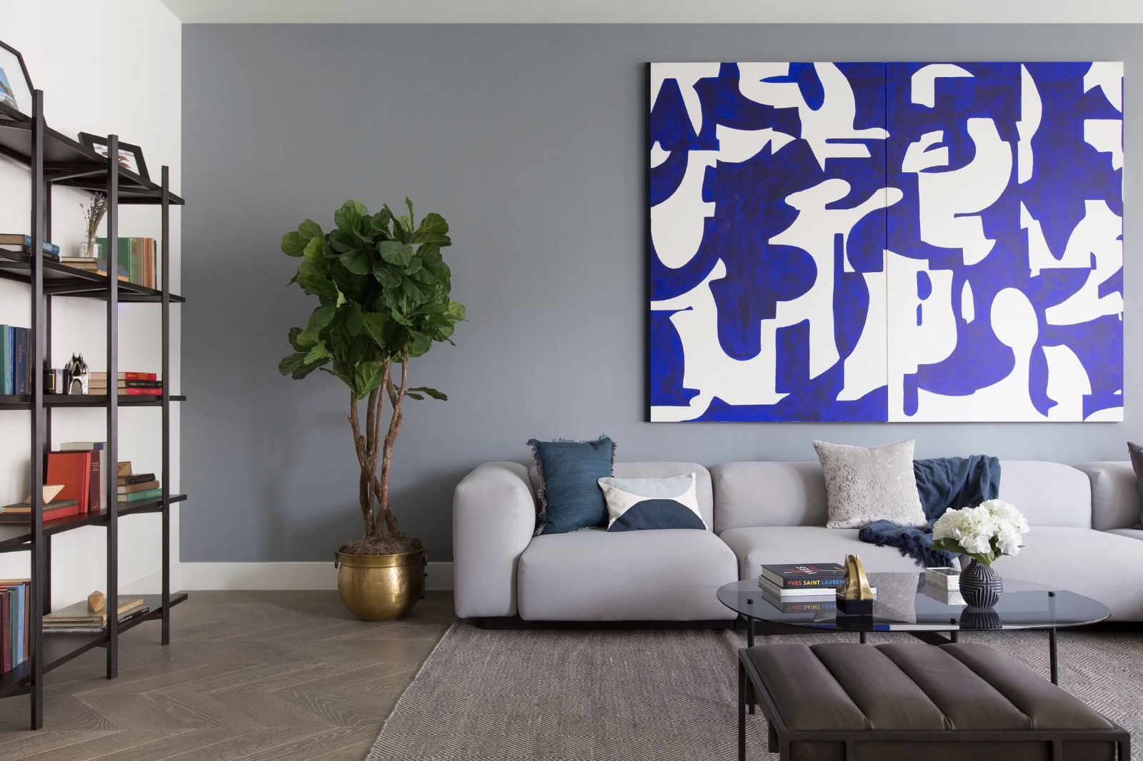
Flower display area. Image © Fancy Images
白门在红砖的背景下格外醒目,不仅简单的长方形光线进入室内空间,还让行人路过商店观看植物活力的可达性,这扇门并不是普通的象征设计,而是加入物业的展示,散落在热带植物的水平上,还没有进入花店,被它独特的气质所吸引。
White door in the red brick against the background is particularly eye-catching, not only the simple rectangular light into interior spaces, but also to let pedestrians pass by the store to watch the accessibility of the vitality of the plant, the door is not a common symbol design but to join the display of the property, the level of scattered tropical plants, has not yet entered the flower shop was attracted by its unique temperament.
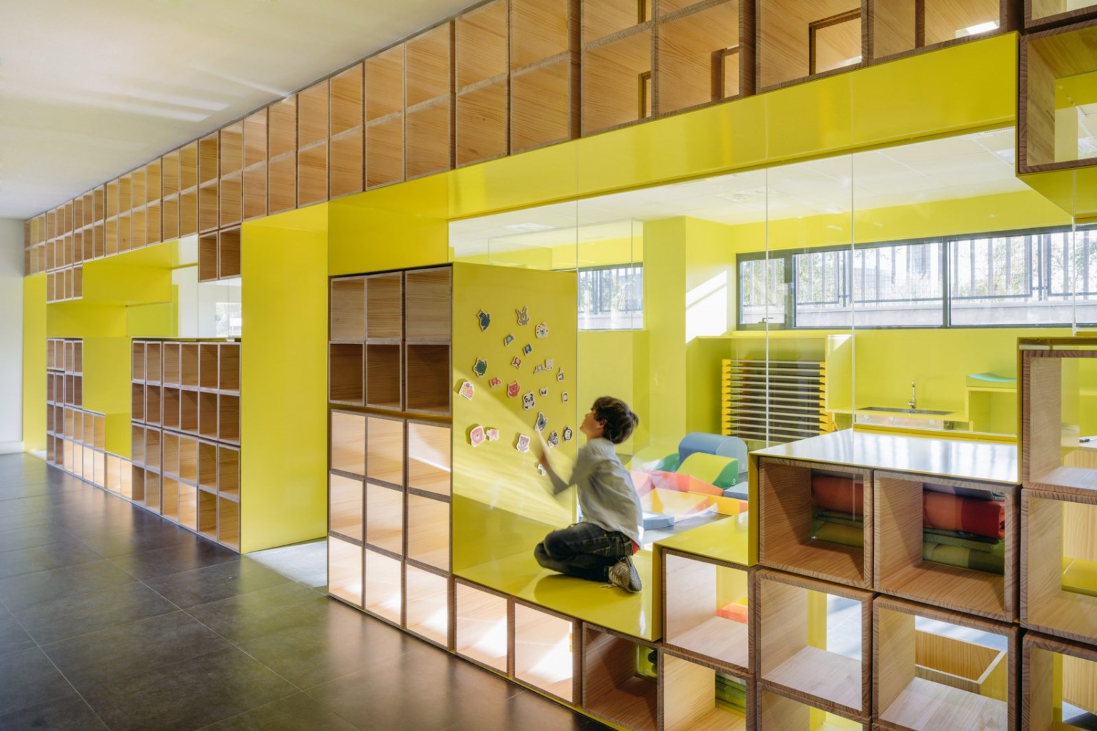
Flower display area. Image © Fancy Images
在一楼入口处放置了三组高低花架,以满足瓶装花卉进入柱状,左侧墙壁可展示永生、香薰蜡烛等礼品包装产品。在后半层的现金条上,保证花店有一个相对独立、不受干扰的创意空间,在没有冷库的情况下,我们安排在里面存放鲜花冷藏室,足够平日花零售和移动用材。
The first floor of the entrance placed three groups of high and low flower racks to meet the bottled flowers into the column, the left side of the wall can display the eternal life, aromatherapy candles and other gift package products. Cash bar in the second half of the floor, to ensure that florists have a relatively independent and not subject to interference creative space.In the absence of freezer, we have arranged in the inside of a storage of fresh flowers cold storage, enough to spend on weekdays retail flowers and movable timber.
一楼的阁楼主要用于交流,并用于日常花课,朋友小聚会,红颜知己下午茶。这里的设计师安排了三种不同类型的桌椅。在夹层栅栏设计了一个酒吧,实现了与一楼无障碍的交流,坐在吧台上的椅子可以直接看到楼下三组鲜花展示区和阳光下的长条形玻璃,让自己置身于一种轻松的氛围中,仿佛你在度假。两组席位可以分开或合并,合并后完全符合多人课程的需要。内部和楼梯之间的甲板,以提供聊天,两人或三人。
The mezzanine on the first floor is mainly for communication, and is used for daily flower lessons, friends small gathering, Confidante afternoon tea. Designers here arranged three different types of tables and chairs. In the sandwich fence designed a bar, which achieved with the first floor of the barrier-free communication, sitting in the bar chair can be directly seen downstairs three groups of flowers display area and long strip of glass into the sun,Put yourself in a relaxed atmosphere as if you were on holiday. The two groups of seats can be separated or merged, after the merger fully meet the needs of a multiplayer course. Inside and staircase between the deck to provide chat to two or three people.
Flower display area. Image © Fancy Images
在二楼展示和销售手工服装时,设计师离开橱窗,将灯光的最佳位置留给产品展示,客人将直接进入展区后一圈进入更衣室,以方便收银员到更衣室付款。客人的步行小溪呈U形,无障碍,不返回公路。特别是,我们在即将离开的楼梯旁安排了一个厕所,以避免化妆后重复更换衣服。
On the second floor for the display and sales of hand-dress, the designer left the window to the best position of the light left to the product display, the guests will be the purpose of direct access to the display area after a lap to visit the locker room, In order to facilitate the payment side of the locker room is the cashier. The walking stream of the guest presents a U-shaped, barrier-free and does not go back to the road. In particular, we arranged a toilet next to the stairs that were about to leave, In order to avoid the repeated replacement clothing after makeup.
Clothing display area. Image © Fancy Images
这两层的阁楼是孙小姐的办公室。虽然规模有限,但能满足他们日常工作和会议的需要。
The mezzanine floor of the two floor is the office for the staff of Miss Sun. Although it is limited in size, it meets the needs of their daily work and meetings.
Party area. Image © Fancy Images
在一楼的阁楼和二楼的连接上,我们设计了一个直到顶楼的楼梯,灵感来自越南薄薄的楼面,在狭小的空间里,设计师经过反复研究,确保空间最大限度地利用舒适性,楼梯的角度和每个楼梯的高度做出了决定。
On the first floor of the mezzanine and the second floor of the connection, we designed a straight to the top of the stairs, the inspiration from the Vietnamese thin floor, in a narrow space, the designer after repeated study to ensure that the space to maximize the use of Comfort, the angle of the stairs and the height of each staircase made a decision.
楼梯上的扶手被巧妙的钢结构所取代,整个空间都使用了方形元素。这种设计不仅创造了良好的氛围,而且还可作为水生植物的展示区域,在没有扶手的情况下,使之在人的楼梯上进行,仍然可以实现综合保护。楼梯的墙面采用不同尺寸的方形木结构,由于平面展示面积和维琴察的方形钢结构,使楼梯的空间特征具有良好的趣味性。
The handrail at the staircase was replaced by an ingenious steel structure square elements were used throughout the space. This design not only creates a good atmosphere but also serves as a display area for hydroponic plants and makes it on the stairs Of people in the absence of handrails in the case,Comprehensive protection can still be achieved. The walls of the stairs are made of wood with a square of different sizes,As the plane display area, and a square steel structure in Vicenza, makes the spatial feature of good interest are realized.
Flower display area. Image © Fancy Images
 举报
举报
别默默的看了,快登录帮我评论一下吧!:)
注册
登录
更多评论
相关文章
-

描边风设计中,最容易犯的8种问题分析
2018年走过了四分之一,LOGO设计趋势也清晰了LOGO设计
-

描边风设计中,最容易犯的8种问题分析
2018年走过了四分之一,LOGO设计趋势也清晰了LOGO设计
-

描边风设计中,最容易犯的8种问题分析
2018年走过了四分之一,LOGO设计趋势也清晰了LOGO设计


 PintereAI


