AdGear Technologies Headquarters ACDF Architecture
2017-08-25 11:00
© Adrien Williams
阿德里安·威廉姆斯


架构师提供的文本描述。AdGear是一家快速增长的数字营销机构,于2010年在蒙特利尔成立,现在是三星电子(Samsung Electronics)的独立分支机构。它委托阿民基建筑公司(Aff Architecture)设计位于蒙特利尔老城麦吉尔街的新总部。
Text description provided by the architects. AdGear – a fast-growing digital marketing agency founded in Montreal in 2010, and now an independent branch of Samsung Electronics – commissioned ACDF Architecture to design its new headquarters located on McGill Street, in Old Montreal.
© Adrien Williams
阿德里安·威廉姆斯


AdGear是一家年轻而富有创新精神的公司,他们希望ADF为公司的60名员工提供一个功能空间,这将增强他们的历史背景和他们创新的公司文化之间的反差。
AdGear is a young and innovative firm, and they wanted ACDF to provide them with a functional space for the company’s 60 employees, that would play up the contrast between their historical setting and their innovative company culture.
Second Level Plan
二级规划


Third Level Plan
三级规划


它最初建于1886年,是一个干货仓库,在20世纪90年代后期,它被改造成了办公空间。该基金会开发了由两个相邻的建筑物组成的空间,使用党墙在办公室中指定了两个不同的区域。一方面,一个休闲开放的区域展开,而另一边是专门用于办公室和工作空间。
Originally built in 1886 as a dry goods warehouse, the property was transformed into office space in the late 1990s. ACDF developed the space comprised of two adjoining buildings using the party wall to designate two distinct zones in the office. On one side, a casual, open area unfolds, while the other side is devoted to offices and workspaces.
© Adrien Williams
阿德里安·威廉姆斯


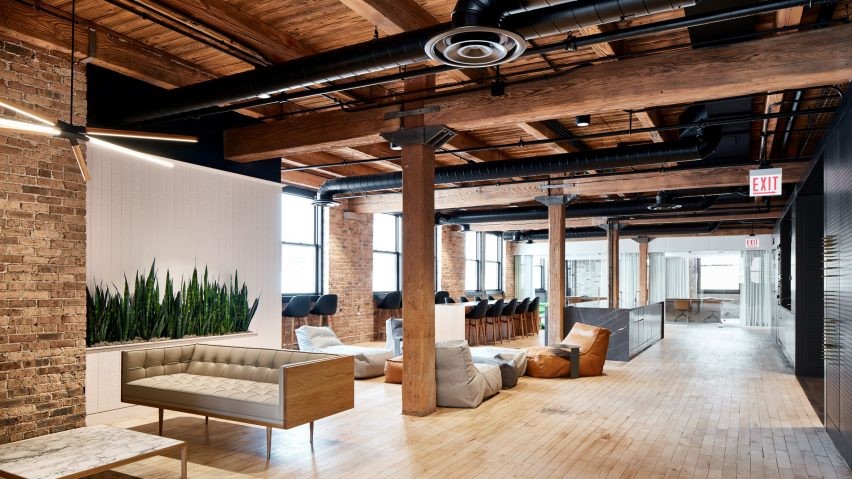
在这两层楼中,中央墙的粗糙的红砖和石头与新材料形成对比,例如用来分隔各个办公室的新抛光玻璃板。像一面镜子,光滑而优雅的表面反射和展示了建筑粗糙的粘土砖和木梁的丰富性。民防部队故意暴露梁,石头插入,砖块图案,并庆祝他们的不完美,享受他们如何讲述了建筑的历史。
Throughout the two floors, the rough red brick and stone of the central wall contrast with new materials such as the newly polished glass panes used to separate the individual offices. Like a mirror, the slick and elegant surfaces reflect and showcase the richness of the building’s rough clay bricks and wood beams. ACDF deliberately exposed the beams, stone inserts, the brick patterns, and celebrated their imperfections, enjoying how they narrate the history of the building.
© Adrien Williams
阿德里安·威廉姆斯


他们还添加了金色质感墙纸的部分,为空间提供了一种令人惊讶的高贵气息,并强调了优雅浮雕的锡天花板。在整个过程中,他们创造了黑色石膏墙,以提供对比,并创造一个天鹅绒般的框架,以光泽的墙纸。
They added sections of golden, textured wallpaper that provide the space with a surprising air of nobility and underscore the elegantly embossed tin ceilings. Throughout, they created black Gypsum walls to provide contrast and create a velvet-like frame to the shiny wallpaper.
© Adrien Williams
阿德里安·威廉姆斯


位于开放空间中心的黑色黑板墙是员工们的便捷沟通工具,白板巧妙地贴在周围的砖头上,鼓励员工临时举行站立会议,让他们有能力在墙上写字,并对周围的环境拥有所有权。
Black chalkboard walls located at the center of the open space are handy communication tools for the employees, and whiteboard panels cleverly positioned against the surrounding brick encourage staff to have impromptu stand-up meetings and give them the ability to literally write on the walls and take ownership of their environment.
© Adrien Williams
阿德里安·威廉姆斯


这个10,000平方英尺的空间所面临的挑战之一是如何将自然光吸引到深地板上。通过保持一个开放的平面图和使用的玻璃面板,该基金会的设计邀请来自建筑的前面和后面的光线在中心和照明空间。
One of the challenges with this 10,000-square-foot space was to draw natural light into the deep floor plates. By keeping an open floor plan and using the glass panels, ACDF’s design invites light from both the front and the rear of the building to meet in the center and illuminate the space.
主楼梯-穿着罗宾的蛋蓝色穿孔钢-允许阳光通过,进一步最大化自然光。新的楼梯让人联想起建筑物的工业历史,而它的角度几何学则预示着一个更现代的时代。
The main staircase – clad in robin’s egg blue perforated steel – allows sunlight to pass through, further maximizing the natural light. The new staircase evokes the building’s industrial past, while its angular geometry nods to a more contemporary era.
© Adrien Williams
阿德里安·威廉姆斯


楼梯用精巧的直线和透明的体积结合在一起,利用不同的材料深度,继续用对比的主题来定义AdGear的总部。楼梯也具有一种统一的性质:不仅仅是两个大区域之间的联系,它还鼓励员工的凝聚力和团队建设。
Bringing together straight lines with finesse, and sheer volume with transparency, the staircase plays with the different depths of its materials, continuing the theme of contrast that defines AdGear’s headquarters. The staircase also possesses a unifying nature: more than just a connection between two large areas, it encourages employee cohesion and team building.
© Adrien Williams
阿德里安·威廉姆斯


阿德福设计的这种迷人的,功能性的环境,充分利用了空间的砖木外壳和历史特征,同时插入了当代元素,创造了一个古老和新的深思熟虑的结合,象征着阿代尔的丰富和质感的过去,现在和未来。
ACDF’s design of this engaging, functional environment makes the most of space’s brick-and-timber shell and historical features while inserting contemporary elements to a create a thoughtful union of old and new, symbolizing AdGear’s rich and textured past, present and future.


Architects ACDF Architecture
Location Montreal, Quebec, Canada
Project Team Maxime-Alexis Frappier, Joan Renaud, Martin St-Georges, Valérie Soucy, Francis Brodeur, Laure Giordani, Christelle Montreuil Jean-Pois
Area 907.0 m2
Project Year 2016
Photographs Adrien Williams
Category Offices Interiors
Manufacturers Loading...

 PintereAI


