Shanghai Baoye Center LYCS Architecture
2017-06-13 20:00
"Water + Bridge"——Shanghai Baoye Center
上海宝业中心是上海西部快速发展的虹桥新中心商业区二期城市发展计划的一部分。该项目的位置使其位于汽车、火车和喷气运输的中心,实际上是从繁忙的虹桥高速铁路终点站乘坐高速列车进入繁忙的高铁终点站之前看到的最后一栋建筑,使该项目在城市中占有重要的地位。该项目有几个具有挑战性的条件:被两个城市指定的临时绿地夹成L形,东、西、南需要60%的立交桥,北面相邻24米高的公路立交桥,建筑物的最大响应距离为1.60,高度为24m。
Shanghai Baoye Center is part of the phase-2 urban development scheme for the new Central Business District in Hongqiao, a rapidly developing piece of western Shanghai. The location of the project puts it at the center of car, train, and jet transportation, and is in fact the last building one sees before entering the busy Hongqiao High-Speed Rail Terminal from the south by bullet train, granting the project a significant urban presence.The site has several challenging conditions: sandwiched by two city-designated temporary green spaces into an L shape, with a 60% frontage ratio requirement to the east, west and south, and a 24m tall highway overpass running adjacent to its north face, the building must respond to a maximum FAR of 1.60 and a height of 24m.
在处理这些条件时,在设计过程中做了很多尝试,更像是在有限的范围内寻找突破,突破的主要是:1。突破场地限制;突破了“最大办公空间可用度”的原则;标准化立面设计的突破。
In dealing with these conditions, There are many attempts within the design process, it’s more like finding breakthroughs within the limitations.The breakthroughs mainly are: 1. The breakthrough in site limitations; 2. The breakthrough in the rule of “maximum office space availability”; 3. The breakthrough in the standardized elevation design.
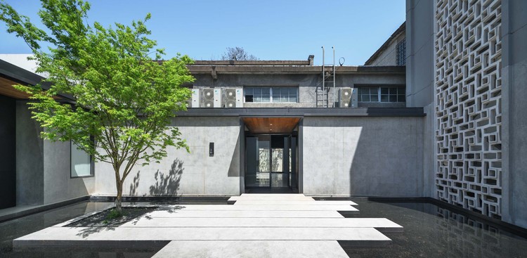
这个L形的场地首先以周边块的形式填入其最大范围,然后将4层楼高到建筑物的高度限制,同时满足预期的13,000平方米的规划面积。然后,周边被推和操纵,以创造三个外部面对空间和三个不同的内部庭院,确定了项目的空间结构。办公室的三个主要卷,即A、B和C,可以独立或合并运作。这三个部分由2、3和4层的悬索桥连接。其中产生铰链的内部庭院,以满足内部循环。
The L-shaped site was first filled in to its maximum extents as a perimeter block, then lofted up 4 stories to the building height limit while satisfying the desired program area of 13,000 sqm. The perimeter is then pushed and manipulated to create three exterior-facing spaces and three distinct interior courtyards, defining the spatial structure of the project. The three main office volumes, designated A, B, and C, can function independently or in combination. The three pieces are linked by suspended bridges on the 2nd, 3rd and 4th floors. which generate hinged internal courtyards, to satisfy the internal circulation.
环绕的走廊还吸引人们进入中央庭院,然后带领人们进入三栋办公楼。电梯操作创造了一个压抑的空间,它创造了一个空间序列,当人们从外面经过三个提升的走廊进入中心庭院时,再次打开-压抑-开放的空间序列。这个序列将显示人们在有限的地点进入并创造更丰富的空间体验的感觉。这样,形式、环流和空间序列是高度统一的。
The enclosing corridors also attract people into the central courtyard and then lead people entering three office buildings. The lift operation creates a depressive space, which creates a spatial sequence as open-depress-open again when people walking from outside via three lifted corridor into the center courtyard. This sequence will indicate people of a sense of entering and creating richer spatial experience in the limited site. In this way, form, circulation and the spatial sequence are highly unified.
这些操作的结果是对“最大办公空间可用度”规则的一种创新,它能在空间序列、规划和长廊体验之间取得平衡。自从纽约布隆伯格总部办公大楼首次引入开放式办公方案,大大提高了办公模式的效率后,如何最大限度地利用办公空间是办公室设计的主要原则。在此,我们提出了“最大限度地提高办公空间质量”的新理念,即将室外景观和绿色空间与室内空间结合起来,带来更多的自然光和通风,增强用户的空间体验,创造一个创造性的工作环境。我们相信,与最大办公面积相比,这将给办公室的用户带来更高的效率。
The result of these operations, which bring the balance between massing and spatial sequence, between program and promenade experience, is an innovation to the rule of “maximum office space availability”. Since the open floor plan office first introduced in Bloomberg headquarters office building in New York, which significantly increases the efficiency of office working model, how to maximize the area of office space is the major principle of office design. Here we are challenging this by proposing a new idea of” maximizing the quality of office space”, which is organizing outdoor landscape and green space integrated with indoor space, bringing more natural light and ventilation., and enhancing the user’s spatial experience, to create a creative working environment. We believe compare with maximum office areas, this will bring more efficiency to the users in the office.
此外,立面设计也是对现代办公建筑标准化统一标高的突破。在“最大办公空间可利用性”的条件下,目前的办公建筑总是以标准化的平面和高度堆叠。
Besides, the elevation design is a breakthrough to the standardized uniformed elevation of contemporary office building. Under the “maximum office space availability”, office buildings nowadays are always stacked by standardized plan and elevation.
在本项目中,除了前面提到的“长廊平面图”外,立面还包括模块化的遮阳板。大约有26种不同的面板在每个层次上逐渐流动。
In this project, besides the “promenade plan” that mention before, the elevation consists of modularized shading panels. There’re around 26 kinds of different panels gradually flows on each level.
这些面板有不同的斜率,这改变了窗户的高度和控制室内的日光条件。
These panels have different slopes, which changes the height of windows and controls the interior daylight condition.
 举报
举报
别默默的看了,快登录帮我评论一下吧!:)
注册
登录
更多评论
相关文章
-

描边风设计中,最容易犯的8种问题分析
2018年走过了四分之一,LOGO设计趋势也清晰了LOGO设计
-

描边风设计中,最容易犯的8种问题分析
2018年走过了四分之一,LOGO设计趋势也清晰了LOGO设计
-

描边风设计中,最容易犯的8种问题分析
2018年走过了四分之一,LOGO设计趋势也清晰了LOGO设计


 PintereAI


