Stanford Apple Store Bohlin Cywinski Jackson
2017-05-02 13:00
© Hufton + Crow
赫夫顿乌鸦


架构师提供的文本描述。苹果公司一直以来都表现出对设计的极大赞赏,无论是在顾客的手中,还是通过他们在商店里展示产品的方式。位于帕洛阿尔托购物中心内,这个展馆尊重品牌的期望,同时引入新的和进化的方式来重新诠释13年的传统。
Text description provided by the architects. Apple has always demonstrated its immense appreciation for design, whether in the hands of the customer or in the manner through which they present their products in store. Located uniquely within the Palo Alto Shopping Center, this pavilion respects the expectations of the brand while introducing new and evolutionary ways to reinterpret 13 years of tradition.
© Hufton + Crow
赫夫顿乌鸦


很快就能认出这个品牌-透明的玻璃从地板一直延伸到天花板,软不锈钢在接近天篷时闪闪发光,温暖的石头在展馆的背景下锚定,苹果在入场前闪闪发亮。
It doesn’t take long to recognize the brand—the transparent glass extending prominently from floor to ceiling, the soft stainless steel shimmering below the canopy upon approach, the warm stone anchoring the pavilion within its context, and the apple glowing white in anticipation of entry.
© Roy Zipstein
罗伊·齐普斯坦


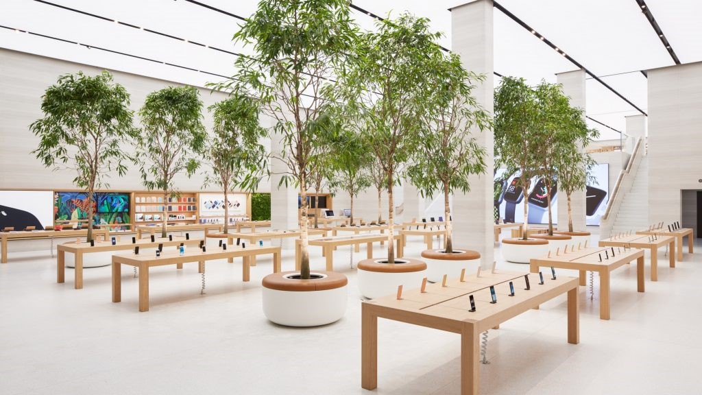
客户体验的核心是产品,因此,空间是围绕着他们的展示设计的。然而,在这个地方,客户体验开始之前,他们甚至走过大门。商店令人难以置信的透明性使室外公共空间与室内零售空间融为一体,鼓励路人进出木制桌子,然后返回到周围的广场。
At the heart of the customer experience is the product, and for that reason, the space is designed around their display. However, in this location the customer experience begins before they even walk through the door. The store’s incredible transparency blends the outdoor public space with the indoor retail space, encouraging passersby to flow into and through the wooden tables and then back out to the surrounding plaza.
© Roy Zipstein
罗伊·齐普斯坦


有180英尺的店面玻璃和三个入口,这一品牌的商店很少有如此视觉识别和物理可达。店面采用细长玻璃片的结构支撑,店面前厅无柱,使顾客可以畅通无阻地浏览和探索摆放在木桌上的各种产品。
With 180 lineal feet of storefront glass and three entrances, rarely has this brand’s store been so visually recognizable and physically accessible. With the structural support of slender glass fins along the facade, the front room of the store is column-free, enabling customers to browse and explore, uninhibitedly, the variety of products that line the wooden tables.
Exploded axonometric
爆炸轴测


当一个人从前厅向后移动时,气氛就会变成一种封闭的感觉。天花板让位于巨大的玻璃屋顶,阳光在地板上活动,顾客活动的声音平静下来。专注于服务、培训和配件零售展示,隐私感支持了公司建立一个集合和学习场所的雄心。
As one moves from the front room to the back, the atmosphere changes to a feeling of enclosure. The ceiling gives way to a tremendous glass roof, sunlight plays along the floor, and the sounds of customer activity quiets down. Dedicated to service, training and accessory retail display, the sense of privacy supports the company’s ambition for a place of gathering and learning.
© Roy Zipstein
罗伊·齐普斯坦


精致的不锈钢梁支撑着轻轻拱起的玻璃屋顶,石墙明显地与上面的天空和谐一致。一个仔细的平衡色调,点图案的薯条,高性能涂层允许调制日光填补空间,同时保持全年舒适。
Delicate stainless steel beams support the gently arching glass roof, and the stone walls stand visibly in harmony with the sky above. A careful balance of tint, dot-patterned frit, and high performance coating allows modulated daylight to fill the space while maintaining comfort year-round.
© Hufton + Crow
赫夫顿乌鸦


Architects Bohlin Cywinski Jackson
Location Stanford Shopping Center, 379 Stanford Shopping Center, Palo Alto, CA 94304, United States
Category Store
Design Principal Karl A. Backus, FAIA
Project Manager Michael Waltner, RA
Design Team Dan Yoder, Designer / David Andreini, AIA / Tina Lindinger, AIA / Joe DiNapoli, RA / Andrew Hamblin, RA / George Bradley, AIA
Project Year 2017
Photographs Hufton + Crow, Roy Zipstein
Manufacturers Loading...

 PintereAI


