PANDEA Art Pavilion MX TAD
2017-01-13 17:00
架构师提供的文本描述。PANDEA是一个为普埃布拉的艺术家和设计师设计的平台,位于索纳塔区,是发展最快的地区之一。
Text description provided by the architects. PANDEA is a space designed to serve as platform for artists and designers in Puebla; located in Sonata District, one of the fastest growing & modern zones of the city.
建筑设计与展馆的视觉特性同时进行,以达到传达不断运动的全球概念。
The architectural design was developed simultaneously with the visual identity of the pavilion in order to achieve a global concept, which transmits constant movement & modernity, projected in a versatile space with intense color and subtle polygonal applications.
该项目本身就是一项干预措施,目的是充分利用以前作为房地产销售办事处已经到位的项目。其意图是将“办公室精华”转化成一个类似废弃仓库的空间;一个工业展馆,可以很容易地适应任何艺术或设计师。
The project itself is an intervention, which sought to take full advantage of what was already in place, which previously served as real estate sales offices. The intention was to take that “office essence” out and transform it into a space that resembled a disused warehouse; an industrial pavilion that could be easily adapted to any art or designer.
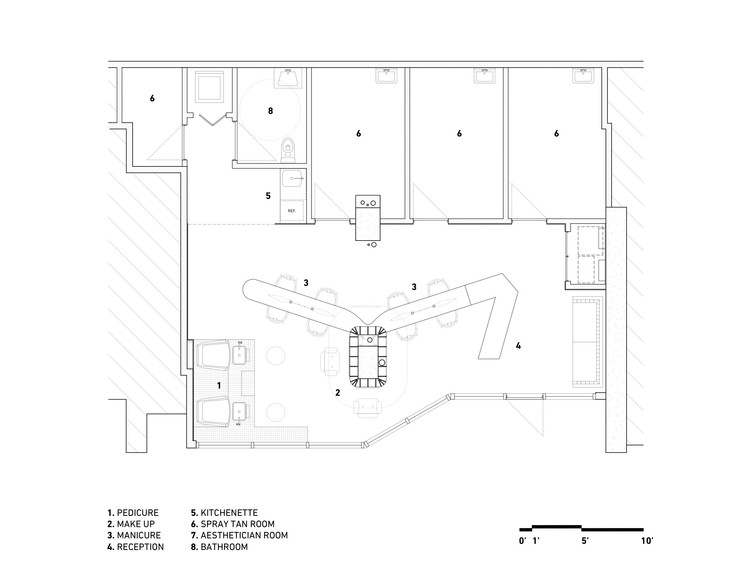
入门层有47平方米的展示空间,配有6块可移动的屏幕,可根据不同的展位创建不同的展览路线,允许展示大格式的作品。使用了现有的地板,墙壁内衬着白色的油漆砖,窗户上覆盖着设计好的标记,以遮挡办公室的视野。前台和中央灯的设计都与展馆的身份相一致,基于不规则的多边形,根据你看到它们的角度产生不同的形状。
The entry level has 47 square meters for display, equipped with 6 removable screens that create different exhibition routes depending on their accommodation, allowing to expose large format pieces. The existing floor was used and the walls were lined with white painted bricks, as well as the windows were covered with a designed decal to block the view towards the offices. Both the front desk and the central lamp were designed to be in tune with the identity of the Pavilion, based on irregular polygons that generate different shapes depending on the angle at which you see them.
为了统一两个层次,让游客跟随游览,我们把楼梯改造成一个过渡隧道,一个强烈的蓝色空间,吸引并激发人们的好奇心,看看下一层是什么。在离开的路上,一个写着“PANDEA”的变形标志结束了这次展览。
To unify the 2 levels and make the visitor follow the tour, we transform the staircase into a transition tunnel, an intense blue space that will attract and arouse the curiosity to see what is at the next level. On the way out, an anamorphic sign that reads “PANDEA” concludes the exhibition tour.
在上层,18平方米作为第二个展厅或展示更重要的作品的理想空间,可以通过控制照明更好地欣赏,而较低层由于来自外墙的自然光而无法提供。在这里,为了避免看到现存的办公室背后的水晶墙,半透明的葡萄藤被应用,以产生一个完全不同的私人环境。
On the upper level, 18 square meters serve as a second exhibition room or as an ideal space to display pieces of greater importance, which can be better appreciated with controlled lighting, which the lower level cannot offer due to the natural light from the façade. Here, to avoid the view of the existing offices behind the crystal walls, translucent vinyls were applied in order to generate a completely different and private environment.
PANDEA is a mutable space.
 举报
举报
别默默的看了,快登录帮我评论一下吧!:)
注册
登录
更多评论
相关文章
-

描边风设计中,最容易犯的8种问题分析
2018年走过了四分之一,LOGO设计趋势也清晰了LOGO设计
-

描边风设计中,最容易犯的8种问题分析
2018年走过了四分之一,LOGO设计趋势也清晰了LOGO设计
-

描边风设计中,最容易犯的8种问题分析
2018年走过了四分之一,LOGO设计趋势也清晰了LOGO设计


 PintereAI


