Headquarters Brand Loyalty Voss Architecture
2016-12-15 02:00
© Guido Erbring
·吉多·埃尔布莱


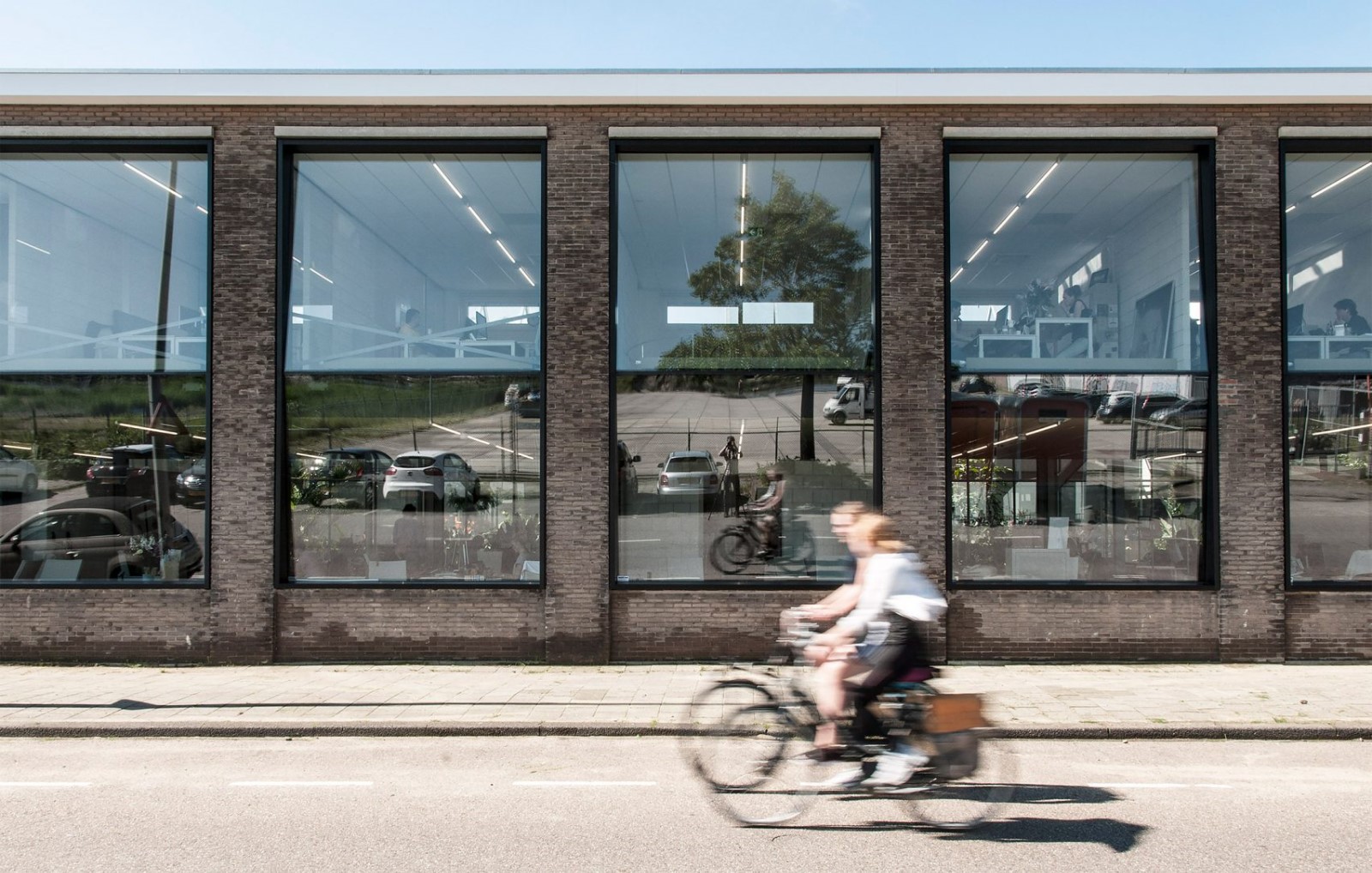
架构师提供的文本描述。这个项目的挑战是从一个枯燥过时的办公大楼转变成一个鼓舞人心、充满活力的聚会场所,基于我们客户的理念,品牌忠诚度,一个全球零售忠诚度的参与者。客户对办公室的外观有一种与众不同的看法;一种专业而又朴实的感觉,加上透明度和尽可能多的开放领域。每件事都有“好客”的感觉。
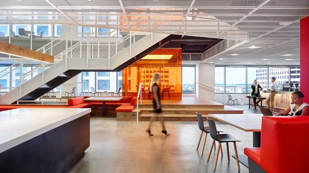
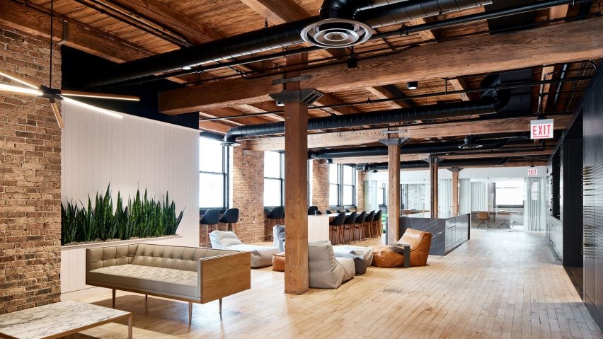
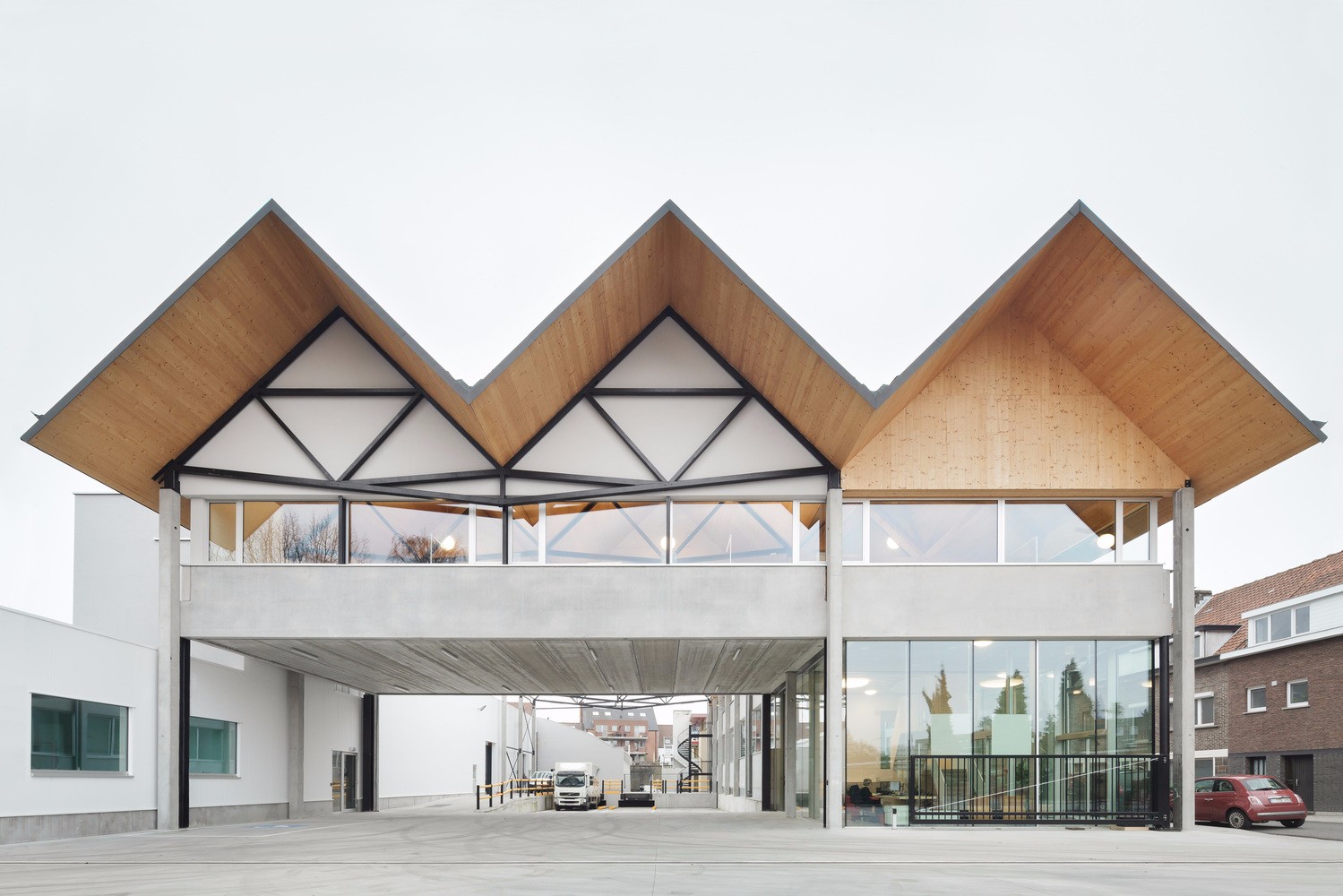
Text description provided by the architects. The challenge in this project was the transformation from a dull, outdated office block to an inspiring and energizing meeting place, based on the ideas of our client, Brand Loyalty, a worldwide player in retail loyalty. The client had a distinguished view on the looks of an office; a professional but homely feel, combined with transparency and as many open areas as possible. Everything with a ‘hospitality’ feel to it.
© Voss architecture
Voss体系结构


该办公室也是一个集合点和知识中心,来自世界各地的雇员可以在那里更新他们的技能。由于有了设备齐全的礼堂和培训室,现在可以在内部举办研讨会、讲习班和培训。
The office also functions as a meeting point and knowledge centre where employees from all over the world can update their skills. Thanks to a fully equipped auditorium and training rooms now seminars, workshops and training can be done in-house.
© Voss architecture
Voss体系结构


在过渡期间,整个建筑被剥离,大中庭被制造,以获得更多的光进入建筑物的中心。在主中庭,靠近入口,设计了一个雕塑螺旋楼梯。这个眼罩,连同中央大厅地板上的沉入池,立即定义了你要进入的特殊空间。入口区的氛围是在酒店大堂后设计的,开放和欢迎。
During the transition the whole building is stripped and big atria are made to get more light into the heart of the building. In the main atrium, close to the entrance, a sculptural spiral staircase is designed. This eyecatcher, together with the submerged pool in the floor of the central lobby, immediately defines the special space you are entering. The atmosphere of the entrance area is designed after a hotel lobby, open and welcoming.
© Voss architecture
Voss体系结构


建筑的结构核心最初用碎石混凝土完成。为了适应新的温暖和自然的外观和感觉,他们穿着深色的、有槽的木材。足够薄以蒸汽并围绕芯的圆角弯曲。与地面和白色灰泥墙和开放式楼梯上的天然石材地板相比,这种新的饰面确实显得与众不同。
The structural cores of the building were originally finished with gravel concrete. To fit in with the new warm and natural look and feel they are clad with dark, grooved wood. Thin enough to steam and bend around the round corners of the cores. This new finish really stands out in contrast with the natural stone floor on the ground floor and the white stucco walls and open staircase.


一楼的餐厅设计得很像你在城市里找到的一家现代化的餐厅。它有一个开放式厨房,每天提供一个小菜单供员工选择。厨房周围有几个不同的地方,你可以吃和见面。它们在座位和气氛的类型和形式上各不相同,所以每个人都能找到自己最喜欢的位置。
The restaurant on the ground floor is designed like a modern restaurant you find in the city. It has an open kitchen that serves a small menu every day where the employees can choose from. Around the kitchen there are several different areas you can eat and meet. They differ in type and form of seating and atmosphere, so everyone can find his or her favourite spot.
© Voss architecture
Voss体系结构


© Voss architecture
Voss体系结构


在入口大厅的另一边,设计了一个咖啡吧/下班后酒吧。这里的墙壁是用深褐色皮革完成的,加上定制的木制家具和优雅的灯光,营造了一种温暖、舒适的氛围。使这也是一个完美的会议场所在白天。
On the other side of the entrance lobby a coffee bar / after work bar is designed. The walls here are finished in dark brown leather, that combined with the custom wooden furniture and elegant lighting creates a warm, comfortable atmosphere. Making this also a perfect meeting place during the day.
© Voss architecture
Voss体系结构


设计真正的办公室楼层是一个挑战。如何做一个不应该像办公室的办公室?为了创造一个温暖,但同时仍然专业,外观和感觉我们自己设计了很多家具。这些储藏室,内置的餐具柜,还有所有的工作场所,都是用榆木完成的.能够做到这一点给了我们机会,把整个设计氛围变成最小的细节。
Designing the actual office floors was a challenge. How to make an office that should not resemble an office? To create a warm, but at the same time still professional, look-and-feel we designed a lot of the furniture ourselves. The pantries, the build-in sideboards, but also all workplaces, finished in elms wood. Being able to do so gave us the opportunity to refine the overall design en atmosphere into the smallest details.
1st Floor Plan
一楼图则


现在办公室在使用,我们的任务似乎已经完成。办公室真的是一个鼓舞人心的聚会场所,你希望你永远不要离开!
Now the office is in use our mission seems to be accomplished. The office really is an inspiring meeting place you wish you would never have to leave!
© Guido Erbring
·吉多·埃尔布莱


产品描述:室内设计的一个重要元素,很容易被忽视,就是照明。在这个项目中,照明也需要复杂,现代,但仍然融入整个气氛的热情和温暖。我们在设计中使用的Nimbus照明设备确实做到了这一点。他们适应,但同时也增加了一个新的维度的设计。办公室的空气灯甚至被整合到桌子上,以创造一种环境,使照明成为整体设计的一部分,并成为房间中的自然元素。
Product Description. An important element of interior design, that is easily overlooked, is lighting. In this project the lighting also needed to be sophisticated, modern, but still blend in with the overall atmosphere of hospitality and warmth. The Nimbus lighting appliances we used in the design really do this. They fit in, but at the same time also add a new dimension to the design. The Office Air lights are even integrated into the desks to create an environment where the lighting really part of the overall design and a natural element in the room.
© Guido Erbring
·吉多·埃尔布莱


Architects Voss Architecture
Location Koningsweg 101, 5211 BH 's-Hertogenbosch,The Netherlands
Category Institutional Buildings
Architects in Charge Bert Voss, Roel Scheepmaker, Dederique Meijs, Dolf Nijsen
Area 9100.0 m2
Project Year 2016
Photographs Guido Erbring, Voss architecture
Manufacturers Loading...

 PintereAI


