Jey Official Building Sarsayeh Architectural Office
2016-10-05 02:00
© Farshid Nasrabadi
(Farshid Nasrabadi)


架构师提供的文本描述。当我们的办公室的结构完全建成时,这个项目被提到了我们的办公室。并根据客户的需求,将底层和地下室设计成商业空间,并将其他各层设计成正式的沙龙,具有足够的灵活性,可划分为不同的模式。
Text description provided by the architects. This project referred to our office when its structure was totally built. And according to client’s demand the ground and basement floor were assigened as commercial spaces and every other levels designed as official saloons with enough flexibility to be divided into different patterns.
© Farshid Nasrabadi
(Farshid Nasrabadi)


在参观了项目现场之后,有一点引起了人们的注意,那就是街道对面的绿色植物线,它们隐藏了所有邻居建筑的绝大部分,都是它自己后面的立面。但由于我们的建筑高度极高,它就像街道对面一个不和谐的地方,树木无法遮掩它的脸。
After visiting the project site one point attracted all attentions and it was the constant green line of trees across the street that they were hiding the most part of all neighbor buildings façade behind itself. But because of our building extreme height it was appearing as a disharmonious spot across the street and trees were unable to hide its face.
© Farshid Nasrabadi
(Farshid Nasrabadi)


因此,最大限度地减少这种不和谐,并采用我们的建筑与它的背景是设计程序的主要目标。
So minimizing this disharmony and adopting our building with its context was the main goal in designing procedure.


我们决定选择一个直线和垂直的几何图形作为主要的立面,因为我们在街道对面的树木中有这样的几何图形。此外,我们还试图找到一种方法,继续绿化的树木在建筑物的表面。经过建筑立面的初步划分后,我们把一些部分划分为绿色区域。通过将表面转换成体积,我们有了一些双层皮肤和半开放的空间,在那里可以做绿色植物。
We decided to choose a linear and vertical geometry for the main division of façade as we had this geometry in trees standing across the street. And also we tried to find a way for continuing the greenery of trees on building’s face. After primary division on building facade we assigned some parts as green zones. And by transforming the surfaces to volumes we had some double skin and semi-opened spaces for making greenery in there.
© Farshid Nasrabadi
(Farshid Nasrabadi)


因此,这种方法不仅使人内心充满了新鲜感,而且植物向外的运动和建筑表面的奔跑也能在人们的头脑中创造出建筑与环境之间的某种联系。
So with this method not only we had many freshness inside, but also the movement of plants toward outside and running on building face could create some relation between building and its context in people minds.
© Farshid Nasrabadi
(Farshid Nasrabadi)


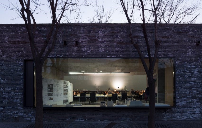
我们选择砖作为主要材料,因为我们的城市的历史特点,我们使用木材作为补充,以更加和谐的环境。
We chose brick as main material because of historical characteristic of our city and we used wood as a complementary for having more harmony with environment.
© Farshid Nasrabadi
(Farshid Nasrabadi)


Architects Sarsayeh Architectural Office
Location Isfahan, Isfahan Province, Iran
Category Store
Area 1100.0 sqm
Project Year 2016
Manufacturers Loading...

 PintereAI


