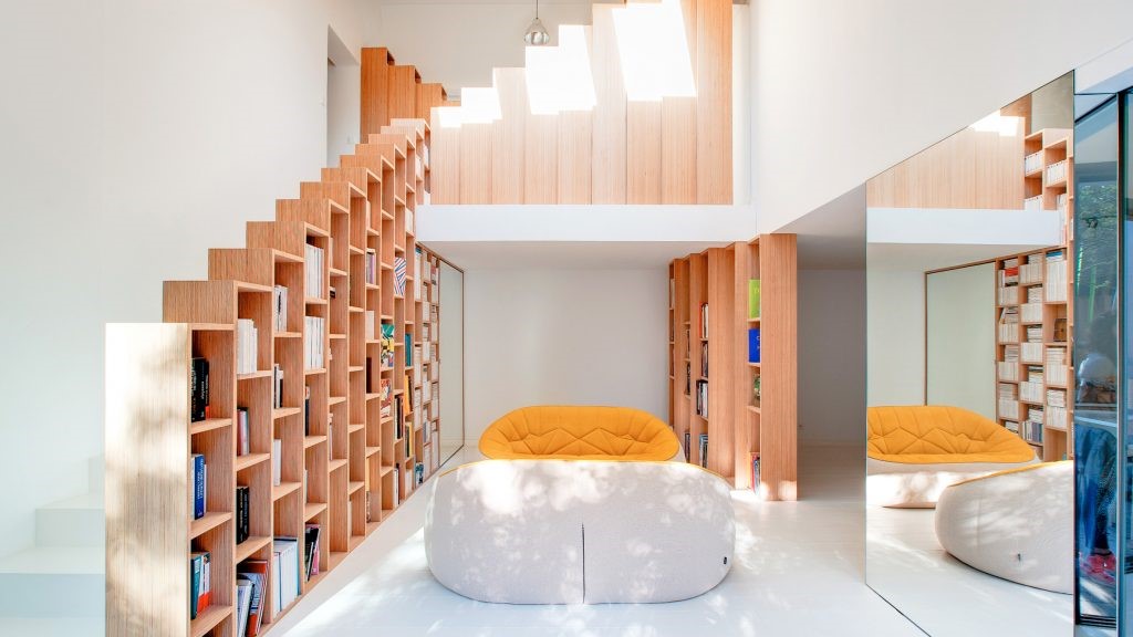
Surf Road House Nick Bell D-A
2016-07-09 20:00
架构师提供的文本描述。这个房子的概念是创造一个空间,反映它的海岸环境,提供一个轻松和令人振奋的环境给业主。
Text description provided by the architects. The concept of this house is to create a space that mirrors its coastal setting, providing both a relaxed and uplifting environment for the owners.
使用钢、玻璃和再生木材创造了一个感觉平静和自信的现代住宅,反映了我们做法的基本原则,即设计低调但令人印象深刻的房屋;简单但细致。
The use of steel, glass and recycled timbers creates a modern home that feels calm and confident, reflecting the underlying principle of our practice which is to design houses that are understated yet impressive; simple yet meticulously detailed.
这座建筑被认为是两大要素。主要的三层楼高的大厦包括主要的住宿和住宿,每个房间都有一个东方的海景,服务和流通在西方脊柱内。西面是一个分开的两层楼的亭子,里面有分隔的私人花园住宿.
The building is conceived as two main elements. The main three-storey block contains the primary living and sleeping accommodation, each room enjoying an easterly aspect to the ocean, with services and circulation within a western spine. To the west is a separated two-storey pavilion, containing separated private garden accommodation.
主展馆的设计采用了一种普通的钢结构。结构框架的重点是提供在主要空间内的个别区域的定义。
The design of the main pavilion utilises a regular steel structure. The structural frame is emphasised to provide definition of individual areas within the main space.
这个设计的关键是在结构的南端有一个两层的空隙.这将公共空间置于房屋的中心,并将永久居住者使用的两个主要层连接起来。这一空隙也提供了清晰和诱人的循环在建筑物内,以使过渡从上层进入到主要的生活空间。主屋顶沿着斜坡向西移动,捕捉到下午的自然光线,并结合空隙,最大限度地利用自然通风。
Crucial to the design is a two-storey void to the structure’s southern end. This places the communal spaces at the heart of the house and connects the two main levels used by the permanent occupants. The void also provides legible and inviting circulation within the building, to make the transition from the upper entry level to main living spaces. The main roof follows the slope up towards the west to capture natural afternoon light and, in combination with the void, maximises natural ventilation.
从这个简单的布局,设计寻求加强空间的清晰度,庆祝元素,表面和材料:钢铁,木材和玻璃的相互作用。
From this simple layout the design sought to reinforce the clarity of space and celebrate the interaction of the elements, surfaces and materials: steel, timber and glass.
当看到海滩和周围,木炭和木材调色板确保一个低调的隐性存在,以符合预期的审美和概念。
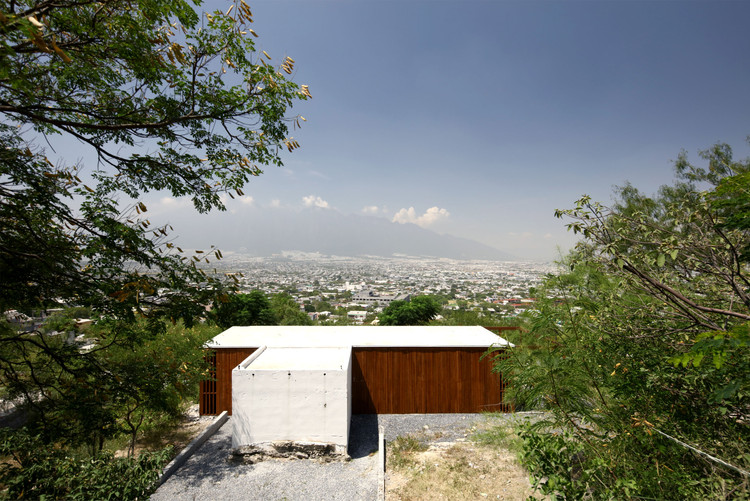
When viewed from the beach and surrounds, the charcoal and timber palette ensures an understated recessive presence in keeping with the intended aesthetic and concept.
 举报
举报
别默默的看了,快登录帮我评论一下吧!:)
注册
登录
更多评论
相关文章
-

描边风设计中,最容易犯的8种问题分析
2018年走过了四分之一,LOGO设计趋势也清晰了LOGO设计
-

描边风设计中,最容易犯的8种问题分析
2018年走过了四分之一,LOGO设计趋势也清晰了LOGO设计
-

描边风设计中,最容易犯的8种问题分析
2018年走过了四分之一,LOGO设计趋势也清晰了LOGO设计


 PintereAI


