Massimo Dutti Sordo Madaleno Arquitectos
2016-07-05 15:00
© Jaime Navarro
c.Jaime Navarro


架构师提供的文本描述。马西莫·杜蒂的新店位于总统玛莎里克大道,这是墨西哥城最有声望的街道之一。作为领先品牌的故乡,它被认为是城市的“黄金之一”,最近进行了一次改头换面,以提高其城市质量。
Text description provided by the architects. The new agship store for Massimo Dutti is located on Presidente Masaryk Avenue, one of the most prestigious streets in Mexico City. Home to leading brands, it is considered the city’s “golden mile” and has recently undergone a makeover to improve its urban qualities.
© Jaime Navarro
c.Jaime Navarro


为了把这座建筑变成真正的建筑作品,在这一特殊的背景下,作为一个美学参照点,项目的规模和设计重新体现了将其融入Polanco社区的愿望。
With the goal of turning the building into a veritable work of architecture that serves as an aesthetic reference point within this exceptional context, the scale and design of the project re ects a desire to integrate it into the Polanco neighborhood.
© Jaime Navarro
c.Jaime Navarro


这座建筑是为了与该地区历史建筑中的高度和空洞的正式景观相匹配而设计的。矩形模块的韵律是由正交金属结构构成的,而FAÇADE的纹理则是由对传统的Polanco锻铁栏杆的重新诠释所启发的屏幕。屏幕产生一系列矩形壁龛,在正交网格中随机重复。
The building façade is designed to match the formal landscape of heights and voids found in the zone’s historical architecture. The rhythm of rectangular modules is formed by an orthogonal metal structure, while the texture of the façade is a screen inspired by a reinterpretation of the traditional wrought iron railings of Polanco. The screen generates a series of rectangular niches that are randomly repeated within the orthogonal mesh.


这是一个活泼和简洁的建筑,感谢强大的内部和外部联系。这些壁龛中的每一个都会变成一个窗口、橱窗或封闭元素,这取决于内部的用途。这个系统只会被镶在主入口处的玻璃板打断,并有一个巨大的三高垂直窗口。
This is a lively and exible architecture, thanks to the strong connection between interior and exterior. Each of these niches becomes a window, showcase or closed element, depending on the internal use. This system is only interrupted by the sheet of glass that frames the principal entrance, with a great triple-height vertical window.
© Jaime Navarro
c.Jaime Navarro


该屏幕是用模具制造的,并在其结构中使用了BerGlass。它代表了传统的本地技能和尖端技术之间的极好的合作。
The screen was manufactured using molds, and employs berglass in its construction. It represents a superb collaboration between traditional local skills and sophisticated technology.
© Jaime Navarro
c.Jaime Navarro


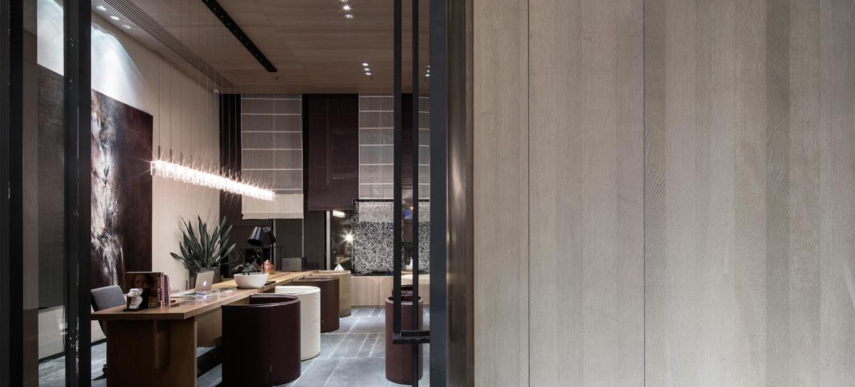
虽然客户的第一印象是建筑物的城市存在,当进入用户体验新的感觉在壮观的双高度大厅空间。在里面,商店被认为是一个城市和当代的空间,具有极简主义风格。简单的线条和纯净的材料,创造了一个多才多艺和永恒的空间,不干扰时尚的需求,并确保产品拥有所有的注意力。
While the rst impression of clients is of the building’s urban presence, upon entering users experience new sensations in the imposing double-height lobby space. Inside, the store is conceived as an urban and contemporary space with a minimalist style. With simple lines and purity of materials, a versatile and timeless space is created that does not interfere with the demands of fashion and ensures the product holds all the attention.


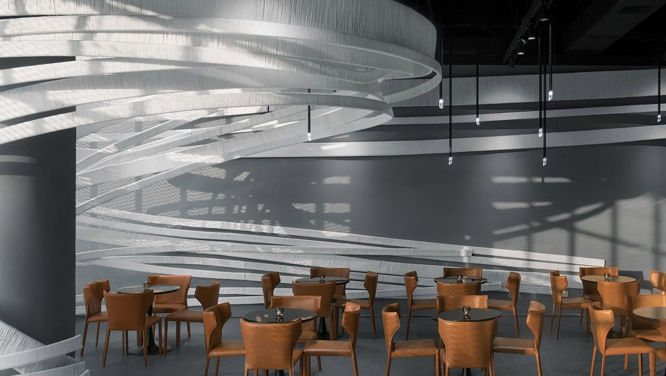
垂直流通核被认为是一个雕塑元素,欢迎客户作为进入商店的视觉背景。
The vertical circulation nucleus was conceived as a sculptural element that welcomes clients as the visual backdrop upon entering the store.
© Jaime Navarro
c.Jaime Navarro


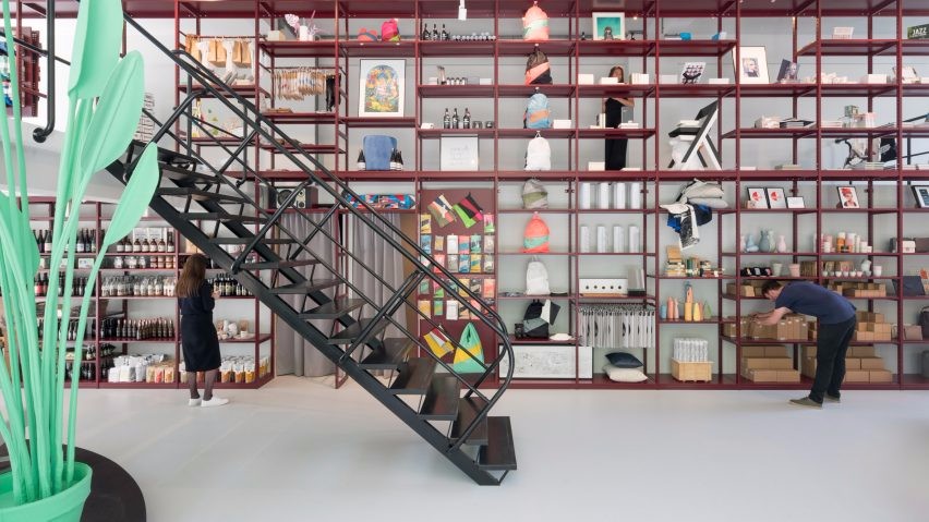
装修简单,几何形式在木材和钢材详细说明。按照同样的方案,品牌的经典作品被重新诠释和简化,以纳入这一极简空间。为商店设计了许多原始作品,包括挂着的陈列柜、展台和付款区。
The furnishing is simple, with geometric forms in wood and steel detailing. Following the same scheme, the brand’s classic pieces were reinterpreted and simpli ed to be incorporated into this minimalist space. A number of original pieces were designed for the store, including the hanging showcases, exhibition tables, and payment area.
© Jaime Navarro
c.Jaime Navarro


© Jaime Navarro
c.Jaime Navarro


屋顶露台的设计是为了补充客户和他们的合作伙伴在商店的经验,在那里他们可以放松和享受咖啡或茶点。它将提供一个多功能的空间,厨房和洗手间服务,提供高超的景色对天际线的Polanco,也将有助于主办品牌活动。
The rooftop terrace was designed to complement the experience of the store for clients and their partners, where they can relax and enjoy a coffee or refreshment. It will provide a versatile space with kitchen and washroom services that offers superb views over the skyline of Polanco, and will also serve to host brand events.
© Jaime Navarro
c.Jaime Navarro


材料的选择集中在经典但创新的品牌精髓上,创造了一个中性的环境。采用不同处理方法的苍白石,以及木材和金属的口音。
The selection of materials was focused on the classical but innovative essence of the brand to create a neutral setting. Pale stone employing different treatments was used, together with accents in wood and metal.
Elevation / Details
高程/细节


这些建筑元素的结合,加上内部使用一个清醒的调色板,是实现网站所要求的优雅的工具,而这个品牌所代表的优雅。
The combination of these architectural elements together with the use of a sober palette for the interior were the tools to achieve the elegance required by the site, and which the brand represents.
© Jaime Navarro
c.Jaime Navarro


Architects Sordo Madaleno Arquitectos
Location Presidente Masaryk 431, Polanco III Secc, 11550 Ciudad de México, D.F., Mexico
Category Store
President Javier Sordo Madaleno Bringas
Architecture Leader Javier Sordo Madaleno de Haro
Project Leader Boris Pena, Fernando Sordo Madaleno de Haro
Area 1450.0 sqm
Project Year 2016
Photographs Jaime Navarro

 PintereAI


