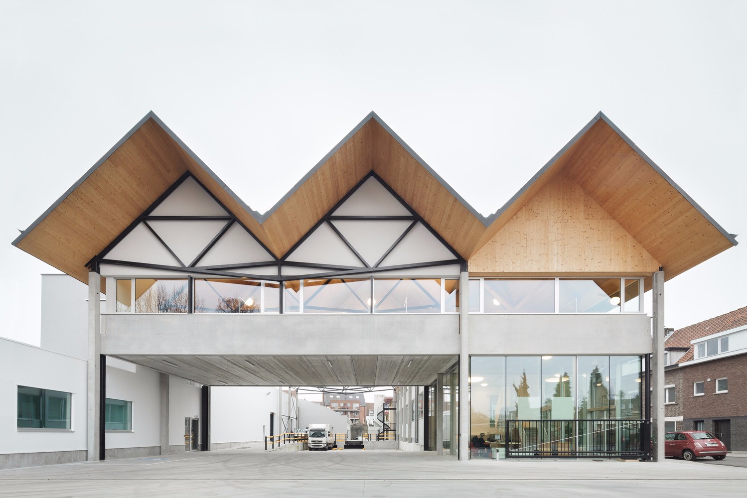
Melrose Health Bent Architecture
2016-06-09 17:00
© Folded Bird Photography
折鸟摄影


Ground Floor Plan


架构师提供的文本描述。这个项目涉及到将一座平淡无奇、静态的办公室/仓库大楼改造成位于墨尔本外东部的一家全国性保健产品公司Melrose的新总部。该项目包括梅尔罗斯思想的整体健康,创造了一个工作场所,对自然环境作出反应,并参与其中的过程。
Text description provided by the architects. This project involves the transformation of a typically mundane and static office/warehouse building into the dynamic new headquarters for Melrose, a national health product company based in outer-eastern Melbourne. The project embraces the Melrose ideology of whole body health by creating a workplace that is responsive to the natural environment and engaged with the processes within.
© Folded Bird Photography
折鸟摄影


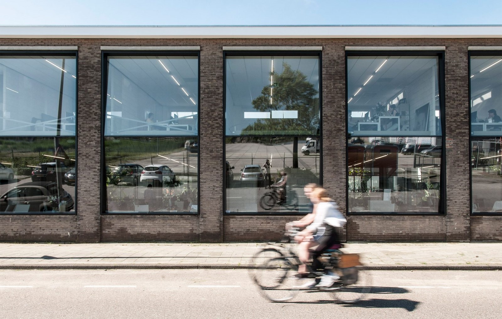
现有的两层办公大楼的街道外墙被一种有机管状钢结构侵蚀,该结构将现场的景观与建筑织物直接连接起来。部分遮阳部分景观乔木,该结构支持落叶和常绿藤蔓的结合,解放了现有的北面窗户,否则将畏缩从炎热的夏季阳光,并提供了一个管道,绿色植物渗透办公室内部。
The street façade of the existing two storey office block was eroded via the introduction of an organic tubular steel structure that literally connects the site’s landscape to the building fabric. Part sun-shade and part landscape arbor, the structure supports a combination of deciduous and evergreen vines that liberate the existing north facing windows that would otherwise cower from hot summer sun, and provides a conduit for greenery to permeate the office interior.
© Folded Bird Photography
折鸟摄影


可开放的窗户被插入,以方便自然通风,模块化的花园床和细木工组件,包括回收材料和建筑断口被插入,以定义工作站,合作工作区,安静空间和协作的“景观”突破区。现有的天花板瓷砖被保留和重新粉刷,原来的仓库混凝土地板被露出来;拆除了上层的一段地板,以提供各层之间的透明度和连通性,从而使工作场所更加活跃。
Openable windows were inserted to facilitate natural ventilation, and modular garden beds and joinery components comprising recycled materials and building off-cuts were inserted to define workstations, co-working areas, quiet spaces and collaborative ‘landscaped’ breakout zones. Existing ceiling tiles were retained and repainted and the original warehouse concrete floor was exposed; a section of floor on the upper level was removed to provide a transparency and connectivity between levels, further enlivening the workplace.
© Folded Bird Photography
折鸟摄影


1st Floor Plan
一楼图则


办公室和仓库之间的隔阂也被侵蚀了,插入了全高度的开口,为公司的各种业务提供了更直接的联系。仓库调色板贯穿内部,以加强两个区域之间的联系,除了存储和固定典型的管理空间,支持更多的种植箱和展示梅罗斯的产品范围。拉链和商品戏剧性地延伸到公司的门厅,这是一个充满灯光的双高度入口大厅,在规划和空间上是多样化的。这座前厅内原来的仓库地板再次暴露出来,木砌的露台,一个位于中心的哭泣的无花果、攀缘藤蔓和自然阳光,定义了一个空间,它在进入时体现了公司的精神、它创造的产品以及利用自然促进健康的好处。
The division between office and warehouse was also eroded, with full height openings inserted to provide a more immediate connection between the various operations of the company. Warehouse palette racking permeates the interior to strengthen the link between the two zones and, in addition to storage and stationary typical of an administrative space, supports additional planter boxes and showcases the Melrose product range. The racking and merchandise extend dramatically into the company’s foyer, which is a light filled double height entrance hall that is programmatically and spatially diverse. The original warehouse floor within this forecourt was once again exposed, and timber lined terraces, a centrally located weeping fig, climbing vines and natural sunlight define a space that, on entry, embodies the ethos of the company, the products it creates and the benefits of harnessing nature to promote good health.
© Folded Bird Photography
折鸟摄影


Architects Bent Architecture
Location Mount Waverley VIC 3149, Australia
Category Refurbishment
Architect in Charge Merran Porjazoski
Design Team Ian Wilson, Paul Porjazoski, Michael Germano, Lana Blazanin, Amy Clark
Project Year 2015
Photographs Folded Bird Photography
Manufacturers Loading...

 PintereAI


