SS3 House Seshan Design
2016-05-31 22:00
© Rupajiwa Studio
c.Rupajiwa Studio


架构师提供的文本描述。一座新建的4600平方英尺的平房建在SS3的7400平方英尺的土地上,这是八达岭Jaya的一个更大的住宅郊区。
Text description provided by the architects. A new built, 4600 sqft built up bungalow on an aprox 7400 sqft land in SS3, one of the bigger residential suburbs of Petaling Jaya.
我收到客户的一封电子邮件询问,说他们需要建造一栋家庭住宅,并正在寻找“狂热”的人与他们合作,以尽快实现这一目标。哦,除此之外,他们的预算也相当有限!但我想怎么回事,我们还是去见他们吧。我做了,我们很合得来!
I had received an email inquiry from the client stating they needed a family home built and were looking for someone to work with them “fanatically” to make it happen ASAP. Oh, and on top of that, they also have a fairly limited budget! - Not exactly the right mix of terms any consultant would jump up to grab.... but I thought what the heck, let's just meet up with them. I did and we surprisingly hit it off!
© Rupajiwa Studio
c.Rupajiwa Studio


__for_publication_120516.jpg)

这些客户都参与了建筑业,并且已经知道他们想要什么。他们特别感兴趣的是目前在马来西亚年轻建筑师中流行的原始工业美学的趋势。
The clients were involved in the building industry and already had an idea of what they wanted. They were particularly interested in the current trend of the raw, industrial aesthetic which was popular among younger architects in Malaysia.
虽然我能欣赏到这种审美(我觉得这是有点过火了!),但我觉得这种感觉渗透到整个家庭可能不是最好的,尤其是对于一个有孩子的家庭。相反,我建议我们做一个混合;我们有一些功能,使用清水混凝土/水泥板/灰泥和砖块,但平衡与“成品”元素,这将给房子更多的层次和对比,从而有更多的特点。
Although I can appreciate that aesthetic (which I felt was getting to be a tad bit overdone!!), I felt that for that look and feel to permeate all throughout a home may not be the best, especially for a home with children. Instead I proposed that we do a mix; we have some features using fairface concrete/ cement screed/ plaster and bricks but balanced off with “finished” elements as well – this would give the house more layers and contrasts and thus have more character
© Rupajiwa Studio
c.Rupajiwa Studio


他们也非常喜欢所有的东西,古董,有相当折中的旧家具,灯光,艺术品和其他各种收藏品。我们认为这一切都会很好地结合起来,创造一个非常丰富和独特的家。
They were also very into all things vintage and had quite an eclectic collection of old furniture, lights, artwork and other assortments. We thought this would all work rather well to come together and create a very rich and unique home.
客户也已经准备了一份非常详尽的简报(这是一个PowerPoint演示文稿!)说明他们需要的空间,并完成一些他们喜欢的图片。
The clients had also already prepared a very thorough brief ( it was a powerpoint presentation!!!!) stating the spaces they require and complete with some images of what they like.
© Rupajiwa Studio
c.Rupajiwa Studio


_for_publication_120516_2.jpg)

和我们所有的其他住宅项目一样,我们总是从客户想要的东西的至少一个选项(带有一些变量)开始-愿望列表。我们还增加了另一个选项(或多个选项),根据我们对简报的解释,我们认为可以工作。最后,它通常是各种选择的混合体,致力于各种优势,想出一些恰到好处的东西。
As with all our other residential projects we always start with at least one option (with some variables) of what the client wants – the wish list. And we also add another option (or options) of what we think could work instead based on how we interpret the brief. In the end, its usually a hybrid of options, working on various strengths to come up with something just right.
这幅土地没有造成任何真正的问题,因为它是相当大和平坦的,没有真正的主要树木或植被可保留,有一个现有的单层平房,我们完全拆除了。基本上,它就像一个没有网站限制的空白页面。房子的主要规划和方向很大程度上取决于入口处和阳光方向:游泳池和房子的公共空间面向东方,以获得早晨的阳光。另一个限制/要求当然是风水。一旦我们有了一个相当可行的布局,客户不得不咨询他们的风水顾问,我们做了一些调整(谢天谢地,这不是个大问题!)符合风水的要求。
The site didn't pose any real problem as it was quite large and flat with no real major tree or vegetation to retain. There was an existing single storey bungalow on site which we demolished entirely. So basically, its was like a blank page with no site constraints. The main planning and orientation of the house was pretty much determined by the entrance and sun orientation: the pool and the public spaces of the house would face East, to get the morning sun. The other constraint /requirement was of course Feng Shui. Once we had a pretty workable layout, the clients had to consult their Feng Shui consultant and we made a few tweaks (thankfully it wasn't major!) to comply to the geomancy requirements.
© Rupajiwa Studio
c.Rupajiwa Studio


我们喜欢认为自己非常擅长空间规划,尤其是善于让小空间看起来比实际空间大。这是我们一直努力遵循的原则之一-在满足所有空间要求的同时,尽可能减少对家庭的影响。让空间看起来更大的一个技巧是管理和维护“视线”。我们总是试图让用户从一个空间看到下一个空间和更远的空间。这就是为什么我们总是鼓励双音量空间和mezzanines-它可以使所有层次的房子,以视觉互动的另一个。尤其是有孩子的家庭;它总是有用的,因为无论他们在哪里,你都可以看着他们,为他们大喊大叫!-没有借口让他们不听你的!
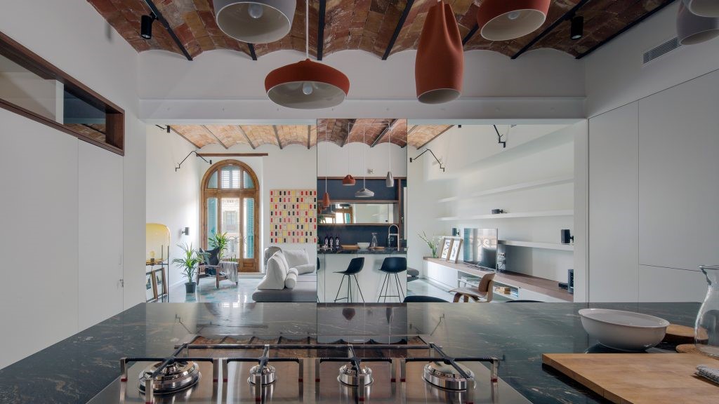
We like to think we're very good at space planning and especially good at making small spaces look larger than they actually are. That's one of the principles we always try to adhere to – to have the minimum footprint as possible for the home while meeting all the space requirements. One of the tricks to make spaces look bigger is managing and maintaining the 'line of sight'. We always try to enable the users to look from one space into the next and beyond. That's why we always encourage double volume spaces and mezzanines- It enables all the levels of the house to interact visually with one another. Especially with homes with children; its always useful as you can always watch them wherever they are and shout at/for them! - no excuse for them not hearing you!
© Rupajiwa Studio
c.Rupajiwa Studio


玩高容量游戏也给空间带来了另一个维度,并与开阔的水平视野相结合-就像从底层所有主要空间到游泳池的开阔视野一样-它让用户体验到整个房子的空间比实际大得多。当然,更大的空间也带来了其他好处,比如增加了自然的空间。照明和允许更多交叉通风的能力。如果有选择的话,我们更希望大部分的空间都是完全自然通风的,但随着近年来世界上这个地区每年都会出现阴霾,这似乎不再可行了-在需要的时候,房子必须完全密封。
Playing with high volumes also gives another dimension to the space and combined with an open horizontal light of sight – like the open view to the pool from all the main spaces of the ground floor – it makes the user experience the entire house as a much larger space than it actually is. Of course the larger volumes also bring other benefits such as increased natural lighting and the ability to allow more cross ventilation. Given a choice, we would have preferred that most of the spaces are left just fully naturally ventilated, but with the annual occurrence of the haze in this part of the world in the recent years, this doesn't seem feasible any more – the house has to be fully sealed when the need arises.
对于整体的外部前景-客户确实想要一些非常明显和标志性的东西,他们也非常喜欢清水混凝土的美学。因此,主体双体积居住空间完全是以自由形式的清水混凝土为主要特征的入口处。-辅之以环绕主浴室的水平屏幕。实际上,我们为这个屏幕想了无数的选择!-从钢,到混凝土砌块,再到绿色的墙壁,直到我们最终在一个钢架上用一个简单的垂直水泥板条(这也隐藏了前面的空调室外单元)。
For the overall external outlook – the clients did want something very visible and iconic. They also were very taken by the aesthetic of fairfaced concrete. So the main double volume living space was done entirely in free form fairfaced concrete as the main feature for the entrance of the house. - this would be complemented by a horizontal screen that would wrap round the master bathroom. We actually went thought countless of options for this screen! - from steel, to concrete blocks to green walls till we finally settled on a simple screen of vertical cement board strips on a steel frame (which also hid the front aircon outdoor units).
© Rupajiwa Studio
c.Rupajiwa Studio


另一个主要的清水混凝土功能是视觉悬臂娱乐块/拉奈在一楼,其中俯瞰游泳池。原本打算作为封闭的空间,它最终被作为一个半开放的区域。我们故意不把它关闭为一个完整的四边“盒子”,并留下它的一面破碎的视觉清晰度。
The other main fairfaced concrete feature was the visually cantilevered entertainment block/ lanai on the first floor which overlooked the pool. Originally intended as a closed up space, it was finally left as a semi open area. We intentionally didn't close it up as a full 4 sided “box” and left a side of it broken for visual articulation.
开放的特征楼梯也在清水混凝土框架内,实际楼梯的底面和底面也在外露混凝土中。然而,我们选择用实木踏板和钢栏杆来缓和混凝土楼梯的硬度,这是受复古格栅设计启发的。
The open feature staircase was also framed in fairfaced concrete and the base and underside of the actual staircase was also in exposed concrete. However we chose to temper the hardness of the concrete staircase with solid timber treads and steel balustrades inspired by retro grill designs.
© Rupajiwa Studio
c.Rupajiwa Studio


我们本想把整个一楼完全用清水混凝土建造-作为一个漂浮的混凝土盒子-但是预算限制迫使我们对哪些区域被视为特色非常有选择,所以我们建造了其他区域作为抹灰砖墙。
We would have loved to have built the entire first floor entirely of fairfaced concrete – as a floating concrete box, but budget contraints forced us to be very selective of which areas were to be treated as features, so we built the other areas as plastered brickwalls.
对于内部底漆,我们不想走太工业化,因为外观已经相当粗糙,所以我们有一个更“完成”的外观。一楼和一楼的公共走廊(包括餐厅和厨房)作为水泥筛板,加上铝质镶嵌物,作为预算考虑。起居室是用破碎的伊波赫白色大理石做的-这与马来西亚60年代和70年代非常流行的传统地板格格不入。卧室都是在利兹认证的豪华乙烯基瓷砖上完成的,这些瓷砖的外观和手感都很好。
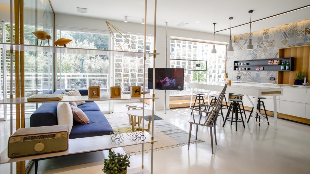
For the interior base finishes, we didn't want to go too industrial as the exterior was already quite raw, so we had a more “finished” look. The common corridors (including the dining and dry kitchen) at the ground floor and first floor were left as cement screening with aluminium inlays for breaks, as a budget consideration. The living room was done in broken Ipoh white marble - a throwback to traditional flooring which was very popular in Malaysia, in the 60's and 70's. The bedrooms were all finished in LEEDs certified, luxury vinyl tiles which had a timber grain look and feel.
© Rupajiwa Studio
c.Rupajiwa Studio


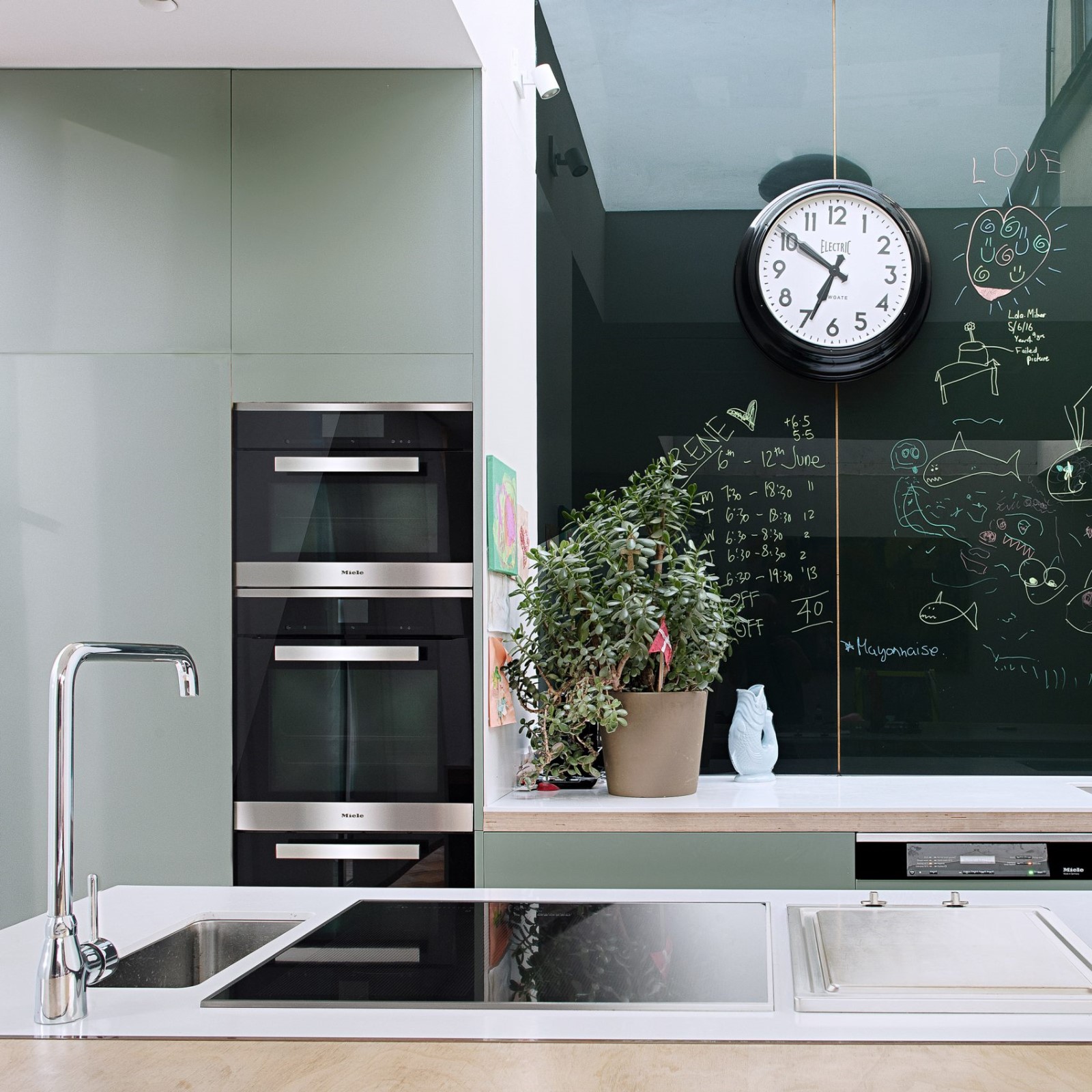
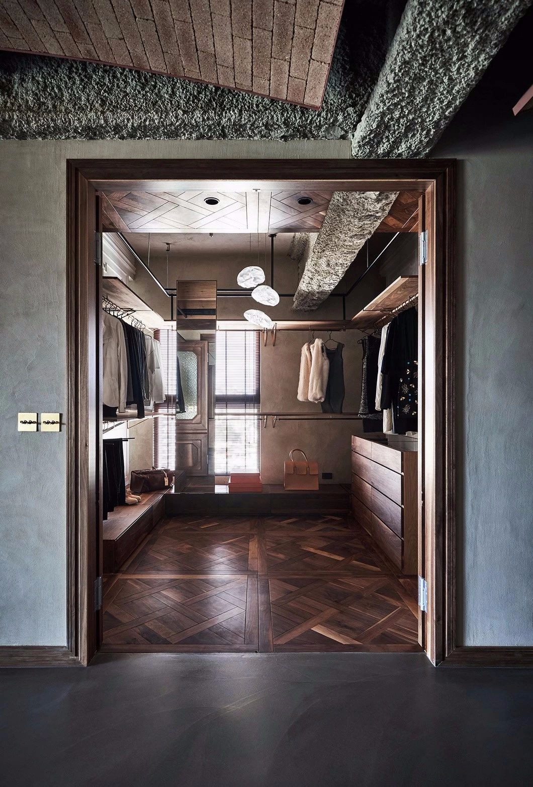
内置的都是我们自己设计的。我们对它们有一些工业上的怪癖,比如厨房岛的钢框架结构和干厨房的水泥板(和秘密门)。主要的衣柜和底层研究都采用了带架子的钢框架结构。客户还采购了一些复古项目,比如我们把老式缝纫机装进了动力室的梳妆台,以及我们从巴厘岛来的预制水龙头、盆和盆,我们也把这些东西纳入了设计中。这些瓷砖与一些复古瓷砖混合在一起,给浴室带来了一种非常独特、兼容并包的味道。我们还从新加坡采购了一些印刷的水泥瓷砖(Hafary瓷砖),这些瓷砖是在泳池对面的露台/围裙上使用的。
The built-ins were all custom designed by us. We had some industrial quirks on them like the steel framed structure for the kitchen island and cement board panelling (and secret doors) at the dry kitchen. The master wardrobe and ground floor study had steel frame construction with shelving. The clients also sourced some retro items like the vintage sewing machine which we incorporated into the power room vanity, and precast terrazzo bathtubs, basins and pots from Bali, which we also included into the designs. These, mixed with some retro tile selections gave a very distinct, eclectic flavour to the bathrooms. We also sourced some printed cement enclaustic tiles from Singapore (Hafary tiles) which were used for effect along the terrace/ apron facing the pool.
在一楼的娱乐平台/拉奈和“游戏室”,我们使用了折叠式格栅,让人想起旧的商店房子,把这两个空间分开。这个区域其实就是房子里的“男人洞”或“洞穴”之类的人!当“小伙子”在拉奈上喝酒时,可折叠的烤架可以打开,进入实际上是家庭剧场空间的“游戏室”。有一个拉下投影机屏幕和小伙子可以观看足球等舒适的开放兰奈空间!
At the first floor entertainment terrace/lanai and “play room”, we used collapsible grills reminiscent of the old shop houses to divide the 2 spaces. This area is actually the man of the house's “mancave” or “den” of sorts! When the “lads” are out drinking on the lanai, the collapsible grill can be opened up into the “play room” which is actually a home theatre space. There is a pull down projector screen and the lads can watch football, etc from the comfort of the open lanai space!
© Rupajiwa Studio
c.Rupajiwa Studio


客户还发现了一套有趣的实木桌子,里面有一对头椅和极高的靠背!不是最稳定的椅子,但他们真的看起来很好,在双卷用餐空间!维也纳“灵感”线框吊灯以上(也来源于客户)完成的外观!
The client also found an interesting solid timber table set which came with a pair of head chairs with extremely high back rests! Not the most stable of chairs but they really look good in the double volume dining space! The Vibia “inspired” wire framed pendant light above (also sourced by the client) completes the look!
客户们一直在四处购物,为房子自己采购零碎家具和配件。在选择过程中,我们将被咨询,以测试大小是否正确或适合空间的主要项目之前,客户进行购买。对于其他人,我们将只是围绕他们购买的东西,并找出如何使用他们。有时,我们需要修改或添加购买的项目,以使其可用(就像缝纫机虚荣心!)(鼓掌)
The clients had been running about shopping and sourcing for the loose furniture pieces and accessories for the house on their own. During the selection process we would then be consulted to test whether the size is correct or suits the space for the major items before the clients makes the purchase. For others, we'll just work around what they had purchased and figure out how to use them. Sometimes we need to modify or add on to the items purchased to make them usable (like the sewing machine vanity!).
© Rupajiwa Studio
c.Rupajiwa Studio


总之,对于我们和客户来说,这是一个相当愉快的过程。客户在设计中投入了大量的精力,我们鼓励他们这样做,因为这所房子实际上也是他们个性的延伸和反映。
All in all, it was a fairly enjoyable process I think for both us and the clients. The clients were heavily involved in the design and we actually encourage that as the house then really becomes an extension and reflection of their personalities as well.
在这种情况下,客户还参与了实际的构建过程,因为客户是在建筑业。他们甚至住在隔壁的房子里,正在施工!-所以他们亲身体验了整个建筑!客户的父亲也是现场客户的项目经理!
In this case, the clients were also involved with the actual build process as the clients are in the construction industry. They were even staying in the house next door when the construction was going on! - so they experienced the entire build firsthand! The client's father was also the client's project manager on site!
__for_publication_120516_2.jpg)

_for_publication_120516.jpg)


__for_publication_120516.jpg)

__for_publication_120516_2.jpg)

__for_publication_120516_3.jpg)

_for_publication_120516_2.jpg)

_for_publication_120516.jpg)


_for_publication_120516_3.jpg)


Architects Seshan Design
Location Petaling Jaya, Malaysia
Category Houses
Design Team Ramesh Seshan, Azlan Syarawi, Suherman Sadelan, Ralph Antonio, Amin Madhadzir, Jeslyn Ko, Fakhruz Zaman
Area 4600.0 ft2
Project Year 2016

 PintereAI


