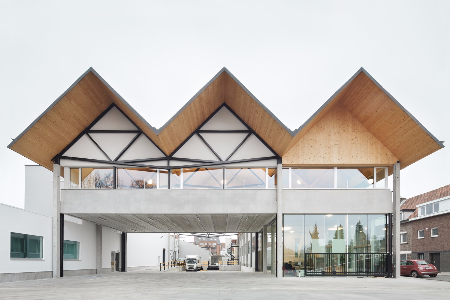
Clinique D diaphane L. McComber
2016-06-01 15:00
架构师提供的文本描述。DanielleBrassard博士一直梦想着在Montréal开设自己的公共皮肤科诊所。为了满足治疗湿疹、牛皮癣、荨麻疹和其他与压力有关的皮肤状况的病人的需要,未来的诊所必须在舒适的气氛中接待病人。她对这片空间的看法与传统诊所的模式不同,传统诊所往往是阴郁的地方,病人和专业人士的舒适和幸福被排挤到一边,以满足技术要求。为了将她的愿景变为现实,她于2014年9月从建筑公司L.McComber与LaurentMcComber取得联系。
Text description provided by the architects. Dr. Danielle Brassard has long dreamt of opening her own public dermatology clinic in Montréal. To meet the needs of clients who deal with eczema, psoriasis, hives and other skin conditions linked to stress, the future clinic must welcome patients in a comforting atmosphere. Her vision for the space is unlike the model of traditional medical clinics, which are often gloomy places where the comfort and well-being of the patients and professionals are relegated to the sidelines in favor of technical requirements. To turn her vision into reality, she contacted Laurent McComber in September 2014 from the architectural firm L. McComber.
黯淡的发光,许多皮肤科治疗的关键成分,是这个项目发展的起点。尽管它的大窗户面向东临阿韦纳尔大道,南临蒙莫兰西地铁站停车场,但占据这一空间的前儿科诊所却是黑暗而乏味的。候诊室在中心的位置,周围没有窗户的检查室,关闭了客户与外界和它的视野和自然光。为了最大限度地利用大的开放空间,整个办公室被改造成一个开放的空间,在诊所内提供不同功能的半透明元素,让丰富的自然光在四周过滤。天花板是隔墙贴在声瓦上的,为了让这个地区感觉更宽敞,所以把它暴露了出来。
Gloomy to glowing Light, a critical ingredient of many dermatological treatments, is the starting point from which the project evolves. Despite its large windows facing east onto Avenir Boulevard and south onto the Montmorency metro station parking lot, the former paediatric clinic that occupied this space was dark and uninspiring. The position of the waiting room in the centre, with windowless examination rooms surrounding it, shut clients off from the outside world and its views and natural light. To make the most of the large openings, the entire office was transformed into an open-plan space with translucent elements serving different functions within the clinic, letting the abundant natural light filter in all around. The ceiling, covered wall to wall in acoustic tiles, was exposed to make the area feel more spacious.
半透明的环境,六间考场,以磨砂玻璃天花板为特色,形成一堵长长的白色墙,中间有六扇高高的木门。这间诊所的专业人士放松的房间看起来就像一个发光的立方体,有着壮丽的乳白色玻璃墙和较低的天花板。光疗机坐在中心,接待处后面。弯曲的半透明玻璃墙封装了他们的功能,因为他们发出迷人的紫色光时运作。一个长长的、实心的火山灰接待室围绕着这个中心核心,两端都有一个入口:皮肤科(主要入口)和光疗(二级入口)。
Translucent surroundings The six examination rooms, featuring frosted glass ceilings, form a long white wall punctuated by six high wooden doors. With its imposing opalescent glass wall and lowered ceiling, the relaxation room for the clinic’s professionals looks like a glowing cube. Light therapy machines sit imposingly in the centre, behind reception. The curved translucent glass walls that encapsulate them give away their function, as they emit an entrancing purple light when in operation. A long, solid ash reception desk wraps around this central core, with an entrance on either end: dermatology (main entrance) and light therapy (secondary entrance).
病人作为焦点,Brassard博士希望她的病人一进入诊所就放松下来。他们应该在访问期间感受到一种令人振奋的平静和平静感,而不是被压力和不适所压垮。在克莱尼克D,候车室提供了整个空间最令人叹为观止的景观:整个阿韦纳尔大道的延伸。人们更有耐心,更理解当他们感到舒适和良好的照顾。在候诊室椅子的脚下,定制的实心灰咖啡桌反映了前台的外观和感觉。在大厅壁橱的底部是一个木制的鞋架,请病人们一走进来就把靴子脱下来。在更有甚者,洗手间所在的壁龛里也有一个热水/冷水分配器,供任何人在等待预约或治疗时给自己倒杯茶。
The client as the focal point Dr. Brassard wants her patients to relax as soon as they enter the clinic. They should feel an uplifting sense of peace and calm during their visit rather than being weighed down by stress and discomfort. At Clinique D, the waiting room offers the most breathtaking view of the entire space: the whole stretch of Avenir Boulevard. People are more patient, more understanding when they are comfortable and well looked after. At the foot of the waiting room chairs, custom-built solid ash coffee tables mirror the look and feel of the reception desk. At the bottom of the hall closet is a wooden shoe rack, inviting patients to take their boots off as soon as they walk in. Further in, an alcove where washrooms are located also has a hot/cold water dispenser for anyone to pour themselves a cup of tea while they wait for their appointment or treatment.
除了照顾医护人员外,诊疗所亦是一个欢迎和安慰病人的地方,而诊所亦必须满足员工的需要,因为他们需要长时间在墙壁内工作。它必须在组织的方式上是有效率的,在布局上必须是愉快的。要做到这一点,诊所的专业人员必须能够在公众看不到的公共区域、办公室和诊疗室之间流动。通过将会诊室从外墙移开,一条长长的服务走廊被解放出来,供工作人员搬进来。这种空间布局,是这个空间真正的骨干,创造了一条明亮活泼的走廊,护士、技术人员和医生可以自由地从一个房间到另一个房间,查阅病人的电脑记录,交换意见和信息,甚至可以去他们的办公室和放松室。计算机工作站安装在墙上,供医务人员在看病人之前或之后查阅记录,而不阻塞这条战略通道。工作人员也可以享受透明的街区,其中的放松室是封闭的,屏蔽了病人好奇的目光。
Caring for the care staff In addition to being a welcoming and comforting place for patients, the clinic must meet the needs of its staff, who spend long hours working inside its walls. It must be efficient in the way it is organized and pleasant in the way it is laid out. To achieve this, the clinic’s professionals must be able to move between the common areas, offices and examination rooms out of sight of the public. By moving the consultation rooms away from the exterior wall, a long service corridor was freed up for staff to move around in. This spatial arrangement, the true backbone of this space, created a bright and lively corridor through which nurses, technicians and physicians can move freely from one room to another, consulting their patients’ computer records, exchanging opinions and information, or even going to their offices and the relaxation room. Computer workstations are mounted on walls for medical staff to consult records before or after seeing their patients, without blocking this strategic passageway. The staff can also enjoy the transparent block within which the relaxation room is enclosed, shielded from the curious glances of the patients.
定制照明,以补充自然光,悬挂Wi-Fi LED灯泡可以编程到所需的强度和颜色为每个区域。安装8‘-0“高,他们为用户提供最大的节能亮度,而不是太盲目。一条条凹进的LED灯突出了悬挂在桌子和整个候车室上方的大木头。同一类型的凹槽照明线接待处,以照亮工作表面的工作人员。最后,每个检查室都有来自各种LED光源的光,产生了非常广泛但高效的光谱:在玻璃天花板后面的面板中,在同一天花板上嵌入线性条带,以及在检查台上方的内置照明装置和在病人旁边可调节手臂上的定向Wi-Fi灯泡的形式。玻璃天花板和通往服务走廊的门完成了散发自然光的布局。在病人的视觉检查中,空间的强烈亮度很好地提高了检查的精度。
Customized lighting To supplement the natural light, hanging Wi-Fi LED bulbs can be programmed to the desired intensity and colour for each zone. Installed 8’-0” high, they offer users maximum energy-efficient brightness, without being too blinding. Strips of recessed LED lights highlight the large wood overhang above the desk and the whole of the waiting room. The same type of recessed lighting lines the reception desk to light up the work surfaces for staff. Lastly, each examination room has light flooding from a variety of LED sources, producing a very expansive but highly efficient spectrum: in panels behind the glass ceiling, in inset linear strips along the same ceiling, and in the form of a built-in light fixture above the exam table and a directional Wi-Fi bulb on an adjustable arm beside the patient. The glass ceiling and doors to the service corridor complete the layout with diffused natural light. The intense brightness of the space lends itself well to greater precision in the visual examination of patients.
所有的标志都是与平面设计师Atelier chinotto合作设计的。风格化但同时通用,它包括一个自定义设计的标识(电话,洗手间,充电站)和更具体的描述每个房间(1,2,3,A,B,C,丹妮尔布拉萨德博士,午餐,等等)。刻字包括从浅灰乙烯基剪裁与白色背景的墙壁。然而,对于混凝土地板,刻字是白色的,在灰色的表面。字体是轻描淡写和圆滑的。三维几何是设计的顶峰。这是一个3D参数挤压的2D标志设计的Atelier chinotto,其中的深度变化的沟槽根据他们的宽度,提供一个惊人的发挥光和阴影。
Atelier Chinotto’s signature All of the signage was designed in collaboration with graphic designer Atelier Chinotto. Stylized but universal at the same time, it consists of a mix of custom-designed logos (phone, washrooms, charging stations) and more specific descriptors for each room (1, 2, 3, A, B, C, Dr. Danielle Brassard, lunchroom, etc.). The lettering consists of cut-outs from light grey vinyl against the white background of the walls. For the concrete floor, however, the lettering is painted white right on the grey surface. The font is understated and sleek. The 3D geometry is the pinnacle of the design. It is a 3D parametric extrusion of the 2D logo designed by Atelier Chinotto, where the depth of the grooves varies depending on their width, offering a stunning play of light and shadow.
Clinique D在聚光灯下-Clinique D Diaphane项目-证明,有了客户的信任,一家充满活力的年轻公司可以交付一个复杂的、专门的建筑项目,而不必事先获得类似企业的专业知识。克莱尼克D有信心,一个欢迎和精心设计的护理空间,促进其用户和专业人士的福祉,并间接导致积极的照顾和工作条件。它独特的建筑和可持续的建筑细节将改善许多人的福祉,从长远来看,这是对社会的真正投资。照护空间不一定要由技术设备来支配。它可以受到居住在它里面的人的温暖和它称之为家的地方的启发。通过v2com。
Clinique D under the spotlight The Clinique D diaphane project is proof that, with a client’s trust, a dynamic young firm can deliver a complex, specialized architectural project without necessarily having acquired previous expertise in similar ventures. Clinique D is confident that a welcoming and well‑designed care space promotes the well-being of its users and professionals, and indirectly leads to positive care and working conditions. Its exceptional architecture and sustainable construction details will improve the well‑being of many, a real investment for society over the longer term. A care space does not necessarily have to be dominated by technological equipment. It can be inspired by the human warmth of the people that inhabit it and the place that it calls home. Via v2com.
Location Laval, QC, Canada
Category Interiors Architecture
Design Team David Grenier, Laurent McComber
Photographs Raphaël Thibodeau
 举报
举报
别默默的看了,快登录帮我评论一下吧!:)
注册
登录
更多评论
相关文章
-

描边风设计中,最容易犯的8种问题分析
2018年走过了四分之一,LOGO设计趋势也清晰了LOGO设计
-

描边风设计中,最容易犯的8种问题分析
2018年走过了四分之一,LOGO设计趋势也清晰了LOGO设计
-

描边风设计中,最容易犯的8种问题分析
2018年走过了四分之一,LOGO设计趋势也清晰了LOGO设计


 PintereAI


