AT Office Est Architecture
2016-05-13 17:00
架构师提供的文本描述。这个项目是为了容纳一家运输公司的大约50名员工而设计的办公空间。
Text description provided by the architects. The project is the fit-out of an office space that is meant to accommodate about fifty employees of a transportation company.


建筑理念基于两个因素:客户运营的内在本质和施工时间短。然而,发展符合几个标准(即。功能,居住者的舒适度,环境设计),并反映了公司的理念。
The architectural concept stands on two factors: the intrinsic nature of the customer's operations and the short time of construction. However, the development meets several criteria (I.e. functionality, occupants’ comfort, environmental design) and reflects the company's philosophy.
Courtesy of Est Architecture
EST建筑


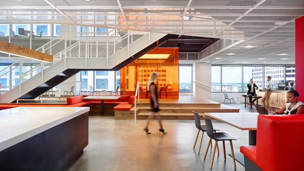
在功能上,设计是基于一个同心圆的方案,方便流通,并以有效的方式组织布局:封闭空间位于外围,而开放空间办公室在中心。开阔的空间里充满了天然的光线,透过厚重的窗户。除了传统的功能外,健身还包含一个休闲娱乐的空间,让员工可以在为这个目的而设计的区域之外工作和会面:在餐厅的桌子上、在看电视的扶手椅上,或者在把这些空间与开放的办公室分开的柜台上。
Functionally, the design is based on a concentric scheme that facilitates circulation and organizes the layout in an effective fashion: closed spaces are located in periphery while open space office is in the center. The open space is flooded with natural light through generous windows. In addition to the traditional functions, the fit-out contains a space for relaxation and entertainment, which allows employees to work and meet outside the areas designed for this purpose: at the table in the dining room, in the armchairs watching TV or at the counters that separate these spaces from the open office.
Courtesy of Est Architecture
EST建筑


材料的选择很简单:以胶合板和OSB以及玻璃为形式的木材。由此产生的形象,除了创造一个温暖、轻松和愉快的工作环境外,还符合载体的开放、简单和透明的理念。除了OSB粗糙的表面外,滑动门有助于空间的“货物”特性。相对于材料的简单性,其他元素消除了任何关于空间作用的含糊不清之处。虽然背景中的光线可以根据居住者的心情改变颜色,但白色办公家具在褐色的表面上显得格外突出。该办事处的名称,北美城市是最频繁的承运人。柜台和接待处在数控机床上制作了胶合板,唤起了传统的罗马尼亚图案。
The choice of materials is simple: the wood in the form of plywood and OSB as well as glass. The resulting image is consistent with the carrier’s philosophy of openness, simplicity and transparency in addition to creating a warm, relaxed and cheerful working environment. Beside the OSB rough surfaces, sliding doors contribute to the 'cargo' character of space. In contrast with the simplicity of the materials, other elements eliminate any ambiguity about the role of the space. While the light in the background can change color according to the mood of the occupants, the white office furniture stands out against the brownish surfaces. The offices bear the names of the North American cities that are most frequented by the carrier. The counters and reception desk, made of plywood on a CNC machine, evoke traditional Romanian patterns.
Courtesy of Est Architecture
EST建筑


最后,完全拆解,可以很容易地修改.当载体离开时,大部分的成分可以通过生物降解被重复使用、再循环或简单地重新整合到自然循环中。
Finally, the fit-out is fully dismantable and can be easily modified. Upon departure of the carrier, most of the components can be reused, recycled or simply reintegrated into the natural cycle through bio-degradation.


Architects Est Architecture
Location Montreal, QC, Canada
Category Offices Interiors
Design Felix Tue
Area 375.0 sqm
Project Year 2016
Manufacturers Loading...

 PintereAI


