Yuanyang Express We+ Co
2015-12-27 02:00
架构师提供的文本描述。北京元阳快车我们共同工作空间北京元阳快车我们共同办公空间位于朝阳区三元桥元阳快车D座,这里曾经是公寓大楼的底层商务部分。客户打算将这个空间转移到一个品牌的合作空间和离线活动领域,并探索未来工作场所的可能性。
Text description provided by the architects. Beijing Yuanyang Express We+ Co-working SpaceBeijing Yuanyang Express We+ Co-working Space is located at Block D, Yuanyang Express, Sanyuan Bridge, Chaoyang District, which used to be bottom business section of the apartment building. The client intends to transfer this space into a brand of co-working space and offline-activity area, as well as to explore the possibility of future workplace.
该协同办公空间占地面积约800平方米,分为一层、二层和地下层。在项目初期,建筑师提出了一种基于研究的设计方法,通过大量的案例研究和先例分析,探讨了一种灵活的空间共享模型的求解方法。
This Co-working Space covers an area of about 800 square metre, divided into first level, second level and underground level. At the beginning stage of the project, a research -based design method was introduced in by the architects, with large amount of case studies and precedent analyses, which approached to the solution of a flexible space-sharing model.
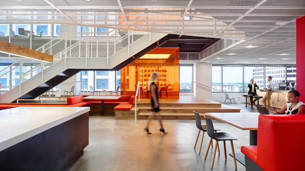
最后的设计带来了图书馆般的空间体验:在第一层,传统的大堂走廊办公室布局不再存在,而是一个广泛开放的空间,酒吧柜台为合作空间提供基本的管理和服务;大型讨论桌为群体和个人服务;更多的隐私可以发现在展位区,这是适合一个较小的群体;如果你不会被人群打断,工作站为您提供投入工作。总之,使用大学图书馆空间的方式被集成到这个项目中:您想要的任何空间都在这里作为选项打开。
The final design brings in a library-like space experience: On the first level, the traditional lobby-corridor-office layout no longer exists, but a widely-open space instead, a bar counter provides basic management and service to the co-working space; The big discussion table serves for both groups and individuals; More privacy can be found in booth area, which is suitable for a smaller group; If you would not be interrupted by the crowd, workstations are provided for you to dive into work. In a word, the way a university library space used is integrated into this project: any space you want is open as option here.
在空间设计中,除了图书馆的经验外,还采用了“展览”的方式。这里的大多数人都是启动阶段的中小型团队,这意味着产品的发布、展示甚至营销活动也需要在设计阶段加以考虑。因此,4个展示单元和一个完整的展示墙被放置在第一级,以满足团队的展示需求。在这里,合作的概念不仅是团队的栖息地,也是他们产品的栖息地。
Besides the library-like experience, the way of “exhibition” is also adapted during the space design. Most occupants here are small or medium size team on start-up phase, which means that the product publication, presentation and even marketing activity requires consideration on the design stage as well. Therefore, 4 display-units and a whole display wall are placed on the first level to meet the presentation needs of the teams. Here the notion of co-working evolves to not only the habitat of the team, but also the habitat of their product.
由于第一级以前被定义为商业部门,因此通常为第一级配备商业职能。除了提供服务和饮料的酒吧外,在这一层的西侧还有一个独立的零售区。零售区域有一个独立的入口,由模块化的家具与大的主空间分开。通常,该区域作为协同工作空间的一部分连接到酒吧柜台,该区域的三角表可以单独使用,也可以连接在一起进行会议和小组工作;虽然在特定的时间,如在上午或周末,该区域也可以提供短期零售和产品展示,作为展示和推广小型产品团队的完美空间。
Since first level was formerly defined as business section, it is usual to equip the first level with commercial functions. Apart from the bar that offering service and beverage, there is an independent retail area on the west side of this level. The retail area has a separate entrance and is parted from the large main space by modular furniture. Normally this area is connected to the bar counter as part of the co-working space, and the triangular tables in this area can be used individually or be joined together for meeting and group work; While at specific times, like in the morning or at weekends, this area is also able to serve short-time retail and product display, as the perfect space for the presentation and promotion of small product team.
在大多数办公空间情况下,地下层因其地理不便而被认为处于不利地位。然而,在这个项目中,通向地下的楼梯完全涂上了明亮的黄色,这提供了强有力的视觉引导,同时也为以前的负面空间注入了活力。黄色的楼梯在地面的入口处打开,变成一个大台阶,变成一个展示空间,供占用的团队举行信息会议或启动项目。地下的公共空间还包括“猫洞”和“睡眠舱”等项目,供团队进行社交和放松。
In most office space case, underground level is considered disadvantaged for its geographic inconvenience. However, in this project, the stairway that leads down to the underground level is painted entirely in a bright yellow, which provides strong visual guiding as well as vitalises the formerly-negative space. The yellow staircase opens up at the entrance of the ground level, turning into large steps down into a presentation space for the occupant teams to hold information session or launch projects. The public space on the underground level also contains programe such as “cat cave” and “sleeping cabin” , for the teams to socialise and relax.
第一层的“展览”语言向上展开:通向第二层的楼梯空间被悬挂的黄色钢框架占据。这些框架形成了栏杆结构,延伸到楼梯顶部-这是一个小的半透明的冥想空间,供团队组织思想和打开心灵。这也是这个设计中的一个亮点。
The language of “exhibition” on the first level spreads out upwards: the stair space leading to the second level is occupied by suspended yellow steel frames. These frames forms into the railing structure and extends to the top of the staircase- - a small translucent meditation space for the teams to organise thoughts and open up mind. It is also a catching point in this design.
这些更多的私人空间,如会议室和办公室隔间,是通过插入小盒子的方法来定义的:由OSB材料制成的模块化家具限制了第二层和地下层的办公空间;独立的办公室隔间被2.4米高的透明玻璃隔开。色彩鲜艳的地板被用来强调“插入”的概念,而这种方法,家具脱离原来的墙壁,也意味着这一合作空间的即时性、灵活性和可变性。
Those more private spaces, such as meeting rooms and office cubicles, are defined by a method of inserting small boxes: Modular furniture made of OSB materials restricts the office spaces on the second and underground level; independent office cubicles are divided by 2.4-metre-high transparent glass. Bright-coloured floor are used to emphasise the idea of “insertion”, while this method, furniture detached from original walls, also imply the Immediacy, flexibility and variability of this co-working space.
 举报
举报
别默默的看了,快登录帮我评论一下吧!:)
注册
登录
更多评论
相关文章
-

描边风设计中,最容易犯的8种问题分析
2018年走过了四分之一,LOGO设计趋势也清晰了LOGO设计
-

描边风设计中,最容易犯的8种问题分析
2018年走过了四分之一,LOGO设计趋势也清晰了LOGO设计
-

描边风设计中,最容易犯的8种问题分析
2018年走过了四分之一,LOGO设计趋势也清晰了LOGO设计


 PintereAI


