Mori x Hako UID Architects
2012-11-04 01:00
多租户项目作为一种重要的建筑类型,以一种吸引人的理念,为多租户建筑提供了一个新的模式,这似乎提出了一些值得考虑的问题。然而,在实践中,大多数项目最终都把利润最大化和楼面面积优化放在了最优先的位置。此外,这些建筑往往包含导致表面建筑的元素。然而,对于这个项目,我们试图重新思考多租户建筑的可能性,它将体现一种有吸引力的当代理念,同时考虑到这些常规考虑因素。该项目位于火车站以北约1公里的一个主要住宅区,有大量的地块,相对于它们的正面而言,地块非常长。这个项目的场地也是一片细长的地块,其正面约10米,与前面的道路相对应,深50米,周围三面都是邻近的住宅。通常情况下,这样的场地往往会导致这样一种情况,即与其他空间相比,面对前面道路的租户空间具有更好的条件。考虑到这一点,我们试图制定出空间原则,使我们能够给予内部空间更多的优势,这将等于或超过前沿空间的条件。
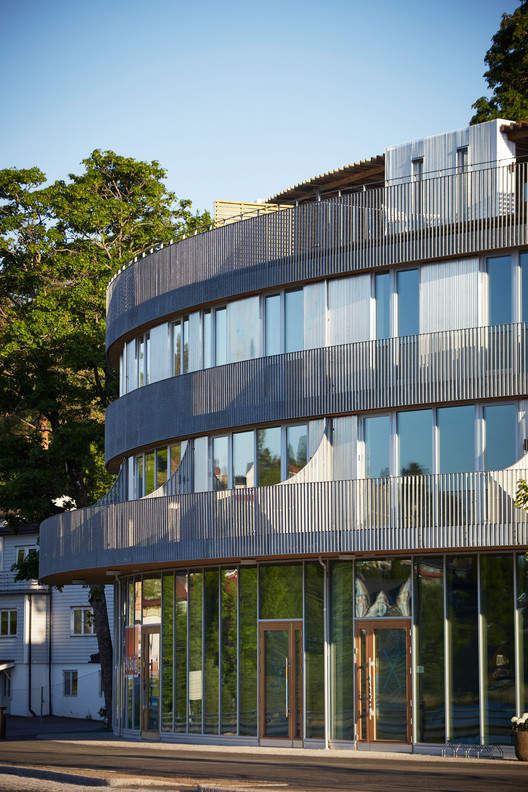
Towards a new model for multi-tenant buildings with an appealing philosophy As an important building type, multi-tenant projects would seem to present somewhat obvious issues for consideration. In practice, however, most projects end up placing top priority on profit maximization and the optimization of floor area. In addition, these buildings often incorporate elements that lead to superficial architecture. Nevertheless, for this project we attempted to rethink the possibilities of a multi-tenant building that would embody an appealing contemporary philosophy while taking into account such routine considerations. This project is situated in a largely residential area that lies about 1km north of the train station, distinguished by a large number of plots of land that are exceptionally long in relation to their frontage. The site for this project, too, was anarrow, slender plot with a frontage of about 10m and a depth of 50m in relation to the road out front, surrounded onthree sides by neighbouring residences. Typically, such a site tends to lead to a situation where the tenant space facing the road out front is blessed with more favourable conditions compared to the other spaces. With this in mind, we tried to work out spatial principles that would allow us to give the inner spaces additional advantages that would equal or surpass the conditions of the front space.
具体而言,该项目涉及一楼的牙科诊所,二楼的美容院和办公室。这些设施设在两个朝东和西方向的箱子里,中间有第三个箱子,里面有楼梯和森林。这种盒子布局所形成的四面墙是为了在建筑中创造一种综合多样性的感觉,这要归功于盒子之间的分层开口。
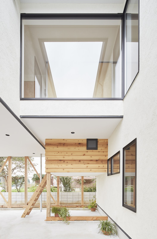
Layered diversity Specifically, this project involved a dental clinic on the first floor and an esthetic salon and office on the second floor. These facilities were housed in two boxes oriented towards the east and west, with a third box in the middle containing a staircase and a forest. The four walls formed by this layout of boxes were designed to create a sense of integrated diversity in the architecture, thanks to the layered openings in between the boxes.
Courtesy of UID Architect
从规划阶段开始,租户也参与了决策过程。他们在决定如何设计室内空间方面发挥了积极的作用,并且能够理解整个建筑的框架。
Tenants were also involved in the decision-making process from the planning stage onwards. They took a proactive role in deciding how the interior spaces would be designed, and were able to understand the framework of the building as a whole.
这四层中每一层的正面和背面都有助于创造一个多样化、相互关联的空间。这些开口确保邻近住户的私隐,而定期开放及收紧这些开口,不但可让人知道楼面之间的垂直连系,以及前后间的水平连系,还可察觉另一种超越物理感觉的距离。此外,我们预计森林中的树木会使物理距离的层次变得模糊不清,创造一个以有机方式分布的整体环境。
The front and back surfaces of each of the four layers contribute to creating a diverse, interrelated space. The openings ensure the privacy of neighbouring tenants, while the opening and tightening of these openings at regular intervals allows one to be aware not only of vertical connections between floors and horizontal ones between front and back, but also another sort of distance that transcends physical sensations. In addition, we expected that the trees in the forest would cause layers of physical distance to become ambiguous, creating an overall environment that would spread out in an organic manner.
通过这样操作空间,前面的租户空间将从内部租户空间中分离出来,同时在各个层之后对其也保持可见。与此形成鲜明对比的是,位于前方空间之外的山景,感觉又近又熟悉。这样,就有可能保护每个租户的隐私,同时建造一个空间,保持这两个要素的有形存在,从而为内部租户提供与前沿空间同等有利的环境。一堵墙的功能既导致了一种由看似随机的开口所造成的多层次的必然感,也导致了由于房客的行动和行为而产生的复杂、随意的特征。这种必然性和偶然性的混合导致了一个新的、三维的扩展和一个多关节的空间。
By manipulating the space in this way, the front tenant space would be separated from the inner tenant space, while also remaining visible to it just beyond the various layers. The mountain scenery that lies beyond the front space, in contrast, feels close and familiar. In this way, it was possible to protect the privacy of each tenant while constructing a space that maintained the tangible presence of both these elements, thus providing the inner tenants with an environment that was equally favourable compared with the front space. The function of a single wall led to both a sense of necessity arising from the multiple layers created by the seemingly random openings, as well as a complex, haphazard character resulting from the movement and behaviour of the tenants. This mixture of necessity and contingency led to a new, three-dimensional expanse and a diversely articulated space.
Courtesy of UID Architect
 举报
举报
别默默的看了,快登录帮我评论一下吧!:)
注册
登录
更多评论
相关文章
-

描边风设计中,最容易犯的8种问题分析
2018年走过了四分之一,LOGO设计趋势也清晰了LOGO设计
-

描边风设计中,最容易犯的8种问题分析
2018年走过了四分之一,LOGO设计趋势也清晰了LOGO设计
-

描边风设计中,最容易犯的8种问题分析
2018年走过了四分之一,LOGO设计趋势也清晰了LOGO设计
hiroshi.ueda-mori%c3%85_hako_uid_04.jpg)

uid-mori%c3%85_hako_uid_09.jpg)

hiroshi.ueda-mori%c3%85_hako_uid_06.jpg)

hiroshi.ueda-mori%c3%85_hako_uid_11.jpg)


hiroshi.ueda-mori%c3%85_hako_uid_01.jpg)

hiroshi.ueda-mori%c3%85_hako_uid_02.jpg)

hiroshi.ueda-mori%c3%85_hako_uid_04.jpg)

uid-mori%c3%85_hako_uid_07.jpg)

hiroshi.ueda-mori%c3%85_hako_uid_06.jpg)

uid-mori%c3%85_hako_uid_09.jpg)

hiroshi.ueda-mori%c3%85_hako_uid_10.jpg)

hiroshi.ueda-mori%c3%85_hako_uid_11.jpg)


 PintereAI


