Classic but unique Dutch architecture styles exemplified in stunning Frans Halsstraat building
2019-03-15 17:32
Smack in the middle of the bustling city of Amsterdam, in The Netherlands, a towering residential project called Frans Halsstraat has been built by Cantero Architecture to show off classic styles of historical Dutch architecture, but this time blended in unique ways with slightly more modern aesthetics.
在荷兰繁华的阿姆斯特丹市中心,坎特罗建筑公司(Cantero Architecture)建造了一个名为Frans Halsstraat的高耸住宅项目,以展示荷兰历史建筑的经典风格,但这一次,它以独特的方式与略显现代的美学融合在一起。
Originally, this building was an old, more traditional set of homes and apartments. Standing tall in the stylish but older neighbourhood of Pijp, right in the centre of Amsterdam, the building was recently renovated to provide a series of more modern residential units that still boast some of the more historical styles in perfect harmony with updated features.
最初,这座建筑是一套古老的、更传统的住宅和公寓。这座建筑坐落在阿姆斯特丹市中心的皮耶普(Pijp)时尚但老旧的街区,最近进行了翻修,提供了一系列更现代的住宅单元,这些住宅单元仍以历史风格更为完美,与最新的特色完美和谐。
Typically, Dutch architecture has been characterized over time by spaces that are both deep and narrow, which is where the common local concept of a “through-flat” evolved from. In this type of apartment, a home can have two main sides that are connected through the middle to the front and back of the building. This gives designers two different opportunities to relate inner spaces aesthetically and physically to the exterior of the building on each side!
通常,随着时间的推移,荷兰建筑的特征是既深又窄的空间,这也是“穿透平面”这一共同的局部概念演变而来的地方。在这种类型的公寓,一个家庭可以有两个主要方面,通过中间连接到前面和后面的建筑物。这给设计师两种不同的机会,使室内空间在美学上和物理上与建筑两侧的外部联系起来!
In this case (since this building does feature classic through-flats), the front “compartment” of the units faces a calm, narrow public street where the public of the country’s capital city mills by. On the other side, each unit is afforded a view of a magnificent interior courtyard out the back of the building, featuring a stunning private garden with nice social seating for residents and visitors.
在这种情况下(因为这座建筑确实有经典的穿透式公寓),这些单元的前“隔间”面对着一条平静而狭窄的公共街道,在这里,这个国家的首都磨坊的公众通过。在另一边,每个单元都提供了一个宏伟的内部庭院的景观,外面的建筑物,以一个令人惊叹的私人花园为居民和游客提供良好的社交座位。
In the particular apartment you see in the photos, designers had to do a bit of spacial organizing before they could really get into the swing of things with the renovation. They first wanted to evaluate how they might make better use of the existing rooms on that floor before changing the space too drastically. They also wanted to examine whether they might integrate some clever storage space into certain living areas to give dwellers more places to put their belongings in order to reduce clutter.
在你在照片中看到的特定的公寓里,设计师们必须做一些空间的整理,才能真正进入装修的过程中。他们首先想要评估如何更好地利用该楼层的现有房间,然后才能大幅改变空间。他们还想研究是否可以将一些巧妙的存储空间整合到某些生活区,为居住者提供更多的地方放置他们的物品,以减少杂乱。
Besides great use of space, building a strong connection between interior and exterior areas was paramount for the design team. They wanted to capture the wonderful view the unit was afforded and bring that inside for the owners enjoyment as much as possible. This was achieved in the form of stunning windows that really serve to open the home up to natural light.
除了充分利用空间之外,在内部和外部区域之间建立牢固的联系对于设计团队来说也是至关重要的。他们想要捕捉到该单位提供的精彩景色,并将其带入室内,让业主尽可能地享受。这是以令人叹为观止的窗户的形式实现的,这些窗户真正地为家庭打开了通往自然光的大门。
Now that the renovation is completed, most rooms in the house appear to revolve around or be organized according to the “oak heart” of the house. This “heart” is a big, shared walk-in closet that provides unparalleled storage and communicates a visual and spatial separation between two main bedrooms and more social or public rooms of the house.
现在装修已经完成了,房子里的大多数房间似乎都是围绕或按照房子的“橡木心”组织起来的。这个“心脏”是一个巨大的、共享的步入式壁橱,它提供了无与伦比的存储空间,并在两间主要卧室和更多的社交或公共房间之间进行了视觉和空间上的隔离。
The wooden closet piece is almost like an experience in itself. When you step into it, you feel as though you’re in a completely separate, entirely wooden structure, the aesthetic of which is only interrupted by natural light flooding in from overhead. Both the inside and outside of this central wooden structure feature storage cubbies and spots, some of which the owners described as “hidden and unexpected”.
木制壁橱本身就像是一种体验。当你走进它的时候,你会觉得自己是在一个完全独立的,完全木制的结构中,它的美学只会被天光从头顶注入的自然光线所打断。中央木结构的内部和外部都有储存小方块和点的特点,其中一些主人描述为“隐藏的和意想不到的”。
Also down the centre of the core is a metal-framed glass corridor. This is where the entrances to the different rooms in the home lie, making one’s movement throughout the unit feel almost entirely continuous. There is also a section where the space you’re walking through appears to open entirely to the outdoors despite actually being enclose, blending interiors and exteriors once more.
同样在核心的中心是一个金属框架玻璃走廊。这是入口处的不同房间在家中,使一个人的行动,使整个单位感觉几乎完全连续。也有一个部分,你走过的空间似乎完全开放到户外,尽管实际上是封闭的,内部和外部再次融合。
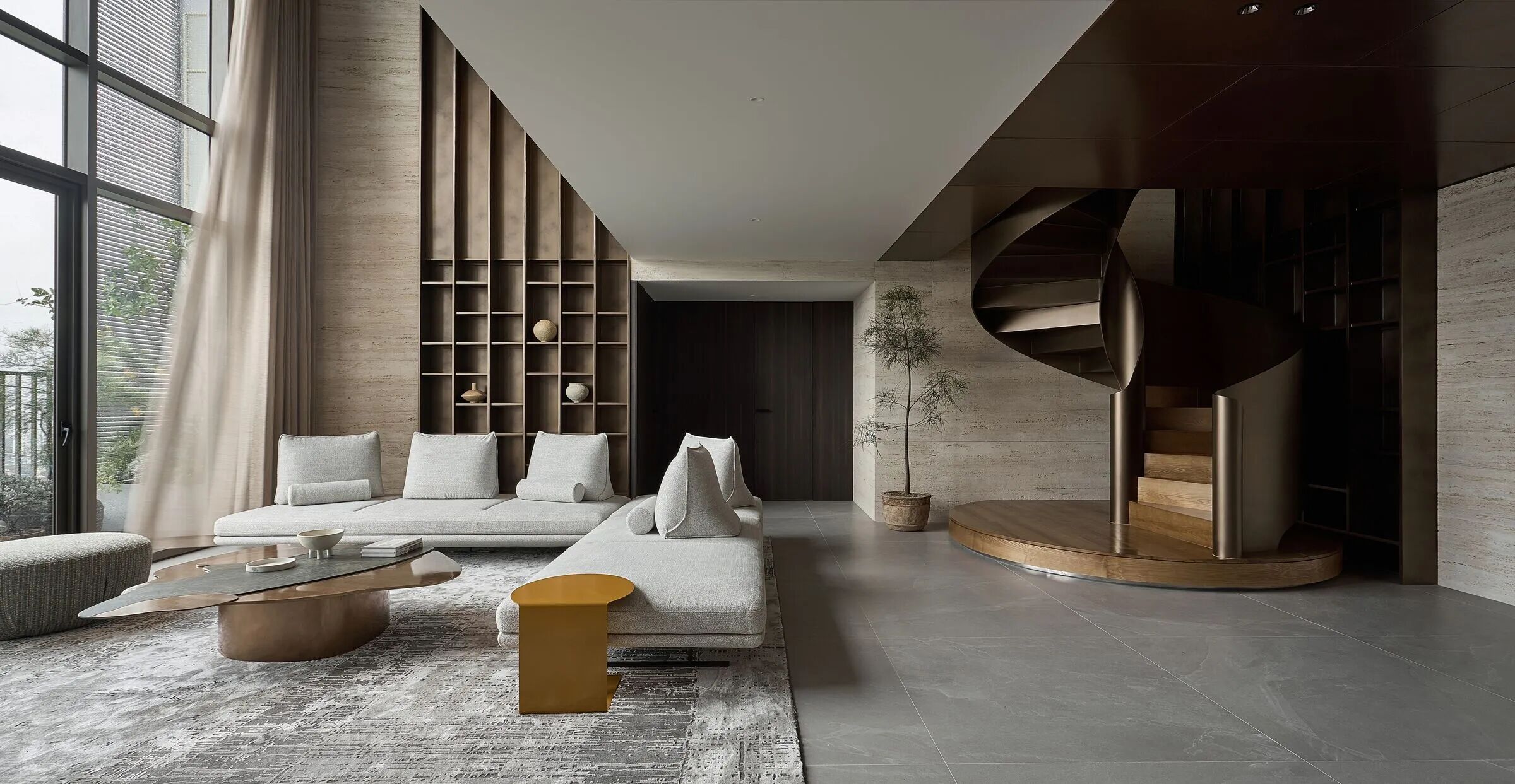
Even the colour contrasts happening within the space appear to open things up a little bit. The way that stark white walls play against dark flooring visually creates space and makes rooms feel more limitless. Designers also played with texture in most rooms, alternating between natural oak furniture and sophisticated matte black or brushed bronzed details and surfaces.
即使是在空间内发生的颜色对比,似乎也会打开一些东西。严酷的白色墙壁在黑色地板上的作用在视觉上创造了空间,使房间感觉更加无限。设计师们还在大多数房间里使用质感,在天然橡木家具和复杂的镀铜黑色或刷过的青铜细节和表面之间交替。
The final touches were added in the bathroom, of all place, but the thought process actually makes a lot of sense! This is where designers wanted residents to be able to relax, concentrate on self care, and seek a sense of wholeness and calm. In the bathroom, you’ll see warm wood featured alongside blue ceramic tiles, while natural lava stone basins add a peaceful element like the kind you might expect in a spa!
最后的触摸是在浴室里添加的,所有的地方,但是思考的过程实际上是很有意义的!这是设计师希望居民能够放松,专注于自我照顾,并寻求一种完整和平静的感觉。在浴室里,你会看到温暖的木头和蓝色的瓷砖一起,而天然的熔岩石盆添加了一种和平的元素,就像你在水疗中心所期望的那样!
 举报
举报
别默默的看了,快登录帮我评论一下吧!:)
注册
登录
更多评论
相关文章
-

描边风设计中,最容易犯的8种问题分析
2018年走过了四分之一,LOGO设计趋势也清晰了LOGO设计
-

描边风设计中,最容易犯的8种问题分析
2018年走过了四分之一,LOGO设计趋势也清晰了LOGO设计
-

描边风设计中,最容易犯的8种问题分析
2018年走过了四分之一,LOGO设计趋势也清晰了LOGO设计


 PintereAI


