Montreal home La Cardinale renovated by L. McComber to bring it back to life after years of young kids and extensions
2019-04-15 17:22
In the Ville-Saint-Laurent neighbourhood of Montreal, Canada, innovative designers at L. McComber recently completed heavy renovations on a semi-detached Tudor home called La Cardinale, bringing it back to life after years of loving wear and tear.
Originally built in the 1950s, the house was long a home for young families with many children. It underwent several extensions without update to the old, main house, limiting the light that enters from outside and causing a disconnect in aesthetic and materiality. Once the children of the final owners had grown up and begun lives elsewhere, the decision was made to give the space a completely new look.
这座房子最初建于20世纪50年代,长期以来一直是有许多孩子的年轻家庭的家。它经历了几次扩展,没有更新到老的,主要的房子,限制了光线从外面进入,并造成在审美和物质上的脱节。一旦最终主人的孩子长大并开始在其他地方生活,他们就决定给这个地方一个全新的面貌。
From the start, efforts were made to preserve some of the original Tudor charm that came with the house itself. Sure, updating and a facelift were necessary, but elements of the facade were untouched and already stunning, so it was agreed that they would be kept despite other structural and aesthetic changes taking place elsewhere.
从一开始,人们就努力保持独当一面的魅力,这是随着房子本身而来的。当然,更新和整容是必要的,但外观的元素没有被触及,已经令人震惊,因此人们一致认为,尽管其他地方正在发生其他结构和美学上的变化,它们仍将保持不变。
First, old, slightly more clumsy extensions were removed from where they blocked sunlight entirely from entering the back of the house. New extensions were rebuilt, but they were strategically place to extend where they might connected already existing parts of the original building, rather than sticking so far out the back that the sunlight and yard disappeared.
首先,旧的,稍显笨拙的延伸被移除,从那里他们完全阻挡阳光进入房子的后面。新的扩建被重建,但它们是战略上延伸的地方,他们可能连接的地方,已经存在的部分,原来的建筑,而不是贴在太远的背后,阳光和庭院消失。
Materiality was considered heavily in this process; original elements like plaster, stone, and red brick were kept but black geometric metal framing near windows and black sheet metal cladding were added to improve curability or energy efficiency. They contrast well with the light grey walls elsewhere, creating a sense of added modernity to the more classic facade. In certain places, pops of more contemporary colour were painted for personality.
Inside, the new extensions enabled designers to build a much more open concept layout where previous, older extensions had actually broken up the house a little and created more walls. This theme continues outside now as well, as a brand new black deck extends the kitchen right into the yard when the lovely, large glass door is opened entirely.
在内部,新的扩展使设计师能够建立一个更开放的概念布局,以前,旧的扩展实际上已经打破了房子一点,创造了更多的墙壁。这个主题现在也在外面继续,因为一个全新的黑色甲板把厨房延伸到院子里,这时可爱的大玻璃门被完全打开了。
Despite the main living spaces and the yard making for a nearly entirely open plan ground floor, some delineation of space still exists so that the home feels sensical and organized. The large kitchen island is a great example of this; it marks a change in function from room to room without cutting off conversation and social time.
尽管主要的居住空间和院子构成了一个几乎完全开放的平面图底层,但一些空间的划定仍然存在,使家庭感觉到耸人听闻和有条理。大厨房岛就是一个很好的例子,它标志着从一个房间到另一个房间的功能变化,而没有中断谈话和社交时间。
Between both floors of the house, unnecessarily filled space has been opened up to create a double-height open area above the living and social spaces below. This makes the whole house feel opened out but without losing the privacy of the intimate areas above. Instead of being fully closed off, a simple corridor along one side of the double-height space leads to the master bedroom and its ensuite bathroom.
在这两个楼层之间,已经打开了不必要的填充空间,以在下面的生活和社会空间之上创建高度开放的区域。这使得整个房子都被打开了,但没有失去上述私密区域的隐私。而不是完全关闭,沿着双高空间一边的一条简单的走廊通向主卧室和卧室的浴室。
This corridor is actually quite an experience to walk down because it’s fully opened, making it feel like you’re traveling across a bridge to reach the deep, relaxing bath. On one side of this corridor the owners are afforded a view of the lovely backyard from big, clear windows. On the other side, they can see right down into the main social areas.
这条走廊实际上是一个很好的体验,因为它是完全开放的,它让你觉得你正穿越一座桥到达深而放松的浴缸。在这条走廊的一侧,屋主可以从大而透明的窗户看到可爱的后院。另一方面,他们可以直接看到主要的社会领域。
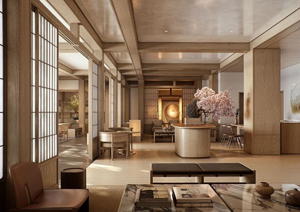
Although the grand and rather rich looking exterior of the house was largely preserved for traditional style, the inside of the house now looks much more simplistic and neatly pleasant in terms of colour and materiality. It’s clean, white overarching palette is minimalist but elegant, like much of the decor, while floors, cabinets, and other details provide a sense of warmth thanks to their stained red oak panelling. A subtle sense of contemporary sophistication comes through in the black and white marbling of the countertops and bathroom finishes.
虽然这座房子的外表宏伟而富饶,大部分都保留了传统风格,但从色彩和物质性的角度来看,这座房子的内部现在看上去更简单,也更整洁宜人。它干净,白色的总体调色板是极简,但优雅,就像许多装饰,而地板,橱柜和其他细节提供温暖的感觉,因为他们的染红橡木板。在台面和浴室饰面的黑白大理石花纹中,有一种微妙的当代复杂感。
Photos by Raphaël Thibodeau
 举报
举报
别默默的看了,快登录帮我评论一下吧!:)
注册
登录
更多评论
相关文章
-

描边风设计中,最容易犯的8种问题分析
2018年走过了四分之一,LOGO设计趋势也清晰了LOGO设计
-

描边风设计中,最容易犯的8种问题分析
2018年走过了四分之一,LOGO设计趋势也清晰了LOGO设计
-

描边风设计中,最容易犯的8种问题分析
2018年走过了四分之一,LOGO设计趋势也清晰了LOGO设计


 PintereAI


