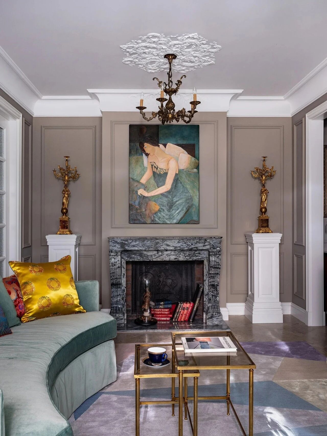
Casa Atrium in São Paulo / Isay Weinfeld Architect
2019-01-10 21:45
Project: Casa Atrium Architects: Isay Weinfeld Collaborator Architects: Domingos Pascali, Marcelo Alvarenga, Katherina Ortner, Sebastian Murr Project Manager: Monica Cappa Design Team: Juliana Scalizi Location: São Paulo, Brazil Built Area: 2.079 m² Year 2014 Photography: Fernando Guerra
项目:Casa Atrium建筑师:Isay Weinfeld合作者建筑师:Domingos Pascali,Marcelo Alvarenga,Katherina Ortner,Sebastian Murr项目经理:Monica Cappa设计团队:Juliana Scalizi地点:巴西圣保罗:2014年摄影:费尔南多·格拉
Text description by Isay Weinfeld: Casa Atrium is located on a rectangular and flat lot, which cuts through the block transversally from one street to the next, in a residential area of São Paulo.
伊赛·温菲尔德(Isay Weinfeld)的文字描述:Casa Atrium位于一片长方形和平坦的土地上,从一条街道横贯该街区至另一条街道,位于圣保罗的一个居民区。
In addition to the client’s (extensive) program, two factors were decisive in defining the set-out of the house and how the spaces would be organized. The first was the existence of a tree the clients wanted to preserve. The second, a norm from the Zoning Text in force, allowing for the occupation of the lot across its whole width.
除了客户的(广泛的)计划之外,有两个因素决定了房子的设置和空间的组织方式。首先是客户想要保存的一棵树的存在。第二,现行分区文本的规范,允许占用整个地段的宽度。
Therefore, from the limits defined by the setbacks and the side boundaries of the lot, we defined the so-called lot coverage area. Instead of occupying it fully, nonetheless, we chose to distribute the program in narrow strips along its perimeter, as to leave a generous garden in the center – actually, a garden with a jagged contour, resulting from the greater or lesser projection of those strips, according to the need/rooms contained therein.
因此,从受挫折和批次的侧边界所定义的限制出发,我们定义了所谓的批次覆盖区域。然而,我们不是完全占领了它,而是选择沿着它的周边在狭窄地带分发这个项目,以便在中心留下一个慷慨的花园--实际上,一个具有锯齿状轮廓的花园,根据其中所载的需要,由这些条的更大或更小的投影产生。
The upper floor, not by coincidence, follows exactly the same contour as the garden along its internal perimeter, accentuating the irregular shape of the inner court. The facades facing that court, by the way, feature louvered sliding doors combined to fixed louvered panels covering their whole extension, thus creating alternating surfaces and hollows when the doors are open, or a uniform and continuous louvered surface, when closed. In contrast to that dynamism, the walls seen from either street – front or rear – are completely blind. They won’t give away or anticipate any detail about the house. One has to cross its threshold to discover it and realize, ato ne glane and almost in amazement, the depth of the plot through rooms, verandas and gardens, without any obstruction.
上面的楼层,不是巧合,沿着其内部的周长与花园的轮廓完全相同,突出了内部庭院的不规则形状。顺便说一句,该法院的正面采用百叶窗滑动门,并将其与覆盖其整个延伸部分的固定百叶窗板相结合,从而在门打开时形成交替的表面和空隙,或在关闭时形成均匀和连续的百叶窗表面。与这种动态形成对比的是,无论是前面还是后面的墙壁都是完全盲目的。他们不会透露或预料到房子的任何细节。一个人必须越过它的门槛去发现它,并意识到,几乎在惊奇中,情节的深度通过房间,阳台和花园,没有任何障碍。
 举报
举报
别默默的看了,快登录帮我评论一下吧!:)
注册
登录
更多评论
相关文章
-

描边风设计中,最容易犯的8种问题分析
2018年走过了四分之一,LOGO设计趋势也清晰了LOGO设计
-

描边风设计中,最容易犯的8种问题分析
2018年走过了四分之一,LOGO设计趋势也清晰了LOGO设计
-

描边风设计中,最容易犯的8种问题分析
2018年走过了四分之一,LOGO设计趋势也清晰了LOGO设计


