Easy and Minimalist Living Style: White House by AD Architecture
2018-09-25 12:07
Design Company: AD Architecture Project Name: A White House ∣ Easy and Minimalist Living Style Chief Designer: Xie Peihe. Project Team: Ji Jianan, Zhou Qian, Zhu Jie Project Location: Shantou City, Guangdong, China Construction Area: 90 m2 Main Materials: KD board, ceramic tile, gray glass, stone, matt white paint, wood floor Completion date: January 2018 Photographer: Ouyang Yun
设计公司:广告建筑项目名称:一位白宫简约的生活风格首席设计师:谢培和。项目组:吉建安,周谦,朱杰项目所在地:广东省汕头市建设区:90平方米主要材料:KD板、瓷砖、灰玻璃、石材、透光白漆、木地板竣工日期:2018年1月摄影师:欧阳云
This white house is located in a community that is far away from the downtown and rural area. Here we can see a large farmland and a branch of Han River outside the window. In terms of design, our philosophy is to create a minimalist white house with the simplicity and purity of black, white and gray, so that people can enjoy the air, the sun and the scenery, and embrace the nature in a place that is only 90 square meters. In general, the house takes a very low-key color scheme of black, white and gray to build textured spaces. The design focuses on “white” in a restrained manner, which balances the strong contrast between black and white boundaries.
这座白宫位于远离市中心和农村地区的社区。在这里,我们可以看到窗外有一大片农田和一条汉江支流。在设计上,我们的理念是创造一座简约、纯正的黑白灰白房子,让人们在一个只有90平方米的地方享受到空气、阳光和风景,拥抱大自然。一般来说,房子采用非常低调的黑色,白色和灰色的配色方案来建立纹理空间。设计的重点是“白色”以一种克制的方式,这平衡了黑白边界之间的强烈对比。
The overall layout perfectly integrates the Eastern and Western design philosophies and interprets an extremely pure modern minimalist living style. The public areas (dining room, living room and kitchen) are very coherent, giving the small apartment a sense of spaciousness. The lines in different places are in good proportion, simple yet elegant. The large windows frame the most beautiful scenery; the bright light passes through the soft curtains, bringing pleasure into life.
整体布局完美地融合了东西方的设计理念,诠释了一种极纯的现代极简主义生活方式。公共区域(餐厅、客厅和厨房)非常协调,给小公寓一种宽敞的感觉。不同地方的线条比例很好,简约而优雅。大窗户构成最美的风景,明亮的光线穿过柔和的窗帘,给生活带来乐趣。
Owing to the reflection of natural light, the matt white paints and marbles divide the space into several layers, in addition to a carefully considered lighting layout, the space has a unique glamour of light and shadow. Leathers, woods, ceramic tiles, gray glasses and other different materials are cleverly collocated, enhancing the temperament and style in the space.
由于自然光的反射,马特白色的油漆和大理石把空间分成几层,除了仔细考虑的照明布局之外,该空间还具有独特的光影魅力。皮革、木材、瓷砖、灰镜等不同材质巧妙搭配,增强了空间的气质和风格。
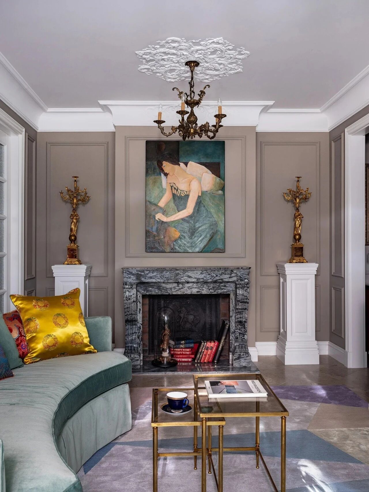
In the living room, the TV background is decorated with black and white, and the ground is in light gray, moreover, white is applied in a large area of the space, together they achieve a simple and bright effect. The gray woody feel penetrates inside and adds warmth into the white and clean space. As the main background of the overall space, white is used to highlight the details and softness of the furniture, reflecting the owner’s pursuit of quality. The customized decorative painting—“listening to the tide” that is on the back of the sofa further highlights the mood created by this home. Sitting here with a cup of coffee and a good book is the life state we want. The chic metal objects inadvertently reveal the owner’s style and taste. The quietness and artistic temperament make people immerse themselves into this concise and smart atmosphere.
在客厅里,电视背景是黑白装饰的,地面是浅灰色的,而且白色被应用在大面积的空间中,共同达到了简单明亮的效果。灰色的木质感觉渗透到里面,为白色和干净的空间增添了温暖。作为整体空间的主要背景,白色被用来突出家具的细节和柔软性,反映主人对质量的追求。这幅定制的装饰画-“倾听潮流”,那是在沙发的背面,进一步凸显了这个家所创造的气氛。坐在这里喝杯咖啡和一本好书是我们想要的生活状态。别致的金属物品无意中暴露了主人的风格和品味。宁静和艺术气质使人们沉浸在这种简洁而巧妙的氛围中。
Black marbles are applied on the surfaces and walls of the kitchen, such strong contrast enriches the layering sense in the space.
黑色大理石被应用在厨房的表面和墙壁上,这种强烈的对比丰富了空间中的分层感。
Glass partition is used between the children’s room and dining room, which effectively increases the spatial feeling and brightness of the children’s room.
在儿童房间和餐厅之间采用玻璃隔墙,有效地增加了儿童房间的空间感和亮度。
Minimalism is a kind of complex. The design team abandoned too many complicated designs, opposed stereotyped forms without piling up objects, but making life simpler, so as to pursue a more suitable living environment. We think we should enjoy this space and let it make us feel relaxed and happy.
极简主义是一种复杂的东西。设计团队放弃了太多复杂的设计,反对刻板印象而不堆叠物体,使生活变得更简单,以追求更适合的生活环境。我们认为我们应该享受这个空间,让它让我们感到轻松和快乐。
 举报
举报
别默默的看了,快登录帮我评论一下吧!:)
注册
登录
更多评论
相关文章
-

描边风设计中,最容易犯的8种问题分析
2018年走过了四分之一,LOGO设计趋势也清晰了LOGO设计
-

描边风设计中,最容易犯的8种问题分析
2018年走过了四分之一,LOGO设计趋势也清晰了LOGO设计
-

描边风设计中,最容易犯的8种问题分析
2018年走过了四分之一,LOGO设计趋势也清晰了LOGO设计


