Scenic Ballade Apartment / HAO Design
2018-07-27 20:34
Designer: HAO Design Project: Scenic Ballade Apartment Location: Kaohsiung city, Taiwan Area: 165.0 m2 Year: 2016 Photographer: Hey!Cheese
设计人:豪设计项目:风景园林公寓位置:高雄市,台湾地区:165.0平方米年:2016摄影师:嗨!奶酪
A better understanding of our clients’ tastes enables us to more clearly envision what they need within their homes. In this particular case, the client, who yearned to live in a home with an expansive park view, contacted us during the pre-sale stage of an apartment in a new building to be constructed in the city of Pingtung and requested assistance for the design of their home. Mr. and Mrs. Hsu are very fond of the classic style, while their children prefer simple yet stylish decor. We endeavored to find middle ground by taking into account the different needs of each individual so as to formulate an all-encompassing design. This was how we proceeded: we started by identifying the apartment’s strength, which is the beautiful park scenery just outside the window, and we considered how the Hsu family would enjoy it from all angles of their home. At the same time we attempted to fulfill everybody’s needs in terms of their preferences for style.
更好地了解客户的口味,使我们能够更清楚地想象他们在家里需要什么。在这个特别的案例中,渴望住在一个广阔的公园景观的房子里的客户,在屏东市一栋新建筑的预售期,联系了我们,并要求我们为他们的住宅设计提供帮助。徐先生和徐太太非常喜欢古典风格,而他们的孩子更喜欢简朴而又时尚的装饰。我们努力通过考虑每个人的不同需求来找到中间的位置,以便制定一个包罗万象的设计方案。我们就是这样做的,我们先找出公寓的实力,这是窗外美丽的公园风光,我们从家里的各个角度来考虑徐家乐的感受。同时,我们试图满足每个人的需求,从他们的喜好风格。
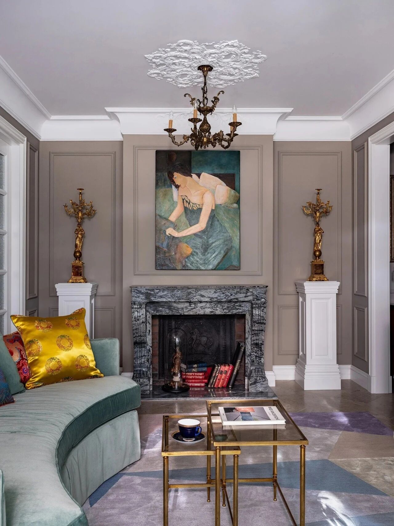
Even though the “classic style” is typically associated with the complex and resplendent, we selected the spectacular view outside the window as our point of departure and gradually veered toward the decision to leave the entire interior space “blank.” That is to say, we proposed to create an environment of serenity and comfort by employing pure white as the primary backdrop. To elegantly exhibit aspects of classical design, we utilized symbolic elements and simplified the complex lines by interpreting classical beauty with a modern approach. We chose white as the background color of the living room wall, to which we added European-style cornices. The original black window frames were replaced by round, arched windows in order to soften the space and to form a visual reference. We strategically arranged the placement of the dining table, lamps, sofas, all the way to the window seat, in a way so that they form a visual continuity extending toward the scenery outside the window.
尽管“古典风格”通常与复杂和辉煌相关联,但我们选择了窗外的壮观景色作为出发点,并逐渐转向决定将整个室内空间保留为“空白”。也就是说,我们建议以纯白为主要背景,创造一种宁静舒适的环境。为了更好地展示古典设计的各个方面,我们运用符号元素,用现代的方法诠释古典美,简化了复杂的线条。我们选择了白色作为客厅墙壁的背景颜色,并在此基础上添加了欧式的飞檐。原来的黑色窗框被圆形拱形窗户取代,以软化空间,形成视觉参照。我们战略性地安排了餐桌、灯、沙发的摆放,一直到靠窗的座位,这样它们就形成了向窗外风景延伸的视觉连续性。
In the original layout of the Scenic Ballade apartment, the kitchen faced south; we altered the floor plan by creating an open space combining the kitchen with the living room. We additionally installed a kitchen island to facilitate the preparation of cooking ingredients. In consideration of Mrs. Hsu’s baking interests, we also designed a simple yet spacious cabinet, which not only provides ample storage but moreover adds a touch of elegance to the overall environment. With respect to the north side of the apartment facing the window, we designed a personal space for Mr. Hsu that accommodates his reading needs and his habits of watching TV and listening to music.We defined the space of the “study” using a heavyweight armchair and designed a stainless steel TV wall which automatically rotates 360°and a side section that provides storage for headphones, magazines and other beloved objects. Thanks to the chair with a foot bath we purposefully installed, Mr. Hsu will be able to fulfill his dreams of enjoying the scenery inside of the small adjacent balcony without suffering from the winter cold.
在风景舞厅原来的布局中,厨房朝南,我们改变了平面图,把厨房和客厅结合起来。此外,我们还安装了一个厨房岛,以方便烹饪原料的准备。考虑到徐太太对烘焙的兴趣,我们还设计了一个简单而宽敞的橱柜,不仅提供了充足的储藏空间,而且还为整体环境增添了一点优雅。在面对窗户的公寓北侧,我们为徐先生设计了一个个人空间,以满足他的阅读需求以及他看电视和听音乐的习惯,我们用一把重量级扶手椅定义了“书房”的空间,并设计了一个自动旋转360°的不锈钢电视墙和一个为耳机、杂志和其他心爱物品提供存储空间的侧面。多亏了我们特意安装的带脚浴的椅子,许先生才能实现自己的梦想,在毗邻的小阳台上享受风景,而不受寒冬的影响。
The common family space, which begins with the pleasant external scenery, is designed so that each individual may focus on their preferred pastimes yet at the same time interact and communicate with each other within an open space. Their bedrooms in turn serve as private enclosures each designed in their favorite styles. The master bedroom is a continuation of the white tonal backgrounds of the living room. The wooded floor however is tinted several shades darker to give warmth to the room.
共同的家庭空间,从宜人的外部风景开始,是为了让每个人都能专注于自己喜欢的娱乐活动,同时在一个开放的空间内相互交流和交流。他们的卧室反过来又成为私人住宅,每一间都设计成他们最喜欢的风格。主卧室是客厅白色色调背景的延续。然而,树木茂密的地板被染成了几个较暗的色调,以给房间带来温暖。
On the back wall of the bed and on the ceiling, we designed symbolic natural “leaf vein” patterns to resonate with the greenery outside the window and to mitigate the weight and presence of the low beams. For the bathroom, we decided on a combination of white stones and tiles with detailed embellishments such as lighting and metal trimming to accomplish an eclectic mix of casual and classical. As for the two secondary bedrooms, we proceeded according to the children’s unique personalities, which is why each door seems to lead into a distinctively furnished boutique hotel room. The boy’s room, furnished with leather and metal ornaments, manifests the staunch, virile and resolute character of a young man who is still somewhat introverted. The girl’s room on the other hand emits an ambiance of casual coziness with its cement textured backdrop and matching designer furniture. All of this ultimately culminates in a home in which each individual is able to locate their preferred space and place for comfort and contemplation.
在床的后壁和天花板上,我们设计了象征性的天然“叶脉”图案,以与窗外的绿色植物共鸣,减轻低矮梁的重量和存在。在浴室里,我们决定把白色的石头和瓷砖结合起来,用灯光和金属装饰等详细的装饰来完成休闲和古典的兼收并蓄的组合。至于两个次级卧室,我们按照孩子们独特的个性进行,这就是为什么每扇门似乎都通向一间家具独特的精品酒店房间。这个男孩的房间里装饰着皮革和金属饰物,体现了一个仍然有点内向的年轻人坚定、坚强和坚定的性格。另一方面,女孩的房间散发出一种随意舒适的氛围,它的水泥质地背景和配套的设计师家具。所有这一切最终在一个家庭中达到高潮,在这个家庭中,每个人都能够找到他们喜欢的空间和地方,以获得舒适和沉思。
 举报
举报
别默默的看了,快登录帮我评论一下吧!:)
注册
登录
更多评论
相关文章
-

描边风设计中,最容易犯的8种问题分析
2018年走过了四分之一,LOGO设计趋势也清晰了LOGO设计
-

描边风设计中,最容易犯的8种问题分析
2018年走过了四分之一,LOGO设计趋势也清晰了LOGO设计
-

描边风设计中,最容易犯的8种问题分析
2018年走过了四分之一,LOGO设计趋势也清晰了LOGO设计


