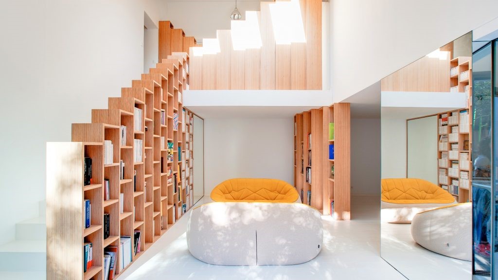
Micro House by Elizabeth Herrmann Architecture
2016-11-16 21:14
This micro house was designed by Elizabeth Herrmann Architecture Design. The house has an area of 40 square meters.
这座微型住宅是由伊丽莎白·赫尔曼建筑设计公司设计的。这所房子有40平方米的面积。
Project description: When an artist approached EH with the ambitious goal of creating a beautiful, tiny, energy-efficient house on a tight budget, she jumped at the opportunity. The project had all the ingredients of a good challenge along with many aspects of residential architecture she’d been eager to combine in a single dwelling. EH was particularly interested in creating a high-performance, micro house that took the dialogue to the next level and didn’t appear to be driven just by size and performance. Rather, she wanted to design a home that was first and foremost a lovely place to be, with all the variety and interest of a much larger home. It had to feel spacious in spite of its size (a mere 430 finished s.f. plus loft), and never feel like a claustrophobic box.
项目描述:当一位艺术家向EH提出一个雄心勃勃的目标,即在预算紧张的情况下创造一座漂亮、小、节能的房子时,她立刻抓住了这个机会。这个项目包含了一个很好的挑战的所有要素,以及她一直渴望在一个单独的住宅中结合的住宅建筑的许多方面。呃特别感兴趣的是创造一个高性能的,微型的房子,把对话提升到一个更高的层次,而不是仅仅被大小和性能所驱动。相反,她想要设计一个首先是一个可爱的地方的家,拥有一个更大的房子的多样性和趣味性。它必须感觉宽敞,尽管它的大小(仅仅430完成S.F。再加上阁楼),永远不会觉得自己像幽闭恐惧症的盒子。
The program was simple: a bathroom (tub, no shower), sleeping area, kitchen , clothing and household storage, dining/work table, living space that could double as guest sleeping, and a sleeping loft. So that the upstairs wouldn’t be cluttered, the program also included a full basement to store additional items, mechanical equipment and laundry machines. (A hatch door camouflaged to blend with the floor opens up easily for basement access.) Though open in plan,the living level was sculpted so that each of the different areas of use have definition and a sense of place, without being static or confining, and so that the house could comfortably accommodates visitors. Framed views help define interior spaces and give each “room” a distinctive focus with plenty of daylight and ventilation. The primary view at the heart of the house is Camel’s Hump, a Green Mountain peak, framed by a large, picture window.
这个程序很简单:一个浴室(浴缸,没有淋浴),睡眠区,厨房,衣服和家用储藏室,饭桌/工作表,可以作为客人睡觉的居住空间,和一个睡觉的阁楼。为了不把楼上弄得乱七八糟,这个项目还包括一个完整的地下室,用来存放额外的物品、机械设备和洗衣机。(一扇舱门经过伪装,与地板相融合,很容易打开地下室的入口。)虽然在计划中是开放的,但生活水平的塑造使得每一个不同的使用区域都有明确的定义和一种场所感,而不是静止的或受限的,这样房子就可以舒适地容纳游客。框架视图有助于定义内部空间,并给每个“房间”一个独特的焦点与充足的日光和通风。房子的中心部分是骆驼峰,这是一座绿色的山峰,由一扇大的画窗构成。
The intimacy of spaces called for a level of finish that could stand up to close scrutiny and heavy use, and like a boat, the house has a designated place for everything in order to maximize space and keep the interior uncluttered. The materials palette was kept simple and light in hue in order to make the interior feel fluid and spacious. Local maple floors cut in short lengths and laid perpendicular to the view give the floor a shimmering, water-like texture that makes it feel expansive and tranquil. Windows have a wood, shadow lined surround, a subtle detail to punctuate the openings without detracting from the view. Custom cabinets are white for the kitchen, birch plywood with expressed edges for wall storage and built-in daybed. The counter top and a bath ledge are white concrete. Outside, a light gray-stained, cedar rain screen milled for a shadow line wraps the house. The bright yellow door and red light fixture add pops of color in pure geometric shapes.
空间的亲密需要一定程度的完成,能够经得起严密的检查和大量使用,而且就像一艘船一样,房子有一个指定的地方容纳一切,以便最大限度地扩大空间,保持内部整洁。材料调色板保持简单和轻盈的色调,以使内部感觉流畅和宽敞。当地枫木地板剪短,铺设垂直于视野,给地板一个闪闪发光,水般的质地,使它感到膨胀和宁静。窗户有一个木头,阴影内衬的环绕,一个微妙的细节标点的开口,而不减损的看法。定制橱柜是白色的厨房,白桦树胶合板与表达边缘的墙壁存储和内置的白昼床。台面和浴台是白色的混凝土。屋外,一片淡灰色的雪松雨幕,为一条阴影线,包裹着房子.明亮的黄色门和红灯夹具添加了纯几何形状的颜色弹出。
It was important that the house, in spite of its size, contain those important transitional spaces that give one a sense of privacy, arrival, or simply a change in scale appropriate to use. For example, the bathroom does not open directly onto the living spaces but is approached through the built-in storage area. A corner was subtracted from the house footprint to form a welcoming front porch while also helping to shape the sleeping area on the inside, and the roof shape slopes so that the more private and intimate spaces, the bath and sleeping area, are contained under the lower part of the slope.
重要的是,房子,尽管它的大小,包含那些重要的过渡空间,给人一种隐私感,抵达,或只是一个规模的变化,适合使用。例如,浴室不直接打开到起居空间,而是通过内置的存储区接近。一个角落被从房子的脚印中减去,形成一个欢迎的前廊,同时也帮助塑造里面的睡眠区和屋顶形状的斜坡,使更多的私人和亲密的空间,浴室和睡眠区,包含在斜坡的下部。
Outside, the house is a kind of shape shifter. The subtracted corners at opposite ends– one to form the porch, the other the loft–create a playful sense of movement and interplay with people and landscape. It is an unpredictable house, but is also the logical and whimsical expression of its contents, its function, and views.
在外面,房子是一种变形器。在相反的两端减去角-一个用来形成门廊,另一个是阁楼-创造了一种有趣的运动感和与人和景观的相互作用。它是一个不可预知的房子,但也是它的内容、功能和观点的逻辑和异想天开的表达。
Thank you for reading this article!
 举报
举报
别默默的看了,快登录帮我评论一下吧!:)
注册
登录
更多评论
相关文章
-

描边风设计中,最容易犯的8种问题分析
2018年走过了四分之一,LOGO设计趋势也清晰了LOGO设计
-

描边风设计中,最容易犯的8种问题分析
2018年走过了四分之一,LOGO设计趋势也清晰了LOGO设计
-

描边风设计中,最容易犯的8种问题分析
2018年走过了四分之一,LOGO设计趋势也清晰了LOGO设计


 PintereAI


