Levent Apartment in Istanbul by COA Mimarlık
2017-01-04 20:57


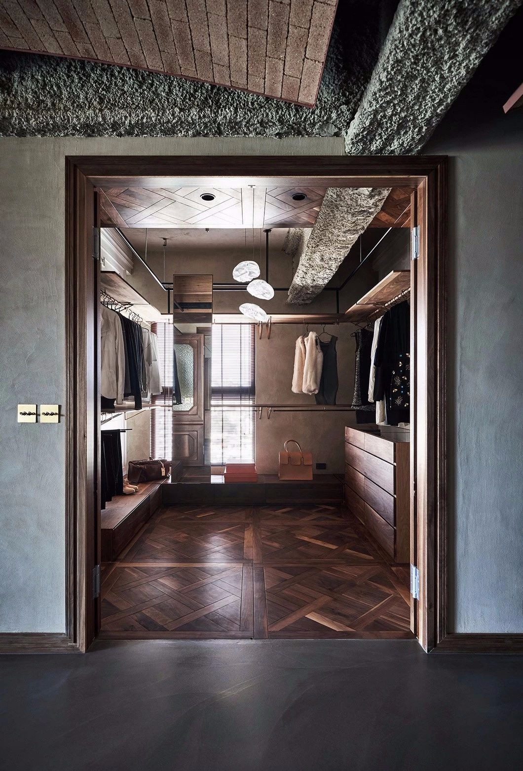
COA Mimarlık has designed Levent apartment for a newly married couple. The apartment is located in Istanbul, Turkey.
CoaMimarlık为一对新婚夫妇设计了LETE公寓。这套公寓位于土耳其伊斯坦布尔。
From the architect: The most important issue for us, was to understand the design taste, need, lifestyle, timetable and activities of the couple together as well as by person. After we summerized the couple well, we gave importance to match these datas with our interior design, products and materials to create spaces that truly fits them.
来自建筑师:最重要的问题,对我们来说,是了解设计品味,需要,生活方式,时间表和活动的夫妇在一起,以及通过个人。在我们很好地总结了这对夫妇之后,我们把这些数据与我们的室内设计、产品和材料相匹配,以创造真正适合他们的空间。


When the project came to us, the apartment looked super small with many doors and a corridor which also caused the bathroom, kitchen and bedroom have a dark atmosphere.
当这个项目来到我们这里的时候,公寓看起来很小,有很多门和一条走廊,这也造成了浴室、厨房和卧室都有一种黑暗的气氛。
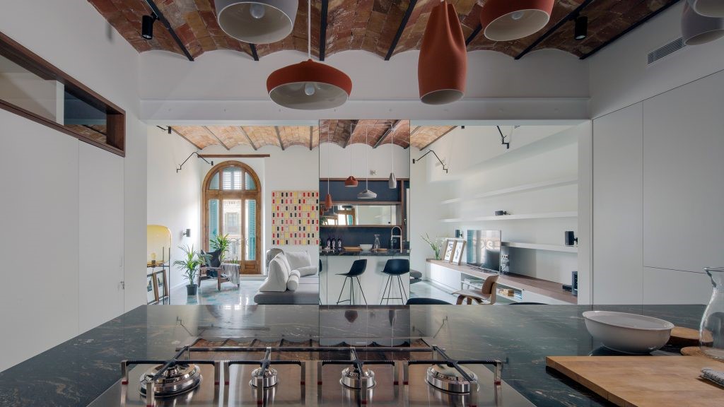
The building was really old so we decided to change all the asset electricity and drain. We destroyed some walls down especially from the corridor to take the daylight into the whole house and removed all the doors except the main bedroom and bathroom.
这座大楼太旧了,所以我们决定把所有的资产都换掉。我们摧毁了一些墙壁,特别是走廊的墙壁,将日光带入整个房子,除主卧室和浴室外,我们还拆除了所有的门。


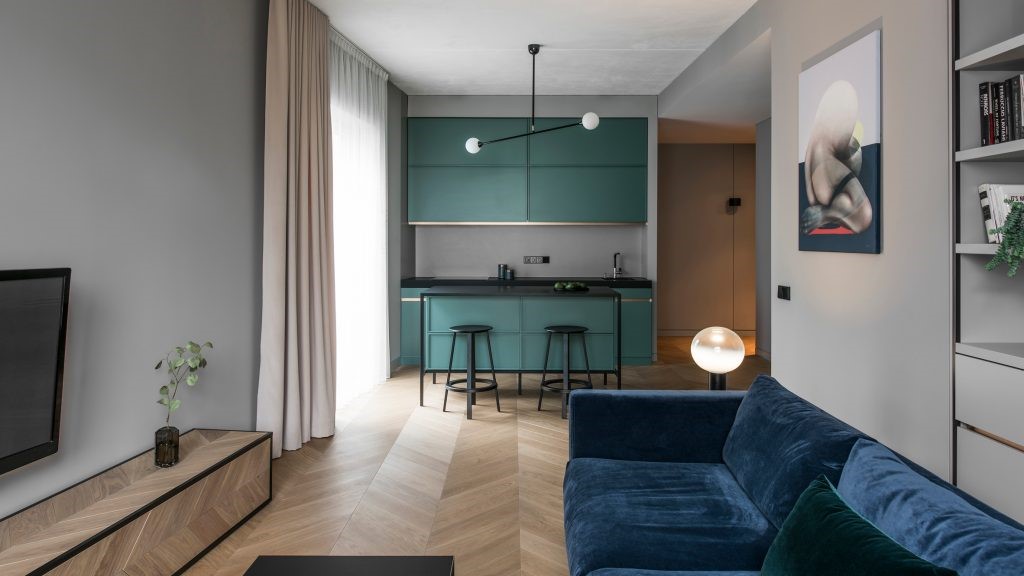
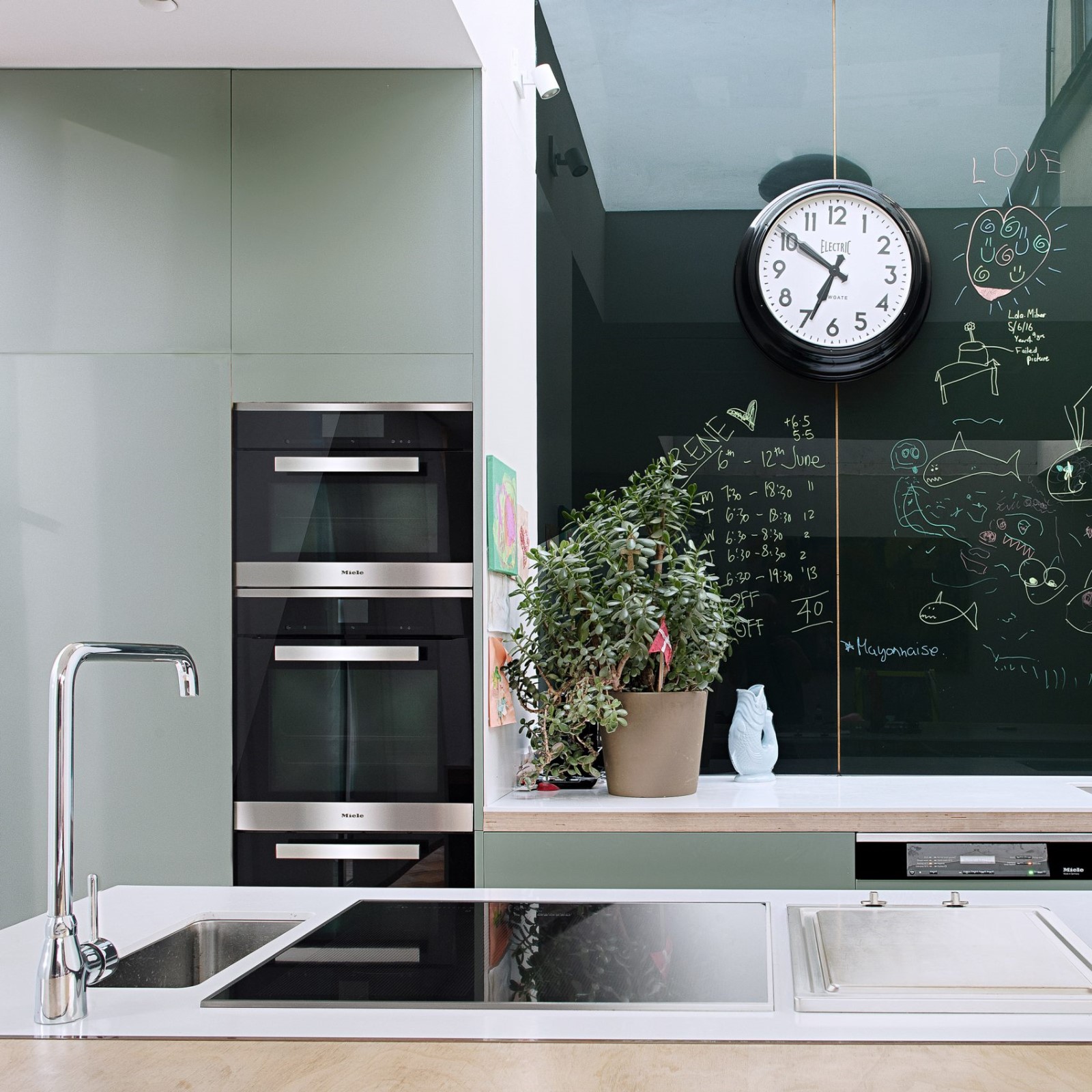
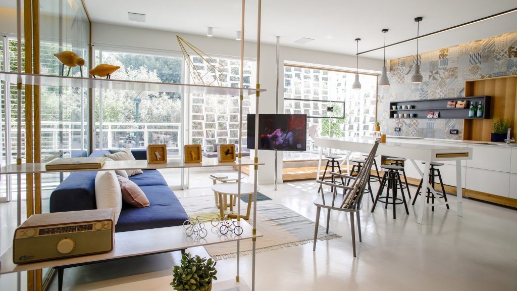
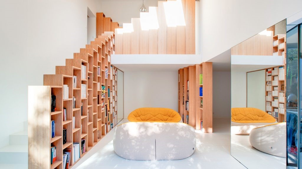
To show the spaces larger we used white in the whole house as main color and supported it with some specific colors in each room. Blue was used in the living room to add peace, yellow and black was added at the office area to add dinamizm, mint green was used at the bedroom to create a relaxing space. The bathroom was mainly designed in white from the walls to the furniture to look super clean and tidy.
为了显示更大的空间,我们在整个房子里用白色作为主颜色,并在每个房间里用一些特定的颜色支撑它。客厅里用蓝色来增加安宁,在办公室里加黄色和黑色来增加迪纳米兹,卧室里用薄荷绿来创造一个放松的空间。浴室主要是从墙壁到家具的白色设计,看起来非常干净和整洁。


We always tend to give a little independence to the customer by providing some space for them to personalize, redesign whenever they need. The tv unit was designed this way. Only the buttom cabinets and the vertical white structures are fixed, neither the racks nor the boxes aren’t. By this design, the customer can arrange the whole unit every time, in many ways. Also the wood panel with holes can provide various uses by plugging the wood pieces in.
我们总是倾向于给予客户一点独立性,为他们提供一些空间,让他们个性化,在他们需要的时候重新设计。电视机就是这样设计的。只有臀部的橱柜和垂直的白色结构是固定的,机架和盒子都不是固定的。通过这种设计,客户每次都可以多种方式安排整个单元。另外,带有孔的木板可以通过插入木片来提供各种用途。
Architects: COA Mimarlık Project: Levent apartment Project team: Cihan Atliman, Özlem Güler Atliman Location: Beşiktaş, Istanbul, Turkey Area: 78.0 m2 Project Year 2016 Photography: Alt Kat Photography
建筑师:CoA Mimarlık项目:伦敦公寓项目小组:Cihan Atliman,zlem Güler Atliman Location:BEşiktaş,伊斯坦布尔,土耳其地区:78.0平方米项目年2016摄影:Alt Kat摄影


Thank you for reading this article!
谢谢你阅读这篇文章!

 PintereAI


