The contemporary Apartment in New York, created by Crosby Studios, gives us a stunning case of the blues 在纽约的当代公寓,由克罗斯比工作室创造,给我们一个令人震惊的蓝色的例子。
2019-08-09 11:36
In the heart of Brooklyn, New York, innovative and artistic designers at Crosby Studios have renovated a small pre-war one bedroom space to make the impressive new Apartment in New York, notable for its contemporary style and pops of colour!
在纽约布鲁克林的中心地带,克罗斯比工作室的创新和艺术设计师们翻修了一个小的战前单卧室空间,以打造纽约令人印象深刻的新公寓,以其当代风格和流行色彩而闻名!
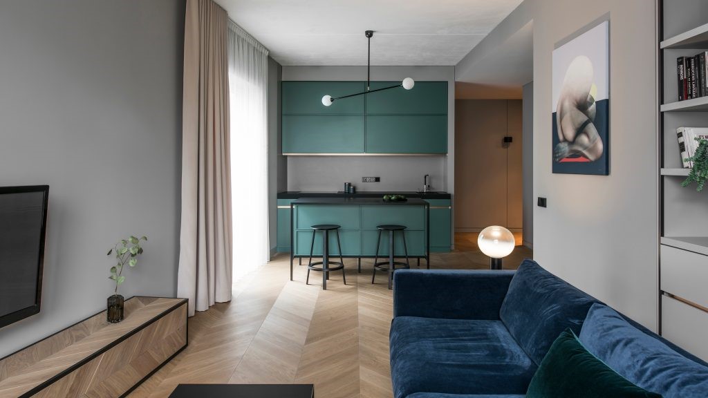
Of course, when one hears “pops of colour”, the mind might wander to a decor scheme featuring many bright colours at once. Instead, designers chose to make this home stand out for the way it communicates colour blocking through the use of a singular monochrome shade of royal blue in several eye catching stand out furnishings.
当然,当人们听到“颜色的突然变化”时,头脑可能会同时想到一种具有许多鲜艳色彩的装饰方案。相反,设计师们选择让这个家脱颖而出,因为它通过在几个引人注目的家具中使用一种单一的皇家蓝色单色色调来传达色彩。
Blue might be the standout colour, but contrast is never a bad thing, even when you’re attempting to heavily establish a particular theme. That’s why, amidst all the blue, several shades of lovely pink can be found subtly peeking out. A pink glass window between the living and dining rooms counteracts the blue section sofa, while a pink bouquet centrepiece on the dining table balances the blue of the chairs.
蓝色可能是最显眼的颜色,但对比从来都不是坏事,即使你试图建立一个特定的主题。这就是为什么,在所有的蓝色,几个颜色可爱的粉红色可以找到微妙的窥视。客厅和餐厅之间的一扇粉红色的玻璃窗抵消了蓝色的沙发,而餐桌上的粉红色花束则平衡了椅子的蓝色。
Shape and materiality are important within this decor scheme as well. Some pieces are quite linear and modular, like the stacked rectangular spinning chrome book shelf in that same light pink, while others are rounded and make of something unconventional, like the circular chandelier over the dining table made from ballpoint pens with blue caps on them that match the blue everywhere else.
在这种装饰方案中,形状和重要性也很重要。有些碎片是相当线性的和模块化的,就像堆叠的长方形旋转镀铬书架一样,粉红色,而另一些则是圆形的,制作出一些非传统的东西,就像圆形的枝形吊灯,上面的圆形枝形吊灯,上面有蓝色的帽子,上面的蓝色帽子与其他地方的蓝色相配。
Now, to blend the senses of pink and blue even further, the pink plexiglass window actually does more than just look unique within an otherwise stark white wall. It actually also balances the colours in the room by bathing it in a very subtle pink wash when the light hits the wall and passes through the glass. This gives everything inside a lovely rosy tone while still letting the blue pieces pop as they should.
现在,为了进一步融合粉红色和蓝色的感觉,粉红有机玻璃窗口实际上不仅仅是在一堵原本赤裸裸的白墙里看起来是独一无二的。它实际上也平衡了房间里的颜色,当光线照到墙上,穿过玻璃时,用非常微妙的粉红色洗澡来平衡房间的颜色。这给了里面的一切可爱的玫瑰色的色调,但仍然让蓝色的部分弹出,他们应该。
According to the designer, his colour choices were born out of a sense of loyalty to colours that he loves and that have served him well in past projects. He wanted to give each shade its chance to shine but also blend the ones he loves best in one place for even more visual appeal and cheerful atmosphere. The finishes and colours of accompanying details are chosen based on what suits the primary colours he has decided to work with best; that’s why you see more than one rose gold piece here.
根据设计师的说法,他的颜色选择源于对他所爱的颜色的忠诚感,并且在过去的项目中已经很好地服务了他。他想给每个人遮遮掩掩的机会,但也可以融合他最喜欢的一个地方,以获得更多的视觉吸引力和愉悦的气氛。伴随细节的完成和颜色是根据自己决定最适合工作的主要颜色来选择的;这就是为什么你在这里看到一个以上玫瑰金块的原因。
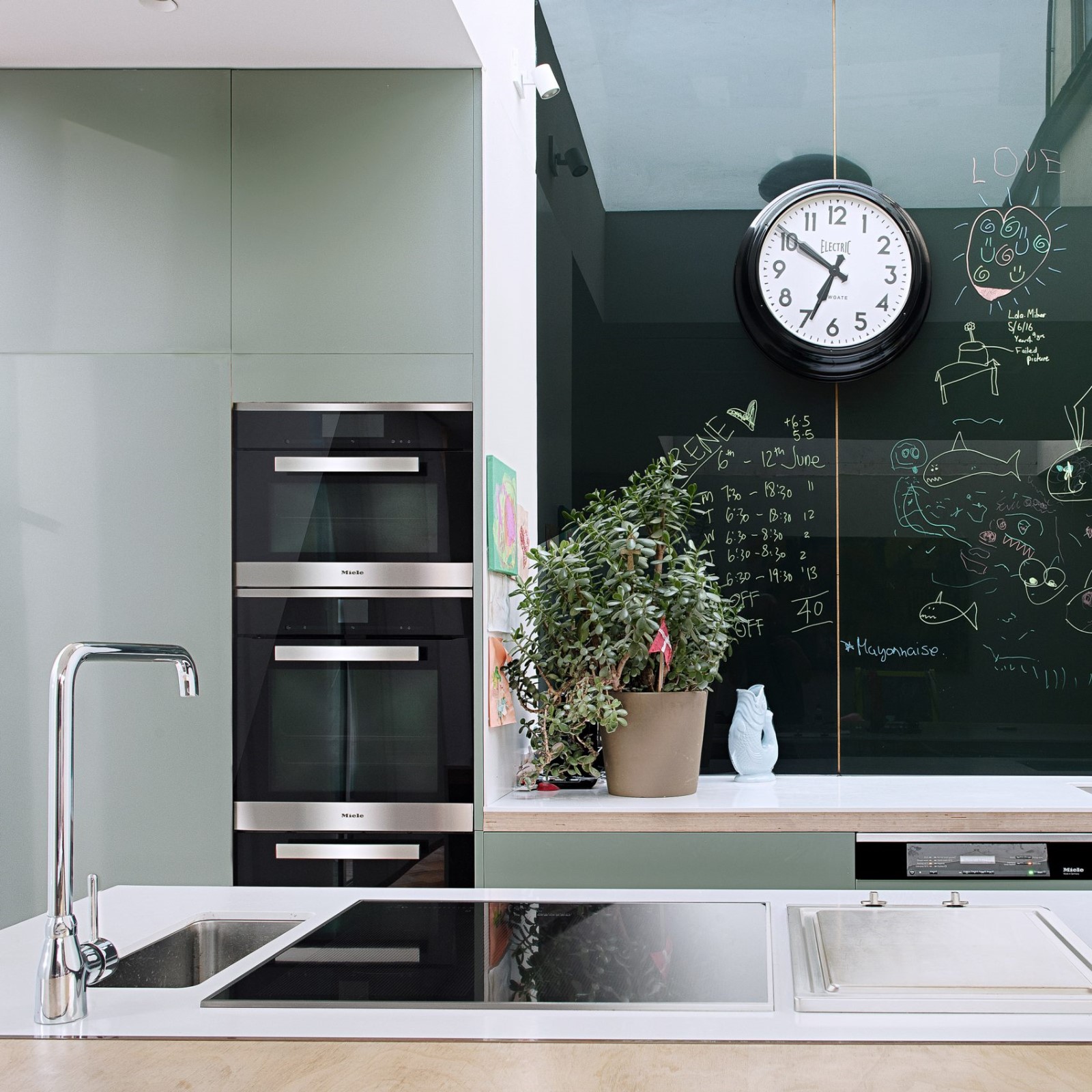
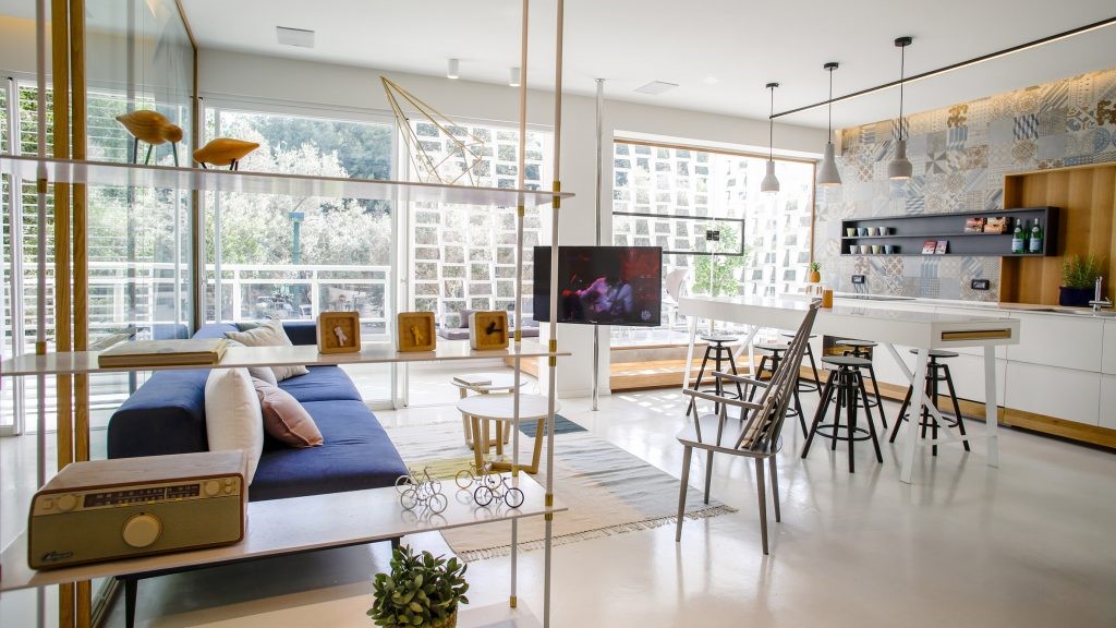
Where most houses might tone things down in the kitchen and use it as a slightly more neutral place to ground the house a little, designers chose to do precisely the opposite here. Blue cabinets have been built around and under the appliances and the same with the sink, livening up the whole space more than just about any kitchen we’ve ever seen.
大多数房子可能会把厨房里的东西调下来,把它当作一个稍微中立一点的地方,让房子稍微接地一点,设计师们选择在这里做正好相反的事情。蓝色的橱柜是在家用电器的周围和下面建造的,水槽也是如此,比我们所见过的任何厨房都更活跃了整个空间。
The blue spills over from the kitchen and dining room into the front room, of course, encompassing an impressive sofa that plays once more with materiality and finishes. While the sofa itself is an attention grabbing, easy to clean vinyl, the throw pillows that accompany it are a softer cotton material to make them differ slightly even though they’re exactly the same shade.
蓝色从厨房和餐厅溢出到前面的房间,当然,包括一个令人印象深刻的沙发,再次发挥与物质和完成。虽然沙发本身是一个吸引注意力,易于清洗乙烯基,抛枕头伴随着它是一种柔软的棉质材料,使他们略有不同,即使他们是完全相同的阴影。
Overall, the use of duo-chromatic colour blocking in partnership with the creative pieces by several local artists on the walls gives the entire apartment an atmosphere of cheerful artistic appreciaton and high brow playfulness.
总体上,在墙上的几位当地艺术家在与创意作品合作的过程中,使用多彩缤纷的色彩阻挡,给整个公寓营造了愉悦的艺术欣赏力和高眉目的气氛。
Photos by Mikhail Loskutov
 举报
举报
别默默的看了,快登录帮我评论一下吧!:)
注册
登录
更多评论
相关文章
-

描边风设计中,最容易犯的8种问题分析
2018年走过了四分之一,LOGO设计趋势也清晰了LOGO设计
-

描边风设计中,最容易犯的8种问题分析
2018年走过了四分之一,LOGO设计趋势也清晰了LOGO设计
-

描边风设计中,最容易犯的8种问题分析
2018年走过了四分之一,LOGO设计趋势也清晰了LOGO设计


 PintereAI


