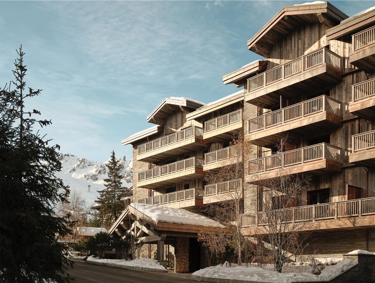
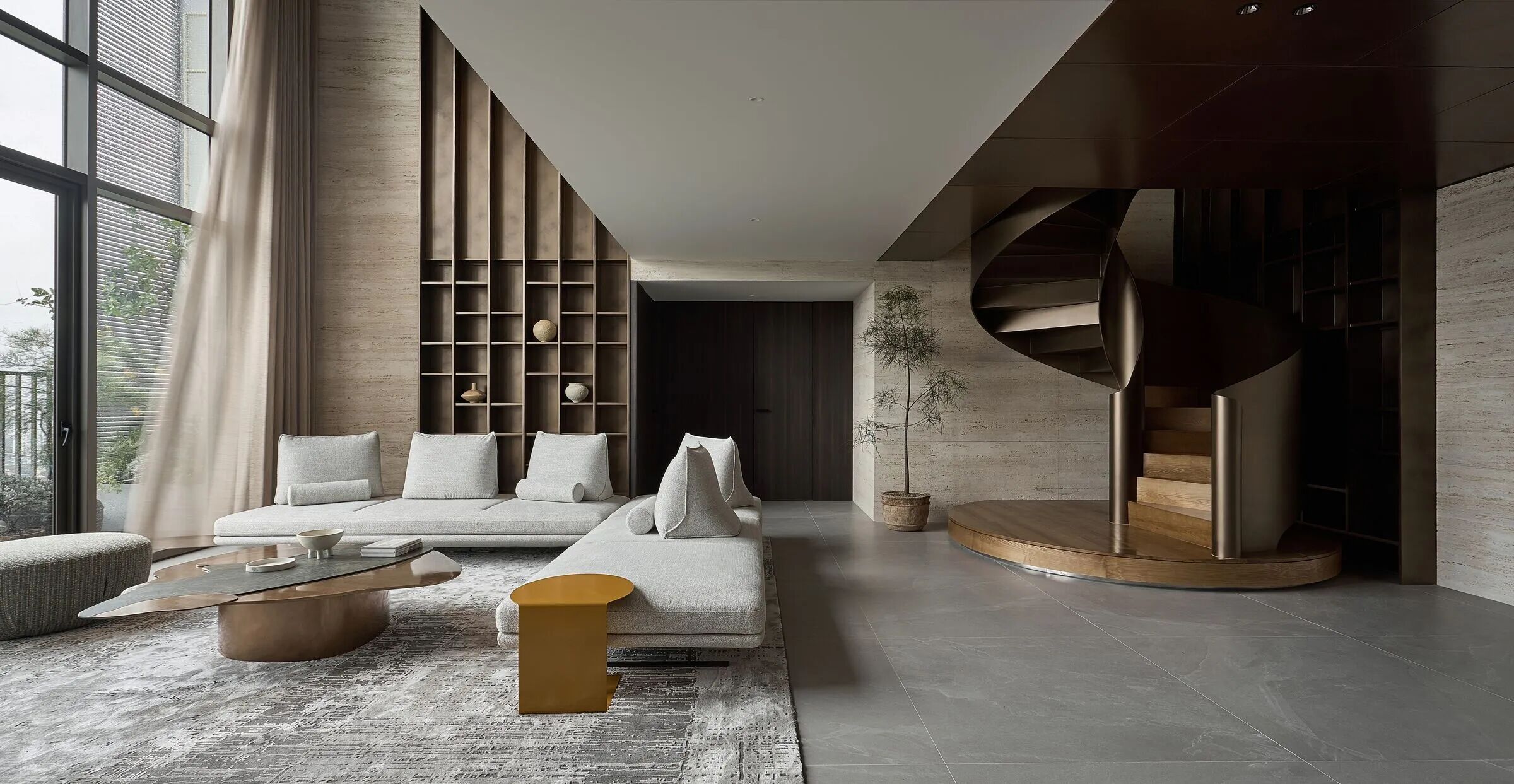
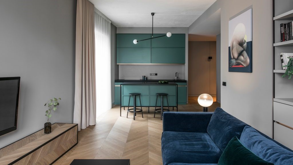
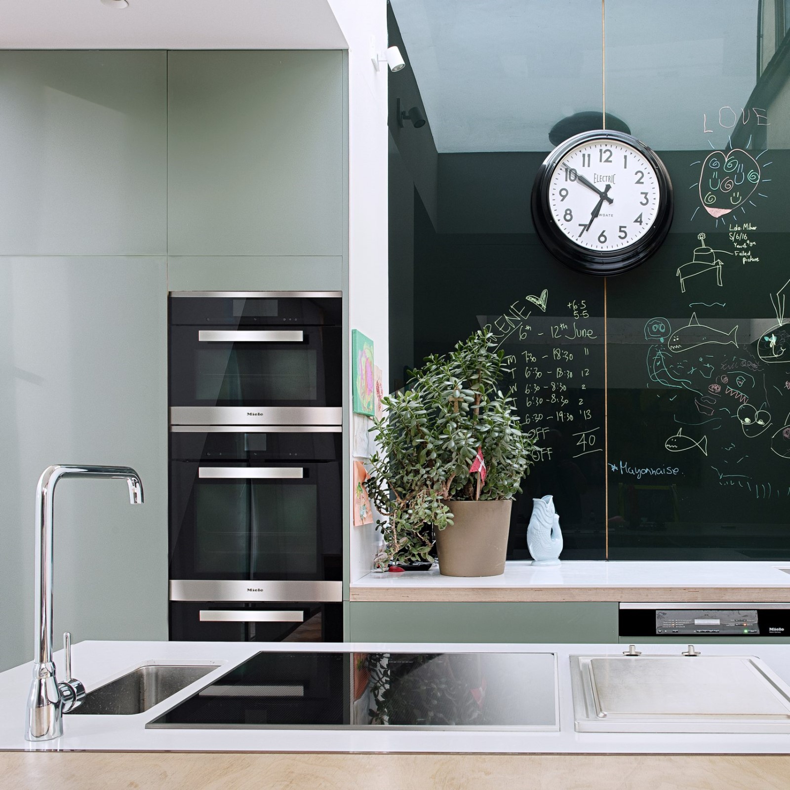
Fan Forest Houses built by bergmeisterwolf architekten to blend into the wooded scenery 风云森林的房子由白麦特狼建筑的建筑,融入林木的风景。
2019-09-02 10:34
Amidst the lush trees of Nova Ponente in Italy, innovative designers at bergmeisterwolf architekten has finished building the Fan Forest Houses; a collection of buildings that, as the name suggests, fan across the landscape to provide a unique home.
在意大利NovaPonente的郁郁葱葱的树木中,BergmeisterWolfArchkten的创新设计人员已经完成了扇状森林住宅的建造;一个建筑物的集合,正如名字所暗示的那样,穿过景观的风扇可以提供一个独特的家。
In total, the collective is made up of three separate house buildings that look and function cohesively to form a residential ensemble. The homes are built and situated very intentionally on the landscape according to, and in order to account for, the crags of rock and crops of plants that exist on a mountainside.
总的来说,集体是由三个独立的住宅建筑组成的,这些建筑外观和功能结合起来,以形成住宅整体。这些房屋是在风景园林上建造和布置的,目的是要考虑在山腰上存在的岩石和作物的裂缝。
Because the homes are built on a landscape that seems to constantly shift, each one of the buildings is afforded a unique view. Similarly, the lines and appearances of the homes’ exteriors all differ depending on where on the mountain peaks you’re standing and looking up on them from. This is all thanks to quickly differing points of elevation.
因为房屋建在一个似乎不断变化的景观上,所以每一座建筑都有一个独特的景观。同样的,房屋外部的线条和外观也各不相同,这取决于你站在山顶上的位置和仰望它们的位置。这一切都要感谢快速不同的海拔点。
For the sake of solidity and endurance against weather, each of the three homes in the collective is built slightly elevated on a concrete slab. The effect of this is to make the homes appear as though they are sort of floating ever so slightly, hovering subtly above the natural topography surrounding them.
为了稳固性和耐侯性,集体中的三个家庭中的每一个都在混凝土板上略微升高。这样做的效果是使房子看起来好像是漂浮的那么轻微,在他们周围的自然地形之上微妙地盘旋。
Each of the homes has a beautiful wooden gabled structure that suits the landscape well. In fact, the colour palette and materiality are so appropriate that the houses actually seem to blend right into the forest even as they float above it. The houses are pleasantly dark, just like the natural wood and rock surrounding them.
每个家庭都有一个漂亮的木桶式结构,适合景观。事实上,颜色调色板和重要性是如此恰当的,以至于即使在它们漂浮在森林上方时,房子实际上似乎也能融入森林。房子很黑,就像周围的天然木材和岩石一样。
As the houses splay outwards on the land to form their compound, the trees seem to swallow them in a way that’s more comforting than intimidating or dark. There is a natural sense of homeliness, as though one who has come here to escape is really being given space to breathe and absorb all the benefits that nature has to offer.
当房屋在陆地上向外伸展,形成它们的院子时,树木似乎以一种比恐吓或黑暗更令人欣慰的方式吞没了它们。这里有一种自然的乡愁感,仿佛一个人来到这里是为了逃避,实际上是被给予空间来呼吸和吸收大自然所提供的所有好处。
On their facades, the houses feature black-brown slats that engulf the walls and continue all the way up to cover the roof as well, giving them a monotone and slightly monolithic look. Several spaces, like the large cantilevered terrace, allow the indoor spaces in each building to blend almost seamlessly with the abundant outside space provided by the surrounding forest.
在他们的正面,房子的特点是黑褐色的石板吞没墙壁,并继续一直到屋顶覆盖以及,给他们一个单调和略为单一的外观。几个空间,如大型悬臂露台,使每个建筑的室内空间几乎与周围森林提供的丰富的外部空间无缝融合。
Adding to their almost otherworldly appearance and the interesting way they use space is the fact that the home’s main entrance, which is located in the largest volume of the three, is covered for privacy. Even more interestingly, the front door is actually accessed by a wooden bridge leading from the wooded land into the foyer.
添加到他们几乎任何世俗的外表和他们使用空间的有趣方式是家庭的主要入口,位于三的最大体积中,被隐私覆盖。更有趣的是,前门实际上是由从林地通向门厅的木桥来访问的。
The first thing most people notice upon passing off the wooden bridge and through the door is the way the roof’s shape can be seen from the underside, letting dwellers and guests actually experience its unique shape. The way the common space extends upward to the topmost point and mirrors the fan-like shape visitors saw outside as they approached the house makes the shared and living spaces feel even more generous than they truly already are.
大多数人在通过木桥和门时注意到的第一件事是屋顶的形状可以从下面看到,让居民和客人真正体验到它独特的形状。公共空间延伸到最顶端的方式,反映了游客在接近房子的时候看到的扇形形状,这使得共享的和生活的空间感觉比他们原来的更慷慨。
From each balcony and floor to ceiling window, one can see the way the buildings appear to grow right out of the landscape and spread out, allowing the woods and the plants and animals they’re home to spread between the volumes of the house nearly uninterrupted.
从每个阳台和地板到天花板的窗户,人们可以看到建筑物看起来从景观中出来的方式,并扩散出去,让森林和植物和动物在房子的体积之间几乎不间断地扩散。
To connect the different units of the home, which are not actually entirely separate from each other the way they might look at first glance, designers built more wooden bridges. These are raised from the ground, contributing to the sense that, from a distance, the volumes of the home seem to float.
为了连接不同的住宅单元,这些单元实际上并不完全独立于彼此,他们可能一眼就可以看到,设计师们建造了更多的木桥。它们从地面升起,有助于感觉到,从远处看,房屋的体积似乎浮动。
The effect on the inner spaces of being separated and connect by these bridges is one of cohesiveness and yet privacy. No one feels cut off from any other space or person, but each person there can still seek calm, peaceful solitude and quiet whenever necessary.
这些桥梁的分离和连接对内部空间的影响是一种内聚力,同时也是一种隐私。没有人感到与任何其他空间或人隔绝,但在那里的每个人仍然可以在必要的时候寻求平静、安宁、孤独和安静。
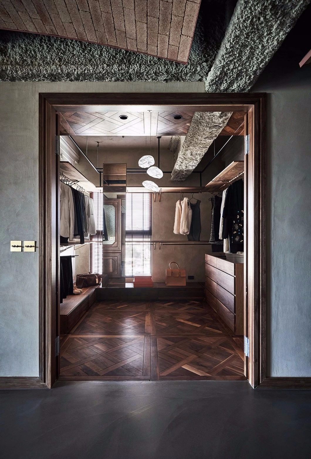
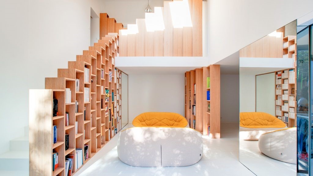
Inside, the palette is much lighter in shade even though the materiality remains much the same. From floor to ceiling, almost the entire interior of the home, especially in the private spaces and sleeping rooms, is wooden. A pleasant light wood keeps the rooms bright in partnership with all those lovely, high windows. This creates a stunning contrast with the dark wood of the exterior.
在内部,即使重要性保持不变,调色板在阴影下也更轻。从地板到天花板,几乎整个家庭的内部,特别是在私人空间和卧室里都是木制的。令人愉快的轻木使房间与所有可爱、高的窗户都保持了良好的合作关系。这与外部的深色木材产生了惊人的对比度。
Furnishings have been intentionally chosen to suit and look cohesive with the materiality and style of the rest of the home. Pieces are neutral, interesting to look at but now flashy, and stylish without being showy.
家具被有意地选择以适合和看起来与家的其余部分的重要性和风格相联系。棋子是中性的,有趣的是看一眼,但现在是浮华的,时尚而不艳丽。
Photographs by Gustav Willeit
 举报
举报
别默默的看了,快登录帮我评论一下吧!:)
注册
登录
更多评论
相关文章
-

描边风设计中,最容易犯的8种问题分析
2018年走过了四分之一,LOGO设计趋势也清晰了LOGO设计
-

描边风设计中,最容易犯的8种问题分析
2018年走过了四分之一,LOGO设计趋势也清晰了LOGO设计
-

描边风设计中,最容易犯的8种问题分析
2018年走过了四分之一,LOGO设计趋势也清晰了LOGO设计


 PintereAI


