Bacob Bank Vincent Van Duysen
2019-10-09 14:34
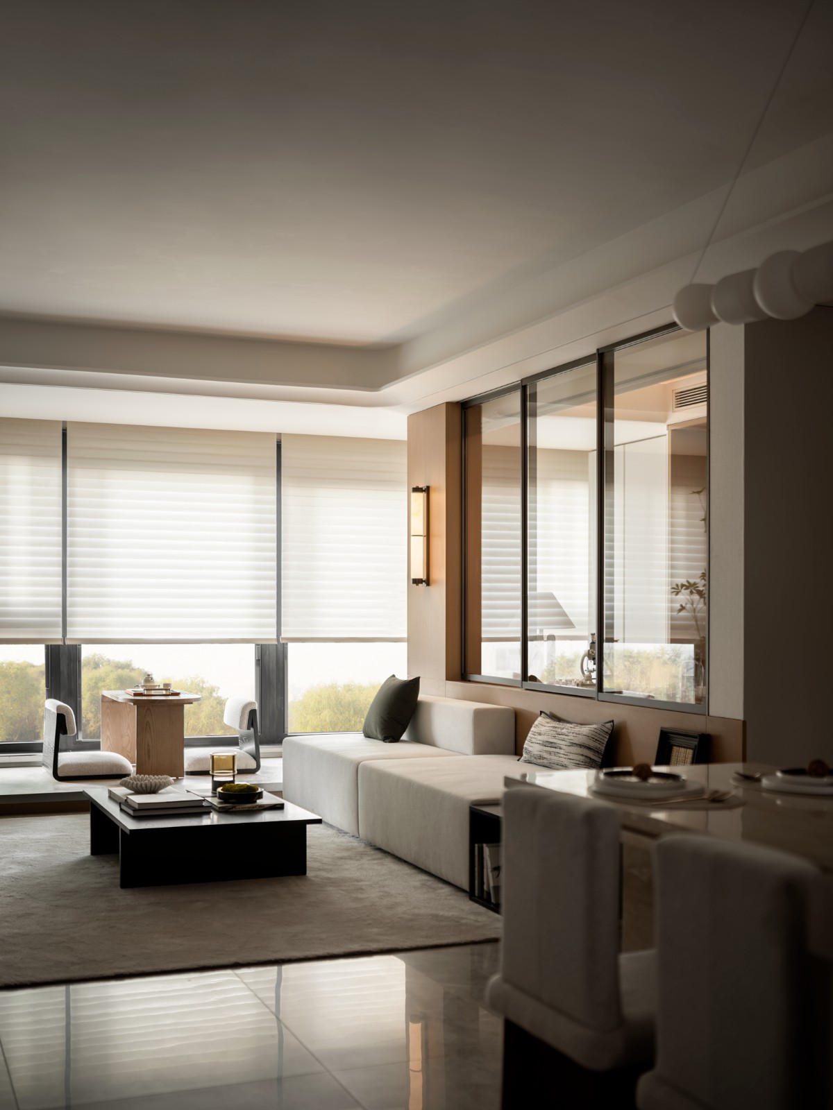
The existing situation was stripped to its primary structure and then divided into three zones: the ‘self’-zone, the ‘information’-zone, and the ‘advice’-zone including personal offices and a conference room.
现有的情况被剥夺了其主要结构,然后划分为三个区域:*自我*区域、*信息*区域和*咨询*区域,包括个人办公室和会议室。
In the center, an open space with a double-height volume was created to let in the zenithal light – transparency and luminance were key aspirations for this project.
在中心,一个具有双高体积的开放空间被创造出来,让天象的光-透明度和亮度是这个项目的主要愿望。
Emphasis is present in the contrast between the dominant structure versus the open spaces and lines of sight. The alternating white structure and grey tinted glass panels create a large-scale graphic pattern.
重点是优势结构与开阔空间和视线之间的对比。交替的白色结构和灰色的彩色玻璃面板创造了一个大规模的图形模式.Only a small variety of materials was used in this project; white walls, concrete tiled floors, and grey painted furniture which creates a monastic atmosphere.
在这个项目中只使用了少量的材料:白色的墙壁,混凝土的瓷砖地板,灰色的油漆家具,创造了一种寺院的气氛。Vincent Van Duysen Architects has also designed Bacob Bank Offices in Mol, Geel, Brasschaat, and Kapellen.
VincentVanDuysen建筑师还设计了BaCob银行办公室,以摩尔、Geel、Brasschat和Kaplen为单位。Photography:Koen Van Damme
科恩·范达梅
 举报
举报
别默默的看了,快登录帮我评论一下吧!:)
注册
登录
更多评论
相关文章
-

描边风设计中,最容易犯的8种问题分析
2018年走过了四分之一,LOGO设计趋势也清晰了LOGO设计
-

描边风设计中,最容易犯的8种问题分析
2018年走过了四分之一,LOGO设计趋势也清晰了LOGO设计
-

描边风设计中,最容易犯的8种问题分析
2018年走过了四分之一,LOGO设计趋势也清晰了LOGO设计


