春设计 SigMann西克曼定制展厅 首
2020-11-06 09:08


吴家春在创办Spring Design Office之前,担任创意总监近十年,在室内设计实践和研究方面积累了丰富的经验,尤其是在住宅设计领域。目前,他致力于提供住宅的最佳和综合室内解决方案,同时将实践扩展到更广泛的类型,如商业展览空间。
Before founding Spring Design Office, Wu Jiachun had worked as a creative director for nearly ten years, which gained him rich experience in interior design practices and researches, especially in the field of residential design. Currently, he is committed to delivering optimal and integrated interior solutions of residences, while expanding practices to a wider spectrum of typologies such as commercial exhibition space.


“我试着在Tomba Brion身上注入一些诗意的想象,虽然不是为了创造诗意的建筑,而是为了创造一种能够散发出正式诗意的建筑。”
I have tried to put some poetic imagination into Tomba Brion, though not in order to create poetic architecture but to make a certain kind of architecture that could emanate a sense of formal poetry.
— Carlo Scarpa


SigMann是一个橱柜和家居品牌,其名称来源于“Sig”和“吗哪”。“Sig”是“special interest group”的缩写,代表有教养的、体面的、有品位的精英,而“吗哪”则来自于《圣经》,暗示着思想的食物。
SigMann is a cabinet and home furnishings brand, the name of which is derived from Sig and Manna. Sig is the abbreviation of special interest group, which represents cultivated, decent and tasteful elites, while Manna comes from Bible and implies food for thought.


随着消费水平和消费观念的提高,一场厨房革命正在发生,越来越多的家庭开始重视厨卫家具的设计和品质。在这样的背景下,SigMann非常重视线下的showroom,相关的体验场景可以激发参观者对未来生活的想象。
With consumption level and ideas improving, a kitchen revolution is happening, and more and more households are paying great attention to the design and quality of kitchen and bathroom furnishings. Under such context, SigMann attaches great importance to its offline showroom, where relevant experiential scenes can evoke visitors imagination of future life.


该展厅位于中国广州的一家大型家居用品商场内。设计师打破原有的空间格局,赋予中庭玻璃幕墙以滚动形式。随着游客的移动,景观也发生变化,自然光线进入,共同形成了一个讲故事的空间。天花板的特点是曲线,看起来像一个慢慢展开的窗帘。
This showroom is situated within a large home products mall in Guangzhou, China. The designers broke the original spatial pattern, while endowed glass curtain wall at the atrium with rolling forms. The view varies as visitors moving, and natural light filter in, together generating a storytelling space. The ceiling features curved lines, and looks like a slowly spreading curtain.


本设计借鉴了中国古典园林设计中的“借景”手法,增强了空间的深度感。嵌套、连接或相互呼应的圆形开口展示部分场景,光线充满变化。设计的重点之一是通过圆形的对称平衡关系来创造韵律。
The design drew on borrowed scenery technique in classical Chinese garden design, to enhance the sense of depth of the space. Nested, connected or mutually echoing round openings reveal partial scenes, and the light is full of changes. One of the design focuses was to create rhythm via the symmetric and balanced relationship of circles.


也许,在某种意义上,现代设计已经沉溺于混凝土的固定材料调色板。但是,物质性和纹理不应该如此单调。
Maybe, in a sense, modern designs have been indulged in the stereotyped material palette of concrete. However, materiality and textures shouldnt be so monotonous.


为展厅定制的大系统岛充满对比和张力,不锈钢释放出浓厚的工业氛围。独特的涂料使橱柜墙面呈现出粗糙质朴的质感,犹如高原上的红土,体现着原始的包容。
The large systematic island customized for the showroom is full of contrast and tension, and stainless steel releases a strong industrial atmosphere. Unique coating gives the cabinet wall a rough and plain texture, which looks like the red soil from plateau, embodying primitive inclusiveness.


设计团队试图按照隈研吾所倡导的“重获物质的自由,唤起它的尊严和骄傲”。
The design team tried to regain freedom of materiality and arouse its dignity and pride as advocated by Kengo Kuma.


在茶室里,一张长长的茶几伸展在下沉的榻榻米上方。空间线条简洁整洁。它的“空”给了它包容的特性。
In the tea room, a long tea table stretches above the sunken tatami area. The space features neat and concise lines. Its emptiness gives it an inclusive character.


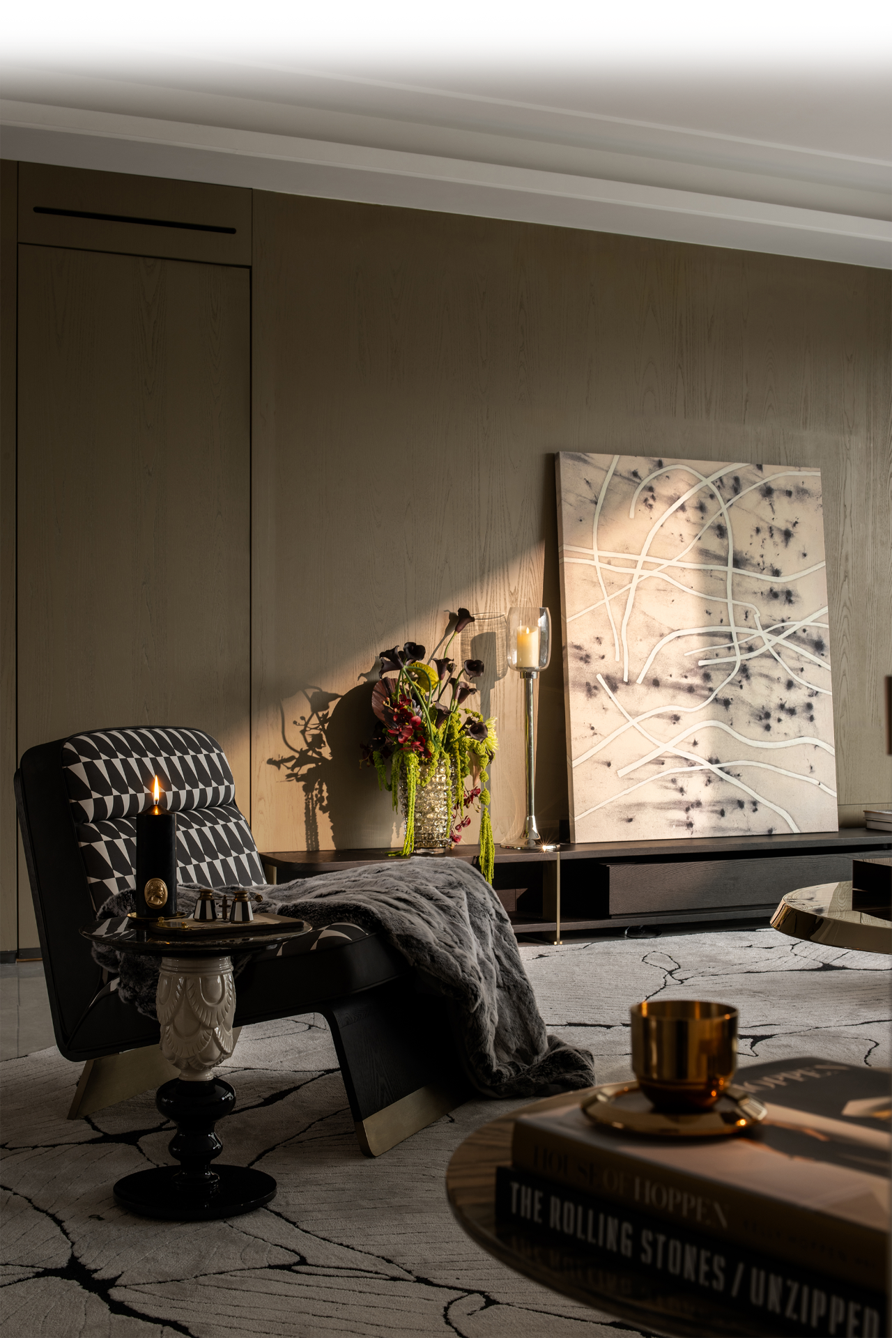
客厅位于楼梯的左侧,是交通和视线的转折点。它以矩形平面为特色,赋予了整个空间社交语言。
Set at the left side of the staircase, the living room area is at the turning point of the circulation and sight line. Featuring a rectangular plane, it endows the overall space with socializing languages.


 PintereAI


