CoCo都可无锡恒隆广场店 OYTT Design 欧阳跳 首
2020-12-04 14:13
项目地址:江苏省无锡市梁溪区人民中路139号恒隆广场4F
艺术中的留白,赋予了人们以无限遐想的空间以及回味无穷的意境。而生活也同样需要忙里偷闲,才能更恰如其分地体会人生的惬意与惊喜。当纯粹的白邂逅新鲜的橙,即是一家充满创想与活力的奶茶店。
The blank space in art endows people with infinite reverie space and endless aftertaste. And life also needs to steal a little leisure from the rush of business, in order to more appropriately experience the comfort and surprise of life. When the pure white meets the fresh orange, it is a milk tea shop full of creativity and vitality.
作为第一批打入内地市场的台湾奶茶品牌,CoCo在其消费市场已经形成了很稳固的品牌印象。因此,本案的设计核心就是要颠覆消费者对CoCo的原有印象,营造强烈的对比的同时,也让亲民的CoCo在消费体验方面得到超预期的升级。
As the first batch of Taiwan milk tea brands to enter the mainland market, Coco has formed a very stable brand impression in its consumer market. Therefore, the design core of this case is to subvert the original impression of consumers on Coco, creating a strong contrast, at the same time, let the people-friendly coco get an unexpected upgrade in the consumption experience.
本项目处于商场转角位置,可用面积十分有限。设计师根据店铺的功能划分出零售区、餐饮区、营业区、员工操作区以及商品展示区等多重区域,并通过对几何造型与空间美学的应用与表达,用趣味的思维转化成室内环境的组合场景。
The project is located at the corner of the shopping mall, and the available area is very limited. According to the functions of the store, the designer divides the retail area, catering area, business area, employee operation area, commodity display area and other multiple areas. Through the application and expression of geometric modeling and space aesthetics, she uses interesting thinking to transform into the combination scene of indoor environment.
弧形的门面采取全开放式设计,最大限度地与商场中来往的客人产生互动。曲线与直线的融合拉升着空间感,打造时尚简约的观感体验。
The arc-shaped facade adopts the full open design, which maximizes the interaction with the customers in the shopping mall. The integration of curve and straight line enhances the sense of space, and creates the visual sense of fashion and simplicity.
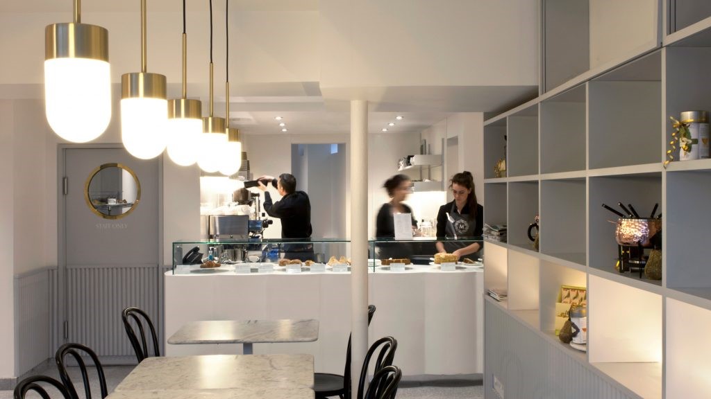
室内摒弃了隔断的层次分割,最大程度上利用灯光和空间结构,去塑造一个时尚、多元、通透的新型茶饮店。设计师通过运用大量干净整洁的水磨石来做装饰,既保证了空间的通透和明亮,又增加了简约纯粹的视觉效果。辅以造型奇特的灯具,在平静且克制的语境中,注入个性鲜明的美学情趣,从而营造出活泼轻快的空间氛围。
Instead of setting up partitions to divide the area, the interior makes the most of the lighting and spatial structure to create a fashionable, diversified and transparent new tea store. The designer uses clean and neat terrazzo to decorate, which not only ensures the transparency and brightness of the space, but also increases the simple and pure visual effect. Accompanied by lamps with unique shapes, injecting the distinctive aesthetic temperament and interest in a calm and restrained context, building a lively and brisk space atmosphere.
营业区打破了传统对于柜台的定义。既增加了空间的开阔感和趣味性,又能营造出热闹的消费氛围,同时还暗合了结构的衔接特性。The business district breaks the traditional definition of the counter. It not only increases the sense of openness and interest of the space, but also creates a lively consumption atmosphere and implies the cohesion of the structure. The dining area also uses the element symbol in the space, forming a fashionable and simple seat, bringing a new urban stronghold for the customers that integrates modern and traditional elements.
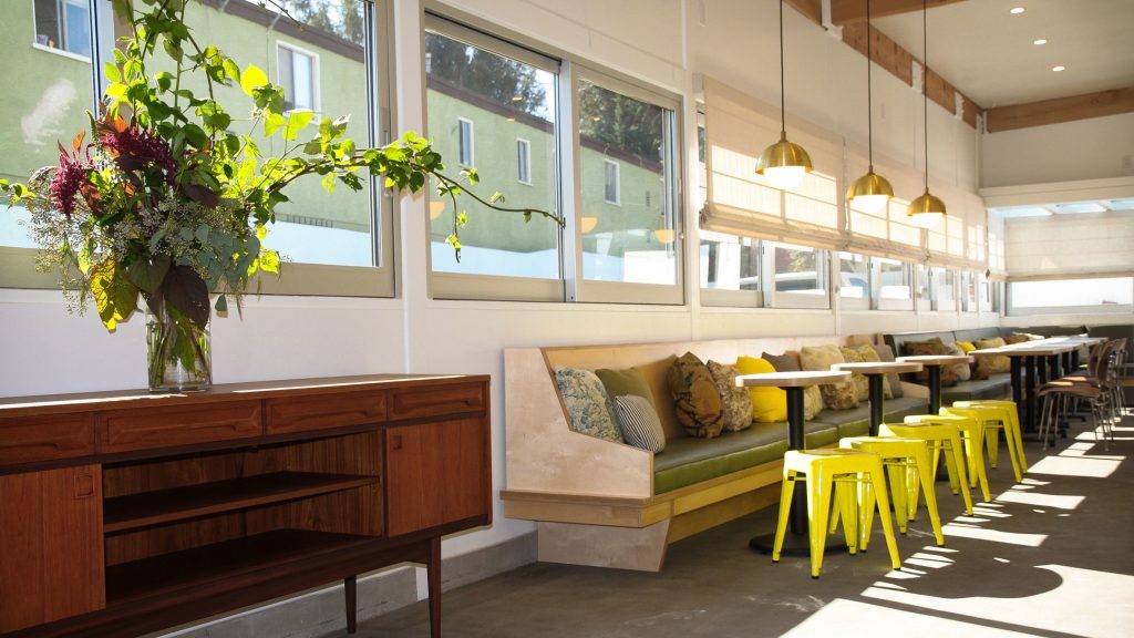
餐饮区同样沿用了品牌主视觉及其衍生出来的元素符号,高低错落的几何关系,在空间中自由重叠、穿插,组成了时尚简洁的桌椅。素净的基底色彩与丰富体块感为空间形态增添了一丝活泼的跃动,调节氛围的同时,极大程度地增强了品牌的辨识度,为消费者带来了一个现代与传统元素交织融合的城市新据点。
The catering area also uses the brands main vision and its derived element symbols, the geometric relationship of high and low scattered, and freely overlaps and intersperses in the space, forming fashionable and simple tables and chairs. The pure base color and rich block sense add a lively rhythm to the space form, while adjusting the atmosphere, it greatly enhances the brand identification, and brings a new urban stronghold with modern and traditional elements interwoven and integrated for consumers.
艺术造型和品牌Logo在虚实之间的交错,让空间瞬间温暖而生动。奠定着活泼的空间基调,弱化背景的渲染,整个空间在时尚与艺术的交融中展现出自己的个性。
The interlacing of artistic modeling and brand logo between the virtual and the real makes the space warm and vivid. Lay a lively space tone, weaken the background of the rendering, the whole space in the fusion of fashion and art show their own personality.
80后空间设计师,白羊座,OYTT Design 创立人,喜欢打破传统审美,挖掘不同寻常的独特,热爱生活和美食的女设计师。
• 德国 | 2020 iF DESIGN AWARD
• 意大利 | 2020 意大利Adesign award设计大奖 银奖、铜奖
• 荷兰 | 2020 Frame Awards • 美国 | 2019 Best of Year Awards
• 美国 | 2019 Architecture Masterprize美国建筑大师奖
• 英国 | 2019 Restaurant - Bar Design Awards
• 意大利 | 2019 意大利Adesign award设计大奖 金奖
• 美国 | 2018 美国IDA国际设计大奖优秀奖
• 中国 | 2019 中国设计·卓越青年城市榜(无锡)商业空间十强设计师
• 中国 | 2018 金堂奖年度优秀餐饮空间设计奖
• 中国 | 2018 IDS国际设计先锋榜优胜奖
• 中国 | 2017 金堂奖年度优秀休闲娱乐空间
欧阳跳设计(OYTT DESIGN)成立于2014年,是一家多元化的空间设计公司,致力于打造现下美学的时尚空间,是一个年轻充满朝气的团队,不惧挑战也喜欢挖掘思维的极限,设计范围包含了咖啡,新零售,餐饮,儿童休闲娱乐品牌等。
不常规思维的,多角度的,差异性的,时刻为每一次的新挑战准备着。
OYTT DESIGN is a leading retail space design studio founded in Wuxi, 2014. As a multidimensional and award winning design studio, OYTT focus on creating face to face experience that work efficiently for the brand, the business and the staff.
Always worked with care, and expertly crafted for the brands we worked with, our designs are born out of skill, collaboration, and meticulous attention to details. We design, develop and deliver commercial interiors and brand spaces that stay true to every brand’s heritage, while always looking towards the future.
采集分享
 举报
举报
别默默的看了,快登录帮我评论一下吧!:)
注册
登录
更多评论
相关文章
-

描边风设计中,最容易犯的8种问题分析
2018年走过了四分之一,LOGO设计趋势也清晰了LOGO设计
-

描边风设计中,最容易犯的8种问题分析
2018年走过了四分之一,LOGO设计趋势也清晰了LOGO设计
-

描边风设计中,最容易犯的8种问题分析
2018年走过了四分之一,LOGO设计趋势也清晰了LOGO设计


 PintereAI


