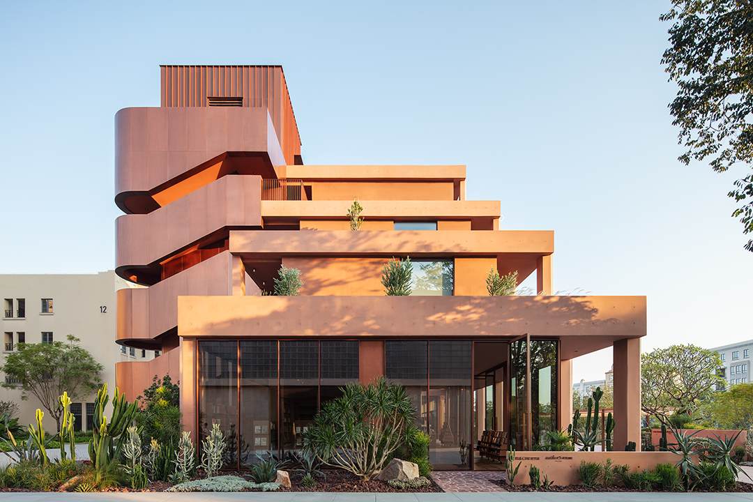
新一设计|新作 个性时尚 OU私品荟 首
2021-02-24 09:30


这是不错的:我们热爱生活,并不是因为我们习惯了生活,而是因为我们习惯了爱,爱里总有疯狂的成分,但同样的疯狂里也有着理智的成分。
This is right: we love life, not because we are used to life, but because we are used to love. There is always an element of madness in love, but there is also an element of reason in madness.
当今是一个快速消费的时代,人们对美食向往的同时越来越注重用餐的空间环境。用餐已经不是一种充饥模式,更是繁忙过后的一种放松式仪式感。每个人的个性与喜好各不相同,只有将不同的文化元素融入到设计理念中才能带领我们感受到精神层面的放松与愉悦。
Today is an era of rapid consumption, people yearn for food while paying more and more attention to the dining space environment. Dining is no longer a mode of hunger, but a sense of relaxation after a busy ritual. Everyones personality and preferences are different, only by integrating different cultural elements into the design concept can we feel the spiritual level of relaxation and pleasure.


设计的过程中,结合项目的地理位置采用社区文化的交互模式,吸引目光的高亮色系及橱窗刻意回避了偏商务的色调使进入空间的人有一种愉悦感。
In the process of design, the interactive mode of community culture is adopted in combination with the geographical location of the project. The eye-catching highlights and window Windows deliberately avoid the commercial tone to make people who enter the space have a sense of pleasure.


店面首层选择金色调搭配卡通摆设,使得整体的空间氛围显得轻松自在;另一方面,“透明的橱窗”,让光线显得柔和与温暖,显得“很欢迎”。
The first floor of the store chooses gold tone with cartoon decoration, making the overall space atmosphere relaxed and comfortable; The transparent window, on the other hand, makes the light soft and warm and welcoming.


不拘泥于常规设计逻辑思维模式,中庭的吊顶的不锈钢波纹镜面反射形成更加立体空间感,同时形成了良好的空间过渡。
The stainless steel corrugated mirror reflection on the ceiling of the atrium forms a more three-dimensional sense of space and a good spatial transition.


店面二层以冷色调搭配超高质感的材质,雅致而且从容,三五好友用餐或小饮都悠然自得!
The second floor of the store with cold color collocation of super high texture material, elegant and calm, 35 friends have dinner or drink are carefree!


高挑的中庭打破了封闭式空间的沉闷感,令每位入店客户倍感舒适。
The tall atrium breaks the dull feeling of the enclosed space and makes every customer feel comfortable.
同时,楼梯间也是整个空间解构的重要连接元素,令空间场景能够流畅进行转换,时而是时尚的餐吧,时而是安静的酒吧。
At the same time, the stairwell is also an important connecting element of the whole space deconstruction, so that the spatial scene can be smoothly transformed, sometimes it is a fashionable restaurant bar, sometimes it is a quiet bar.


设计装修中采用非传统的混合、拼接等手段,打造出高低错落的空间多元化氛围。
In the design and decoration, non-traditional means such as mixing and splicing are adopted to create a diversified atmosphere of space with scattered heights.


颜色作为区域划分标记,有质感的材料作为装饰要素,使整个空间具有流畅延续性同时富有十足的个性,起到“看似无意,实则匠心”的效果。
Colors are used as regional markers, and textured materials are used as decorative elements, so that the whole space has a smooth continuity and full of personality, playing the effect of seemingly inadvertent, but actually craftsmanship.


艺术风格上的多元化:一楼的时尚橱窗设计令整体空间明亮大方;中庭既是一楼与二楼的风格过度要素又体现了宽敞与高挑的建筑主体;二楼的高品非平面材质装饰材料运用使空间变得更有质感,通过细节点缀装饰进行空间的自由切换给人强烈的反差视觉感,令每位客人能根据自己的喜好选择开放或温馨的空间环境进行驻足。
Diversification of artistic styles: the fashion window design on the first floor makes the whole space bright and generous; The atrium is not only the transitional element of the first and second floor, but also reflects the spacious and tall main body of the building. On the second floor, the use of high quality non-planar material decoration materials makes the space become more textured. The free switching of space through details gives a strong sense of contrast and visual sense, so that each guest can choose an open or warm space environment according to their preferences.
平面图 /The floor plan


Project name: OU private products vera
设计机构:新一建筑室内设计
Design agency: Xinyi building interior design
Chief Designer: Zhang Xinqiang
Project location: Shantou, Guangdong
Floor area: 300m²
摄影师:广州大象视觉 阿力
Photographer: A Li from Guangzhou Elephant Vision
内容策划 / Presented
策划 Producer :知行
排版 Editor:Tan 校对 Proof:Tan
图片版权 Copyright :原作者

 PintereAI


