费罗娜企业总部
2021-03-23 18:49
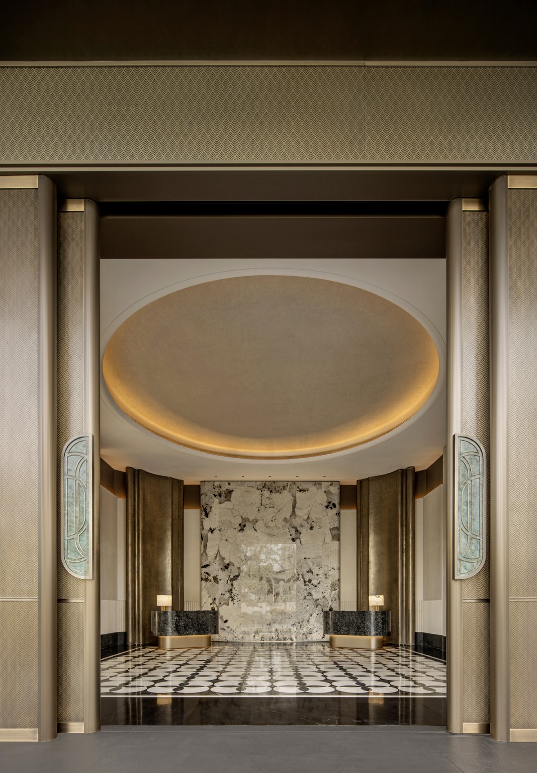
费罗娜陶瓷企业总部位于广东佛山智慧新城的一栋甲级写字楼里。此次总部的搬迁与全新的总部形象设计也是费罗娜实现品牌飞跃的里程碑式进程。
Florina Ceramics enterprise headquarters Located in a Grade A office building in Zhi Hui building Foshan City. The relocation of the headquarters and the new headquarters image design are Florina achieve brand leap milestone process.


08年成立的费罗娜,作为佛山陶瓷行业年轻的新生派代表,以“原创、精品、品质”作为品牌理念,凭借原创设计和高品质的水泥砖产品,深受年轻消费者和设计师的青睐,因其精致突出的特点已成为小众品牌的先锋代表。
Florina was founded in 2008, as a young freshman representative of Foshan ceramic industry, take originality, boutique, quality as a brand concept, with original design and high quality cement brick products, deeply favored by young consumers and designers. Because of its exquisite and outstanding characteristics has become the pioneer representative of niche brand.
近十年来,中国制造被越来越多品牌强调, 佛山本土制造业也越来越重视品牌。费罗娜作为首当其冲的企业也宣布进入2.0时代,在品牌方面,从企业的整体VI、店面SI、及企业总部的形象都进行全面升级,扩大市场辨识度,力求实现中国陶瓷砖行业品牌的又一突破。
In recent ten years, made in China has been emphasized by more and more brands, and the Foshans local manufacturing industries are also taking brands more seriously. Florina, as the first enterprise to bear the brunt, has also announced to enter the 2.0 era. In terms of brand, from the whole VI, storefront of the enterprise SI, and the image of the headquarter of the enterprise are all fully upgraded, expanding market identification to achieve another breakthrough in Chinas ceramic tile industry.


在功能规划上,2000平米建筑面积三分之二用于办公,其余作为瓷砖展厅。为体现品牌的统一性,设计上打破传统办公与展厅明显区分的方式,将其格调融合于一体。
In functional planning, 2000 square meters building area 2/3 for office work, the rest for tile exhibition hall. In order to reflect the unity of the brand, the design breaks the traditional way of distinguishing the office from the showroom, and integrates its style into one.
一个企业总部的形象就如同人的形象,“表里如一”是其诉求。生产好品味、高品质瓷砖的费罗娜理应有与此相匹的总部形象。
The image of an enterprise headquarters is like the image of a person, qulity is its appeal. Florina who produces good taste, high-quality ceramic tile ought to have matched this head office image.


形象,它不单单靠眼睛看,还有触感、整体空间感受都可传达。于细微处,这种理念也与费罗娜注重细节的产品理念相吻合。
Image, it not only depends on the eyes to see, but also touch, the overall spatial feelings can be conveyed. In nuances, this concept also coincides with Florinas detailed product philosophy.


踏入展厅区域,是柔软舒脚的水泥灰地毯引领步伐的前进。展厅并不是产品的堆砌,于细微处传达企业的品味,必定会使得企业在客户心中脱颖而出。
Step into the exhibition hall area, the soft and comfortable gray carpet leads the pace forward. Showroom is not product stacking, convey the taste of the enterprise in details, will certainly make the enterprise stand out in the heart of the customer.


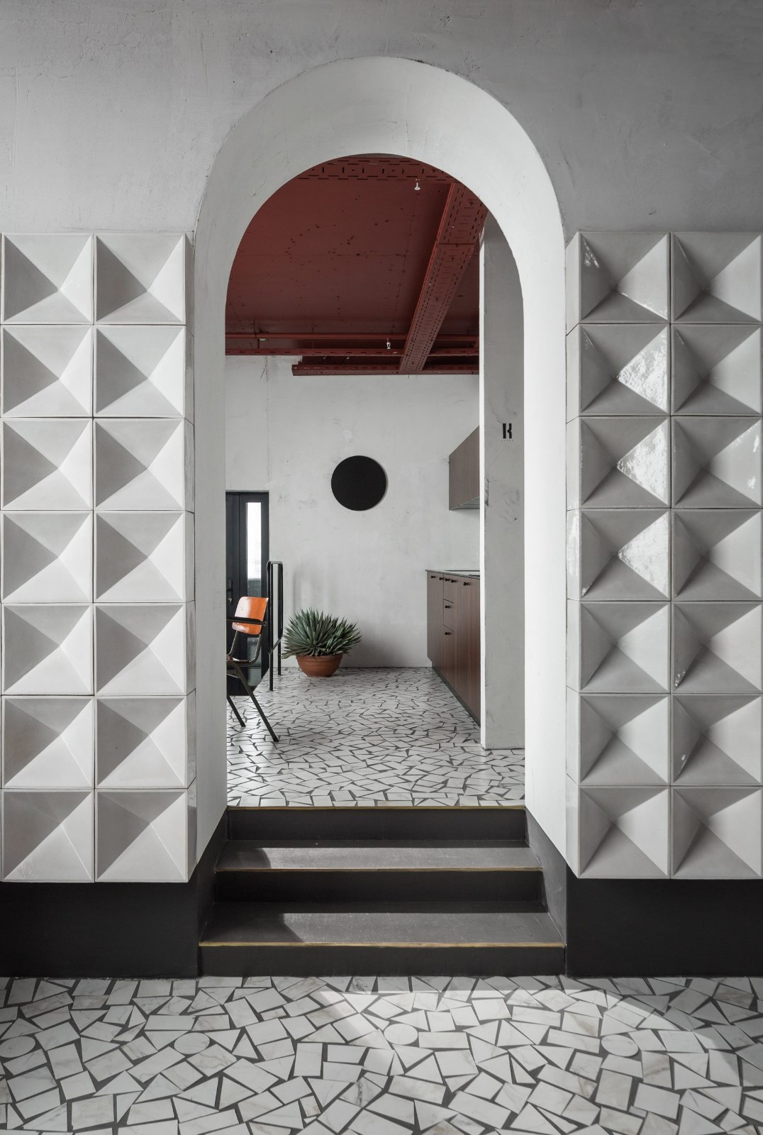
在整个设计中,除了作为展厅展示瓷砖产品外,几乎没有运用到费罗娜的瓷砖。这样设计的目的是希望通过把企业品牌文化和产品元素糅合于空间,构建空间的品质感和独有气质。水泥预制、水泥涂料及水泥色的地毯在这里得到大量的应用。砖已不是空间材料的主角,而是“砼”。
Throughout the design, few of Florinas tiles were used except the display products. The purpose of this design is to create a sense of quality and unique temperament of space by combining corporate brand culture and product elements into space. Cement prefabricated component, cement paint and cement-colored carpets are widely used here in Florina. Brick is not the protagonist of space material, but concrete.


砼(Concrete),5000年前开始被用于生活;250年前,成为改变世界景观的重要材料;今天 ,成为城市过度建设的“石林”。
Concrete began to be used in life 5000 years ago; it became an important material to change world landscapes 250 years ago; now, it has become the “stone forest” of urban over-construction.
费罗娜,重塑“砼”的自由和纯粹美的使者,让“砼”回归到具有自然理念建筑材料的制造者。
Florina, the emissary of pure beauty and of reshaping the freedom of concrete, is also the maker to get concrete back to architecture material with natural ideas.
设计师从“砼”的历史、文化、功能、发展、未来出发,用简单的建筑结构语言,代表“砼”的本质图案圆、方、三角作为型态基础。并在费罗娜“砼”的愿景中寻找企业文化价值和产品独特引领性,寻找“砼”在办公环境中的新思维、新形态的环境应用。是项目实施前的重要思考。
Based on the history, culture, function, development and future of concrete, our designer uses simple architectural structure language to demonstrate the essential patterns of concrete --- circle, square and triangle. In the vision of Florina Concrete, we look for enterprise culture and the unique guidance of products. We also try to discover the new thinking and new form of environmental application of concrete in offices. These are important explorations and thinking of the project.


延续费罗娜的企业和产品风格,用代表“砼”的力量灰为主色调,统一应用在天、地、墙面,圆、方、三角形态的温柔黄色穿行在“力量”灰调中,通过暧黄色的灯光渲染,力量与温情的高度溶合,便是设计师对费罗娜的设计灵魂所在,也正是简约风格的所在。
To continue Florina’s enterprise and product style, we choose gray which represents concrete as the main color, applying it to the ceilings, floors and walls. We apply yellow to the circle, square and triangle form, with soft yellow light rendering. The combination of strength and warmth is the soul of our design as well as the core of our simple style.


被赋予了“砼”的思考的费罗娜新办公总部,符合企业文化和产品,对企业型象和产品有前所末有的新气象。适合企业员工的需求和全方位应用。整个空间里,与历史的对话,与文化的谦修,与自然的拥抱,与时代的互动,与节奏的平衡。体现了办公中心的人文高度和谐及关怀,这正是对新时代奢华的定义!
Florina’s new headquarter which is endowed with the thinking of concrete, is in line with the culture of the enterprise and products. It shows the entirely new look of our corporate image. The new office is suitable for our employees’ needs and full range of applications. In the whole room, the dialogue with history, the modesty with culture, the embrace with nature, the interaction with the times and the balance with rhythm, do reflect the high degree of harmony and care. This is the definition of new era of luxury!


项目名称 | 费罗娜企业总部
Name | Florina headquarters 项目面积 | 1800 ㎡ Area | 1800 ㎡ 项目地点 | 中国佛山 Location | Foshan,China 设计单位 | 瑞坤国际—正方良行设计公司 Design Unit | Lucien International—Masanori Designs 主创设计 | 徐庆良 Designer | Qingliang Xu 设计团队 | 黄缵全 Design team | Zuanquan Huang 设计时间 | 2017年6月 Design time | June 2017 开放时间 | 2018年5月 Open time | May 2018 主要材料 | TOA太涂水泥基艺术涂料、铝单板、古铜不锈钢板、地毯、水泥预制件 Main material | TOA cement paint, aluminium panel, bronze stainless steel plate, carpet, concrete prefabricate 摄影师 | 吴永长 Photographer | Yongchang Wu


广东正方良行设计有限责任公司
Guangdong Masanori Designs Co.,Ltd
地址:中国广东佛山 南海简平路12号 天安数码城6期2座3楼
Add: 3/F,Block 2,Phase 6,Tianan Cyber Park,NO.12 Jianping Road,Nanhai District,Foshan City,Guangdong Province,P.R.China


电话Tel: 86 757 81858802 邮件Mail:masanoridesign@163.com
官网Site:www.masanoridesigns.com
微博Weibo:正方良行设计

 PintereAI


