时装店流体设计体验 首
2021-04-19 21:58


Fluid circulation
随之而来的是“宁静感”
City life out of chaos
Rich fluid circulation experience
Presents the form of architectural elements
Then comes the sense of tranquility
Obtain variable spatial perception perspective


展厅区域旨在接待零售品牌的时装设计师。通过专注于主要用户的设计师,其目的是创建替代性的工作设置,使访客可以拥有该空间作为他们的办公室。
设计的重要标准之一是在参观者体验的每个阶段中,都应在内部营造“宁静”的感觉,与建筑物外部的密集城市格局形成鲜明对比。
The exhibition hall area is designed to receive fashion designers from retail brands. By focusing on designers who focus on the main users, the aim is to create alternative work settings so that visitors can own the space as their office. One of the important design criteria is that at each stage of the visitor’s experience, a feeling of “quiet” should be created inside, in sharp contrast with the dense urban pattern outside the building.


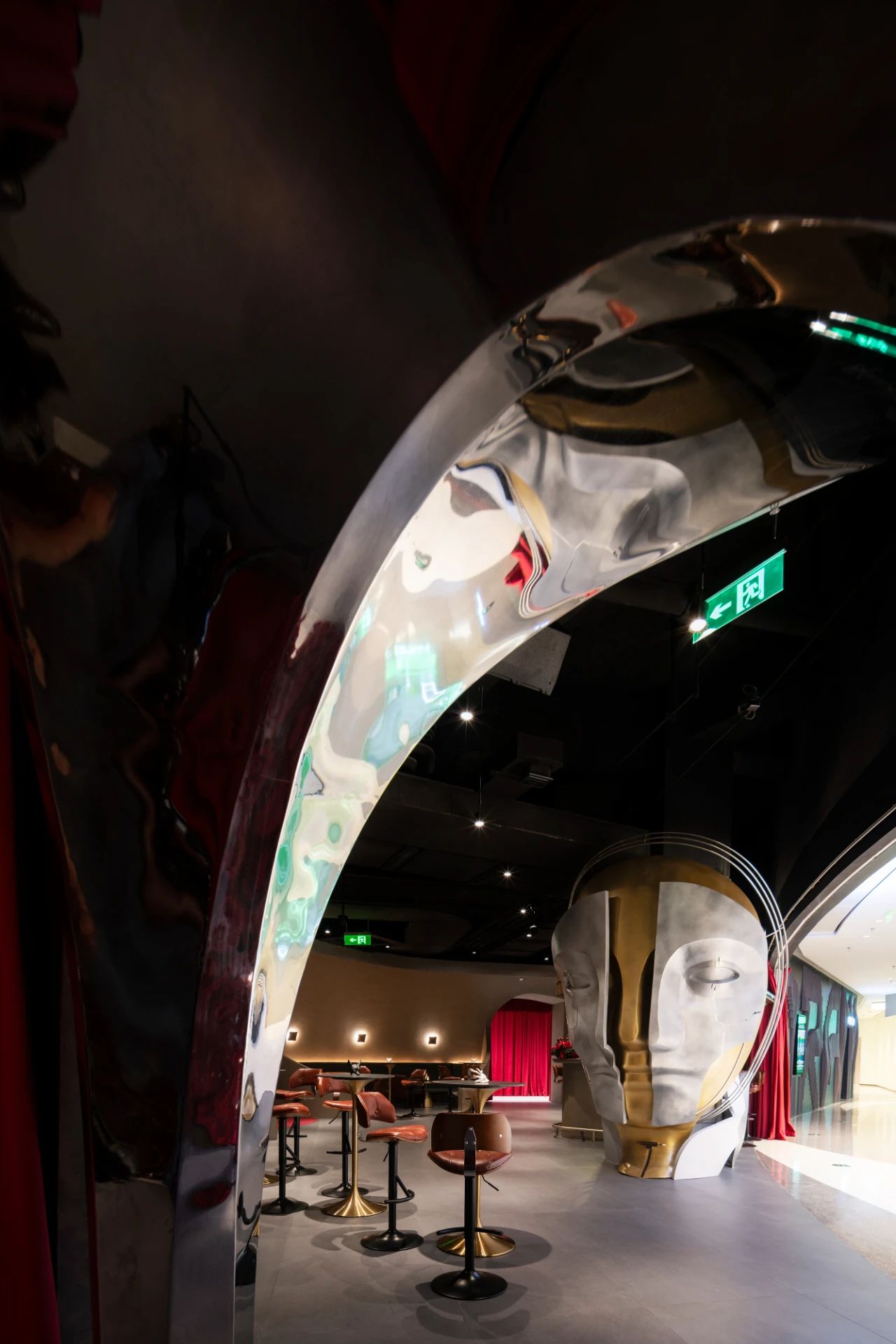
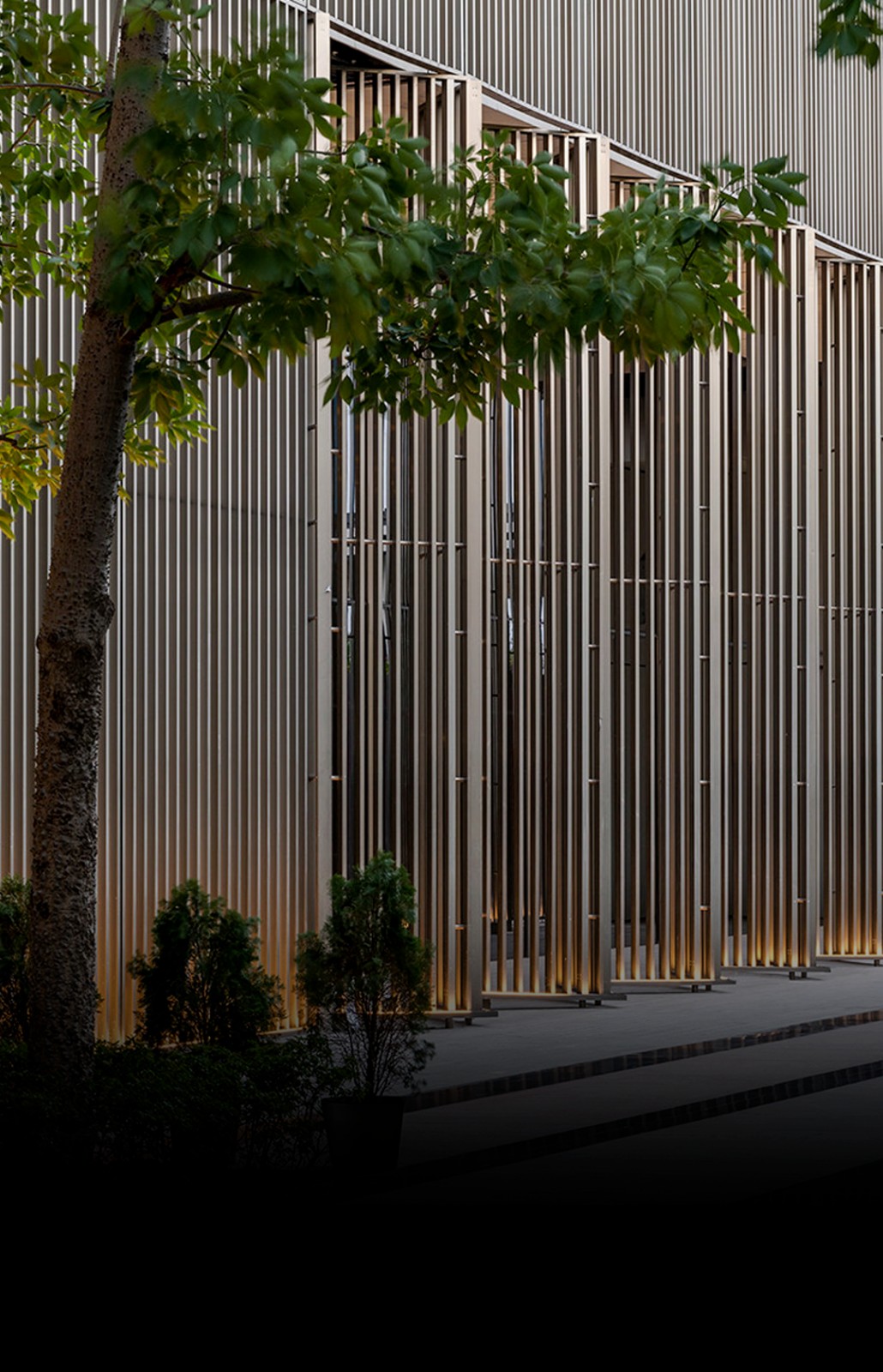
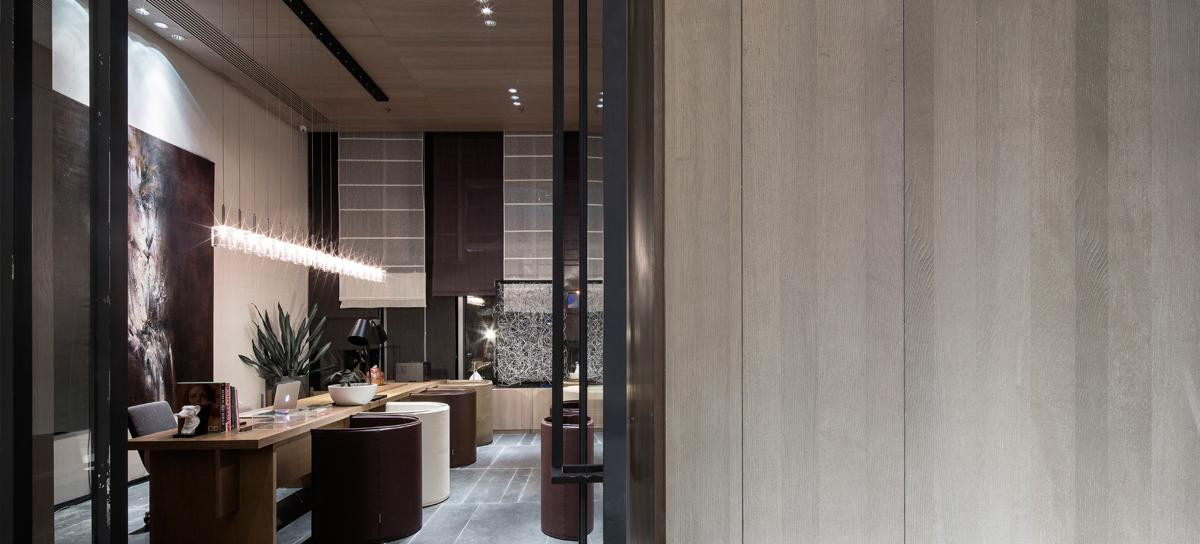
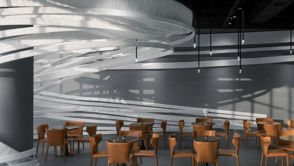
在建筑物的正门,首选安静和柔和的设计,几乎是陈列室区域的使者。在整个建筑中,它旨在通过曲线墙为游客建立一个令人愉悦的环流场景,该曲线墙并不能决定其路线,而是通过其自然流动来引导它。
通过创建一个用透光面板排除周围城市格局的外壳,可以提供一种完全内向的体验设置。
At the main entrance of the building, a quiet and soft design is preferred, and it is almost the messenger of the showroom area. Throughout the building, it aims to create a pleasing circulation scene for visitors through the curved wall, which does not determine its route, but guides it through its natural flow. By creating a shell that excludes the surrounding urban pattern with translucent panels, a completely introverted experience setting can be provided.


这种内向的设置也是通过在构造元素中采用有机形式以及定制设计的可移动家具模块的“流动性”来创建的。主要陈列室的设计采用互锁的双层圆形方案,将参观者保持在中心位置。外层由固定的结构元素和展示元素集成而成,内层由在地板上的圆形轨道上移动的展示模块定义。
This introverted setting is also created through the use of organic forms in the structural elements and the fluidity of custom-designed movable furniture modules. The design of the main showroom uses an interlocking double-layer circular scheme to keep visitors in the center. The outer layer is integrated with fixed structural elements and display elements, and the inner layer is defined by display modules that move on a circular track on the floor.


圆形层彼此之间以及与外壳之间的相互缠绕的连接实现了巧合的视角。设计语言和材料决策的制定是为了反映公司产品系列中朴素而优雅的语言统一感。产品的“轻便”是“简单”的概念,其曲线曲面将空间划分为多个部分,并在调色板中选择了中性色调。
The entangled connection of the circular layers to each other and to the outer shell allows for coincidental viewing angles. The design language and material decisions are made to reflect the simple and elegant sense of language unity in the companys product series. The lightness of the product is the concept of simple. Its curved surface divides the space into multiple parts, and a neutral tone is selected in the palette.


精心设计的手工定制细节以及诸如黄铜,大理石和木材之类的材料被选择用于多样化的展览模块,以象征着所展示产品的丰富性和关怀性。用户在四个主要陈列室中的旅程已被设计为整体和分区流程。
Well-designed hand-customized details and materials such as brass, marble and wood are selected for the diverse exhibition modules to symbolize the richness and caring of the products displayed. The users journey in the four main showrooms has been designed as an overall and partitioned process.


这些部分通过圆形图相互分隔,圆形图根据产品的品种和数量定义为不同的尺寸 。圆形区域的边界通过壁相互连接,壁的上下凹凸与透明表面上完成的曲线相协调 。
These parts are separated from each other by a circular diagram, which is defined as different sizes according to the variety and quantity of the product. The boundaries of the circular areas are connected to each other by walls, and the upper and lower concavities and convexities of the walls are coordinated with the curves completed on the transparent surface.


充满活力和新鲜感,因为它不断变化和更新。它以一种混合、包容的氛围,吸引和聚集世界各地的年轻人城市。这是一个休闲的地方,与日常生活息息相关,日新月异。它强调运动美学,致力于为亚洲女性提供轻便、舒适、时尚的产品。设计从一种自由的态度开始,以一种灵活方式执行,创造意想不到的邂逅和惊喜来激发设计之美。
Its full of vitality and freshness because its constantly changing and updating. It attracts and gathers young people from all over the world in a mixed and inclusive atmosphere. This is a place for leisure, closely related to daily life and changing with each passing day. It emphasizes sports aesthetics and is committed to providing Asian women with lightweight, comfortable and fashionable products. Design starts with a free attitude and is carried out in a flexible way to create unexpected encounters and surprises to stimulate the beauty of design.


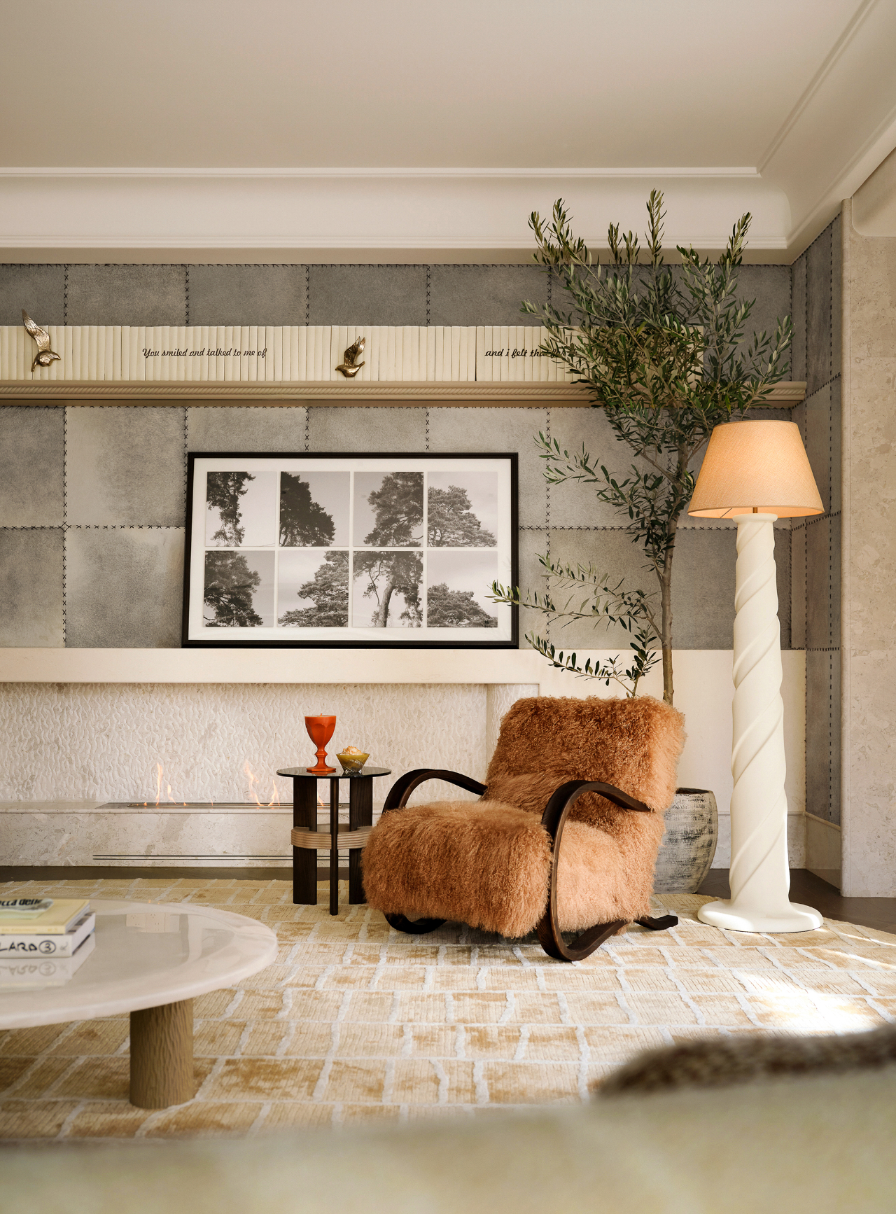
受该轻松、自由氛围的启发,设计师确定“游荡灵魂”为设计理念。在空间中引入柔性曲线,给日常生活带来审美流动性。奶油黄色被选为主导色调,并适用于大面积的空间。当从弯曲入口遥望室内时,整个商店就像一块奶油蛋糕,柔和黄色将顾客和空间拉近距离。三文鱼粉和紫灰色通过不同的纹理和形式呈现,为内饰注入活力和节奏感。
Inspired by the relaxed and free atmosphere, the designer determined wandering soul as the design concept. The introduction of flexible curve in space brings aesthetic mobility to daily life. Cream yellow is chosen as the dominant color and is suitable for large areas of space. When you look into the room from the curved entrance, the whole store is like a cream cake. Soft yellow brings customers closer to the space. Salmon powder and purple grey are presented in different textures and forms to inject vitality and rhythm into the interior.


不规则多边形空间被划分为几个核心区块,包括入口内的圆形展台、中间的展示家具组合、装修区、休息区和墙壁展示区。为了增加整体空间的节奏,打破沉闷,所有功能区结构圆润。功能块的形式简单而多样,就像在与顾客接触的空间中自由移动的“点”。通过各种材料,重新定义服装店,打破场景的束缚。
The irregular polygon space is divided into several core areas, including the circular exhibition stand in the entrance, the display furniture combination in the middle, the decoration area, the rest area and the wall display area. In order to increase the rhythm of the whole space and break the dullness, the structure of all functional areas is mellow. The form of function block is simple and diverse, just like the point that moves freely in the space of contact with customers. Through a variety of materials, redefine the clothing store, break the shackles of the scene.

 PintereAI


