粉色系·柔美商业空间 首
2022-01-17 22:26


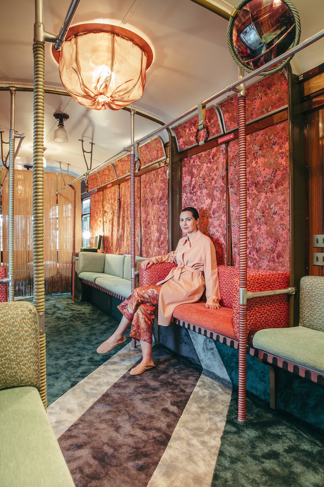
“ 粉色系装修凤,甜美但不甜腻,养眼又治愈。 ”
设计师手记 时尚粉色装饰 与灰色搭配显得柔和 凸显温馨浪漫的气质 有趣、清新而时尚 带来灵动优雅
优雅 · 高级灰 粉色
| Elegant · Premium Grey Pink


阿尼耶比总部前台是一个粉色的接待台,灰色瓷砖墙泛着光,带闪光灯泡的ANIYE BY标识牌醒目的呈现在来访者面前。另一边,洽谈区用灰色的落地帘隔出封闭的圆形空间。
The front desk of aniebi headquarters is a pink reception desk, the gray tile wall is shining, and the aniye by sign with flashing light bulb is prominently displayed in front of visitors. On the other side, the negotiation area is separated from the closed circular space by a gray floor curtain.


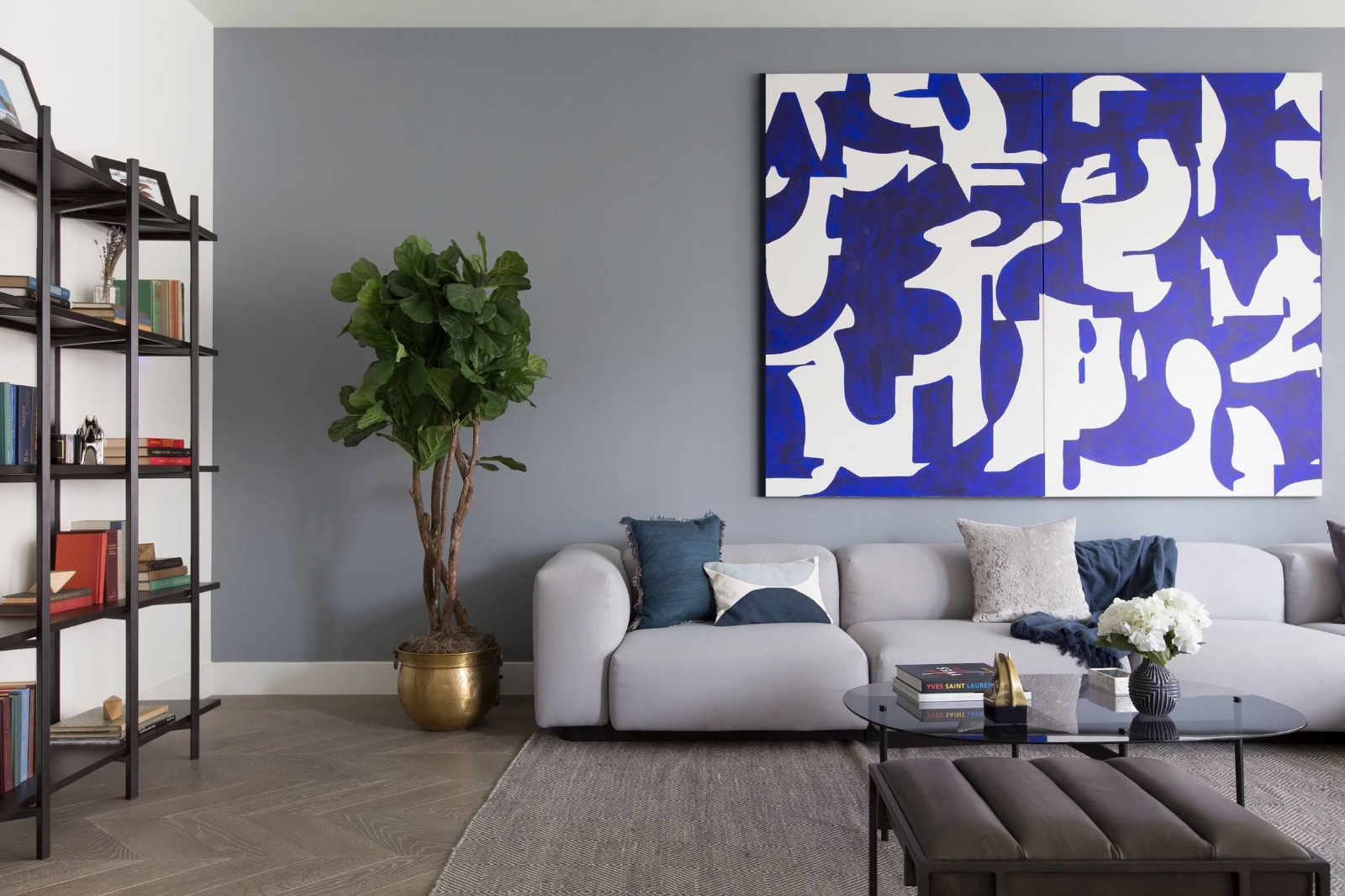
鱼骨纹木地板让空间显得整洁而干净,粉色沙发蜿蜒着靠落地窗摆放,沙发线条让面料体积显得十分饱满。墙面人物艺术画装饰,展现空间的文化底蕴,室内外绿植景观让空间充满生机活力。
Fishbone wood floor makes the space look neat and clean. The pink sofa is placed against the French window, and the sofa lines make the fabric volume look very full. The wall figure art decoration shows the cultural heritage of the space, and the indoor and outdoor green plant landscape makes the space full of vitality.


整体空间采用灰色 粉色,卫生间以粉色为主调只有地板是灰色,极简灯泡悬挂在洗手台上方。楼梯空间护栏和墙面运用粉色,灰色台阶俯视可以看到空间中美丽的波浪纹线条。
The overall space is gray pink. The bathroom is dominated by pink, only the floor is gray, and the minimalist bulb is hung above the wash desk. The stair space guardrail and wall are made of pink and gray steps. Looking down, you can see the beautiful wavy lines in the space.
| 3D · Art Exhibition


看看这位3D艺术家如何为一个真实展览呈现50个不同的方案,3D数字渲染改变游戏程度——最显著的是它们使编辑照片。哥本哈根画廊的第一次展,设计师安德烈斯·赖辛格在与画廊总监彼得·安比就最终概念达成一致
之前,为展览提案创作50多种不同3D效果图。
See how the 3D artist presents 50 different schemes for a real exhibition. 3D digital rendering changes the degree of the game - most notably, they enable editing photos. In the first exhibition of Copenhagen Gallery, designer Andres lesinger created more than 50 different 3D renderings for the exhibition proposal before reaching an agreement on the final concept with gallery director Peter amby.


这场名为“求职面试”的展览旨在唤起面试者不适感,其特色是巨大粉色回收PVC球体,占据画廊一部分空间,几乎没有给观众留下任何空间。
The exhibition called job interview aims to arouse the discomfort of interviewers. Its feature is a huge pink Recycled PVC sphere, which occupies part of the space of the gallery and leaves almost no space for the audience.


然而,通过展示最终展览提案的图像,该展览还提出一个相对棘手的问题:如果大多数人只在网上观看展览,最终展览的概念到底有多重要?我们在下面选择我们最喜欢的方案;如果你像我们一样短期内不在哥本哈根,请滚动浏览以自行决定,并偷偷看一眼最终的展览图像。
However, by displaying images of the final exhibition proposal, the exhibition also raises a relatively thorny question: how important is the concept of the final exhibition if most people only watch the exhibition online? We choose our favorite scheme below; If you are not in Copenhagen for a short time like us, please scroll to make your own decision and take a sneak look at the final exhibition image.


同样,巨大球体换了颜色和背景却呈现截然不同的效果,空间装修材质如皮肤背景,而软装和家具等物品则是功能、用途的主要体现。艺硕设计,根据客户不同需求量身定制专属服务,只为达到最佳室内装饰效果。
Similarly, the color and background of the huge sphere have changed, but they show different effects. The space decoration materials such as skin background, while soft decoration and furniture are the main embodiment of function and use. Yishuo design, tailor-made exclusive services according to different needs of customers, only to achieve the best interior decoration effect.

 PintereAI


