极简主义 现代诗意空间的简单表达 首
2022-04-27 11:47
设计师手记 简单是很 难以创造 尤其是当每个 单个细节计数 它意味着 中性的墙壁 柔和的色彩 天然材料和 简单的解决方案
当我们在她位于圣彼得堡的工作室与她聊天时,她向我们讲述了她基于感觉和功能的细心设计方法;以及她对纯粹精致的追求如何在物体、家具和室内
空间之间流畅地移动。奥斯米尼娜希望这个地方能够反映艺术画廊平静而精致的一面。“我想创造一些极简而崇高的东西;一个你可以感受到的空间,没有分心或大惊小怪,“她分享道。从她的旅程开始,极简主义就一直是 Osminina 的哲学。“当我不得不(在公寓里)做出决定时,我开始使用我在处理曝光时使用的相同原则。我想到了我们生活的空间和我们周围的物体有多重要,”她解释道。
As we chat with her from her studio in Saint Petersburg, she tells us about her attentive design method based on feeling and functionality; and how her search for pure sophistication moves fluently between objects, furniture, and interior spaces.
Osminina wanted the place to be a reflection of the calm sophistication of art galleries. “I wanted to create something minimal and sublime; a space where you can feel, with no distractions or fuss,” she shares.
Minimalism has been Osminina’s philosophy since the beginning of her journey. “When I had to make decisions [in the apartment], I began to use the same principles I used when working with exposures. I thought about how important is the space we live in and the objects we surround ourselves with” she explains.
“墙壁、物体、颜色——一切都有自己的线条和体积;每个主题都有自己的性格。我将这些放置在空间中,与我的构图感有关,”她继续说道
。“我想创造一个你可以感受到的空间,没有分心或大惊小怪”在设计中,极简主义可以适用于很多事物;对于 Osminina 来说,它包含直线、干净的几何形状和稀疏但功能丰富的空间。简单是很难以创造,尤其是当每个单个细节计数它意味着中性的墙壁、柔和的色彩、天然材料和简单的解决方案。
Walls, objects, color—everything has its own line and volume; each subject its own character. I placed these in space, in rel
ation to my sense of composition,” she continues.“I wanted to create a space where you can feel, with no distractions or fuss”n design, minimalism can apply to many things; for Osminina it encompasses straight lines, clean geometries, and sparse yet functionally-loaded spaces. Simplicity is very difficult to create,especially when every single detail counts It means neutral walls, soft enveloping colors, natural materials, and uncomplicated solutions.
“对我来说,空间必须感觉简单;设计必须为自己说话,”她说。简单是很难创造的,尤其是当每一个细节都很重要时。“矛盾的是,简单是最难的事情,”她补充道。“实现它需要大量的观察和研究,”她解释说,并补充道,“其中有很多东方哲学,其中蕴含着深刻而漫长
的沉思。”Osminina 的设计作品往往是住宅室内设计,但它存在于房间和家具设计与建筑无缝交叉的领域。对于设计师来说,这个地方的感觉和历史具有重要的个人意义。“我努力保存一切都是有价值,而不是重建失去的东西”“我努力保护所有有价值的东西,而不是重建失去的东西,”她说。
“For me, a space must feel simple; the design must speak for itself,” she says. Simplicity is very difficult to create, especially when every single detail counts. “Paradoxically, simplicity is the hardest thing,” she adds. “Achieving it demands a lot of watching and studying,” she explains, adding “there is a lot of Eastern philosophy in this, in which deep and long contemplation lies.”Osminina’s design work tends to be residential interiors, yet it exists in a territory where the design of rooms and furniture intersects seamlessly with architecture. For the designer, the feeling and history of the place are of great personal significance. “I strive to preserveeverything that is valuable, rather than recreating what is lost”“I strive to preserve everything that is valuable, rather than recreating what is lost,” she says.
“重要的是要定义历史本质并一丝不苟地遵循它,以突出空间的特殊美感。” 她的项目源于概念基础原则。“我从源头开始,试图了解这个空间。它的性质是什么?一切都是围绕着什么建造的?对象位于哪个国家、城市和街道?谁建造和设计了它?这些问题奠定了基调和参考框架,”她解
释道。Osminina 在每个项目上都非常注重细节。这些是引人注目的房间和住宅,拥有单色饰面和大墙,清醒但从不简朴。“我理想的设计是一种平静和自然的感觉,好像没有人在它上面工作过,而你仍然可以感觉到整个空间的基础视觉概念,”她分享道。
“It is important to define the historical essence and meticulously follow it, so as to highlight the space’s special beauty.” Her projects arise from conceptual basis principles. “I start from the source and try to understand the space. What is its nature? What is everything built around? In which country, city, and street is the object located? Who built and designed it? These questions set the tone and frame of reference,” she explains.Osminina works on every project with a remarkable attention to detail. These are compelling rooms and residences with monochrome finishes and large walls, sober yet never austere. “My ideal design is one where there is a feeling of calmness and naturalness, as if no one had worked on it, while you can still sense an underpinning visual concept for the entire space,” she shares.
对于设计师来说,真正的美在于自然。“我喜欢使用天然材料,例如混凝土、木材、石膏和金属。我希望它们尽可能自然地展开,而不施加任何额外
的效果,”她说。“我喜欢材料尽可能自然地展开,而不施加任何额外的效果”在她的实践中,Osminina 倾向于单色,使用单色调色板来增强空间的整体外观和感觉。“项目的感觉总是建立在颜色之上;一种从材料和光中出现的东西,”她说
。“我的作品中有很多颜色,但细微差别是如此微妙,以至于营造出单一颜色的整体感觉。这种解决方案克服了趋势的瞬间和影响,但它包含了一个更有价值的组成部分,形成了空间的本质:永恒,”她继续说道。
For the designer, real beauty lies in the natural. “I love to work with natural materials, such as concrete, wood, plaster, and metal. I like them to unfold as naturally as possible, without applying any additional effects,” she says.“I like materials to unfold as naturally as possible, without applying any additional effects”In her practice, Osminina ten
ds to go monochrome, using a one-color palette to intensify the overall look and feel of the space. “The feeling of the project is always built on color; one that emerges from materials and light,” she says.“There’s a lot of color in my works, but the nuances are so delicate that an overall feeling of a single color is created. This solution defeats the momentary and the influence of trends, yet it contains a much more valuable component that forms the essence of the space: timelessness,” she continues.
Osminina 只用最必要的家具填充她的空间。“功能性是我设计的核心;这些空间必须有人居住,”她说。
味的感觉”“这是一种深思熟虑的日常解决方案,让我们能够在形成设计时保留最初构想的感觉
,”她继续笑着说,“我有两个孩子,所以我知道我在说什么。” 对于设计师来说,视觉舒适性和实用性齐头并进。“我非常关注存储系统;他们支持极简主义哲学,在空间中保留空气和空虚。”“我追求一种崇高的虚无,一种以雕塑般的精确度形成的虚无”Osminina 需要创造力才能在空间中拥有足够的呼吸空间。“有许多不必要的物体的空间会引起焦虑和忙碌感,”她说。
Osminina fills her spaces with only the most necessary furniture. “Functionality is at the heart of my designs; these spaces have to be lived in,” she says. “Thoughtful everyday solutions allow us topreserve the design’s original feeling”“It is thoughtful everyday solutions that allow us to preserve the feeling originally conceived when forming the design,” she continues, laughing, “I have two children, so I know what I’m talking about.” For the designer, visual comfort and practicality go hand-in-hand. “I pay a lot of attention to storage systems; they support a philosophy of minimalism, retaining air and emptiness in a space.”“I pursue a sublime emptiness, one that is formed with sculptural precision”Osminina demands creativity to have enough breathing room in a space. “Spaces in which there are many unnecessary objects cause anxiety and a sense of bustle,” she says.
“对我来说,这不是‘少即是多’或‘少即是好’的问题;我所做的每一件事都坚持‘只有必要,但最好’的原则,”她补充道。在缺乏和减少之间,在纯粹的极简主义和
本质主义之间,她的功能空虚指导原则令人着迷。“我追求一种崇高的空虚,一种以雕塑般的精确度形成的空虚,”她宣称。设计师将自己置身于过去与当代之间的连续叙述中,在两者的平衡中找到一种诗意。不和谐的音符是矛盾的是什么加强了项目的整体感觉和谐。
“For me, it is not a matter of ‘less is more’ or ‘less is better’; I adhere to a principle of ‘only necessary, but the best’ in everything I do,” she adds. Somewhere between a case of lacking and a case of lessing, between pure minimalism and essentialism, her guiding principle of functional emptiness is fascinating. “I pursue a sublime emptiness, one that is formed with sculptural precision,” she declares.The designer inserts herself into a continuous narrative between the past and the contemporary, finding a sense of poetry in the balance of the two.The discordant note is paradoxically what reinforces the project’s overall sense of harmony.
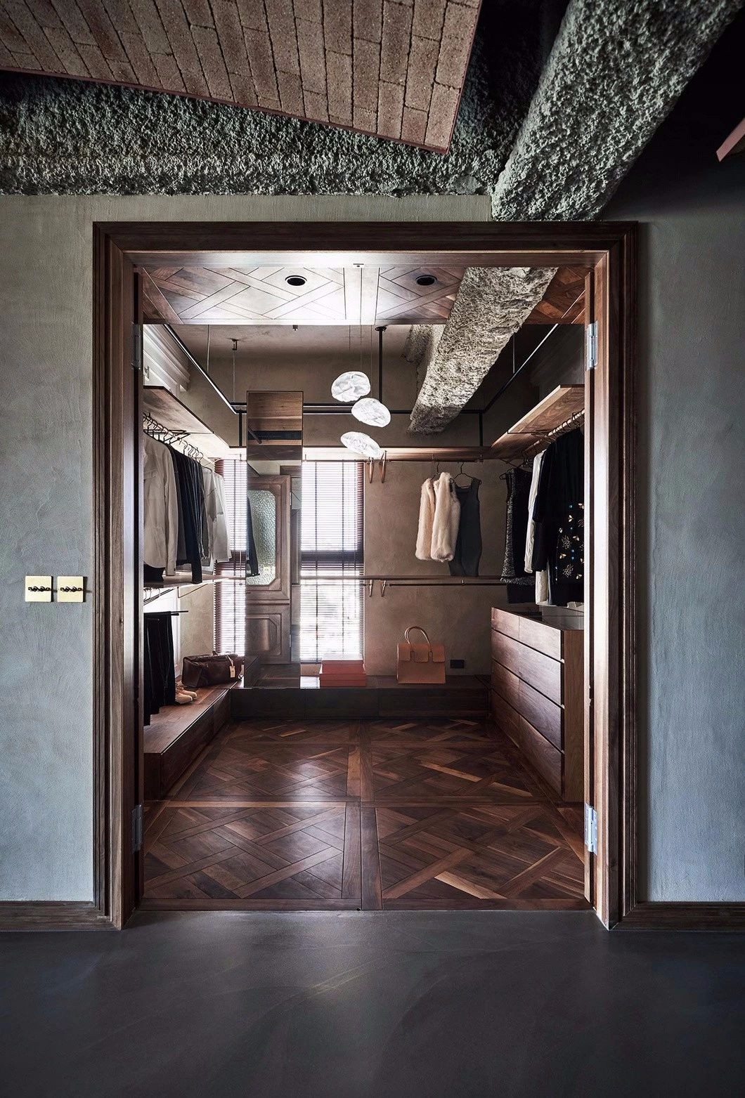
她对“米色”(位于圣彼得堡的 20 世纪早期公寓)进行了极简改造,突出了她对当代解决方案概念化的掌握,例如白色立体主义体积和光滑的混凝土,同时保留了该空间的建筑遗产及其独特性,例如复杂的装饰 灰泥和精致的飞檐
。与整体构图的精致技巧并列,她的项目中不和谐的音符,通常是古董家具或装饰元素,却自相矛盾地强化了整体的和谐感。Osminina 的许多项目,包括“Vibrance”和“Time Boundaries”,将不同时代的物品和家具与有意的意义相结合,进一步赋予空间一种历史平衡和宁静的感觉。“我室内的每一件家具都很重要,它们改变并塑造了它们所在的空间,”她说。“我喜欢在形式、颜色和空虚之间找到平衡,让每个元素都感觉像是 [房间] 不可或缺的一部分。
Her minimalist revamp of ‘Beige’—an early 20th-century apartment located in Saint Petersburg—highlights her mastery in conceptualizing contemporary solutions, such as white cubist volumes and smooth concrete, while preserving the space’s architectural heritage and its singularities, like the intricate decorative plasterwork and elaborate cornices. Juxtaposed to the polished finesse of the overall composition, the discordant note in her projects, often an antique furnishing or ornamental element, is paradoxically what reinforces the overall sense of harmony.Many of Osminina’s projects, including ‘Vibrance’ and ‘Time Boundaries’ combine objects and furniture from different eras with intentional meaning, further endowing the space with a sense of historical balance and serenity. “Every piece of furniture in my interiors matters, they change and shape the space in which they are located,” she says. “I like to find the balance of forms, color, and emptiness, so that each element feels like an integral part [of the room].”
”在“Vibrance”中,新旧家具的错综复杂线条,包括 Eileen Grey、Gepo、Ubald Klug、Rick Owens 的设计以及 Lucio Fontana 的艺术品,都为空间增添了雕塑感;每个项目都增强了另一个项目的个性。“当我觉得缺少必要的形状时,我会自己制作
家具,”Osminina 补充道,暗示她的“永恒”物品系列。“当我觉得缺少必要的形状时,我会自己制作家具”“对我来说,每件物品都有自己的情感波动,”Osminina 说,她展示了她对艺术和设计边界上的收藏品的迷恋。“我喜欢能唤起感情的物品;能在感官上为周围环境着色的物品。人生中,最可贵的莫过于观美的那一刻。对我来说,这就是充实生活的东西,”她说,结束语与她的设计精神一样具有共鸣和个人色彩。
In ‘Vibrance’, the intricate lines of new and vintage furniture, which includes designs by Eileen Grey, Gepo, Ubald Klug, Rick Owens, and artworks by Lucio Fontana, all add a sculptural feeling to the space; each item enhancing the personality of the other. “When I feel that the necessary shapes are missing, I create pieces of furniture myself,” Osminina adds, hinting at her ‘Timeless’ object collection.”When I feel that the necessary shapes are missing, I create pieces of furniture myself”“For me, each object has its own emotional wave,” Osminina says, as she reveals her fascination for collectible objects on the border of art and design. “I love objects that evoke feelings; items that sensually color the environment that surrounds them. In life, the most valuable is the moment of contemplating beauty. To me, that is what fills life,” she says, a closing statement as resonant and personal as her design ethos.
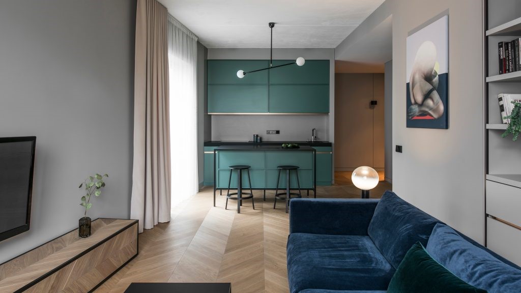
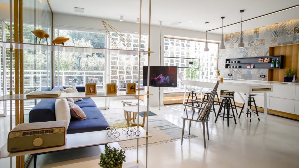
Turovksokogo 是位于明斯克的极简主义公寓。该项目的想法是为两个人的舒适住宿创造一个明亮的空间。公共休息室同时包括几个区域:厨房区、电视区、用餐区和办公室。公共休息室的明亮口音是专为该项目设计的厨房岛。它由橡木贴面中密度纤维板组装而成,可用作带有存储系统的附加工作区,以及早餐或快餐的地方。
Turovksokogo is a minimalist apartment located in Minsk. The idea of the project was to create a bright space for a comfortable stay of two people. The common room includes several areas at once: a kitchen area, a TV area, a dining area and an office. A bright accent of the common room is the kitchen island, designed specifically for this project. It is assembled from oak veneered MDF and serves as an additional working area with a storage system, as well as a place for breakfast or a quick bite.
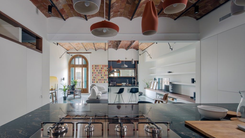
该设计结合了当地制造的灰白色橡木板、白色体量和柔软的纺织品。这样既保证了空间的亮度,又增加了空间的层次感和质感,给人一种原始自然的感觉。这个项目的亮点是隐藏的办公室。它也是由橡木覆盖的中密度纤维板制成,与其余木板的颜色相同。办公室通过滑动门与客厅的其他部分隔开。因此,您可以根据需要隐藏和打开办公室。卧室的设计是基于白色体积的组合,强调轻质和柔软的纺织品。卧室有自己的电视区和一个小的工作场所,主人会在那里化妆和回信。
The design is based on a combination of ash-colored oak panels made locally, white volumes and soft textiles.
This not only ensure the brightness of the space, but also adds the layering and texture of the space, giving it an original natural feeling.
The highlight of this project is the hidden office. It is also made of MDF covered by oak in the color of the rest of the wood panels. The office is separated from the rest of the living room by a sliding doors.
Thus, you can hide and open the office as necessary.
The design of the bedroom is based on a combination of only white volumes that emphasize light and soft textiles.
The bedroom has its own TV zone and a small workplace where the owner will do makeup and answer letters.
浴室也有纺织品。淋浴区隐藏在一个特殊的窗帘后面。从外面看,它是一种舒适的轻质面料,为该区域增添了舒适感。在背面,它是防水的一面。这个区域在灯箱的帮助下被照亮,并且由于大镜子,浴室空间扩大了,视觉上看起来更大更宽敞。
The bathroom also has textiles. The shower area is hidden behind a special curtain. From the outside it is a cozy light fabric that adds comfort to this area.
And on the back, its waterproof side. This area is illuminated with the help of a lightbox, and thanks to large mirrors, the bathroom space expands and visually seems larger and more spacious.
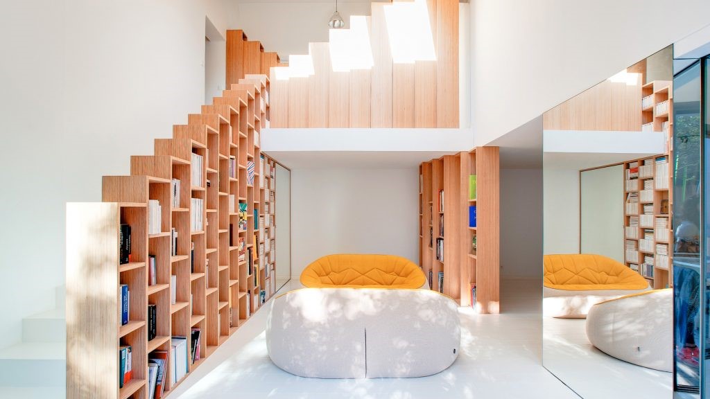
最初,这所房子在楼层之间有一个复杂的通信系统。这所房子甚至没有通往花园的安全出口。在此基础上,我简化了关卡之间的过渡,并试图通过赋予每个关卡自己的功能来使其尽可能合乎逻辑。所以顶层被主卧室和图书馆占据。楼上设有厨房区和客厅。
Initially, this house had a complicated communication system between floors. The house did not even have a safe exit to the garden. Based on this, I simplified the transit between the levels and tried to make it as logical as possible by giving to each level its own function. So the top floor is occupied by a master bedroom and a library. The upper floor has a kitchen area and living room.
主层有车库和客房。下层是托儿所。最低层是一个有客人的寒冷区域,从那里可以进入花园。厨房区域的概念是基于白色和对比色木材的组合。厨房采用隐
藏式配置,让您将这个房间变成一个完整的用餐区,您不会被厨房家具分心,可以充分享受与亲人交流的乐趣。客户唯一想从以前的公寓搬来的东西就是他的 Yamaho 钢琴。因此,客厅的心脏是这种乐器,它对顾客来说是珍贵的,并揭示了他的创造力。
The main level has a garage and guest bedrooms. The lower level is a nursery. And the lowest level is a chilling area with guests, from where access to the garden is organized.The concept of the kitchen area is based on a combination of white and contrasting wood. The kitchen has a hidden configuration, which allows you to transform this room into a full dining area, where you will not be distracted by the kitchen furniture and can fully enjoy communicating with loved ones.The only thing the customer wanted to transport from the previous apartment was his Yamaho Piano. Therefore, the heart of the living room is this musical instrument, which is dear to the customer and reveals his creative nature.
多亏了窗帘,我们可以将这架钢琴“添加”到用餐区,当我们想在晚餐时与家人一起弹奏时,也可以将这架钢琴“添加”到起居区。或者你可以为自己隐藏和播放一些东西。起居室有隐藏的储物区,您可以在其中放置书籍、玩具或酒类。在这里,设计也建立在形式和纹理的结合之上。主要材料是木材、人造革和混凝土。
Thanks to the curtains, we can “add” this piano both to the dining area, when we want to play something with the family during dinner, and to the living area. Or you can hide and play something for yourself. The living room has hidden storage areas where you can place a collection of books, toys or alcohol. Here, the design is also built on a combination of form and texture. The main materials are wood, artificial leather and concrete.
采集分享
 举报
举报
别默默的看了,快登录帮我评论一下吧!:)
注册
登录
更多评论
相关文章
-

描边风设计中,最容易犯的8种问题分析
2018年走过了四分之一,LOGO设计趋势也清晰了LOGO设计
-

描边风设计中,最容易犯的8种问题分析
2018年走过了四分之一,LOGO设计趋势也清晰了LOGO设计
-

描边风设计中,最容易犯的8种问题分析
2018年走过了四分之一,LOGO设计趋势也清晰了LOGO设计


 PintereAI


