盒子几何美学 空间概念! 首
2022-11-24 23:16


“ 盒子几何美学, 空间概念。 ”
设计师手记 一个可以从 城市中得到 保护和休息的地方 就像一个碉堡和绿洲一样 自然界的材料 如象征城市的沙漠和它的补充物--水 被用来在空间上体现这种矛盾


韩国眼镜品牌YUN成立于柏林,是一个保留了东方和西方文化的平衡所带来的技术上的精致和模拟上的重合的品牌。
Established in Berlin, Korean eyewear brand YUN is a brand that preserves a technological delicacy and analogical remblance accommodated by the balance of eastern and western cultures.


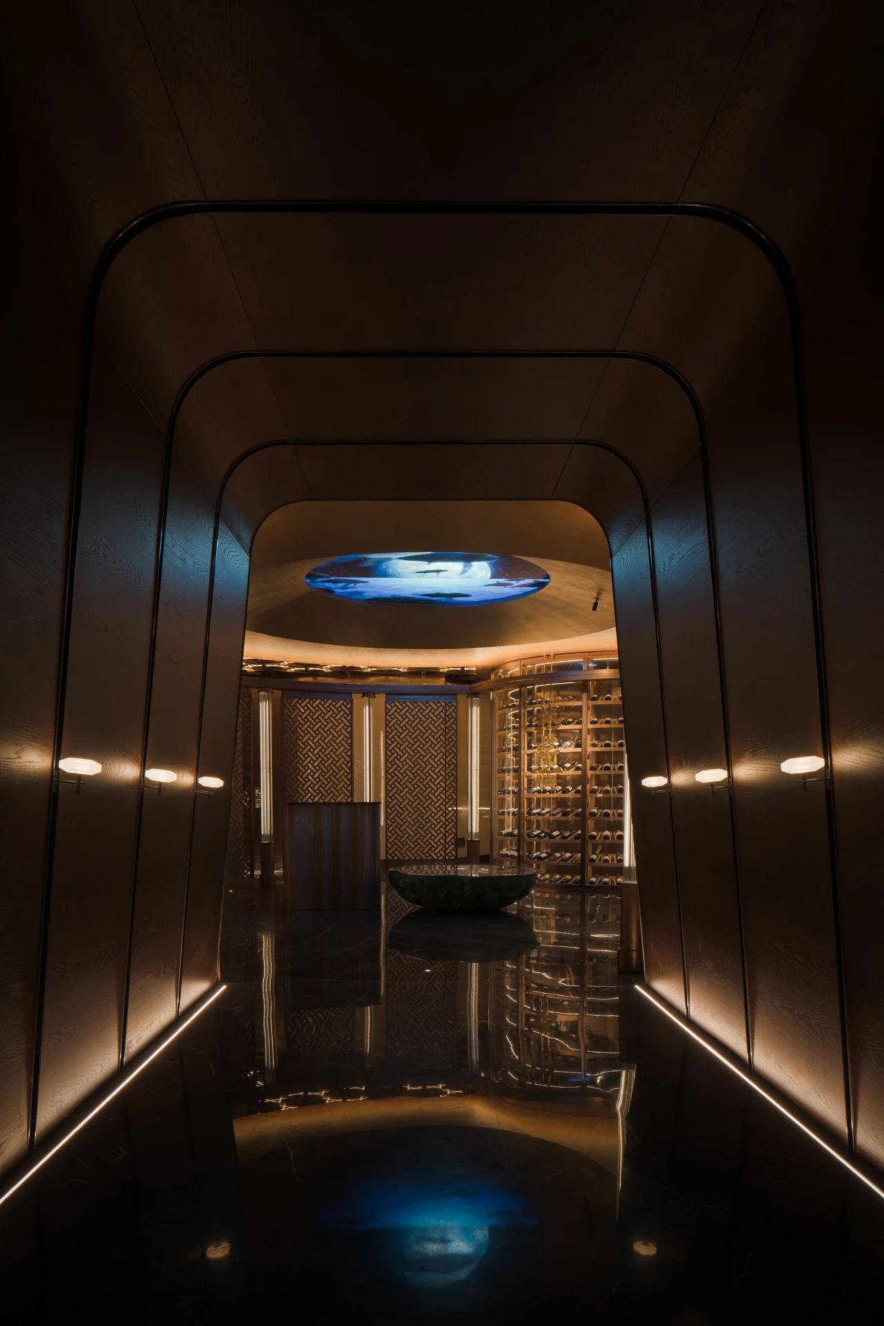
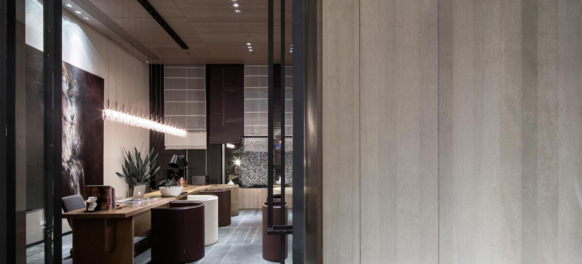
YUN Hannam是一个YUN品牌和YUN teehaus共存的地方。为了使YUN汉南成为一个可以从城市中得到保护和休息的地方,就像一个碉堡和绿洲一样,自然界的材料,如象征城市的沙漠和它的补充物--水,被用来在空间上体现这种矛盾。
YUN Hannam is a place where the brand YUN and YUN teehaus coexist. In hopes of YUN Hannam becoming a place where one can be protected and get rested from the city like a bunker and an oasis, material of nature such as the desert symbolizing the city and its complementary, water was used to spatialize the contradistinction.


空间的设计是以沙漠的碉堡和水的亭子为空间概念。
Space was designed with the spatial concept of a bunker of the desert and pavilion of water.


通过利用空间的入口作为轴线,我们将右边的空间命名为 沙漠的碉堡,左边的空间命名为 水的亭子。通过水和沙漠的对比,我们能够将设计语言具体化。
By utilizing the entrance of the space as the axis, we titled the space on the right for YUN as ‘bunker of the desert’ and space on the left for YUN teehaus as ‘pavilion of the water’. Through contrast and comparison of water and desert, we were able to materialize the design language.


首先,在相似性方面,图案的重复性被用作基础。空间的右侧是有节奏和有层次的垂直结构的重复,增加了空间的结构感。与右边相反,左边是水平结构的重复,用于空间的逐渐扩展。
First, in similarity, repetition of the patterns was used as base. The right side of the space is a repetition of rhythmic and layered vertical structures which adds a structural sense of space. In contrast to the right, the left side is a repetition of horizontal structures for the gradual expansion of the space.


第二,外墙、地板和墙体结构的图案重复被用来描绘规律性和节奏性。
Secondly, the repetition of patterns for the facade, the flooring and the wall structure was used to portray regularity and rhythmicity.


第三,通过材料的重复,图案和结构制造了空间的细节。
Thirdly, patterns and structures through the repetition of materials fabricated the details of the space.
Notabene旗舰店
Notabene Flagship Store


在设计这家时尚的商店时,Norm的建筑师为空间注入了个性和魅力,同时保留了其工业魅力。
In designing the sleek store, the architects at Norm have injected personality and charm into the space, while retaining its industrial appeal.


进入商店,人们被一个宏伟的双层空间所欢迎,墙壁是裸露的、有触感的,地面是原始的水磨石,还有引人注目的极简主义铝制货架,将最新的意大利手工鞋系列展示为精致的图标,该公司的一份声明解释说。
“Entering the store, one is welcomed by a grand double-height space with exposed and tactile concrete walls, an original terrazzo flooring, and striking minimalist aluminum shelves, showcasing the newest collection of Italian handmade shoes as delicate icons,” explains a statement from the firm.


轻盈而精致的重新设计旨在改变Notabene的零售体验,创造一个包括零售、擦鞋吧和创意实验室的中心。
Light and refined, the redesign aimed to transform the Notabene retail experience to create a hub that comprises retail, a shoeshine bar, and a creative lab.


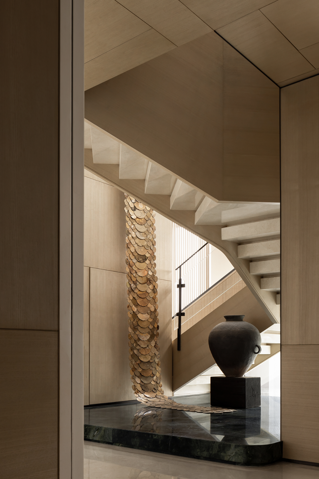
由日本家具品牌Karimoku Case Study和当地工匠精心打造,米色调的优雅家具伴随着雕塑般的木质楼梯,几何般地连接着空间的三层,同时阳光透过橡木结构渗入其中。
Carefully crafted by Japanese furniture brand Karimoku Case Study and local craftsmen alike, elegant furniture pieces in beige tones accompany a sculptural wooden staircase, geometrically connecting the three levels of the space while sunlight seeps through its oak structure.


他们补充说:优雅的木制细节、茂盛的布纹织物、手工拉丝铝制表面和波纹混凝土的材料组合,创造了一个前卫的宇宙,同时又是轻松、精致和豪华的,。
“The material combination of elegant wooden details, lush bouclé fabrics, hand brushed aluminum surfaces, and rippled concrete creates an edgy universe that is both relaxed, refined, and luxurious at the same time,” they add.
艾米利亚-维克斯特德的旗舰店
Emilia Wicksteads flagship shop


与永恒的卓越价值相同,工作室与时装设计师密切合作,以实现一个最能反映品牌精神的精品店,其基础是对传统但现代风格的热爱和对细节的高度关注,从而形成一个低调的优雅空间。
Sharing the same value of timeless excellence, the studio worked closely with the fashion designer to achieve a boutique that best reflected the brand ethos based on the love for a traditional yet contemporary style and great attention to detail, resulting in a space of understated elegance.


本着同样的卓越理念和深思熟虑的方法,Nenmar将设计概要解释为一个有意义的设计,创造了一个令人难忘的客户体验,并在不同的区域创造了真正的发现之旅。
With the same idea of excellence and a thoughtful approach, Nenmar interpreted the brief into a meaningful design that creates a memorable customer experience and a real journey of discovery through the different areas.


为了向意大利理性主义致敬,最好的代表是建筑和艺术杰作,如Piero Portaluppi设计的Villa Necchi,Nenmar的灵感来自1920-1940年代意大利建筑的理性简洁和功能性。
Paying homage to Italian rationalism, best represented by architectural and artistic masterpieces such as Villa Necchi designed by Piero Portaluppi, Nenmar’s inspiration arose from the rational simplicity and functionality of the Italian architecture of the 1920-1940s.


房间之间的移动是流畅的,目光可以不受干扰地延伸到商店的整个横截面。罗莎-阿利坎特(Rosa Alicante)大理石门户将顾客从成衣室引向精品店的明珠--新娘区,通过桃花心木转轴门进入,并以织物覆盖,进一步增加了精致和个性化的感觉。
The movement between the rooms is fluid, and the gaze can stretch uninterrupted across the entire cross-section of the store. Rosa Alicante marble portals guide the customers from the ready-to-wear rooms through to the jewel of the boutique, the bridal area, accessed via mahogany pivot doors and shrouded in fabric to add a further touch of sophistication and personalization.


精致一致的贵重材料调色板,由罗莎-阿利坎特(Rosa Alicante)和白色卡拉拉(White Carrara)大理石制成的棋盘式地板,与抛光不锈钢吊轨、展示单元和定制的镜子等定制元素相映成趣。
A refined and consistent palette of precious materials, with a chequerboard flooring made of Rosa Alicante and White Carrara marble, is set against bespoke elements such as polished stainless steel hanging rails, and display units and made to measure mirrors.

 PintereAI


