WGNB新作丨色彩的维度 首
2023-02-14 22:14


WGNB
是韩国首尔的一家设计工作室,由三位年轻的创始人
Jonghwan Baek、Jonghyeon Shin
Dohan Kim
联合成立于2015年。
WGNB
尝试将日常生活中的瞬间灵感收集、提取、转换后应用于空间设计之中,试图借此展示一种独特的审美视角。
WGNB is a design studio based in Seoul, South Korea, founded in 2015 by three young founders: Jonghwan Baek, Jonghyeon Shin, and Dohan Kim. WGNB tries to collect, extract and transform the moments of inspiration in daily life into space design, in an attempt to demonstrate a unique aesthetic perspective.


PXG Graphite
品牌旗舰店
PXG Graphite
PXG
的第一家品牌重塑旗舰店,
WGNB
通过新的名词“
Graphite
”来重新定义其所追求的“黑色”内涵,以突出物质性、功能性和品牌的精神。“
Graphite
”是一种完全由碳组成的同位素,象征着纯洁和高贵。与钻石会反射光线并自身透光不同,而“
Graphite
”只展现出原始的、粗糙的表情肌理。
PXG Graphite was PXGs first rebranding flagship store, and WGNB sought to redefine the black connotation it was seeking with the new term Graphite to highlight materiality, functionality and the spirit of the brand. Graphite is an isotope made up entirely of carbon, which symbolizes purity and nobility. Unlike diamond Graphite, which reflects light and shines through itself, Graphite shows only raw and rough expression texture.


Ne
gi Dining
“黢黑”的
餐厅
这是一家
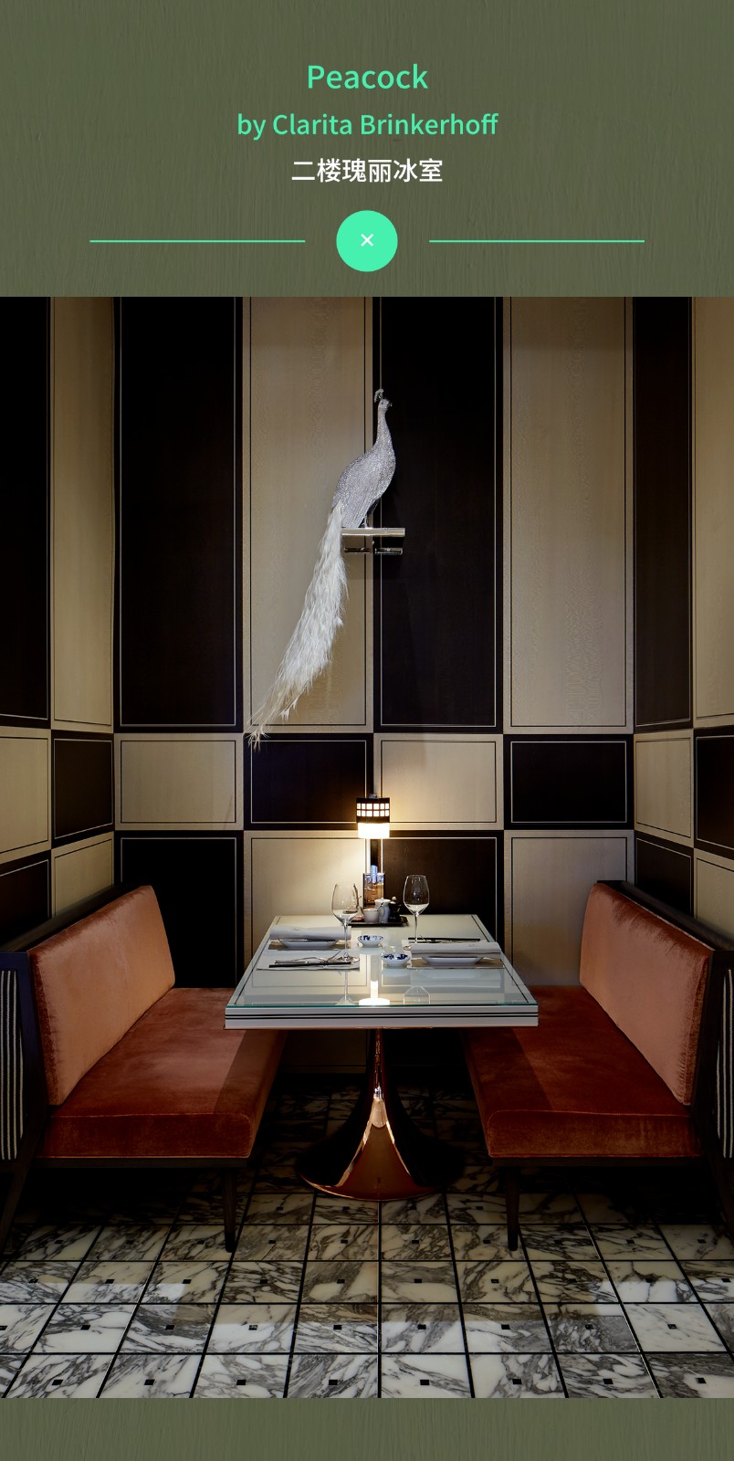
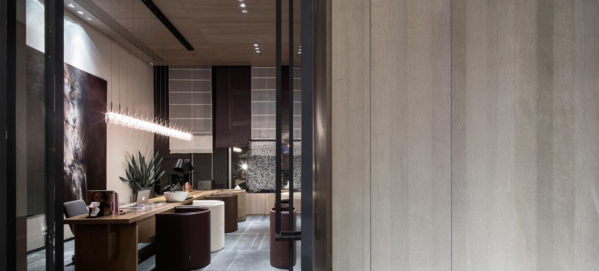
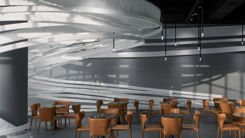
“黢黑”的餐厅,无论是墙面还是家具都为暗色调基底,并采用昏暗的灯光进行局部照明,营造出神秘、庄重的就餐氛围。WGNB摒弃了过多的装饰手法,并使照明灯具隐藏于天花内,以保证空间的整体性;另外大理石台面的应用,提升了整个空间的优雅品质。
This is a coal dark restaurant, both wall and furniture are dark tone base, and dim light is used for partial lighting, creating a mysterious and solemn dining atmosphere. WGNB abandons excessive decorative techniques and hides the lighting inside the ceiling to ensure the integrity of the space. In addition, the application of marble countertop improves the elegant quality of the whole space.


Mue Flags
hip Store
Mue旗舰店
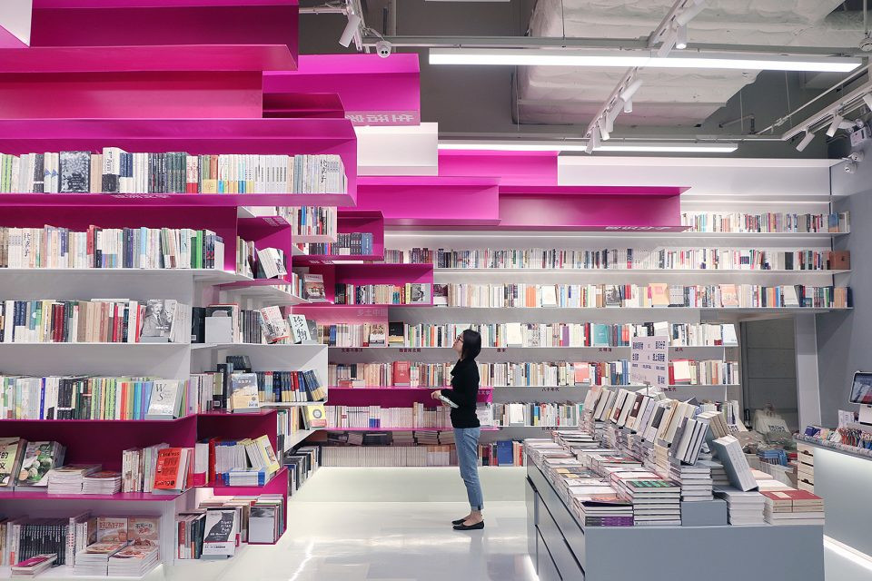
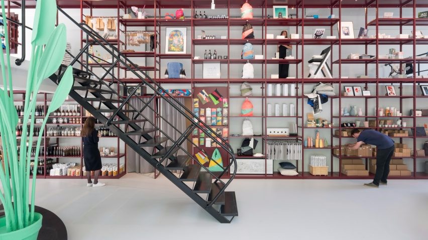
WGNB使用大胆的色彩为Mue新的旗舰店营造出强烈而独特的外观肌理,使它看起来更像是一件动态的艺术品。
蓝色与橘陶色在视觉上产生着碰撞,形成强烈的视觉冲击力;
设计师通过功能性和美学的相结合,勾勒出独特性格的商业品牌空间。
WGNB used bold colors to create a strong and unique exterior texture for Mues new flagship store, making it look more like a work of art in motion. Blue and orange pottery produce visual collision, forming a strong visual impact; Designers through the combination of functionality and aesthetics, outline the unique character of the commercial brand space.


图片版权 Copyright :WGNB

 PintereAI


