苏泊尔体验店│ 爱,一抹永不褪色的温暖
2023-07-10 10:19


 一个空间散发温润光芒,
于生活中漫射暖意,终成诗和远方。
 A space that radiates a warm glow,

diffuses warmth in life,

and eventually becomes poetry and distance.

对生活而言,我是一个小小灵感家以参与者的角度碰撞自由或表露美好——来自苏泊尔小家电自述
For life, I am a little inspirational person,
colliding with freedom or expressing beauty
from the perspective of the participants.
  ——A self statement from SUPOR small home appliances


0 1
升级的策略
Upgrade Strategy

我们坚持,
把平凡日常,变成诗和远方。
我们希望,
创造一个可触碰、可感知、可体验的生活质地。
我们将空间重新定义,
以“品质生活”为核心价值,重塑苏泊尔空间形象与体验。
We insist on turning the ordinary daily life into poetry and distance.
We want to create a touchable, perceptible and experiential texture of life,
We redefine the space, take "quality life" as the core value to reshape the image and experience of SUPOR space.


0 2
偏爱 • 空间营造
Preference • Space Creation

我偏爱永不缺席的浪漫暖意
我偏爱在转角和抬头的不经意间
偶遇弥漫的橘光和天边柔软的云
我偏爱这份秩序井然
更偏爱这份仪式感
I prefer the romantic warmth that is never absent.
I prefer in the corner and look up at the casual,
encounter the diffuse orange light and the horizon of the soft clouds.
I prefer this order,
and I prefer this sense of ritual even more.


这,是苏泊尔给予的灵感,也是来自空间的自由想象。在琳琅满目的家电包围之中,触及内心,引发感动,漫漫烟火气之中散发着每个人对生活的品味与格调。
This is the inspiration given by SUPOR, and it is also from the free imagination of space.Surrounded by a variety of home appliances, it touches the heart, arouses emotion, and exudes everyones taste and style of life in the hustle and bustle.


作为空间的第一视觉感受,是舒适的,是多元的,是纯粹的,所有这些状态,汇聚在一起,构成生活的“有机整体”。
As the first visual perception of space, it is comfortable, it is pluralistic, it is pure, and all these states come together to form the "organic whole"of life.


聚焦用户的产品体验,强调功能契合及质感生活,让产品与空间相互交融,相互渗透,带给消费者精致、高级的美好生活意象。
Focus on the users product experience, emphasize functional fit and texture life, let the product and space blend and penetrate each other, and bring consumers exquisite and advanced imagery of a beautiful life.


0 3
聚焦 • 感官维度
Focus • Sensory Dimension

当城市继续生长,什么样的家会让你倾心?有舒适的客厅,承载着你不大不小的幸福;有温度的厨房,唤醒你的味蕾,带你跳出一天的疲惫。
When the city continues to grow, what kind of home will you fall in love with? There is a comfortable living room, carrying your happiness; A warm kitchen that wakes up your taste buds and takes you out of the fatigue of the day.


厨房也不再囿于一日三餐,变成自然健康的烹饪理想地、舒适自在的交流地。由一个小家电的触及到整个厨房的连接,让消费者在美食课堂体验过程中深刻体会到物至美时的从容随心。
The kitchen is no longer limited to three meals a day, but has become an ideal place for natural and healthy cooking, as well as a comfortable place for communication.The connection from the touch of a small home appliance to the entire kitchen, let consumers deeply appreciate the things to the beauty of the calm at heart in the process of food class experience.


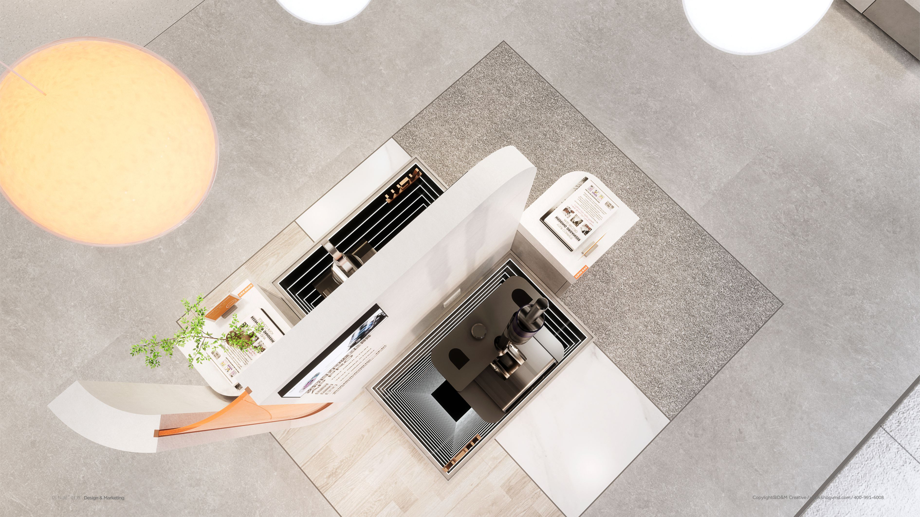
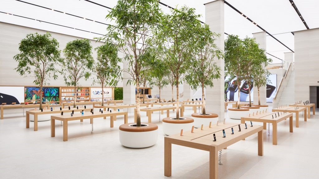
空间整体分为两大板块:场景体验区(厨房场景、客厅场景)、销售陈列区(生活电器、厨房电器、炊具电器)。
The whole space is divided into two sections: scene experience area(kitchen scene, living room scene)and sales display area(living appliances, kitchen appliances, cookware appliances).


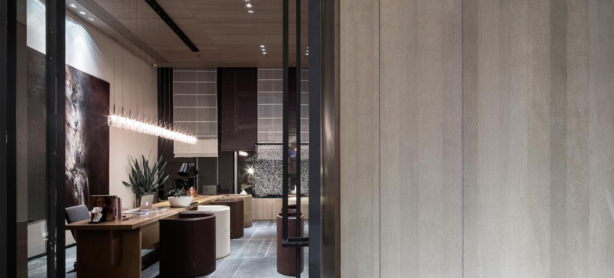
场景化的空间布局使得一切功能的置入更加流畅。空间中出现的座椅不再呈现一种“洽谈区”的姿态,而是日常休憩小坐的地方。同时,空间属性的变化也改变着销售与消费者的交谈氛围。
The scene space layout makes the placement of all functions smoother.The seats appearing in the space no longer present a "negotiation area" posture, but a place for daily rest and sitting.At the same time, the change of spatial properties also changes the atmosphere of conversation between sales and consumers.


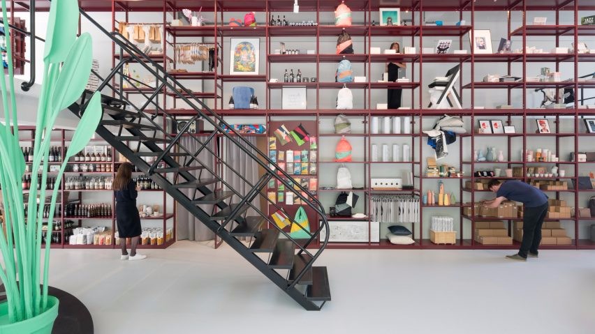
销售陈列区,通过同色系、不同肌理多种材质的结合,粗糙、光滑、光泽、弹性、透明,不只是空间的品味与质感,更是一种含蓄、微妙的情感,让消费者于时间流逝的痕迹中感知触手可及的质感。
The sales display area, through the combination of the same color and different texture materials, rough, smooth, glossy, elastic and transparent, is not only the taste and texture of the space, but also a subtle emotion, allowing consumers to perceive the texture within reach in the traces of time passing by.


集合幸福感的高颜值小家电、美好的瓶瓶罐罐、自然朴素的藤质收纳筐,将精心设计的组合陈列,为每个人打造出独一无二的生活方式与习惯。方寸之地,是多元与包容,是“美”与“高级”。
A collection of happy high-value small home appliances, beautiful bottles and cans, natural and simple rattan storage baskets, display carefully designed combinations to create unique lifestyles and habits for everyone. It is a place of diversity and tolerance, "beauty" and "advanced".


简单利落的线条和恰到好处的留白艺术,将极简的空间轮廓贯穿于每一处角落,是简单纯粹的表现,也是引领未来的审美感知。动人之处,往往在于不着痕迹又恰到好处的细节中,简约丰盈,舒适由心。
The simple and clean lines and just the right white space art, the minimalist spatial outline runs through every corner, is a simple and pure expression, but also to lead the future aesthetic perception.The charm often lies in no trace and just right details, simple and abundant, comfortable by the heart.


04
再造 • 基于品牌美学
Reproduce • Based on Brand Aesthetics
是延续,是创新,是共生。
It is continuity, innovation, and symbiosis.


基于SUPOR品牌基因,延续其局部圆角个性和特点,以直线和弧线结合的线条语言,一反以往商业设计的狭义程式,让原本坚硬的技术空间更加圆润,为每一位消费,打造了一处舒适包容的精神之所。
Based on the SUPOR brand gene, it continues its local rounded personality and characteristics, with the line language combining of straight lines and arcs ,contrary to the narrow formula of previous commercial design,make the original hard technical space more rounded, and create a comfortable and inclusive spiritual place for every consumer.


美好事物携光而来,摆脱冰冷的科技调性,带入人的情绪感知。SUPOR的橘色,在渲染的温暖国度下,成为空间中自由、时尚、多元的活力因子,以此唤醒消费者潜在的感受和情绪,激发关于生活的想象和热情。
Beautiful things come with light, get rid of the cold technological tone, and bring into peoples emotional perception.The orange color of SUPOR has become a free, fashionable and diversified vitality factor in the space under the warm country of rendering, so as to awaken consumers potential feelings and emotions, and stimulate imagination and enthusiasm about life.


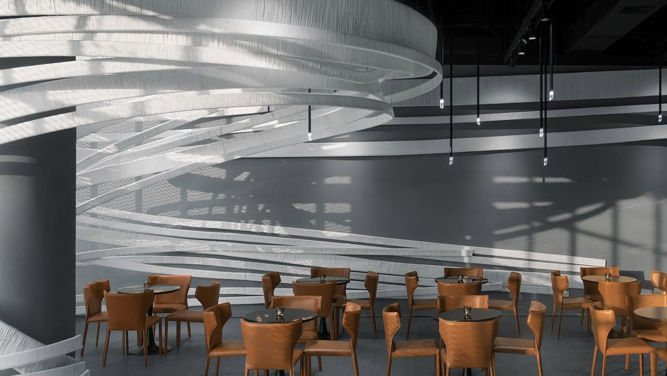
而以橘、白两色的L型发光软膜和圆球的形态组成的艺术装置,成为这个国度的点睛之笔,将日常之物艺术化,实现理想与现实的共振。
The art installation, composed of orange and white L-shaped luminous soft film and round ball, has become the finishing touch of this country, turning everyday objects into art and realizing the resonance of ideal and reality.


在漫漫洒落,柔和的爱意里,诉说不尽的生活诗意。
In the long and gentle love, the poetic charm of life is indescribable.


05
巧思 • 生活灵感涌现
Ingenuity • Life Inspiration Emerges

生活,本来就是动词
当一个个可互动的场景被搬进
当一个个可随心创造的细节被加入
看似单调的空间开始变得流动起来
Life is essentially a verb.
When interactive scenes are moved in.
When details that can be freely created are added.
The seemingly monotonous space begins to flow.


我们强调多变,产品展台以N个不被定义的构成方式,灵活组合,错落有致,释放自由不羁的态度,解锁创意无限的生活。这是对苏泊尔“有巧思,无难事”的转译,也是表达生活的多元包容。
We emphasize variability, with product booths constructed in N undefined ways, flexibly combined and arranged, unleashing a free and unrestrained attitude, unlocking the creative life.This is a translation of SUPORs "ingenuity, no difficulty", and it is also an expression of diversity and tolerance in life.


我们更在乎细节,在满足多样功能需求的基础上,再以“互动性”和“融合性”,直面传达给消费者丰富感及趣味性。
We pay more attention to details, on the basis of meeting the needs of various functions,and then use "interactivity" and "integration" to directly convey the sense of richness and interest to consumers.


“生活原型”嵌入,明星产品展示与体验台平齐于人可操作高度,再辅以“小道具”,把普通产品拍出“生活新意”。
Embedding the "Life Prototype",the star product display and experience platform are level with the height of human operation, and supplemented by "props",and ordinary products are photographed with "new ideas of life" .


村上春树说:“当你用认真有趣的态度对待生活里那些看似无趣的小事时,就会收获一份份小小而确定的幸福,从而觉得生活美好无比。”
Haruki Murakami said, "When you take the seemingly boring little things in life with a serious and interesting attitude, you will reap a small but certain happiness, and you will feel that life is very good."


对于“品质生活”的表达?
从温馨舒适的空间氛围,到多个生活场景的感知,到颠覆刻板印象的细节表现,到N个巧思的灵感触点,及装置、灯光、肌理等融合形成的空间意象,设计既是聚焦体验和感知,更是对品牌“有巧思,无难事”的创造性回应。用精致瓦解繁杂,用情趣消解疲乏,以这份独有的方式,拓展品质生活的边界。
An expression of "quality life"?
From the warm and comfortable space atmosphere, to the perception of multiple life scenes, to the subversive stereotypical detailed performance, to N ingenious inspiration contacts, and the spatial image formed by the integration of installation, lighting, texture, etc., the design is not only a focus on experience and perception, but also a creative response to the brands "ingenuity, no difficulty".Dissolve complexity with refinement, dissolve fatigue with fun, and expand the boundaries of quality life in this unique way.


D&M店与面,秉承“让零售创新更有趣有效”的设计理念,聚焦新零售领域的品牌升级以及空间创意体验设计。我们致力于在零售创意领域为不同行业的前瞻性客户,打造最顶级的零售空间创意体验和品牌营销推广的视觉设计。D&M adhering to the design concept of "making retail innovation more fun and effective" ,focus on brand upgrading and space creative experience design in the new retail field.We are committed to creating top-notch retail space creative experience and brand marketing visual design for forward-looking clients in different industries,create top-notch visual design for retail space creative experience and brand marketing promotion.

平面动线
Plane diagram:


项目名称:苏泊尔SI规划设计/苏泊尔西安体验店
委托方:浙江苏泊尔股份有限公司
设计方:店与面(广州)创意设计有限公司
设计师团队:邱启平、李东辉、袁善铭、陈冰宏、洪玉勤
甲方团队: 谢锋、施伟阳、史新光、李霖、戴丽、刘辉华、吴萌、张仁猛、任晶磊、周洁
工程管理:周志勇、陈康林
公司网站:http://www.shopvmd.com/
项目地址:中国西安
完成时间:2023年5月
建筑面积:100㎡
视觉&传媒管理:李帆、赵秋萍
摄影:冯喆
撰文:符宝澜

Project name:SUPOR SI Planning and design/SUPOR Xi’an experience store
Client:Zhejiang Supor Co., Ltd
Designer:D&M (Guangzhou) Creative Design Co., Ltd
Designer Team:Qiu Qiping,Li Donghui,Yuan Shanming,Chen Binghong,Hong Yuqin
Party A team:Xie Feng, Shi Weiyang, Shi Xinguang, Li Lin, Dai Li, Liu Huihua, Wu Meng, Zhang Renmeng, Ren Jinglei, Zhou Jie
Engineering management:Zhou Zhiyong,Chen Kanglin
Company website:http://www.shopvmd.com/
Project address:Xi’an,China
Completion time:May 2023
Building area:100m²
Visual & Media management:Li Fan,Zhao Qiuping
Photographer:Feng Zhe
Written by:Fu Baolan


 PintereAI


