新作|极简原木风 白色,有格调! 首
2023-08-10 22:48
极简公寓|寓子设计


日常与浪漫就是生活,生活的美好之处藏在分分秒秒中,小美好亦或是小惊喜,都值得被珍藏。
大家好,我是爱挖掘国内外优秀设计作品的阿德。
今天给大家分享的,是几套极简原木风的公寓。


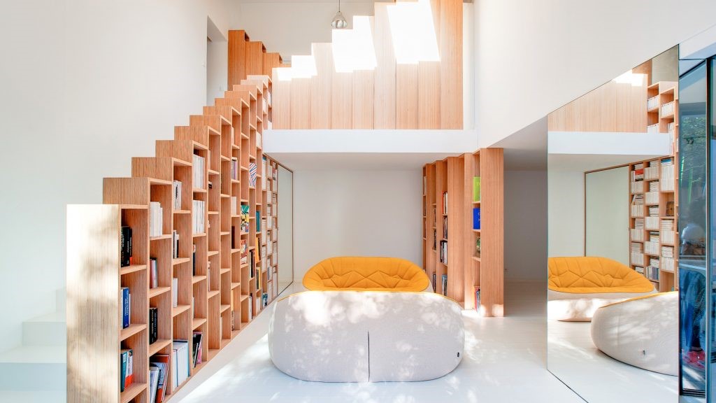
第一处,白色与原木色的结合,使空间显得更为纯粹静谧,空间整体布局流畅美观,设计师选用极简的设计风格,为居者打造喧嚣生活的难得的宁静之所。平稳的线条勾勒,浅色调的色彩淡雅,更凸显出空间的沉稳大气。
The first aspect is the combination of white and wood colors, making the space appear more pure and serene. The overall layout of the space is smooth and beautiful, and the designer chooses a minimalist design style to create a rare tranquil place for residents to live a noisy life. The smooth lines outline and the light tones of colors are elegant, highlighting the calm and atmospheric atmosphere of the space.


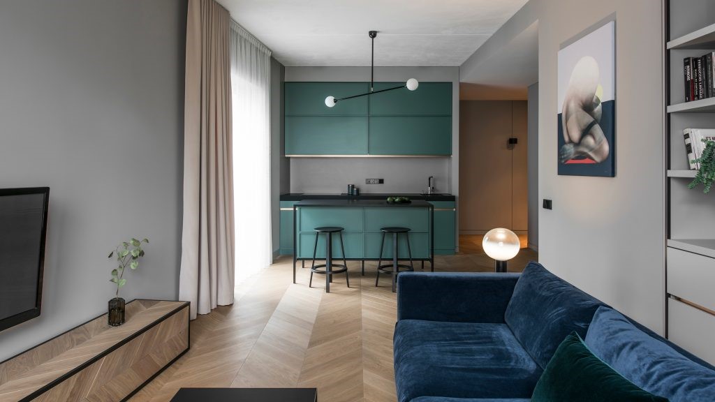
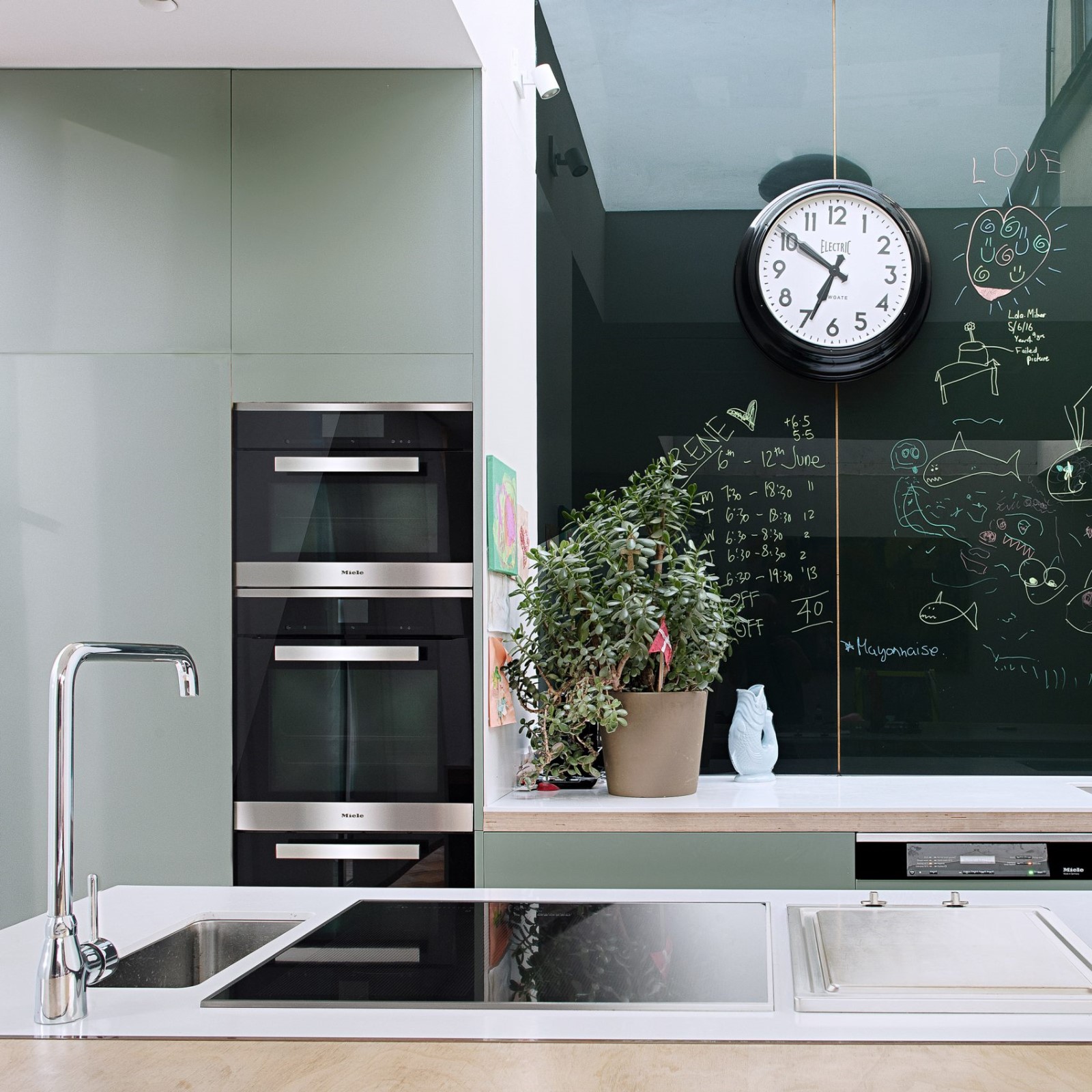
客餐厨选用一体化设计,增强空间的整体性,增强区域间的联系性,营造温馨的居家氛围。白色和木色也是厨房的主色调,疏散了油烟,给居者提供良好的烹饪环境。橱柜整洁干净,实用性强。
The guest kitchen adopts an integrated design to enhance the overall space, enhance the connectivity between regions, and create a warm home atmosphere. White and wood are also the main colors in the kitchen, dispersing oil fumes and providing a good cooking environment for residents. The cabinet is clean and practical.


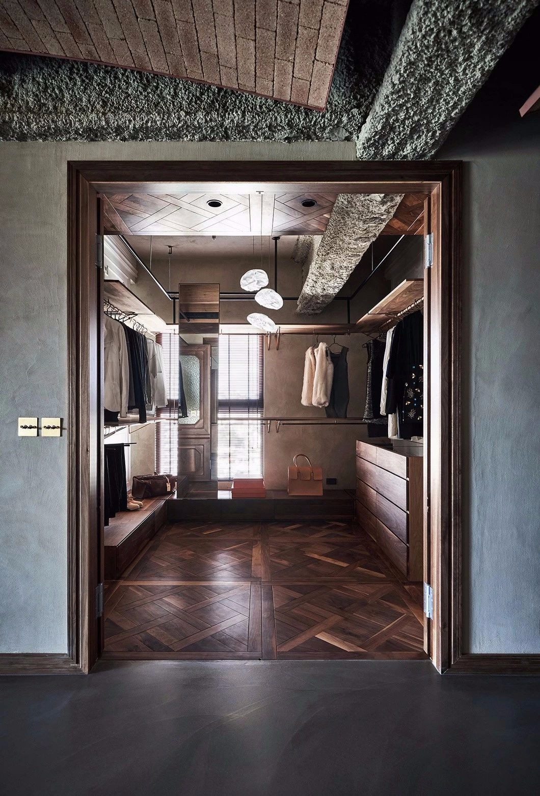
空间不大的卧室的衣柜倚墙而设,满足居者收纳需求的同时,不占用太大空间。在白色背景墙的映衬下,柔和的灯光使卧室更为温馨舒适,帮助居者放松心情。
The wardrobe in a small bedroom leans against the wall, meeting the storage needs of residents while not occupying too much space. Against the backdrop of a white background wall, the soft lighting makes the bedroom more warm and comfortable, helping residents relax.


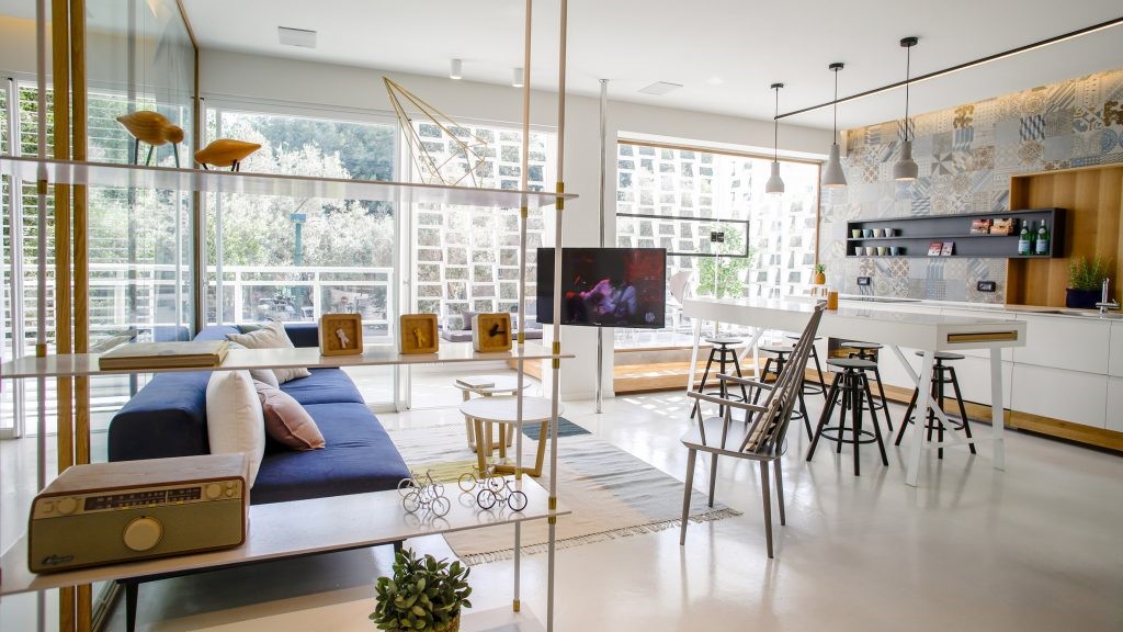
第二处,极简的设计下,木色与白色混搭,增强空间的简洁纯粹感。客厅设计是紧凑型,舒适的双人沙发方便居者放松,自然光线透过窗户照进室内,增强空间的通透感。摆件精致小巧,点缀在空间内,使空间更显丰富感。
The second aspect is the minimalist design, which blends wood and white to enhance the simplicity and purity of the space. The living room design is compact and comfortable, with a two person sofa for easy relaxation. Natural light shines into the room through the window, enhancing the transparency of the space. The decorations are exquisite and small, embellishing the space, making it more rich.


卧室面积较小,但其功能性很强。床具是柔和的白色,与室内大片的留白相呼应,更显干净整洁。简易的办公桌由一侧的床头柜延伸而来,居者可在此办公,方便实用。
The bedroom area is small, but its functionality is strong. The bedding is soft white, echoing the large amount of white space left in the room, making it more clean and tidy. A simple desk extends from the bedside table on one side, allowing residents to work here, making it convenient and practical.


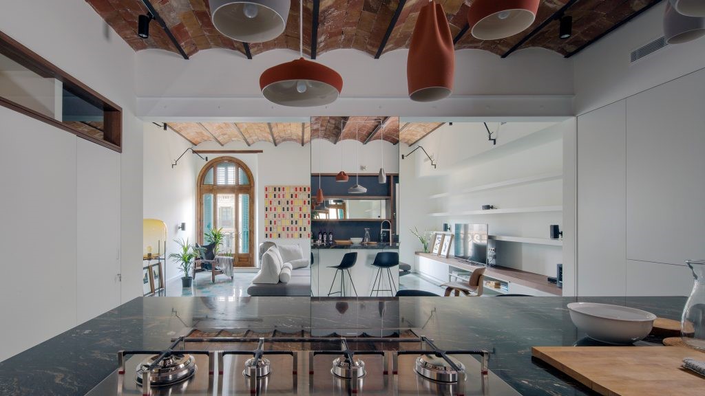
第三处,面积较大,简约的布局,自然光线充足,使空间更显敞阔。白色与木色的混色,配以简约大气的家具,整个空间给人以满满的干练感和整洁感。
The third point is the large and minimalist layout, with ample natural light, making the space more spacious. The mixed color of white and wood, paired with simple and atmospheric furniture, gives the entire space a full sense of conciseness and cleanliness.


设计Design-版权©:寓子设计

 PintereAI


