楷素设计|昆明280㎡ZP Office的小空间趣味性构建 首
2023-08-29 22:27


黄华君
楷素设计(KES Design Office)创办人 设计总监
荣获奖项:
2022亚洲设计大奖金奖
2021国际设计传媒奖金奖
2021金腾奖年度设计大奖
2020 AD100 YOUNG
2019-2020意大利A Design Award
2018美国Architizer A Awards
2017-2018意大利A Design Award
2016APIDA香港亚太室内设计大奖
2016上海金外滩奖
2015艾特奖
2015红土奖


ZP Office——小空间的趣味性构建
Interesting Construction of Small Spaces
通道在楷素设计的空间中往往占有比较大的比重,因为我们把它视为一条有记忆、引人思考的“小径”,“还有什么比一条小路更美的东西?它是生动而多变的生活的象征和形象。”——乔治.桑(Jeorge Sand)。它除了是通道也是不同功能空间的连接过渡,它往往是隐喻过去与未来、现实与梦境的媒介,它无足轻重又不可或缺。
A passage often occupies a large proportion of the space designed by the KES Design Office. Because we regard it as a “path” with memory to invoke people to think about what can be more beautiful than a path. It is the symbol and image of a vivid and varied life. -- Jeorge Sand. It is not only a passage but also a transition between different functional spaces. It is often a metaphor for the past and the future, reality and dreams, and it is both insignificant and indispensable.


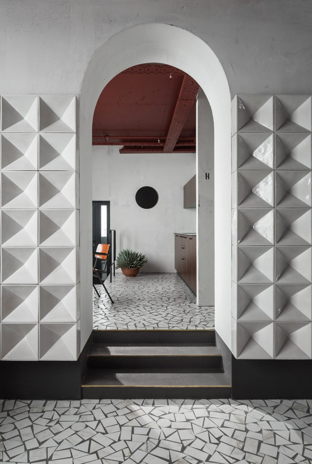
楷素设计在通道中以廊柱的形式串联起两个楼梯空间、洽谈空间以及接待空间,同时作为门厅的第一印象它具有对称性和仪式感。提炼的廊柱细节隐喻这个空间的使用者(创意公司)将传统文化与现代形式表达相结合的决心。
KES Design connects the two staircase spaces, the negotiation space and the reception space in the form of a corridor column in the passage. Meanwhile, as the first impression of the foyer, it has a sense of symmetry and ritual. The distilled corridor details are a metaphor for the determination of the user of this space (a creative company) to combine traditional culture with modern formal expression.


原空间是两间层高为4.5米的办公室,业主希望在有限的空间内设置办公区、会议区、洽谈区以及独立办公室。设计师以分散式的布局方式,弱化了以办公区为核心的传统方式,转而向使用者与来访者传递一种更加生活化、随性舒适的氛围,以此激发员工的创作灵感。
The original space was two offices with a height of 4.5 meters. The owner wanted to set up office areas, meeting areas, negotiation areas and separate offices within the limited space. With a decentralized layout, the designer departed from the traditional approach of focusing on office areas, and instead convey a more lifelike, spontaneous and comfortable atmosphere to users and visitors so as to inspire the creativity of employees.


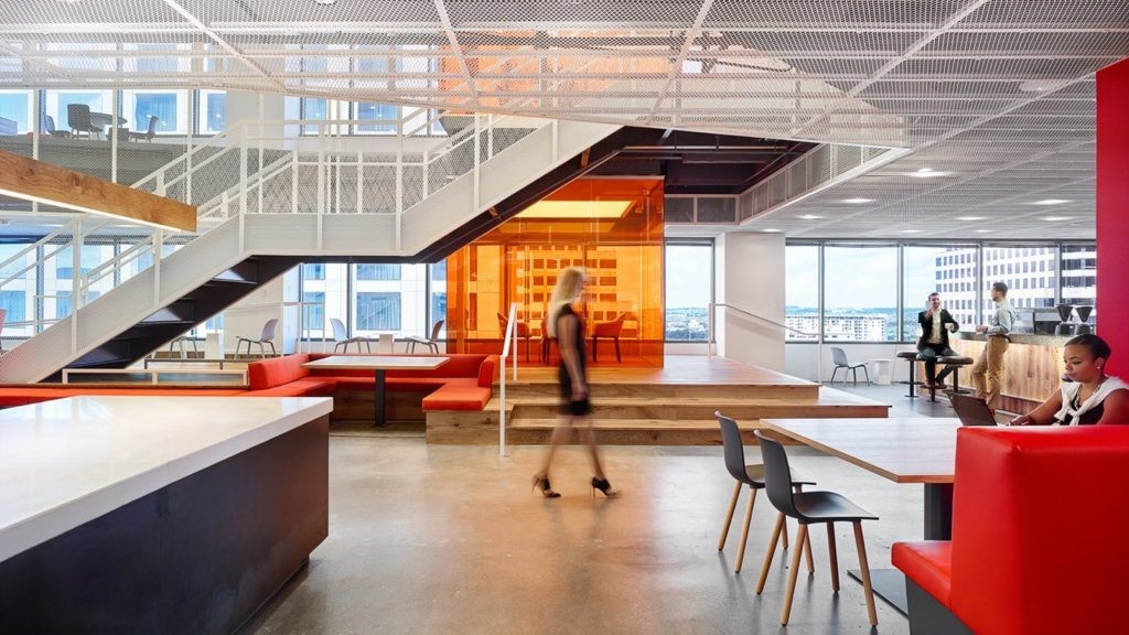
为了最大限度利用采光,先把原空间打通,去除不必要的结构,设计出一个敞开式的使用空间,在有限层高的空间中实现阁楼的搭建并同时拥有通透高挑的空间感。楼板中间挖空的圆洞为相对低矮的空间带来别有洞天的体验感。
In order to maximize the use of light, the original space was first opened up and the unnecessary structure was removed to create an open space for use, which allows for the construction of a loft in a space with limited floor height and also provides a sense of transparency and high space. The round hole in the middle of the floor creates a sense of a special space for the lower space.


门厅设置了一个过渡空间,它类似于一个不规则的展示橱窗,在地面以及墙面上以切割的小的条状石材铺设,结合玻璃砖的材质向来访者传递公司所倡导的工匠精神。廊道右侧设置了一个开放式的多功能空间,既是接待用的茶室又可以作为会议室使用。在整个办公室开窗面积最大的立面从二层屋顶悬挂延伸至一层的悬空隔断也以小的条状石材饰面,既遮挡了户外过强的光线又为休闲区营造相对舒适的围合感。
A transitional space is set up in the lobby, which resembles an irregular display window, with small strips of cut stone on the floor and walls, combined with glass tiles to convey the craftsmanship advocated by the company to visitors. To the right of the corridor, an open multi-functional space is set up, which can be used as both a reception tea room and a meeting room. The overhanging partition that extends from the roof of the second floor to the first floor of the office with the largest window area is also finished in small strips of stone, which can block excessive outdoor light and create a comfortable sense of enclosure for the lounge area.


由于二层空间被一根结构梁一分为二,所以需要在空间中架设两把楼梯以达到完全利用二层空间的目的。弧形楼梯置于廊道端头,营造顺势而上的动线,同时作为空间中的端景而存在。另一个直形楼梯以嵌入的方式置于门厅旁,楼梯内绿色的材质为空间带来色彩的变化也为空间带来更大的趣味性。
Since the second-floor space is divided into two by a structural beam, two staircases are needed to fully utilize the second-floor space. The curved staircase is placed at the end of the corridor to create a flowing line of movement upward, while existing as a side view in the space. Another straight staircase is embedded in the lobby, and the green material in the staircase brings a change of color and more fun to the space.


二层的一半作为展厅使用,设计师在楼板中设置多个圆形与方形孔洞,使之在上下两层空间之间产生通透的延伸感,以此打破受层高限制的压抑感。从二层俯瞰廊道,是一排有序的拱形阵列柱式与吊灯,形成可读性更强烈的空间秩序。
Half of the second floor is used as a showroom, and the designer built multiple round and square holes into the floor slab to create a sense of permeability between the upper and lower spaces, which breaks the oppressive feeling limited by the height of the floor. The view of the corridor from the second floor is an orderly row of arch-shaped array of columns and chandeliers, forming a more enjoyable spatial order.


空间中大量使用了原木色板材,裸露的天花板、柔和的涂料和温暖的木质纹理为空间带来更加自然的感受。多种材料的对比使用也增加了空间的节奏感和张力。立面上的多个条形开口以及直形楼梯的锯齿状踏步开口处理为空间增加一种特别的穿透感和窥视感,让投射的光形成不同形态,营造柔和安静的延伸感。
The space is heavily lined with original wood-colored panels, and the exposed ceiling, soft paint and warm wood texture bring a more natural feel to the space. The contrasting use of multiple materials also adds a sense of rhythm and tension to the space. The multiple bar openings on the facade and the jagged tread openings of the straight staircase add a special sense of penetration and peeking into the space, allowing the projected light to take different forms and creating a soft and quiet sense of extension.


设计师试图从可持续的设计方法中寻找灵感:将施工过程中产生的废弃包装袋经过喷漆硬化处理后以艺术装置的形式放置于廊道内,作为施工过程的特殊见证者而存在。设计师希望最终实现的是人与空间的对话,人与材料的对话。
The designer tried to find inspiration from sustainable design methods. The discarded bags in the construction were sprayed and hardened and then placed in the form of an art installation in the corridor, which exists as a special witness of the construction process. What the designer hopes to achieve eventually is a dialogue between people and space, and between people and materials.


平面PLAN


分析图PLAN
项目名称:ZP Office
项目地点:昆明
设计公司:楷素设计(KES Design Office)
主创设计:黄华君
设计团队:林祖朝、赵健、黄凡、黄发军、徐晓梵
项目面积:280㎡
设计时间:2022.6
完工时间:2023.1
施工管理:尊品装饰
项目摄影:Wakon Wong,黄凡
Project information:
Project location:Kunming, China
Design Company: KES Design Office
Main creative design: Wakon Wong
Design Team: Zuchao Lin,Jian Zhao,Fan Huang,Fajun Huang,Xiaofan Xu
Project area: 280㎡
Design time: 2022.6
Completion time: 2023.1
Construction management: ZP decoration
Project Photography: Wakon Wong, Fan Huang
文字/图片:楷素设计
COMPANY
设计公司


楷素设计(KES Design Office)


主创团队Design Team
楷素犹楷模。以此传达我们热爱生活、钻研细节、简约表达创意的设计态度。坚持以研究的方式实践设计,坚持探寻项目背后的故事,坚持做真实、有态度的设计。自成立以来曾荣获国际设计传媒奖、AD100 YOUNG、美国Architizer A Awards、意大利A Design Award、APIDA香港亚太室内设计大奖等国内外权威奖项。

 PintereAI


