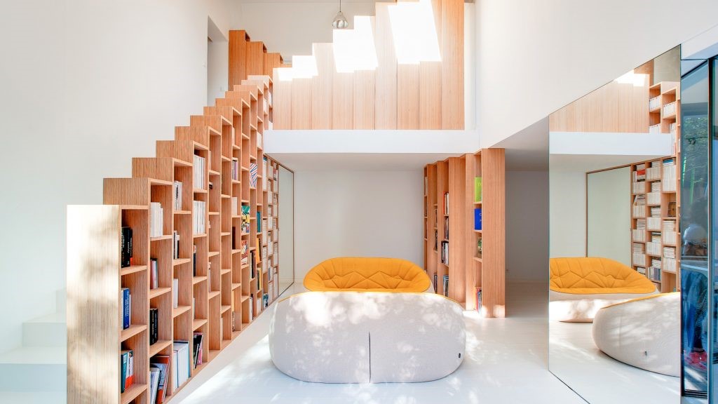
新作丨吾隅设计 × 旧房改造:归谧 首
2023-09-14 17:47
原本是一家三口一起生活的家,美式乡村风格的装潢,墙面墙纸已经空鼓开裂,地板也有不同程度的变形,孩子长大已经出国工作,空置的房间几乎很少进入更不谈使用,屋主夫妇退休不久在家时间变得长了起来,愈发觉得原来的家不能满足他们生活功能的需求和动线体验,希望通过设计重新构架空间格局,解决家中收纳不足同时提高生活的品质。
Originally a family of three living together, American country style decoration, wall wallpaper has been empty and cracked, the floor has also different degrees of deformation, children have grown up to work abroad, vacant rooms are rarely entered let alone used, the owner couple retired soon after the time at home became longer, more and more feel that the original home can not meet their life function needs and moving line experience, hope to restructure the space pattern through design, solve the lack of storage at home and improve the quality of life.
这是个老房翻新的项目,业主一家已经在这里生活了18年,房屋本身条件不错,双面采光,每个房间都有不错的窗景,遗憾的是房间都是各自独立光和窗景都被关在了房间里,同时遮住了主动线的光线,导致这条通往各个房间的走道的昏暗,加上原来空间功能不合理,餐厨闭塞没有互动性,收纳不足导致生活物品外拓,公区空间体验下降,最终导致整体空间浪费愈发严重。
This is an old house renovation project, the owners family has lived here for 18 years, the house itself is in good condition, double-sided lighting, each room has a good window view, unfortunately the rooms are their own independent light and window scenery are closed in the room, while blocking the light of the active line, resulting in the dimness of this walkway leading to each room, coupled with the original space function is unreasonable, the kitchen is closed and not interactive, insufficient storage leads to the expansion of living items, the experience of public space declines, and finally leads to the overall space waste is more and more serious.
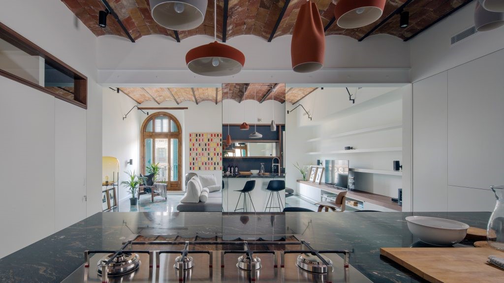
经过和屋主的前期沟通我们决定以开放式为构架重新设计空间,将空间的优势与屋主的需求结合,在解放出来的空间中重新构建了一条“洄游动线”,通过这条动线来串联起整个空间的功能格局,我们把全屋60%的收纳空间都安排在了这条“洄游动线”的内侧,让动线不止是走道,同时也赋予它的使用性,在可使用的基础上,这条动线也有着不错的体验,在每个空间转换都能看到不同的窗景,重塑动线上可移动的愉悦感。
After the preliminary communication with the owner, we decided to redesign the space with an open plan, combine the advantages of the space with the needs of the owner, and reconstruct a migratory circulation line in the liberated space, through this circulation line to connect the functional pattern of the entire space, we arranged 60% of the storage space of the whole house on the inside of this migratory circulation line, so that the circulation line is not only a walkway, but also gives it usability, on the basis of use, this circulation line also has a good experience. Different window scenes can be seen in each space transition, recreating the movable pleasure of moving lines.
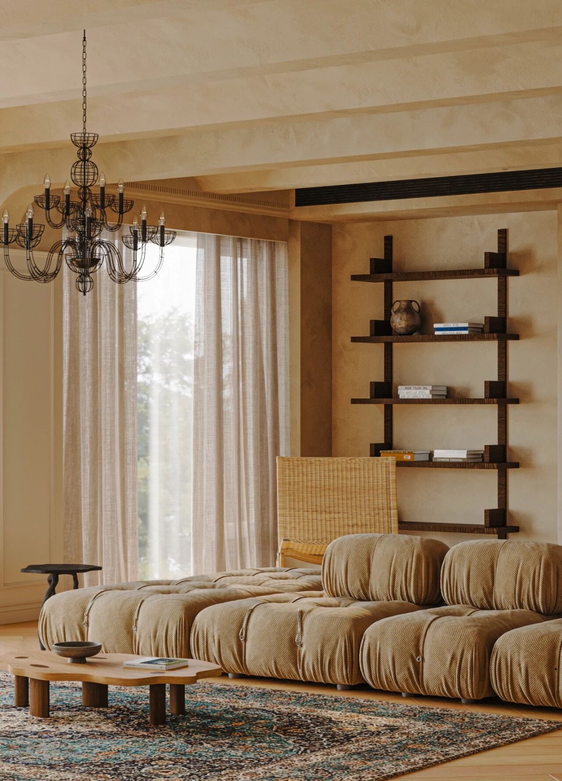
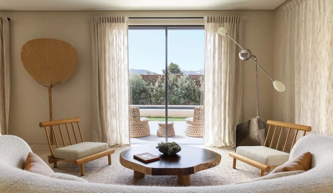
通过设计阶段与屋主的沟通,我们将整个家定调为松弛,自然又略带拙朴的居家氛围,在空间里我们置入了麻制的窗帘,让空间显得柔软;温润的木皮,让人有归属感;粗粝的石头,让人感受生活的真实和回归,在空间中就可以与自然“肌肤相亲”。
Through the communication with the owner at the design stage, we set the tone of the whole home to a relaxed, natural and slightly humble home atmosphere, and we placed linen curtains in the space to make the space appear soft; The warm veneer makes people feel a sense of belonging; The rough stone makes people feel the reality and return of life, and they can kiss the skin with nature in the space.
打开了厨房后玄关显得开阔许多,阳光也能更多地延伸到这里,简单打造了入门的玄关端景,可以随季节或心情插上不同的鲜花,简单随性,制造出入门的好感觉。
After opening the kitchen, the entrance appears much more open, and the sunlight can extend more here, simply creating a entrance scene, you can insert different flowers according to the season or mood, simple and casual, creating a good feeling of entry.
入户是鞋柜,两扇柜门置放鞋子,两扇柜门作为包和衣物临时挂放,1.6米的卡座两人同时落座换鞋也是比较宽松的,鞋柜和卡座都用了挑空的处理,让玄关隔而不断,保持了空间之间的关联和延伸。
ring the house is a shoe cabinet, two cabinet doors to place shoes, two cabinet doors as bags and clothes temporary hanging, 1.6 meters of booth two people at the same time to change shoes is also relatively loose, shoe cabinet and card holder are used empty treatment, so that the entrance is separated and continuous, maintaining the association and extension between spaces.
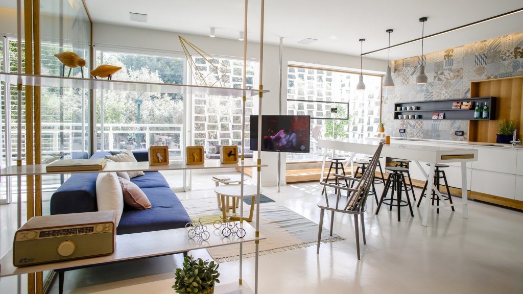
玄关左转便进入客厅空间,把阳台纳入客厅后,不仅光线更多的来到了客厅,而且为客厅带来了沉浸式的窗景体验,黑色手工皮沙发面朝内而坐,不仅能把窗景的蓊郁引入客厅,还营造出松弛自在的室内氛围,形成客厅动线上令人愉悦的驻足点。
Turn left at the entrance to enter the living room space, after incorporating the balcony into the living room, not only the light comes to the living room, but also brings an immersive window experience to the living room, the black handmade leather sofa faces inward, which can not only introduce the richness of the window into the living room, but also create a relaxed and comfortable indoor atmosphere, forming a pleasant stopping point on the living room moving line.
我们在客厅设置了5米长的收纳柜体,胡桃木柜门饰面,随着时间的推移而变化,木调的颜色可以刻录时间的表情,悠闲地躺在沙发上,感受一旁落地窗外的蓊郁和阳光。
We set up a 5-meter-long storage cabinet in the living room, walnut cabinet door finish, which changes over time, the color of the wood tone can record the expression of time, and we can lie leisurely on the sofa and feel the lush and sunshine outside the floor-to-ceiling windows.
客厅的储物柜相当于100个20寸登机箱的容量,不论是目前男主人高尔夫装备还是日后屋主日常收纳都可以轻松应对。
The lockers in the living room are equivalent to the capacity of 100 20-inch cabin suitcases, whether it is the current mans golf equipment or the daily storage of customers in the future.
屋主一直想有一个可以看电影的客厅,在壁橱前我们在吊顶嵌入了投影幕布,不论自己是看电影,还是家人、朋友一起聚会也能拥有丰富多元的互动体验,让空间动静相宜,是个非常Chill的驻足地。
The owner has always wanted to have a living room where you can watch movies, and in front of the closet, we have embedded a projection screen in the ceiling, whether you are watching a movie, or a family and friends gathering together, you can also have a rich and diversified interactive experience, making the space dynamic and static, which is a very chilly stopover.
家里慢慢的被屋主喜欢的植物和饰物填充,它们在这里渐渐安稳的居住下来,把空间滋养出松弛和静谧的气质;
The home is slowly filled with plants and ornaments that the owner likes, and they gradually settle down here, nourishing the space with a relaxed and quiet temperament;
在沙发旁的角落我们设置了一处minibar,早上太阳的光线缓缓穿过窗外树梢的叶片,在室内的木柜门,水磨石板上都印上了它们的表情,磨一杯咖啡,放一段自己喜欢的音乐足以激活我们一天的能量,屋主说他每天早上最喜欢呆的角落就是这里。
In the corner next to the sofa we set up a minibar, the morning suns rays slowly through the leaves of the treetops outside the window, in the indoor wooden cabinet doors, terrazzo slabs are printed with their expressions, grinding a cup of coffee, playing a piece of his favorite music is enough to activate our energy for the day, the owner said that his favorite corner every morning is here.
盥洗间安排在客厅靠近走廊的一端,进门处的落地窗外是走道的花池小景,我们希望能把自然引入盥洗间,同时也能把走廊的光线延伸到这里。为了延续公区空间自然放松的基调,我们用橄榄绿的微水泥作为盥洗间的背景,搭配略带deco风的地砖让沐浴时光变得宁静、安心。
The bathroom is arranged at one end of the living room near the corridor, and the floor-to-ceiling window at the entrance is a small view of the flower pond in the hallway, and we hope to bring nature into the bathroom, but also extend the light of the corridor here. In order to continue the natural and relaxing tone of the public space, we used olive green microcement as the background of the bathroom, and the slightly deco style floor tiles made the bathing time peaceful and secure.
盥洗间内做了干湿分离,利用异形区域有效划分空间,略带古典气息的扇形镜子搭配宝格丽大理石的一体盆,既复古又简洁,在角落设计了一个带衣架的卡座便于沐浴后的落座更衣。
The bathroom has been separated from wet and dry, using special-shaped areas to effectively divide the space, a slightly classical fan-shaped mirror with a Bulgari marble integrated basin, both retro and simple, and a booth with a hanger in the corner is designed to facilitate sitting and changing clothes after bathing.
从客厅往餐厨走,能感受到餐厨已经融为了一体,现在阳光的餐厨是屋主的最爱,原本很少在家做饭的女主人,
也开始站在窗前研究烹饪,这里也开始成为他们生活的新核心,家人的互动也都由此展开。
Walking from the living room to the kitchen, you can feel that the kitchen has been integrated, now the sunny kitchen is the favorite of the owner, the hostess who rarely cooked at home, also began to stand in front of the window to study cooking, here has also begun to become the new core of their lives, family interaction has also begun.
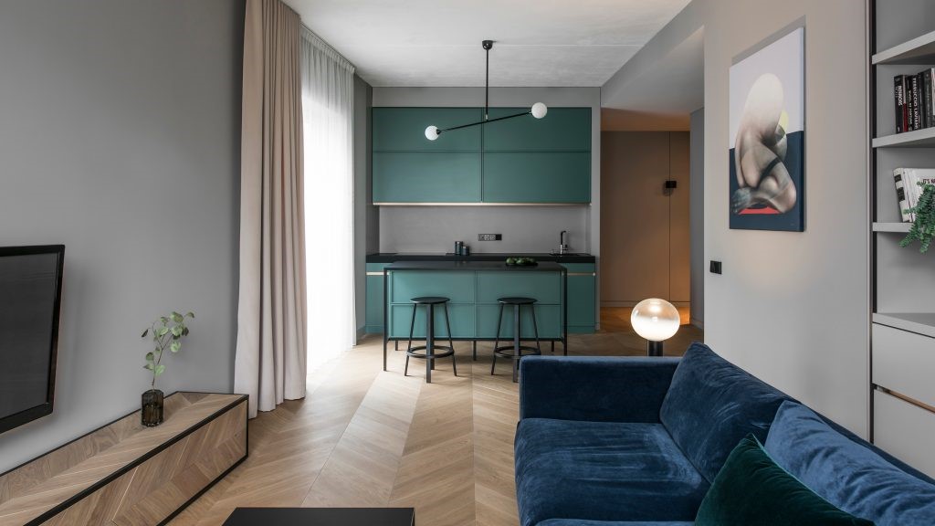
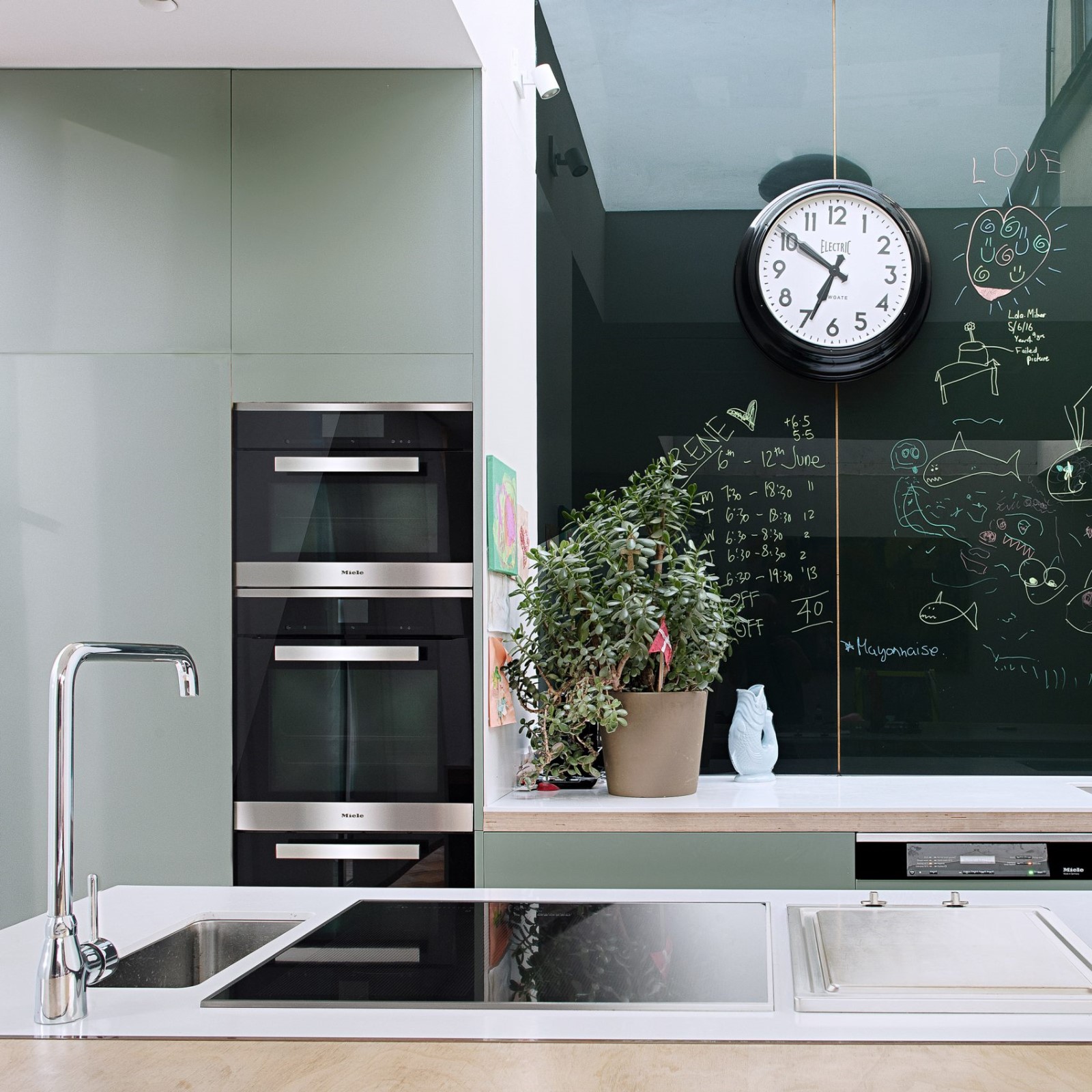
我们打开了原来的厨房空间,把“卷缩”在里面橱柜,一字排开舒展出来,一直延伸到餐厅,这样不仅拉大了餐厅空间的尺寸,让他成为家人的生活中心,造型圆润的原木餐桌搭配藤编的木椅,呈现拙朴、宁静的生活氛围。
We opened the original kitchen space, rolled up the cabinets inside, and stretched it out in a row, extending to the dining room, which not only increased the size of the dining room space, but also made him the center of his familys life, and the rounded log dining table with rattan wooden chairs presented a simple, quiet living atmosphere.
经过餐厨往里走就来到了书房,在走道左侧的一排挑空设计的柜体承担了这个空间相对的壁橱功能,也是为这个空间在不同模式下切换做准备,这里动线也不再只是走道,也可以回归到使用性上来,是走道亦是空间。
After the kitchen walked in, I came to the study, and a row of empty cabinets on the left side of the aisle undertook the function of the closet relative to this space, and it was also to prepare for the switch of this space in different modes, and the circulation line here is no longer just the aisle, but also can return to the usability, which is the aisle and the space.
次卧和书房准确说这是由两个房间组合在一起的弹性空间,在平时只有屋主夫妇两人在家的话,这个空间书房 休闲空间模式,走道的口袋门都是藏在墙里面,如果孩子回来了需要卧室了,可以通过口袋门的隔断来重组空间,切换成卧室 书房的小套间模式。
The second bedroom and the study room are precisely a flexible space composed of two rooms, in normal times only the owner and the couple are at home, this space study leisure space mode, the pocket door of the aisle is hidden in the wall, if the child comes back and needs a bedroom, you can reorganize the space through the partition of the pocket door and switch to the small suite mode of the bedroom study.
下午两三点钟的光线温柔而美好,在这里独处、阅读、聊天,有真情实意的情感互动其中,才尤其温暖,若是在书房呆累了起身几步就可以来到旁边房间的卧榻伴着窗外的阳光和绿意小憩放松。
The light at two or three oclock in the afternoon is gentle and beautiful, here alone, reading, chatting, there is a sincere emotional interaction, it is especially warm, if you are tired in the study, get up a few steps, you can come to the next room of the couch with the sun and green outside the window to relax.
卧室床头设计了胡桃木 麻织的床屏,胡桃木让人有归属,麻织的床屏让空间显得更柔软,氤氲出平和松弛的气息。
The bed head of the bedroom is designed with a walnut hemp bed screen, walnut wood makes people belong, and the linen bed screen makes the space appear softer, exuding a peaceful and relaxed atmosphere.
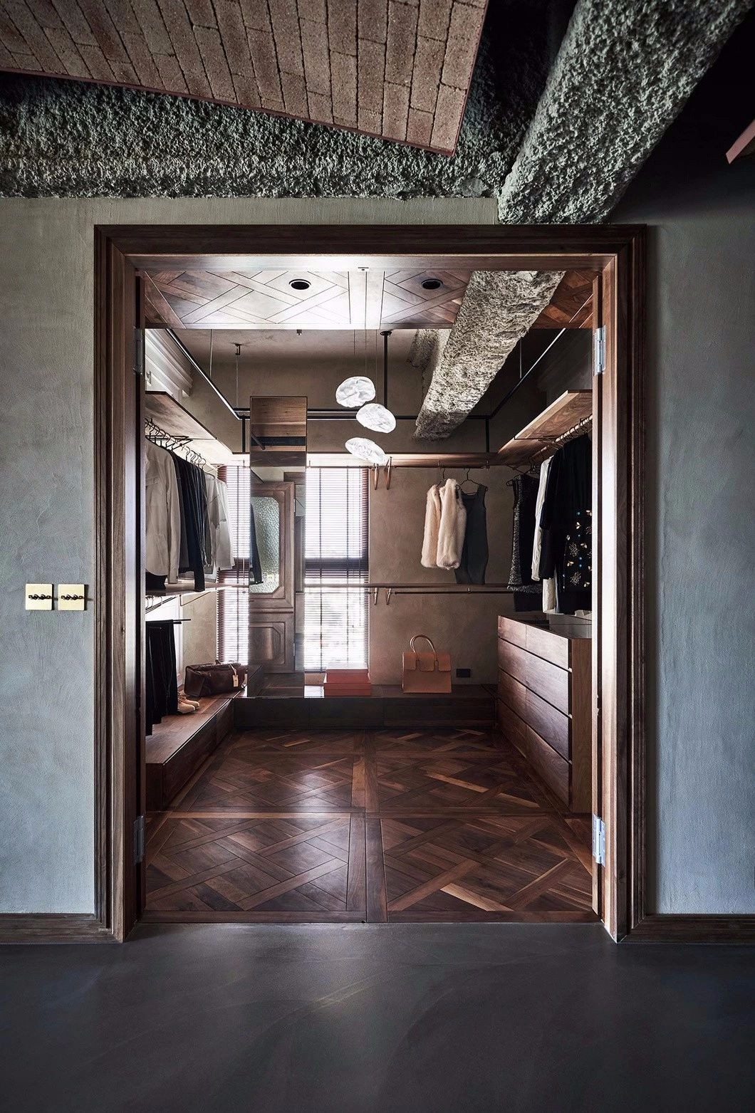
书房与衣帽间的隔墙底端设置了挑空,用玻璃作为隔断,把书房良好的光线延伸到衣帽间地面,衣柜采用胡桃木 麻织搭配,营造舒适而松弛的更衣场景,柜内都设置有灯带,便于衣物日常挑选和取放。
The bottom end of the partition wall between the study and the cloakroom is set up, using glass as a partition, extending the good light of the study to the floor of the cloakroom, the wardrobe is made of walnut linen to create a comfortable and relaxed changing scene, and the cabinet is set with light strips to facilitate the daily selection and placement of clothes.
主卫采用了浅米色的水磨石砖墙地通铺,模糊墙地交界,倍化空间视觉。盥洗台面做了二分之一处理,一半用于女主人的梳妆台面,一半用于洗漱,提高的使用效率和品质。
The main bathroom adopts a light beige terrazzo brick wall to pave the floor, blurring the boundary between the wall and the ground, and multiplying the visual of the space. The washstand has been treated in half, half for the hostesss dressing surface, and half for washing, improving the efficiency and quality of use.
从卧室东侧打开一扇门,尽头通往客厅,从客厅到餐厨,从厨房到弹性空间的书房,再回到卧室,完成了全空间的串联,并在移动中设置了令人愉悦的驻足点和窗景,同时围绕动线我们巧妙的安排了全屋的收纳系统,一条动线在空间中能游、能看、能使用,趋于多功能,融于空间当中,而不是简单连接房子前后的廊道,我们认为它的价值就会相对提高,带给人惊喜而愉悦的空间体验。
Open a door from the east side of the bedroom, the end leads to the living room, from the living room to the kitchen, from the kitchen to the study of the flexible space, and then back to the bedroom, complete the series of the whole space, and set up a pleasant stopping point and window view in the movement, and at the same time around the circulation line We cleverly arrange the storage system of the whole house, once the moving line can swim, see, and use in the space, tends to be multi-functional, integrated into the space, rather than simply connecting the corridor before and after the house, we think its value will be relatively improved, A surprising and enjoyable space experience.
吾隅成立于2017年,坐落于中国成都。致力于人性空间研究和深度定制居家生活方案,
我们主张以“生活”与“体验”为设计基础,把“家”的结构简单化。
美丽表象的盒子,而应该是有可延续使用性,并贴合屋主的习性和喜好,能凝聚家人的情感,能为家人身体和心里带来治愈的力量的综合空间。
采集分享
 举报
举报
别默默的看了,快登录帮我评论一下吧!:)
注册
登录
更多评论
相关文章
-

描边风设计中,最容易犯的8种问题分析
2018年走过了四分之一,LOGO设计趋势也清晰了LOGO设计
-

描边风设计中,最容易犯的8种问题分析
2018年走过了四分之一,LOGO设计趋势也清晰了LOGO设计
-

描边风设计中,最容易犯的8种问题分析
2018年走过了四分之一,LOGO设计趋势也清晰了LOGO设计


 PintereAI


