内敛 摒弃喧闹浮华 首
2023-09-25 22:24
创造不同的氛围
Argentalia 餐厅
| Argentalia


该项目分为两层,双高,由一条用作酒吧和栏杆的隔断格子带框架。底楼是一个通道,其末端是一个可以上锁的酒吧,同时作为一个带有桌子的展位容器,这标志着就餐区的开始,该区域的顶部是饮料吧台,其背衬由星星制成,满足了人们的需求。具有瓶子展示的双重功能。
The project is divided into two floors, double height, framed by a partitioned lattice strip used as a bar and railing. The ground floor is a passageway that ends in a bar that can be locked and at the same time serves as a booth container with tables, which marks the beginning of the dining area, which is topped by a beverage bar with a backing made of stars that meets the needs of the people. Serves the dual function of bottle display.


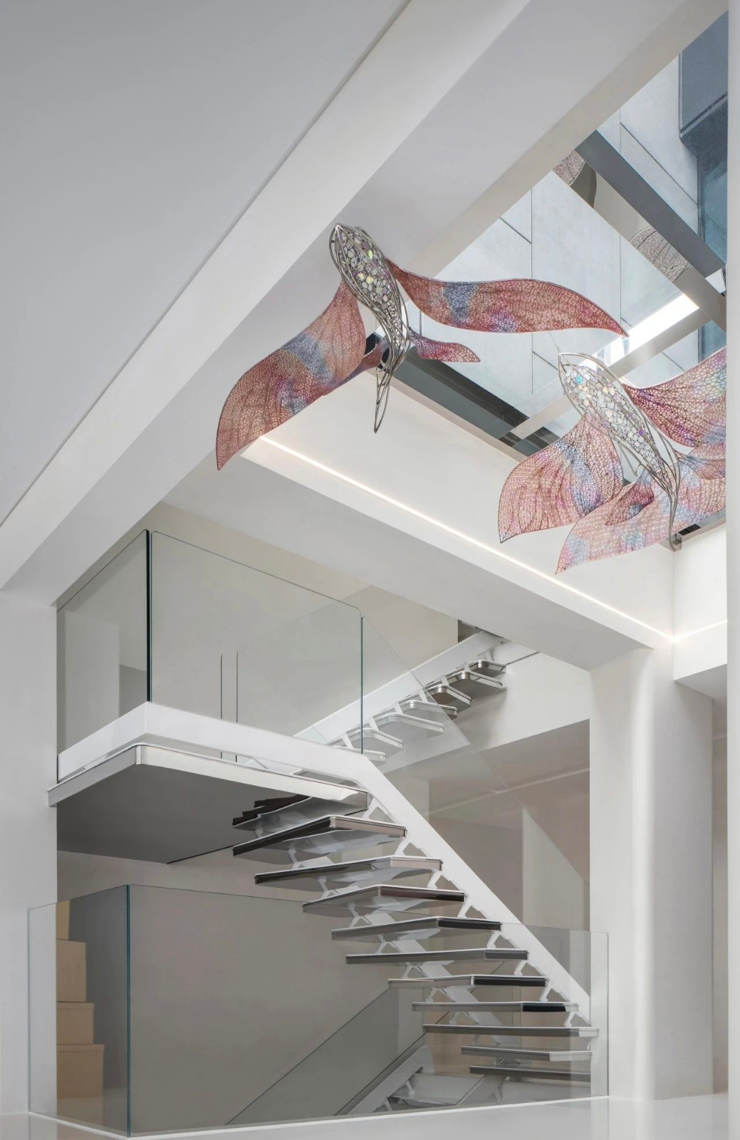
为了进入上层,我们设计了一个雕塑楼梯,为用户产生了一条有趣的路线,这些楼梯由一条由射孔、隔断和木材制成的隧道组成,这些隧道与天花板的木梁诞生并散布在一起,同时他们有一套高度和偏差,赋予双倍高度特征。楼上继续是食客区域,拥有不同类型的家具和环境,其中包括带有干绿色色调墙壁和与阿根廷美食所用原材料相关的照片的摊位区域。
To access the upper floor, a sculptural staircase was designed that generates an interesting route for the user, these stairs are made up of a tunnel made of shot holes, partitions and wood that are born and scattered with wooden beams of the ceiling, while they have a set of heights and deviations that give a double height character. Upstairs continues with the diners area, with different types of furniture and environments, including the area of stalls with walls in dry green tones and photographs related to the raw materials used in Argentine cuisine.


这些格子作为餐厅两层和双层高度之间的连接。它们充当建筑元素;楼梯区域的格子包含了这个流通的空间,并与木质天花板交织在一起,在整个项目中营造出一种统一感。它们还被应用在外围栏杆上,形成餐厅的双层高度,最后它们被用作吧台和吧台形式的家具,充当准备区,并在酒吧和厨房中展示瓶子。
These lattices act as a connection between the two levels of the restaurant and the double height. They act as architectural elements; the lattice in the staircase area contains this circulation space and is interwoven with the wooden ceiling to create a sense of unity throughout the project. They are also applied to the perimeter railings to form the double height of the restaurant, and finally they are used as furniture in the form of bars and barstools, acting as preparation areas and displaying bottles in the bar and kitchen.


这些格子强调了项目的视角,赋予纹理并产生几何秩序,给人以舒适感,并邀请用户进入空间,在这些隔断之美的温暖和友善的庇护下度过一段时间,这些隔断让人想起传统,但又一个扭曲的当代人。
These grids emphasize the perspective of the project, giving texture and generating a geometric order that gives a sense of comfort and invites the user to enter the space and spend some time in the warmth and friendly shelter of the beauty of these partitions, which are reminiscent of the traditional, yet a twisted contemporary.
Lonely Mouth 面馆
| Lonely Mouth


对于内饰,设计师选择了温暖的绿色和棕色色调,以及带纹理的石膏和柔软的内饰,营造出亲密的氛围。受到日本极简主义的启发,室内设计采取了‘少即是多’的方法。
For the interiors, the designers chose warm shades of green and brown, as well as textured plaster and soft upholstery to create an intimate atmosphere. Inspired by Japanese minimalism, the interior design takes a less is more approach.


木钉屏风将酒吧和用餐空间分隔开来,增添了亲密感。餐厅的面条机在酒吧区工作,客人可以观看食物的制作过程。酒吧后面的架子上陈列着清酒收藏,是用空间翻新过程中回收的木材建造的。
A dowel screen separates the bar from the dining space, adding a sense of intimacy. The restaurants pasta machine works in the bar area, where guests can watch their food being prepared. A collection of sake is displayed on shelves behind the bar, constructed from wood reclaimed during the spaces renovation.


长椅旁边有一排木桌,还有一条额外的线穿过房间的中间。这些中央餐桌旁的用餐者坐在铺有棕色天鹅绒灯芯绒的椅子上,而其他座位则铺有绿色织物。
The benches were next to a row of wooden tables with an additional line running through the center of the room. Diners at these center tables sit in chairs covered in brown velvet corduroy, while the other seats are covered in green fabric.


三盏球形纸吊灯向餐厅投射出昏暗的光芒,并在聚光灯、流苏台灯和蜡烛的辅助下营造气氛。
Three spherical paper chandeliers cast a dim glow into the dining room and set the mood with the aid of spotlights, tasseled table lamps and candles.

 PintereAI


