Babayants Architects|萨多维·克瓦塔利公寓 首
2023-12-25 09:09
The starting point of the Sadovie Kvartali project was the bright space itself with high ceilings and a gorgeous panoramic view. Architects had to reveal and emphasize these advantages as much as possible. It was important to create a multi-scenario and multi-functional space without breaking it up or overloading it. In the project, every centimeter is used despite the general visual lightness.
The panoramic view with the sky, the lake, and the changing seasons becomes the protagonist, the observed picture while the interior is a worthy frame.
这套公寓占据整个楼层,原始户型不规整,不乏尖锐的拐角。建筑师的布局设计巧妙地优化了不规则的空间。
The apartment occupies an entire floor and was initially characterized by complex geometry with sharp corners. The architects built the layout so that this acute-angled contour was not felt anywhere.
根据Babayants Architects的设计图制作的,
使得访客能够沉浸在空间所展现出的氛围、情感和风格之中。
The hallway is the first impression that cannot be made twice. At the entrance to the apartment, guests are greeted by a composition inspired by the East with two tables, as if it were a single element with a crack in the middle. This marble object is designed according to the drawings of Babayants Architects. Above the symmetrical tables, there are two Flos lamps. This composition sets the guests on the atmosphere, mood, and style of the space that opens further.
A corridor leads to the common and private areas from the hallway. This space is like a junction, a center around which movement takes place.
电视被巧妙地隐藏在书架中,随着柜门的移动形成了有趣的构图。
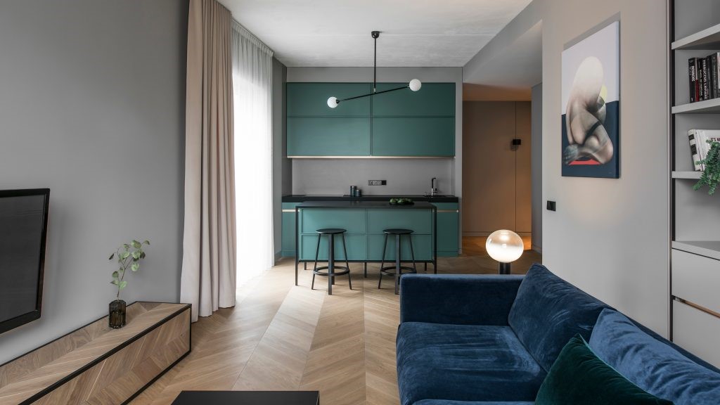
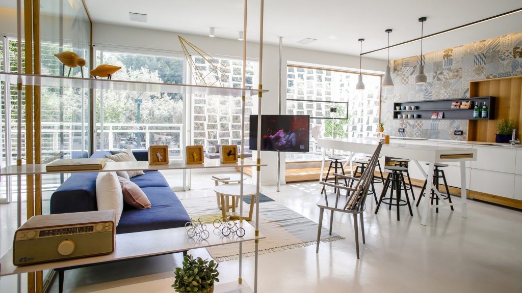
A double-sided sofa facing the TV area and panoramic windows is in the center of a large and bright living room. The TV is neatly hidden in the bookshelves, the doors of which form an interesting composition in each position.
The marble island of complex shape was designed by Babayants Architects. It is absolutely functional; can be used as kitchen or bar. The island has a built-in wine cooler and cabinets.
采用了长达3米的宽幅木材,为空间设定了一种独特的开阔感。
The proportions of the living room are clearly calibrated, even in the details. The floor is laid out with a wide engineered wood up to 3 meters in length. This format sets a certain rhythm and a sense of space. The convectors in the floor have longitudinal gratings to match the engineering wood. All this forms the right image and perfect proportions.
A functional kitchen is hidden from prying eyes. It is located behind a wooden panel with leather inserts and lighting. The kitchen is as practical as possible: it is made for active use.
早餐区位于厨房旁边,边上是大面积的玻璃幕墙,可以欣赏到周围现代建筑的景色。
The breakfast area is located next to the kitchen, in a beautiful place with corner glazing and a view of the neighborhood with modern architecture.
由Babayants Architects设计,搭配与早餐区相同的椅子,以及一个悬挂式橱柜,内设展示柜,
餐桌上方悬挂由几何形状构成的Apparatus吊灯。
The dining room is mostly used for receiving guests and having special events. Here is a big table designed by Babayants Architects, the same chairs as in the breakfast area, and a hanging cabinet with a showcase for serving items. The composition is complemented by geometric Apparatus pendant lamps.
所有橱柜家具都采用了木饰面,为了达到完美的色调,这一过程耗费了整整9个月的时间。
A rich palette of natural materials was used in this project: wood, natural leather, brass, and stone. All cabinet furniture is made of ash veneer, tinted in a cold shade. It needed 9 months to reach the ideal shade of veneer.
例如,在客厅里,木制书架搭配黄铜搁板,天然石台和一个用皮革装饰的抽屉。
感受温暖的皮革、冰冷的金属、有纹理的木材和石头之间的微妙化学反应。
While working with materials, it was important to focus on the contrast of textures and shades. Its pleasant to tactilely feel the difference between warm leather, cold metal, textured wood, and stone.
The guest bathroom is designed in dark colors, in contrast to the rest of the apartment. Such an approach surprises guests. The play with perception is continued by the wooden sink and the composition with the Agape sink and shelves, where the faucet is part of a metal shelf. These elements change the usual idea of the bathroom.
地板铺有天然光滑的Salvatori石材,墙壁凹凸不平的纹理,
The floor is lined with natural smooth Salvatori stone, and the walls are embossed one. It adds tactility and sensory experience.
这赋予了空间一种可塑性和雕塑感,这正是建筑师想要传达的。
The kids’ bathroom is completely white. Graphic porcelain tiles as if hatched with a pencil are on the walls. All sanitary is white and made of artificial stone and ceramics. This gives plasticity and sculpturesqueness, which architects wanted to convey in this space. The bathtub floats above the podium, which enhances the feeling of lightness, air, and spaciousness.
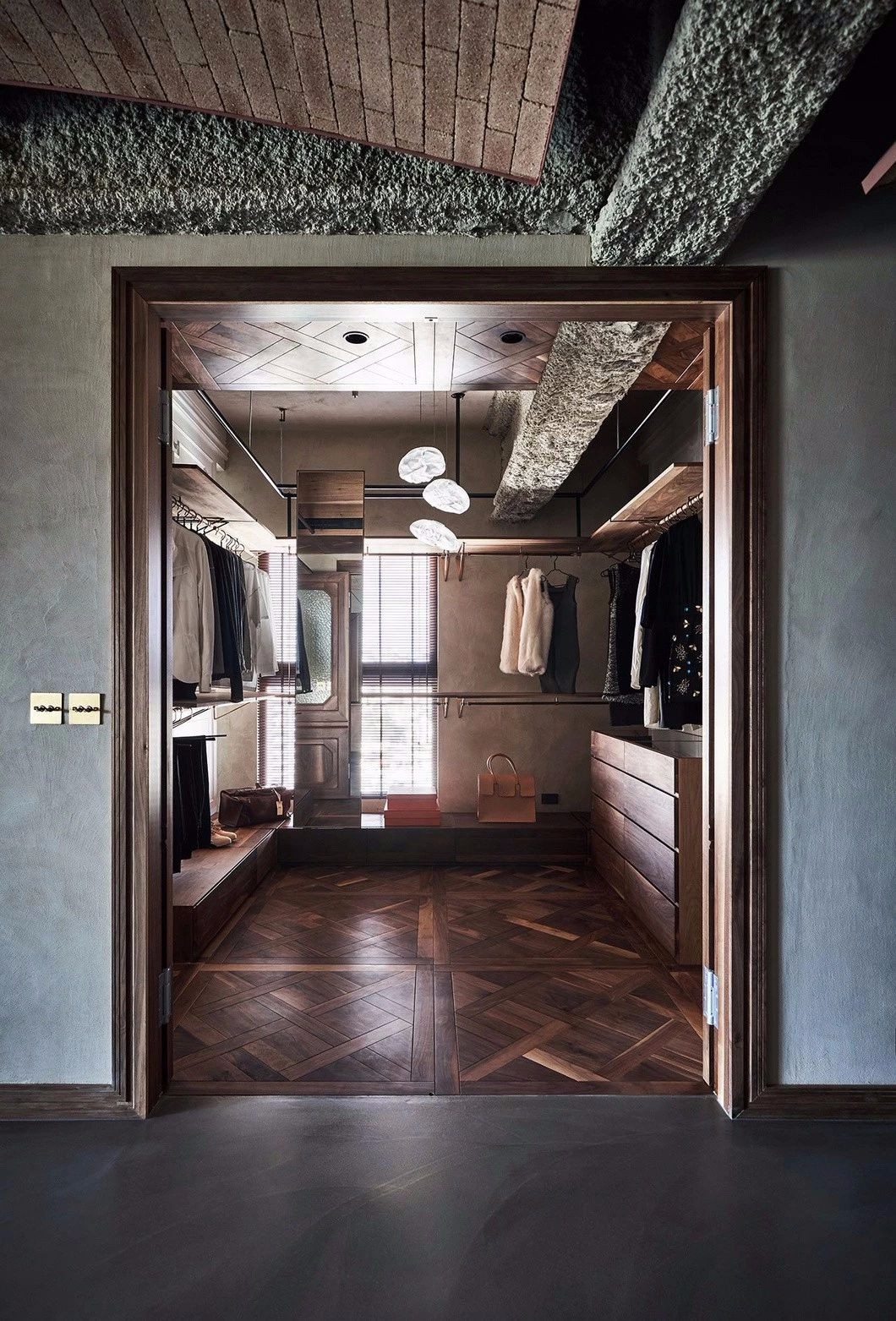
To get to the master zone, one needs to go through the walk-in closet. It is symmetrical: half is female, half is male. Part of the cabinets along the walls is made with blank facades in the color of the walls.
一个是内嵌在墙壁中的Davide Groppi对角线灯。
The bedroom has two main characteristics. The first is the diagonal of the Davide Groppi lamp built into the wall. The pendant shines into the ceiling, providing a soft and diffused light. To set the right atmosphere for relaxation, the lamp can be dimmed. On the sides of the headboard, there are two luminous threads, the light of which is turned towards the panels. This gives a warm and soft light suitable for a bedroom.
The second detail is the multi-layer construction of the headboard made of three different materials: wood, brass, and leather. The composition looks concise and holistic due to the restrained colors.
地板采用光滑的Salvatori大理石制成,淋浴区墙壁采用凹凸不平的石材制成。
浴室柜和台盆按照Babayants Architects的设计定制。
The master bathroom is clean and spacious with natural light. The floor is finished with smooth Salvatori marble, and the shower tray and walls are finished with relief stone. The cabinet and sink are custom-made according to the drawings of Babayants Architects. The composition looks like a single whole. Brass elements are made in the light champagne finish. An illuminated mirror and a shower on the podium add a feeling of lightness and spaciousness.
The working area in the home office is finished with nickel-shade metal. All items were custom-made. The office has a glass insert through which natural light enters the corridor.
许多的独创之处和复杂的解决方案。在客厅中,建筑师设计了一个吊顶,形成了一条引人注目的锐利线条。新风系统巧妙地隐藏在这轻盈而精致的结构中。
In the minimalist project Sadovie Kvartali, there are a lot of authors developments and complex solutions that are invisible to the eye.In the living room, the architects designed a ceiling drop that sets a spectacular sharp line. Slotted air grilles are hidden in this light and sleek structure.
例如,橱柜和门都是加高设计,间隙极小,在工艺上这是极难实现的。
The apartment has high ceilings of 3.4 m. It demanded some complicated technical solutions. For instance, cabinet furniture and doors are made in full height, with a minimum gap. This is extremely difficult to implement.
簋板的不同厚度,创造了复杂而有趣的储物空间,增添了更多的表现力。
Cabinet furniture is faced with slats using a special technology. These are not recesses carved into a single panel, but a type-setting structure. A complex and interesting rhythm is created thanks to the different thicknesses of the slats. It adds even more expressiveness to the space.
Babayants Architects团队探索现代建筑、室内和设计已有9年之久,被称为莫斯科的主要极简主义者,但对他们来说,极简主义与其说是一种艺术语言,不如说是一种感知世界及其美丽的方式,他们只为最重要的东
Babayants Architects生活在未来,努力在每一个方案中走在时代的前列,并试图创造新事物,进行新发现。他们做的不是设计,而是感官体验,内心状态和情感。
Babayants Architects的工作涉及空间、物体和概念,创造住宅和公共室内设计、建筑设计、塑造品牌形象、制作家具和参加展览。
采集分享
 举报
举报
别默默的看了,快登录帮我评论一下吧!:)
注册
登录
更多评论
相关文章
-

描边风设计中,最容易犯的8种问题分析
2018年走过了四分之一,LOGO设计趋势也清晰了LOGO设计
-

描边风设计中,最容易犯的8种问题分析
2018年走过了四分之一,LOGO设计趋势也清晰了LOGO设计
-

描边风设计中,最容易犯的8种问题分析
2018年走过了四分之一,LOGO设计趋势也清晰了LOGO设计


 PintereAI


