Puntoy Coma书店丨探索与思想交流的奇妙空间_20240825 首
2024-08-25 20:54
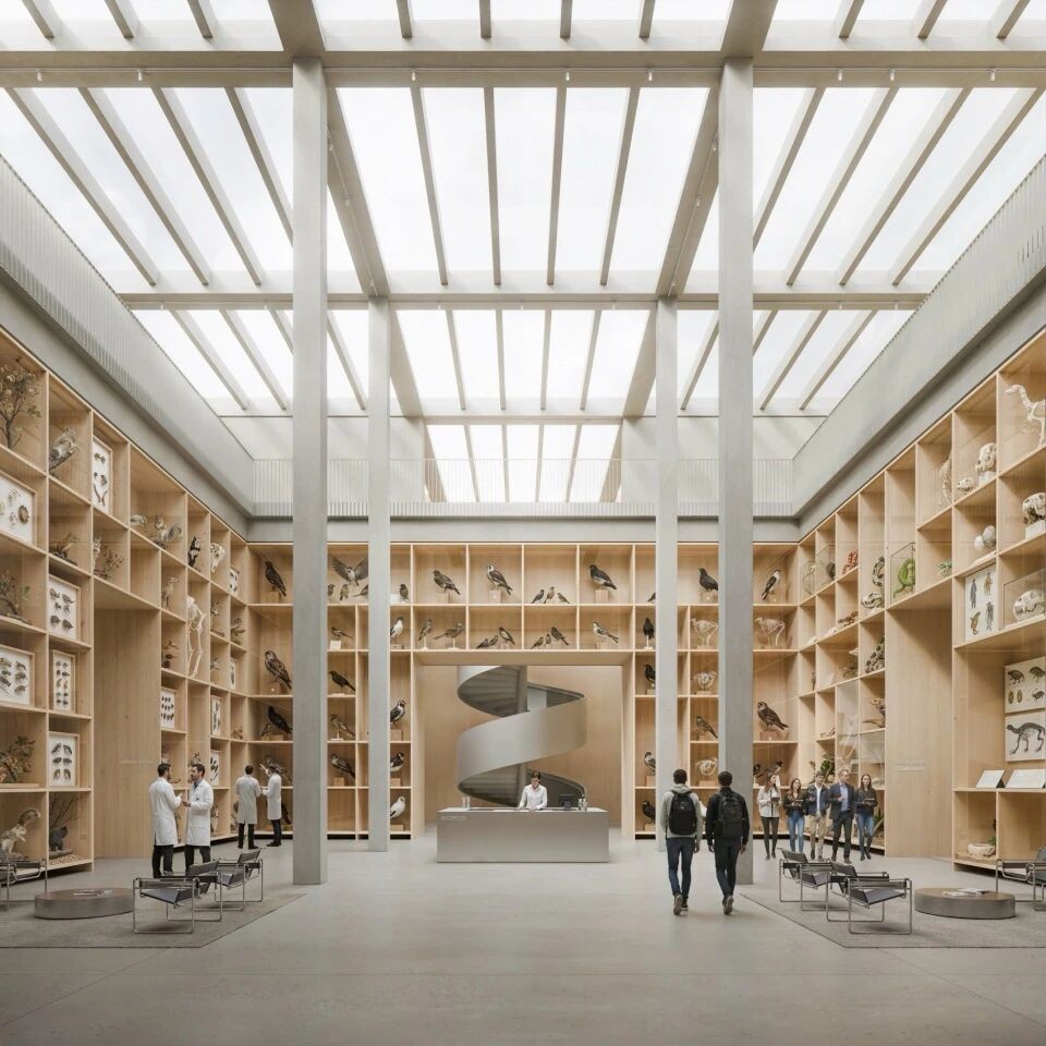
在墨西哥的克雷塔罗(Querétaro),有一家由 Verduzco Guerra 设计的 Punto y Coma 书店,以其独特的设计重新定义了书店的体验,为人们打造了一个充满探索与思想交流的奇妙空间。
In Queretaro, Mexico, the Punto y Coma bookstore by Verduzco Guerra redefines the bookstore experience with its unique design, creating a fantastic space for exploration and the exchange of ideas.
走进 Punto y Coma,首先映入眼帘的是其无门布局和弧形墙壁。这种设计巧妙地引导游客穿梭于各个区域,仿佛一场充满惊喜的发现之旅。每一处角落都似乎在诉说着新的故事,激发着人们的好奇心与探索欲。一张长长的展示桌贯穿其中,宛如一条纽带,连接起书店和文化中心的不同部分。
Entering Punto y Coma, the first thing that strikes is its doorless layout and curved walls. The design subtly guides visitors through the various areas, as if on a journey of discovery full of surprises. Every corner seems to be telling a new story, inspiring peoples curiosity and desire to explore. A long display table runs through it, acting as a link between the different parts of the bookstore and the cultural center.
这里不仅有丰富的书籍,还设有开放区域供人们休息和社交,以及安静角落适合阅读和反思。其中,反射空间尤为引人注目,它是一个灵活多变的区域,可用于举办各种活动。而在办公场所的后面,协作工作空间提供了三种不同的工作环境,无论是小组工作的中央蓝色桌子,还是用于专注任务的个人隔间,亦或是能欣赏小庭院景观的长办公桌,都满足了人们多样化的需求。
Not only is there a wealth of books, but there are also open areas for rest and socializing, as well as quiet corners for reading and reflection. In particular, the reflective space is a flexible area that can be used to host a variety of events. At the back of the office space, the collaborative work space offers three different work environments, whether it is a central blue desk for group work, an individual cubicle for focused tasks, or a long desk with a view of the small courtyard to meet the diverse needs of people.
在材料的选择上,Punto y Coma 也独具匠心。翻新工程露出了 1980 年代的原始混凝土板,如今成为了抛光而粗糙的地板,散发着独特的历史韵味。墙壁和天花板则涂有 Nanocal 的细石灰灰泥,形成光滑、连续的表面,将整个空间紧密联系在一起。定制设计的家具更是在功能与形式之间取得了完美平衡。蓝色的桌子,钢制下部结构搭配水泥板饰面,与微妙的美国橡木长凳和支撑件形成鲜明对比,既与墙壁的中性色调融为一体,又将焦点集中在展出的书籍和物品上。JM Villegas 的灵活搁架系统,由支架和天然铝条制成,可适应不同尺寸和高度的展示物品。天然钢装饰,如中央圆柱形灯具,为空间增添了功能性与独特触感。
Punto y Coma was also creative in his choice of materials. The renovation revealed the original concrete slab from the 1980s, which is now a polished and rough floor, exuding a unique historical charm. The walls and ceiling are coated with Nanocals fine lime stucco, creating a smooth, continuous surface that binds the space together. Custom-designed furniture achieves the perfect balance between function and form. Blue tables with steel substructures paired with cement panel finishes contrast with subtle American oak benches and support pieces, both blending in with the neutral tones of the walls and bringing the focus to the books and objects on display. JM Villegas flexible shelving system, made of brackets and natural aluminum strips, can accommodate display items of different sizes and heights. Natural steel decorations, such as the central cylindrical light fixtures, add functionality and a unique touch to the space.
Punto y Coma书店无疑是一个将设计、材料和布局完美结合的地方。它创造了一个鼓励游客探索和参与的环境,让人们在这个空间里尽情感受书籍的魅力与思想的碰撞。我们仿佛能看到那一个个热爱阅读与探索的身影,在这个独特的书店中,开启属于自己的知识之旅。
The Punto y Coma bookstore is undoubtedly a perfect combination of design, materials and layout. It creates an environment that encourages visitors to explore and engage, allowing people to feel the charm of books and the collision of ideas in this space. It seems that we can see the figure who loves reading and exploring, and open their own knowledge journey in this unique bookstore.
项目名称PROJECT NAME : Punto y Coma
位置LOCATION : Queretaro, Mexico
设计DESIGN : Verduzco Guerra
撰文 WRITER :L·xue 校改 CORRECTION :
版权 COPYRIGHT : Verduzco Guerra
 举报
举报
别默默的看了,快登录帮我评论一下吧!:)
注册
登录
更多评论
相关文章
-

描边风设计中,最容易犯的8种问题分析
2018年走过了四分之一,LOGO设计趋势也清晰了LOGO设计
-

描边风设计中,最容易犯的8种问题分析
2018年走过了四分之一,LOGO设计趋势也清晰了LOGO设计
-

描边风设计中,最容易犯的8种问题分析
2018年走过了四分之一,LOGO设计趋势也清晰了LOGO设计


 PintereAI


