The Watson,加拿大温哥华
2024-09-07 16:28
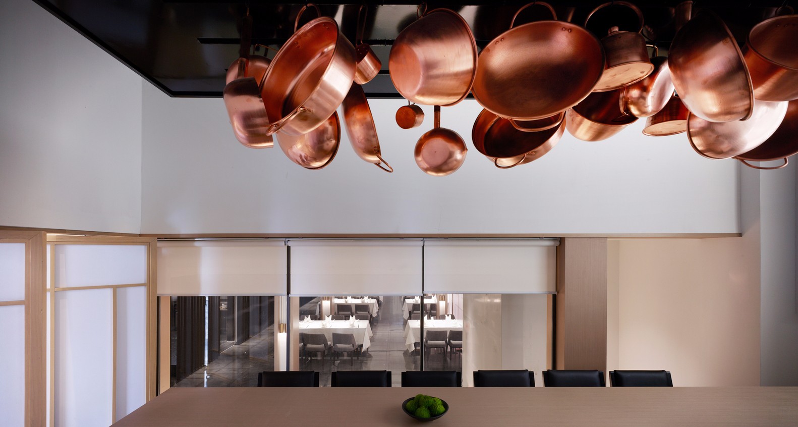
The Watson is a dynamic, cocktail forward restaurant in Mount Pleasant, fully renovated by Erica Colpitts Interior Design in 2023. The 2,000 square foot restaurant has soaring 23’ high ceilings and a mezzanine lounge overlooking the dining space and bar below. Scale was key in the design of this spaceto create an interior that was visually stunning but intimate in experience.
The Watson 是一家位于芒特普莱森特的充满活力的鸡尾酒前卫餐厅,由 Erica Colpitts Interior Design 于 2023 年全面翻新。这家 2,000 平方英尺的餐厅拥有 23 英尺高的天花板和一个夹层休息室,可俯瞰下面的用餐空间和酒吧。规模是这个空间设计的关键,它创造了一个视觉上令人惊叹但体验亲密的内部。
Inspired by libraries and apothecary shops from Belgium and the Netherlands, the sizable, tiered back bar features a 9’ tall mirror shrouded in a backlit bronze arch. Paired with antique filled shelving, a decadently edged quartz bar top, and subtle contemporary pendant lights, the bar is the hero of the entire space. Locally commissioned, oversized artwork and stunning chandeliers work to balance the space in both drama and scale, and lush plants throughout provide an additional hint to a Victorian aesthetic.
受比利时和荷兰图书馆和药剂店的启发,宽敞的分层后吧设有一面 9 英尺高的镜子,遮罩在背光青铜拱门中。搭配装满古董的架子、颓废边缘的石英吧台和微妙的现代吊灯,酒吧是整个空间的主角。当地委托的超大艺术品和令人惊叹的枝形吊灯在戏剧性和规模上平衡了空间,郁郁葱葱的植物为维多利亚时代的美学增添了额外的暗示。
Offering an intoxicating view of the scene below, the mezzanine lounge acts as a dark and sexy corner in which to sneak away for the evening and not be noticed. The interior design team curtained off the lounge with olive green velvet drapes and dropped the lighting very low. Erica designed and commissioned two custom lighting sconces from a maker in Illinois – they cast an almost sinister light in the space. Warmed up with weathered oak woodwork, creamy marble tables, and brass accents, this is the perfect space to sip cocktails into the wee hours of the night.
夹层休息室提供令人陶醉的下方场景,是一个黑暗而性感的角落,可以在晚上偷偷溜走,而不会被注意到。室内设计团队用橄榄绿色的天鹅绒窗帘遮住了休息室,并将灯光调得很暗。Erica 设计并委托了伊利诺伊州的一家制造商制作的两款定制照明壁灯——它们在空间中投下了近乎险恶的光芒。风化的橡木制品、奶油色大理石桌子和黄铜装饰营造出温暖的氛围,是啜饮鸡尾酒到凌晨的完美空间。
Overall, The Watson feels striking and impressive while maintaining a sense of warmth, ease, and belonging. It is a place to celebrate a typical Tuesday just as much as a special occasion.
总体而言,The Watson 感觉引人注目且令人印象深刻,同时保持了温暖、轻松和归属感。这是一个庆祝典型星期二和特殊场合的地方。
The founder of the restaurant is Erica Colpitts’ brother, restauranteur Michael Gayman. With some of his key partners from another venture, Bartholomew, Michael wanted to bring an easy going, cocktail-forward dining destination to his own neighbourhood of Main Street.
餐厅的创始人是 Erica Colpitts 的兄弟,餐厅老板 Michael Gayman。Michael 与另一家企业 Bartholomew 的一些主要合作伙伴一起,希望为他自己的 Main Street 社区带来一个轻松、鸡尾酒前卫的用餐目的地。
Scale and maximizing space were the two biggest challenges for this project. The main footprint of the restaurant is quite small compared to the overall ceiling height, so I needed to ensure we were maximizing impact on both the North and South walls (with the oversized bar and artwork), as well create a hub of seats on the lower floor so the space always feels happening and alive. It’s amazing to have the additional seats upstairs, but when you walk into a restaurant you want to see it full of people right before your eyes. After considering several space plan options, we landed on a layout that consists of a long banquette across the front of the restaurant space for more formal dining, paired with a set of high-top tables closer to the bar for a more casual experience. We added a one-sided banquette with small tables along the stairwell – these seats provide an excellent view of the bar and offer the perfect spot to cozy up to your partner for an intimate date night. I used a similar style of seating in Bartholomew, and they have proven to be favourites.
规模化和空间最大化是该项目面临的两个最大挑战。与整体天花板高度相比,餐厅的主要占地面积相当小,因此我需要确保我们最大限度地影响南北墙(带有超大的吧台和艺术品),并在下层创建一个座位中心,这样空间总是感觉很真实。楼上有额外的座位真是太棒了,但当你走进一家餐厅时,你会想看到它就在你眼前挤满了人。在考虑了几个空间规划选项后,我们确定了一个布局,其中包括一个横跨餐厅空间前面的长长椅,用于更正式的用餐,搭配一组靠近酒吧的高脚桌,以获得更休闲的体验。我们在楼梯间增加了一个单侧长椅,上面有小桌子——这些座位可以欣赏到酒吧的美景,是与您的伴侣舒适地度过亲密约会之夜的理想场所。我在巴塞洛缪使用了类似风格的座椅,事实证明它们是最受欢迎的。
When it came to scale and interest, the size of the bar, artwork, and chandeliers were of key importance to ensure the space felt truly finished and adorned, airy but not cavernous. I knew that the bar would need to be incredibly impressive in size, but I also needed to ensure that it was varied in form to avoid stuffiness or having it feel boring. I designed a 16’ tall, tiered bar with a beautiful oversized (9’ tall) bronze arch in the center, complete with glowing liquor steps holding more than 100 bottles. We flanked the mirrored arch with bookcase like shelving and added apothecary drawers, fluted channels, and detailed crown mouldings and carvings. Paired with the worn wood tone, these details help to make the very substantial bar feel like it has been there forever—that it just belongs there and has always been.
当涉及到规模和兴趣时,酒吧、艺术品和枝形吊灯的大小对于确保空间感觉真正完成和装饰、通风但不空洞至关重要。我知道酒吧的规模需要令人印象深刻,但我还需要确保它的形式多种多样,以避免闷热或让人感到无聊。我设计了一个 16 英尺高的分层酒吧,中间有一个漂亮的超大(9 英尺高)青铜拱门,并配有可容纳 100 多瓶酒的发光酒级。我们在镜面拱门的两侧安装了书架般的书架,并增加了药剂师抽屉、凹槽通道以及详细的皇冠造型和雕刻。这些细节与磨损的木质色调相得益彰,使非常坚固的酒吧感觉就像它已经存在了很长时间——它只是属于那里,并且一直在那里。
The oversized, custom commissioned artwork on the opposite wall balances the space in both scale and drama. These pieces of art were absolutely critical to the design of the space, and we were fortunate enough to work with local artist and tattoo artist, Rene Botha, who understood my vision from our very first meeting. We wanted the pieces to be a modern take on traditional Victorian still lives and portraits—stiffly poised and arranged pieces of art typically found in private halls and libraries. I wanted a modern, gritty take on this style, something dramatic and moody, romantic but with an edge. Rene captured this concept impeccably, and her work is nothing short of striking – I am so grateful for her brilliance. Of the trio, the portrait is my personal favourite. There is something very haunting in the ambivalence in the girl’s expression. She watches over the space with a hint of disdain—you can’t help but love her for it.
对面墙上的超大定制艺术品在规模和戏剧性方面平衡了空间。这些艺术品对空间的设计绝对至关重要,我们有幸与当地艺术家和纹身艺术家 Rene Botha 合作,他从我们第一次见面就理解我的愿景。我们希望这些作品是对传统维多利亚时代静物画和肖像画的现代演绎——这些作品通常出现在私人大厅和图书馆中。我想要一种现代的、坚韧不拔的风格,一些戏剧性和喜怒无常、浪漫但又有前卫的东西。Rene 无可挑剔地捕捉到了这个概念,她的作品简直令人震惊——我非常感谢她的才华。在这三幅画中,这幅肖像是我个人最喜欢的。女孩的矛盾表情中有一些非常令人难以忘怀的东西。她带着一丝轻蔑的眼神注视着这个空间——你会情不自禁地爱上她。
Wood tone was incredibly important to me for this project, for the bar itself as well as the extensive woodwork throughout the restaurant. I wanted the wood to have a faded quality that could seemingly only come from age—something soft and worn, but not roughly weathered. The millworkers from The Shop at Pacific were completely dedicated to achieving this for me, and I could not be more pleased with the final product. This wood tone is featured on the bar and classic wood panelling on the Main Floor, with a more modern panelling detail used throughout the Upper Floor Lounge.
对于这个项目,木质色调对我来说非常重要,无论是酒吧本身还是整个餐厅的大量木制品。我希望木材具有一种褪色的品质,这似乎只能来自年龄——柔软和磨损,但不是粗略风化的东西。The Shop at Pacific 的工厂工人全心全意为我实现这一目标,我对最终产品感到非常满意。这种木质色调在吧台和主楼层采用经典木镶板,整个上层休息室采用了更现代的镶板细节。
We knew we wanted a classic, creamy marble bar top, but we needed this to be maintenance free and hard wearing. We opted for a Hanstone quartz product and finished it with a thick ogee edge. The bar top wraps fully through the back bar, a beautiful detail best viewed from the mezzanine. The stone is slightly more grey than the limewashed cream wall beside the bar—a subtle tonal change that is a nice complement.
我们知道我们想要一个经典的奶油色大理石吧台,但我们需要它免维护且耐磨。我们选择了 Hanstone 石英产品,并用厚厚的 ogee 边缘完成它。吧台完全包裹在后吧台上,这是一个美丽的细节,最好从夹层观看。这块石头比吧台旁边的石灰粉刷奶油墙略灰——这种微妙的色调变化是一个很好的补充。
Metal tones are always important to me, and I like to use a mixture or warm, burnished brass with elements of gunmetal and iron. After a lengthy search I managed to find chandeliers that had this wonderful combination of aged brass bodies with dark steel cording—a combination that keeps delicate form from feeling too precious. I knew that I wanted the arch in the back bar to be bronze—not too bright but still full of warmth and depth. Ales Hauser from 3 Dimensions Ltd is an incredible talent, and he was able to use a thermal spray technique that gives a sandcast texture to the metal. The result is a metal that feels both rough and refined at the same time—perfection in my mind. We paired this with cast brass pendants from Buster and Punch, and I managed to find hurricane candles with cast iron bases. Upstairs, my custom sconces from John Beck steel are fabricated in a natural steel tone with a blackened patina applied and brass base plates for warmth.
金属色调对我来说一直很重要,我喜欢使用混合或温暖的抛光黄铜与青铜色和铁元素。经过长时间的搜索,我设法找到了吊灯,它们将古老的黄铜主体与深色钢绳完美结合——这种组合使精致的形式不会让人感觉太珍贵。我知道我希望后吧台的拱门是青铜色的——不要太亮,但仍然充满温暖和深度。来自 3 Dimensions Ltd 的 Ales Hauser 是一位了不起的人才,他能够使用热喷涂技术,为金属提供砂铸纹理。结果是一种既粗糙又精致的金属——在我心目中是完美的。我们将它与 Buster and Punch 的铸铜吊坠搭配,我设法找到了带有铸铁底座的飓风蜡烛。在楼上,我用 John Beck 钢制成的定制壁灯采用自然钢色调制成,并涂有发黑的铜绿和黄铜底板以保暖。
For upholstery, I am always a fan of materials that are traditionally used for menswear, and The Watson was a perfect place to have fun with this. We have upholstery pieces in a classic Harris tweed, more structured herringbones, and even one loose and almost messy tweed pattern. Add in nubbly wool, performance velvets, and a few hard-wearing leather-look materials in various colours, and we have a pretty fabulous fabric palette.
对于室内装潢,我一直是传统上用于男装的材料爱好者,而 The Watson 是享受这种乐趣的理想场所。我们有经典的 Harris 粗花呢内饰,更有结构的人字形,甚至还有一个松散且几乎凌乱的粗花呢图案。再加上小块羊毛、高性能天鹅绒和一些各种颜色的耐磨皮革外观材料,我们有一个非常美妙的面料调色板。
采集分享
 举报
举报
别默默的看了,快登录帮我评论一下吧!:)
注册
登录
更多评论
相关文章
-

描边风设计中,最容易犯的8种问题分析
2018年走过了四分之一,LOGO设计趋势也清晰了LOGO设计
-

描边风设计中,最容易犯的8种问题分析
2018年走过了四分之一,LOGO设计趋势也清晰了LOGO设计
-

描边风设计中,最容易犯的8种问题分析
2018年走过了四分之一,LOGO设计趋势也清晰了LOGO设计


 PintereAI


