PintereAI


Localy Store,莫斯科 重构苏联美学 首
2025-08-20 20:45


Open the door and you’ll be greeted by the texture of Moscow’s historical buildings and a “market harking back to bygone times” – the design of Localy Store deconstructs the aesthetic core of the Soviet lost and found office from a contemporary perspective, allowing historical memories and everyday objects to reunite here.
推开门,莫斯科历史建筑的肌理与一间 “藏着旧时光的市集” 撞个满怀 ——Localy Store 的设计,以当代视角拆解苏联失物招领处的美学内核,让历史记忆与生活物件在此重逢。


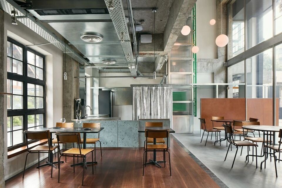
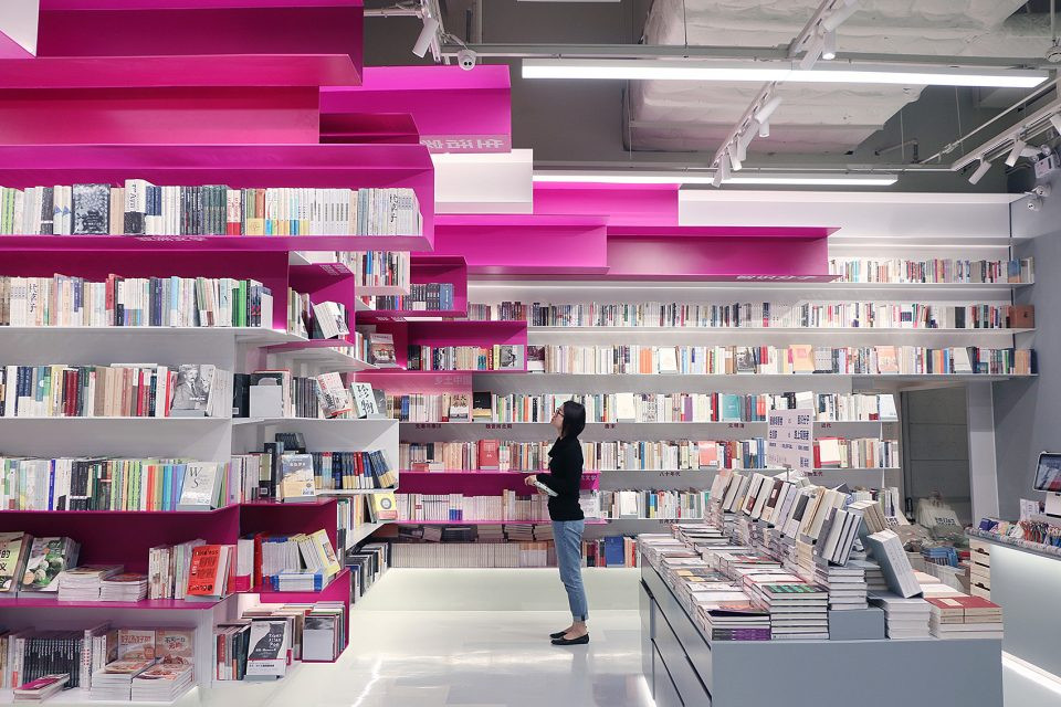
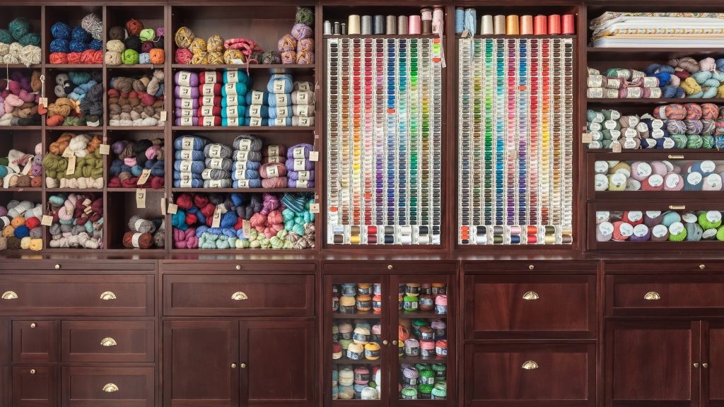
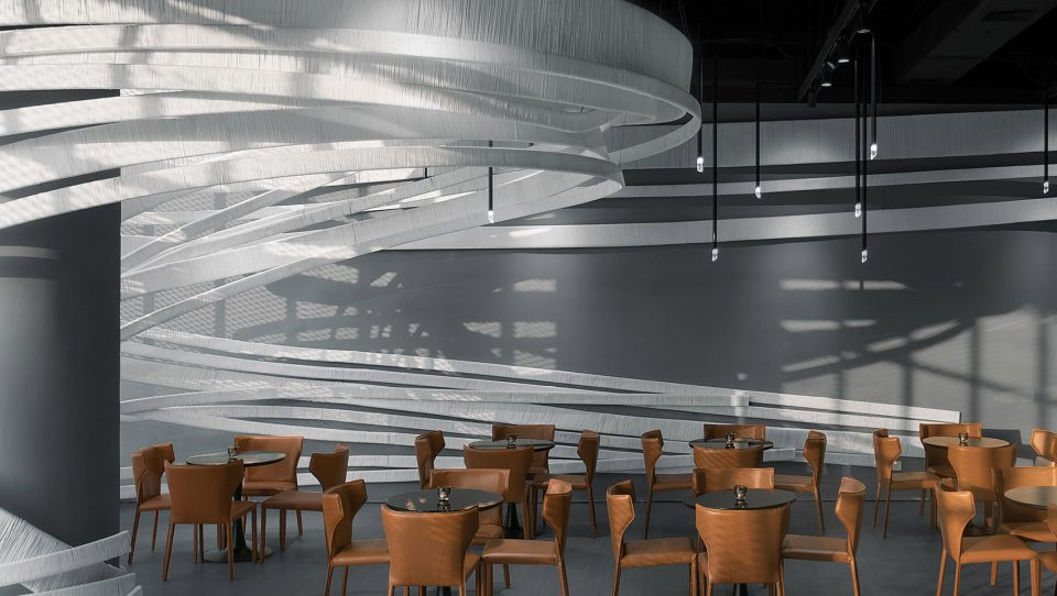
The spatial narrative begins with the ingenious concept of a box within a box. Located in a historic building, the design team deliberately avoided complex renovations, instead defining the space solely through the structure of the furniture. Shelving along the walls resembles layered filing cabinets, avoiding planning approval delays while also creating a sense of order. Much like a Soviet lost and found office, where scattered items are carefully sorted, various Russian home furnishing brands find their own dedicated display spaces on the shelves, reducing clutter and enhancing the sense of abundance.
空间的叙事从 “盒中盒” 的巧思开始。因身处历史建筑,设计团队刻意摒弃复杂改造,仅用家具结构勾勒格局:沿墙架设的货架像层层展开的文件柜,既避开了规划审批的延误,又让 “秩序感” 成为隐形线索 —— 就像苏联失物招领处里,零散物件终会被妥帖归类,这里不同俄罗斯本土品牌的家居,也在货架上找到专属陈列位置,不显杂乱,更显丰盈。


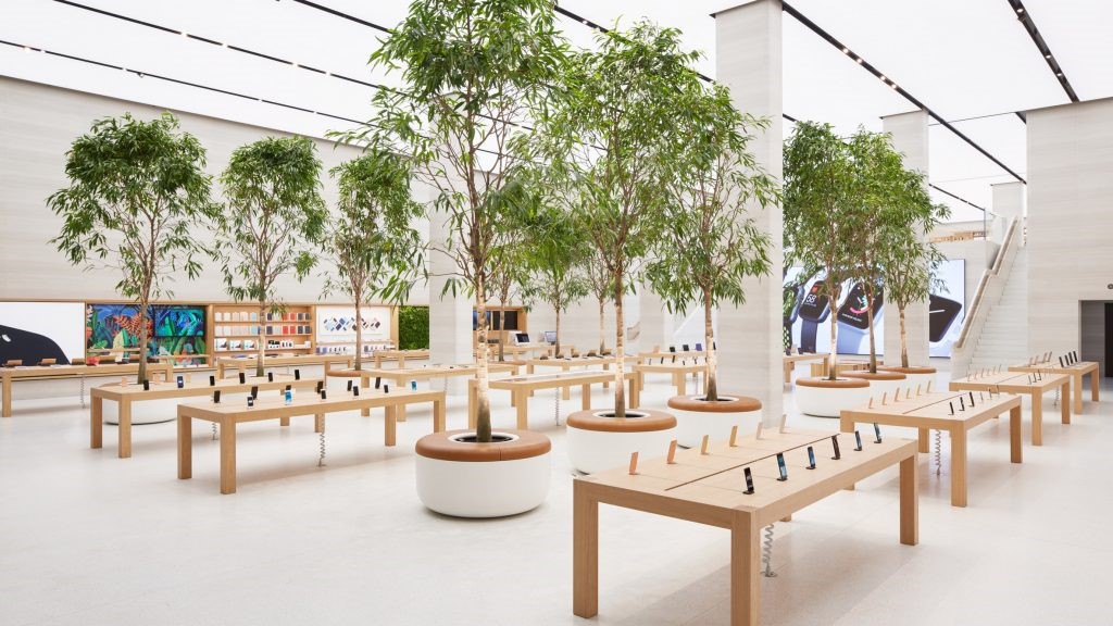
The triangular area at the entrance is the first line of the narrative: the central shelves hold a selection of home furnishings, like the first stalls in a market that attract people to stop; the rest area surrounded by armchairs is covered with soft fabrics, becoming a breathing station during shopping; the double-island checkout area is divided into transaction and customization functions, allowing people to complete their purchases while adding their own unique mark to the items - the traffic flow is full of encouragement to stay rather than hurried circulation.
入口的三角区域是叙事的第一句诗:中央货架托着精选的家居物件,像市集里最先引人驻足的摊位;扶手椅围成的休息区铺着柔软织物,成了逛店途中的 “呼吸站”;双岛收银区则分置 “交易” 与 “定制” 功能,一边完成购买,一边可为物件添上专属印记 —— 动线里藏着对 “停留” 的鼓励,而非匆忙的流转。


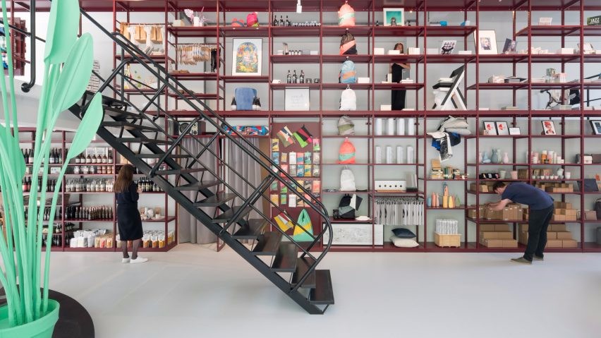
The contrast between the two exhibition areas embodies the designs gentle and thoughtful approach to the senses. The first area, a lively dialogue zone, features shelves filled with home furnishings and handmade products from various brands. The coolness of metal ornaments, the warmth of wooden utensils, and the softness of fabrics intertwine here, creating a vibrant atmosphere reminiscent of an oriental bazaar. Moving on to the second area, Morpheus textiles occupy a dedicated space, where tones subside and textures stand out. The visual experience shifts from diversity to focus—this deliberate alternation of movement and stillness quietly alleviates visual fatigue. The windowsill seats are designed for this purpose, allowing visitors to rest and let the fragments of fresh visuals settle before continuing their exploration with a relaxed mood.
两个展区的对比,是设计对感官的温柔体贴。第一展区是 “热闹的对话场”,货架上摆满各品牌的家居与手作,金属摆件的冷感、木质器皿的温润、布艺的柔软在此交织,像东方 bazaar 般充满生活气息;转至第二展区,Morpheus 品牌的纺织品独占空间,色调沉下来,质感凸出来,视觉从 “多元” 转向 “聚焦”—— 这种刻意的动静交替,悄悄消解了视觉疲劳。窗台边的座席正为此而生,访客可坐下来,让刚接收的视觉碎片慢慢沉淀,再带着松弛的心情继续探索。


The materials and colors evoke a gentle reinterpretation of bygone times. Recycled plastic panels, with their subtle textures, resemble time-worn artifacts. 70s-style lacquered wood furniture radiates a warm glow, embracing the rich, warm color palette, freeing the space from the coldness of mere display cases. Much like a Soviet lost and found office, each forgotten item carries the warmth of its owner. Each piece of furniture here is not a commodity, but a companion waiting to be cherished.
材质与色彩则是 “旧时光的温柔转译”。回收塑料板带着细微的肌理,像被时光磨过的旧物件;70 年代风格的漆木家具泛着暖光,与层次丰富的暖色 palette 相拥,让空间褪去 “陈列容器” 的冰冷 —— 就像苏联失物招领处里,每一件被遗忘的物品都带着主人的温度,这里的每一件家居也并非 “商品”,而是 “等待被珍视的伙伴”。


Those invitations hidden in the details make shopping in the store a natural exploration: the dark light box at the entrance to the second exhibition area emits a soft glow, as if whispering Go inside, there are more surprises; the shelves are arranged with a precise rhythm, from sculptures that can be grasped by fingertips to large draped fabrics, all of which can bloom clearly in the field of vision - there is no deliberate guidance, only the comfort of just seeing.
那些藏在细节里的 “邀约”,更让逛店成了一场自然的探索:第二展区入口的暗灯箱泛着柔和的光,像轻声说 “往里走,有更多惊喜”;货架的排布带着精准的节奏,小到指尖可握的雕塑,大到垂落的布艺,都能在视线里清晰绽放 —— 没有刻意的引导,只有 “恰好看见” 的惬意。


The designs most moving aspect is that it doesnt merely display Soviet aesthetics as mere symbols, but rather allows them to become a bond of connection: connecting the uniqueness of Russian brands, the historical fabric of Moscow, and users aspirations for a warm everyday life. When visitors pick up a piece of fabric, their fingertips experience not only the softness of the material but also the design teams interpretation of reunion—much like lost and found items, where they eventually find their owners, each piece of furniture here can become part of a familys daily memories.
设计最动人的,是它没有把苏联美学当成陈列的符号,而是让其成为 “连接” 的纽带:连接俄罗斯本土品牌的独特性,连接莫斯科的历史肌理,也连接使用者对 “有温度的日常” 的期待。当访客拿起一件织物,指尖触到的不只是材质的柔软,还有设计团队对 “重逢” 的诠释 —— 就像失物招领处里,旧物件终会找到主人,这里的每一件家居,也能在某个家庭里,成为日常记忆的一部分。


The Localy Store ultimately became a space that sold more than furniture, but rather the possibility of giving objects narratives and spaces memories. In this contemporary reimagining of Soviet aesthetics, the weight of history meets the vividness of life, and every corner speaks to the fact that good design can transform a store visit into a heartwarming conversation, transforming everyday objects into storytelling companions.
Localy Store 最终成了这样的空间:它卖的不是家居,而是 “让物件有叙事、让空间有记忆” 的可能。在苏联美学的当代重构里,历史的厚重与生活的鲜活相遇,每一个角落都在诉说:好的设计,能让逛店变成一场温暖的对话,让日常物件变成有故事的伙伴。


△三维方案图


推荐作品

相关文章
-
2018年走过了四分之一,LOGO设计趋势也清晰了LOGO设计
-
2018年走过了四分之一,LOGO设计趋势也清晰了LOGO设计
-
2018年走过了四分之一,LOGO设计趋势也清晰了LOGO设计